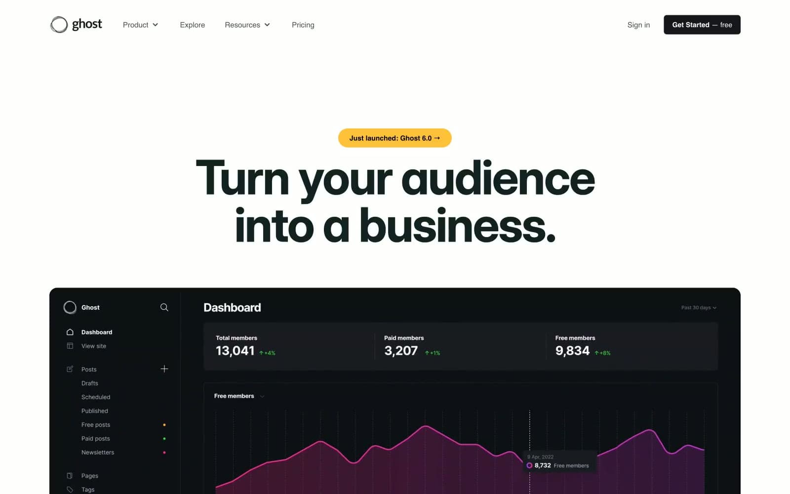
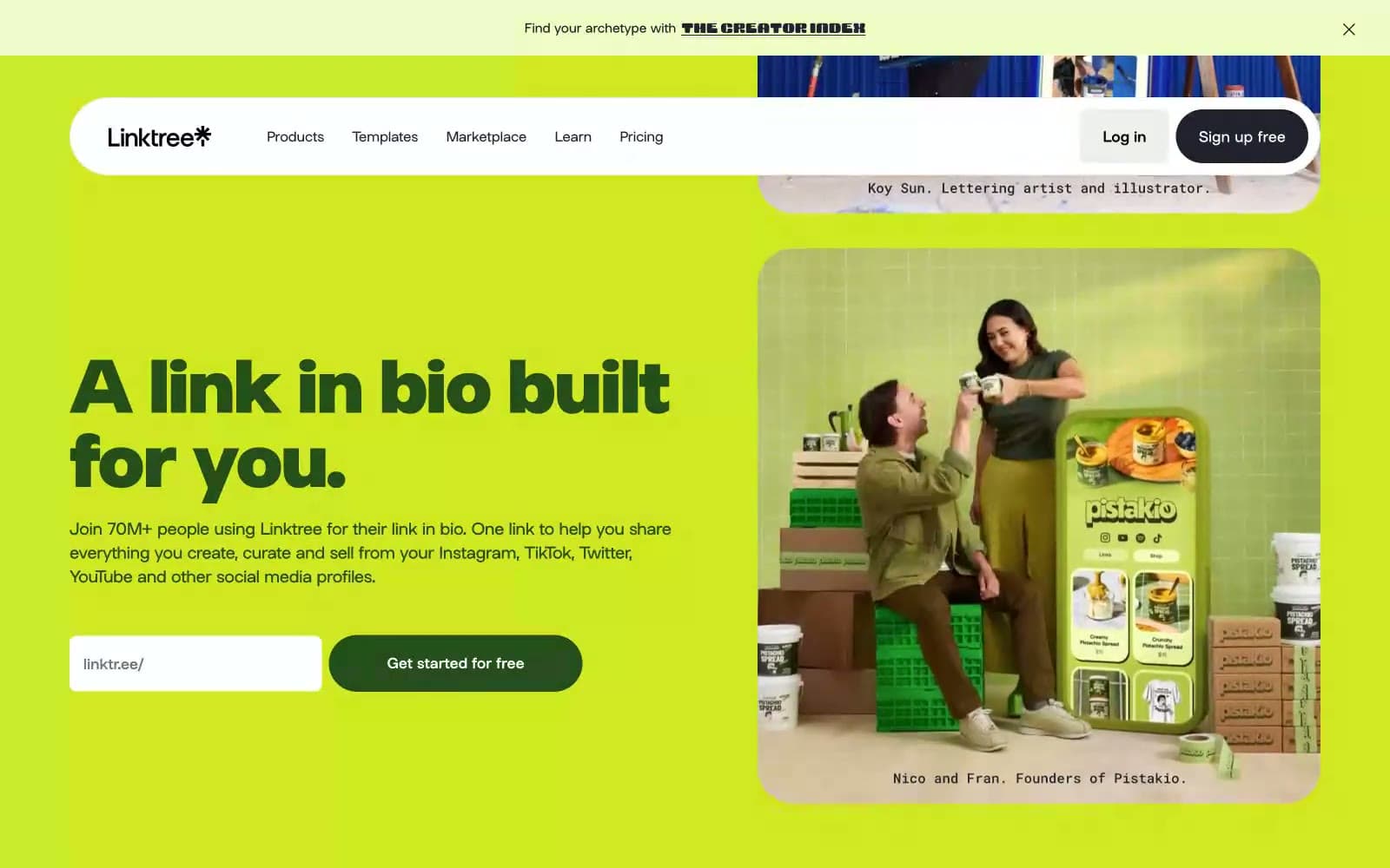
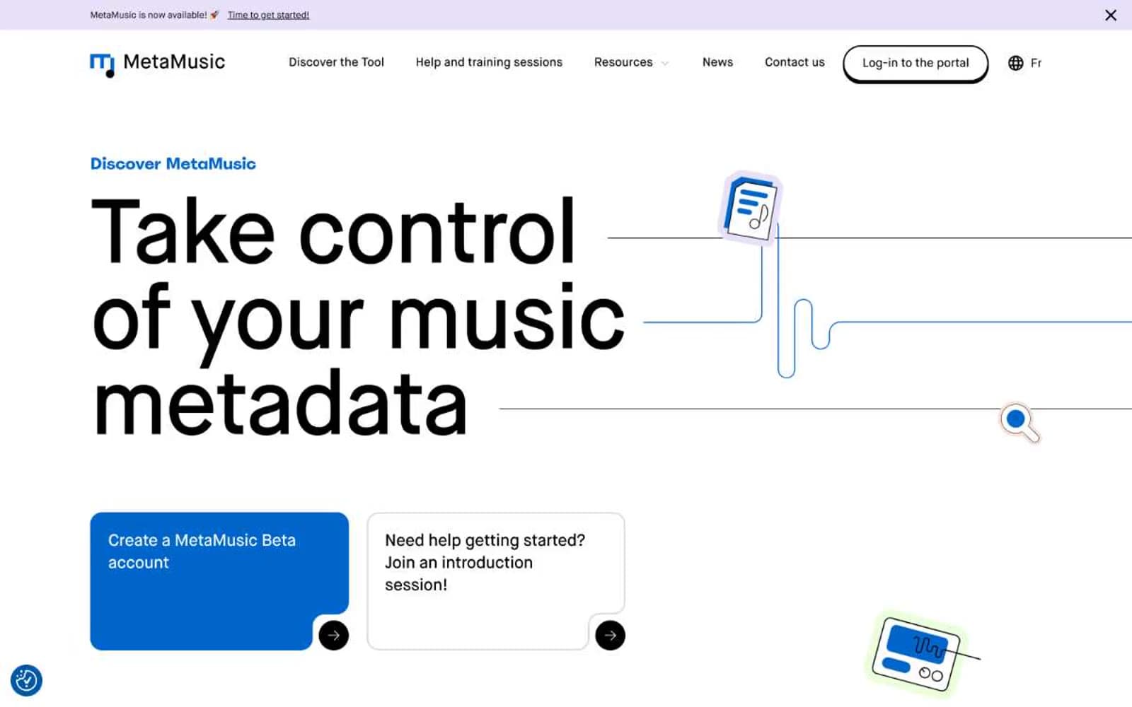
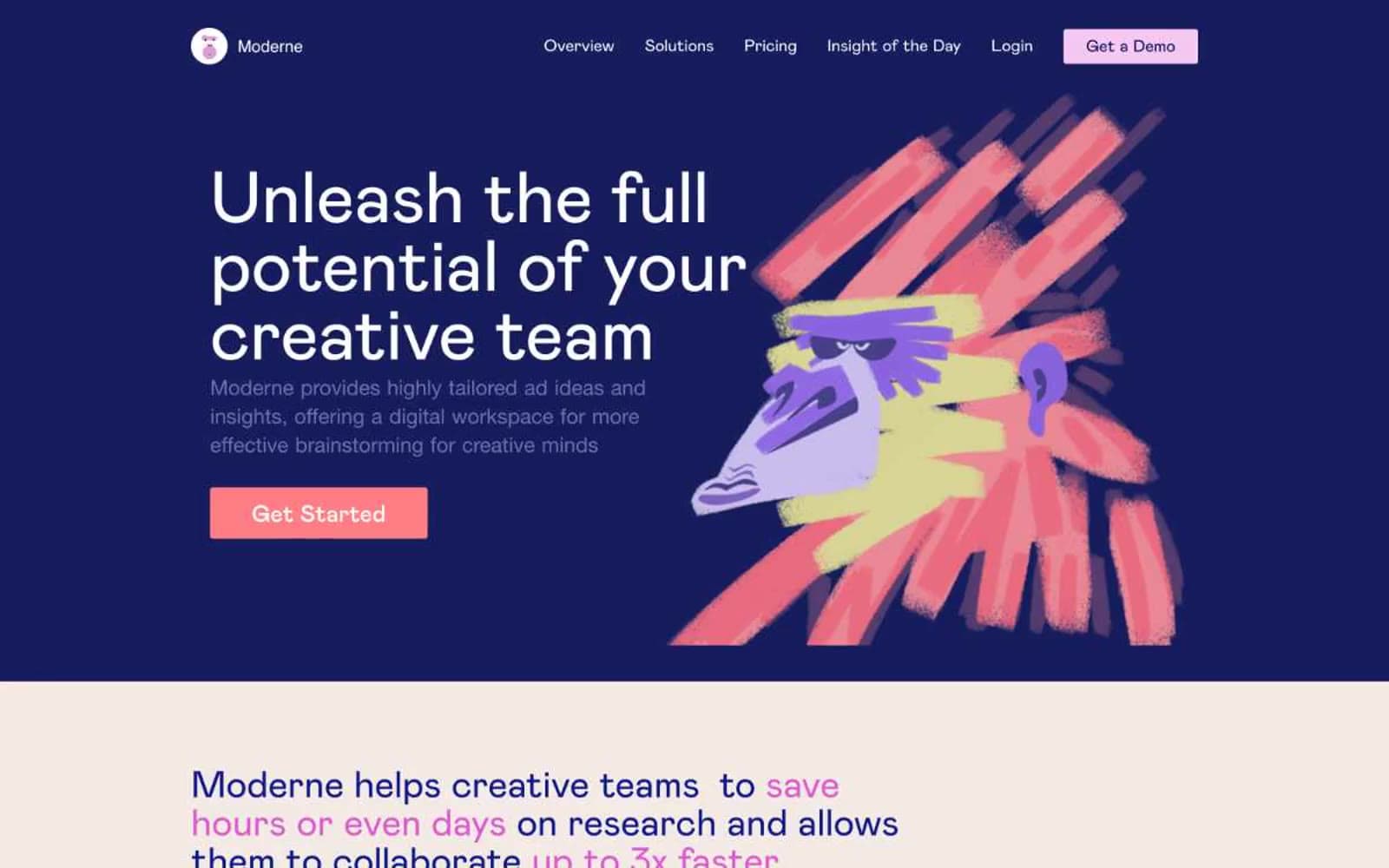
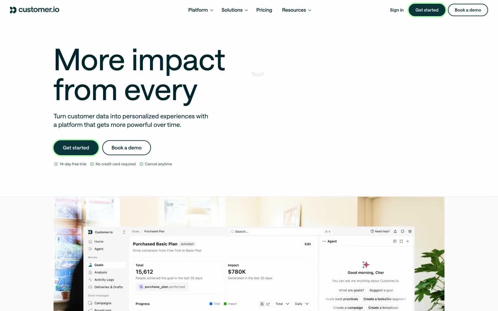
Customer.io. Dark spruce forest meeting cream paper.
- SaaS
- Mixed theme
- 18 colors
- 1 typeface
Customer.io uses a deep forest palette anchored in near-black spruce greens, creating a page that feels like dark pine on warm paper. Typography is custom Saans at near-uniform weight 475 — an unusual medium-light voice that avoids the typical SaaS shout of bold headings, instead making 96px display text feel architectural and quietly authoritative. Color appears sparingly as functional punctuation: a vivid verdant green glow marks interactive elements, while warm cream surfaces and soft blue washes tint alternate sections. The system is built on thin 1px borders, minimal elevation, pill-shaped primary buttons, and 2px corner radii everywhere else — a flat, almost editorial product surface.
Customer.io design system

Brand2
Primary CTA fill on dark backgrounds, elevated card surfaces, border accent
Interactive glow — CTA button fill, focus ring halo, active state border; vivid green signals action without aggression
Accent7
Muted teal accent — illustration fills, secondary icon color
Primary page canvas and white card surfaces. Use as a supporting accent, not as a status color
Violet text accent for links, tags, and emphasized short phrases.
Heading accent color for keyword highlights in display text
Hairline borders, dividers, input outlines, and card edges on light surfaces. Use as a supporting accent, not as a status color
Orange text accent for links, tags, and emphasized short phrases.
Yellow text accent for links, tags, and emphasized short phrases.
Neutrals9
Deepest background — footer canvas, dramatic section breaks
Primary dark surface — headers, hero, main navigation background; dominant text color on light surfaces
Body text on light surfaces, secondary heading color
Decorative stroke, muted link text, icon outlines on dark surfaces
Hairline borders, dividers, subtle separators across the interface
Hairline borders, dividers, input outlines, and card edges on light surfaces. Use as a supporting accent, not as a status color
Alternate section background, subtle card backgrounds
Primary light surface — content sections, card backgrounds
Elevated card surface, button text on dark fills, content blocks
Try a pairing
Pick any two colors from the palette to check whether text stays readable on top.
Aa
Pure White on Spruce 700
13.08 : 1 contrast
- Body textPasses AA 4.5
- Large textPasses AA 3
- StrictPasses AAA 7