
Ghost. Monumental type on infinite white paper.
- SaaS
- Mixed theme
- 14 colors
- 2 typefaces
Ghost speaks at full volume through typography alone: monumental Inter Display headlines (72–96px, weight 600, tracking -0.025em) command the white canvas, then drop to InterVariable for compact, functional body text. The page alternates between two distinct modes — bright white editorial sections with massive headlines and product/dashboard sections rendered in near-black (#15171a) with vivid purple-pink chart gradients. A single chromatic accent — electric lime (#d1ff19) — punctuates links and emphasis against the achromatic backbone, while a warm amber pill (#fec137) handles announcement chips. Components stay soft and approachable: 24px radius on primary controls, 8px on cards, layered 0.1-alpha shadows that hint at elevation without weight. The rhythm is editorial — enormous headlines, generous vertical breathing room, centered or left-aligned stacks, with dark product cards providing visual counterpoint to the white marketing canvas.
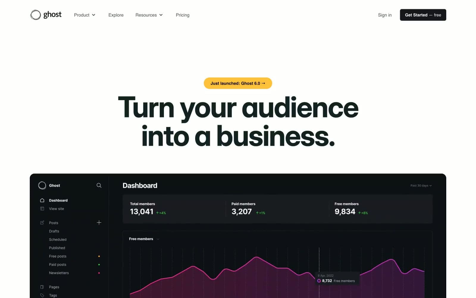
Ghost design system

Brand3
Green supporting accent for decorative details and low-frequency emphasis. Do not promote it to the primary CTA color
Green supporting accent for decorative details and low-frequency emphasis. Do not promote it to the primary CTA color
Green supporting accent for decorative details and low-frequency emphasis. Do not promote it to the primary CTA color
Accent1
Yellow supporting accent for decorative details and low-frequency emphasis.
Neutrals10
Maximum-contrast text on light, SVG fill for logos and icons
Supporting neutral for secondary UI, dividers, and muted labels. Do not promote it to the primary CTA color
Headline color on white — the darkest near-black used for display copy, warmer than #15171a
Heavy borders on cards and dashboard panels — the border workhorse for dark UI elements
Emphasized body text, sub-labels, card headings on light surfaces
Body text on light backgrounds, supporting copy, link underlines
Muted body text, secondary metadata, nav placeholders — desaturated blue-gray reads as informational without competing with headlines
Icon strokes, secondary borders, disabled state outlines
Hairline borders, subtle dividers, ghost surfaces — the dominant neutral that softens the white-on-white hierarchy
Page canvas, card surfaces, button text on dark fills
Try a pairing
Pick any two colors from the palette to check whether text stays readable on top.
Aa
Pure Black on Voltage Lime
18.03 : 1 contrast
- Body textPasses AA 4.5
- Large textPasses AA 3
- StrictPasses AAA 7
More DESIGN.md files. Same web, different personalities.
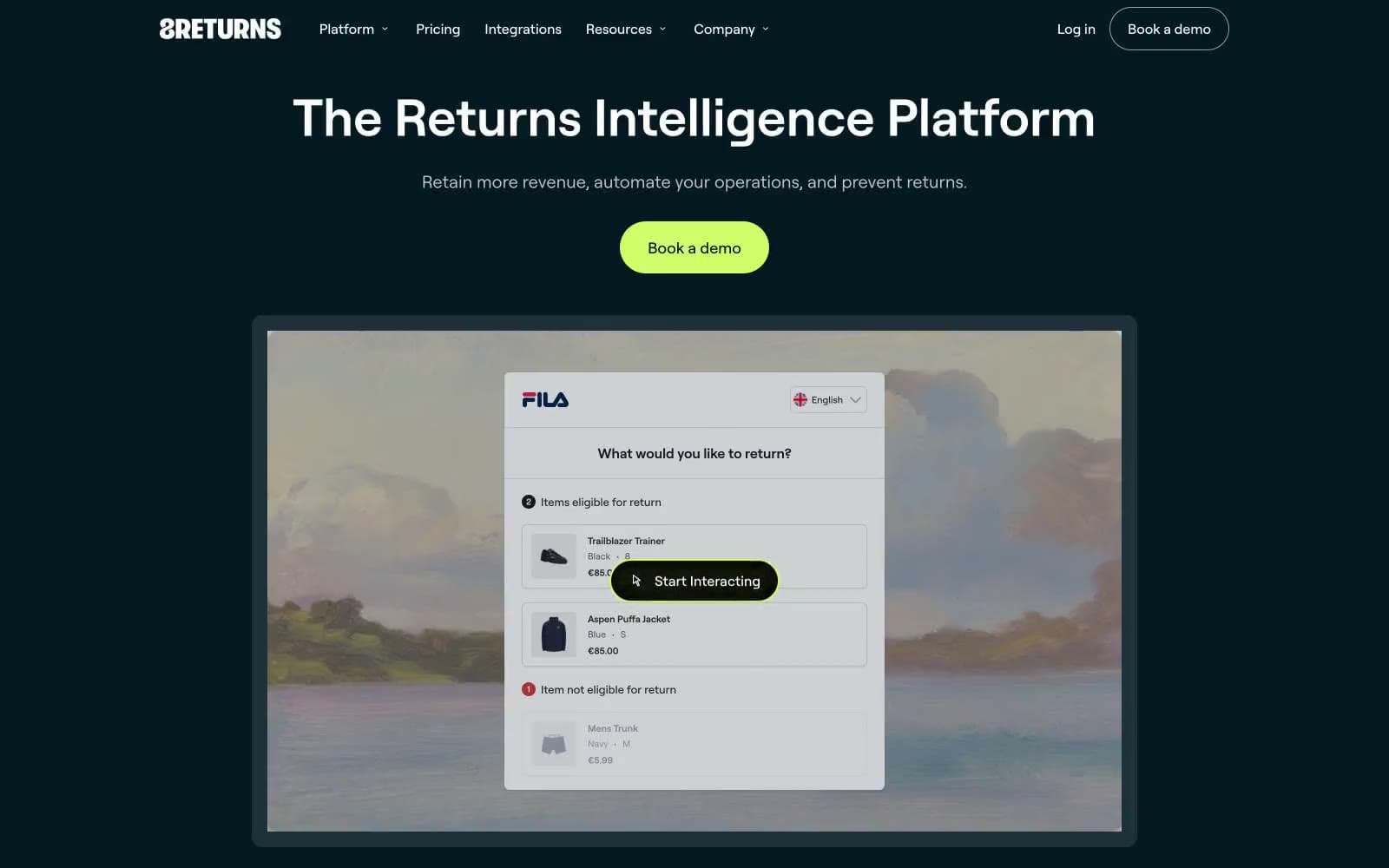
8returns
SaaS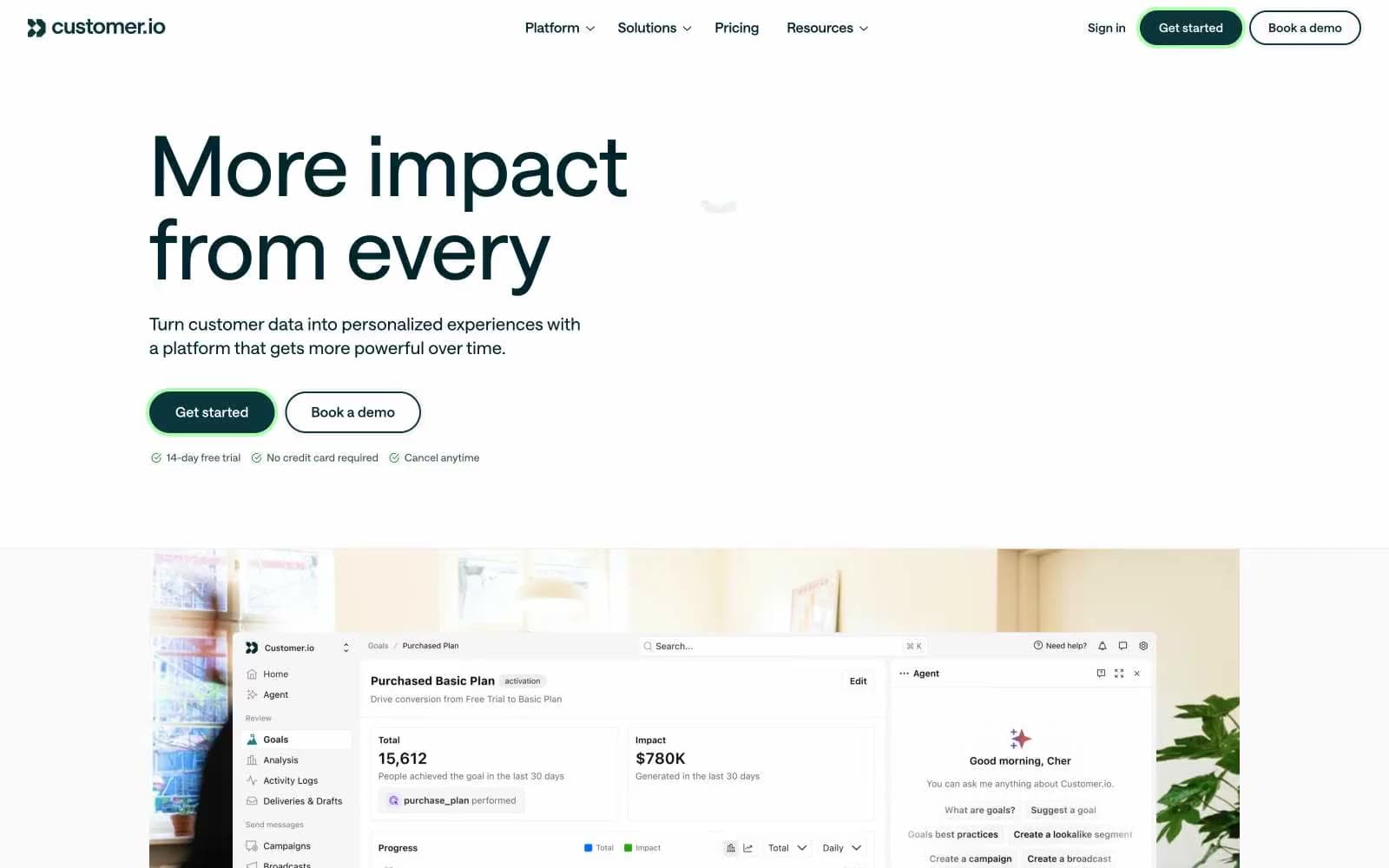
Customer.io
SaaS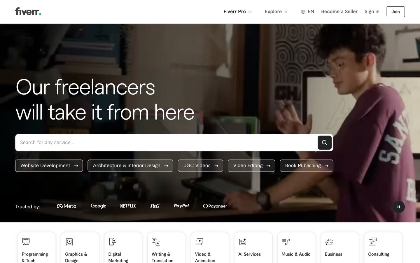
Fiverr.com
SaaS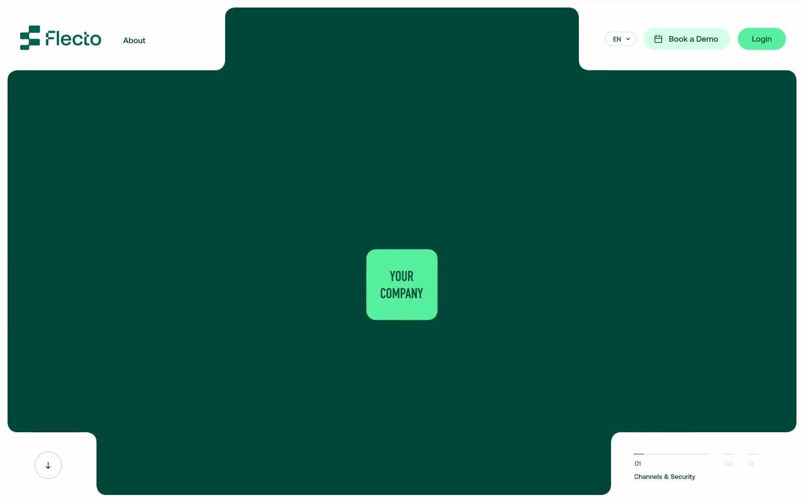
Flecto
SaaS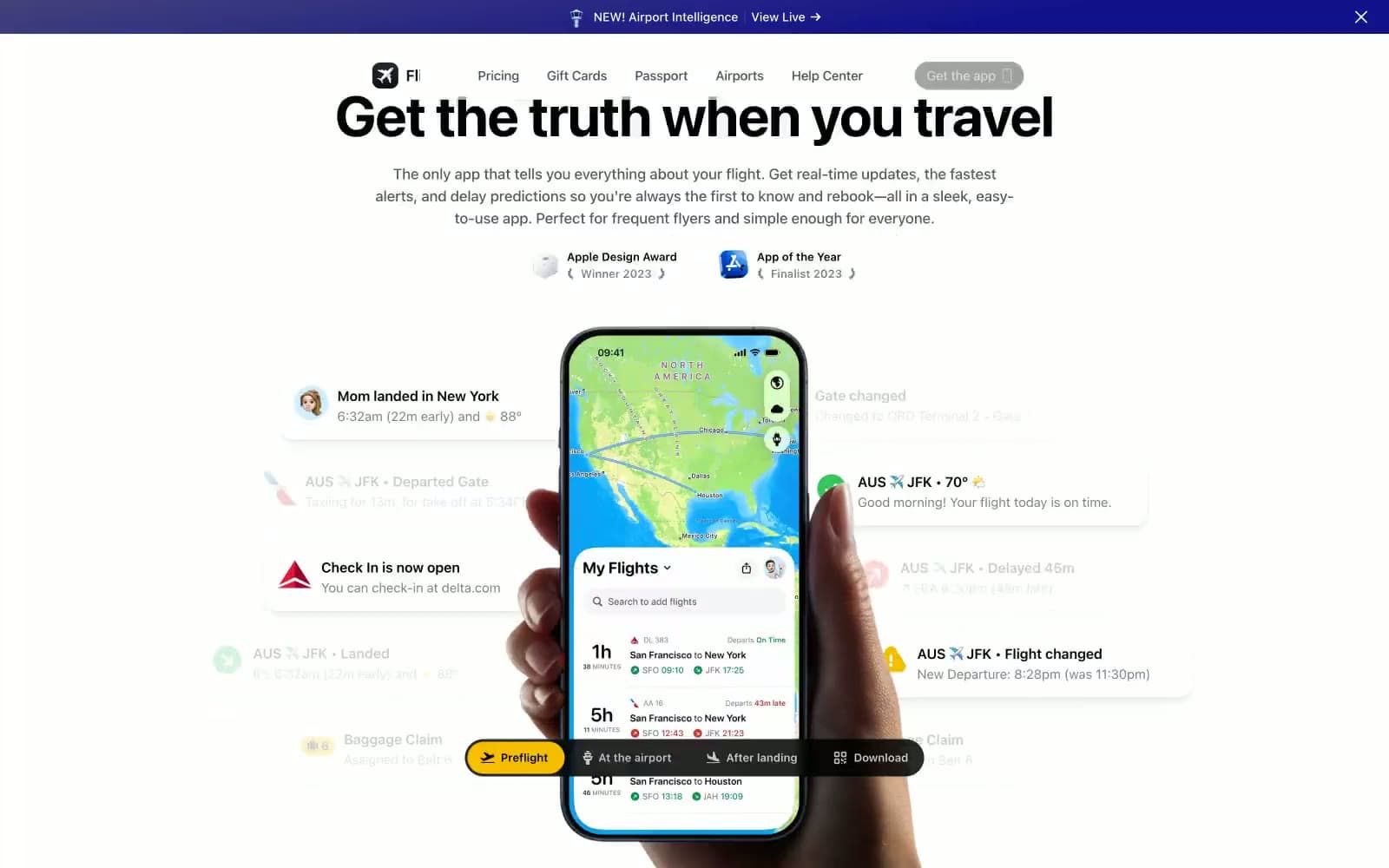
Flighty
SaaS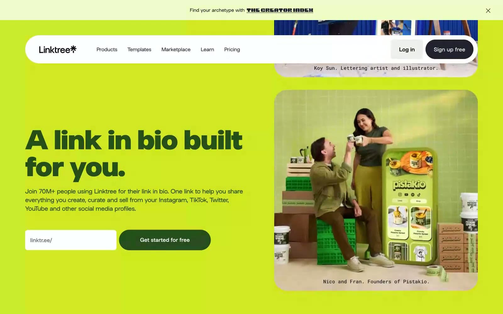
Linktr
SaaS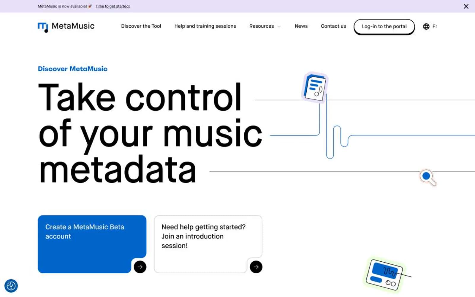
MetaMusic
SaaS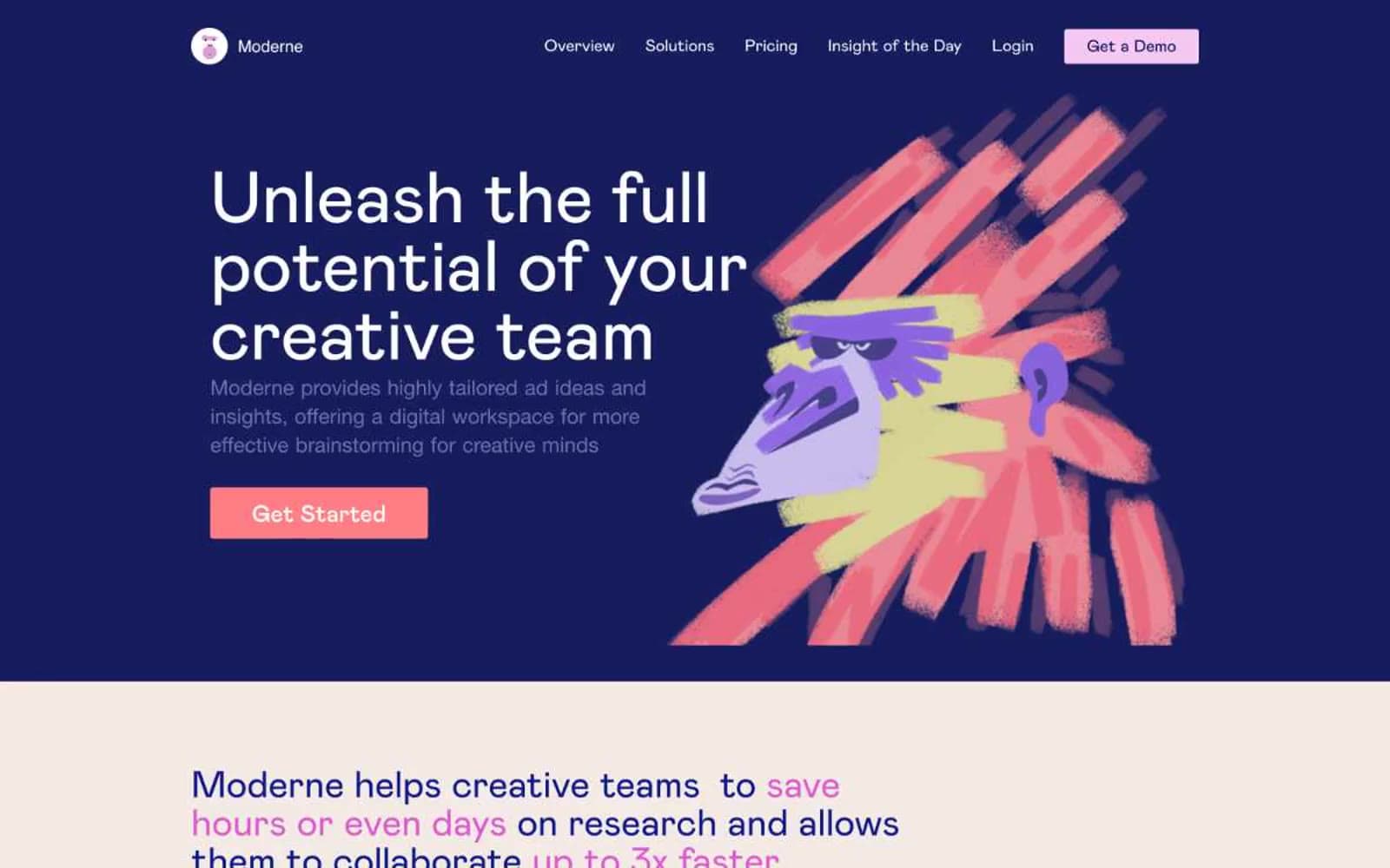
Moderne
SaaS
Passionfroot
SaaS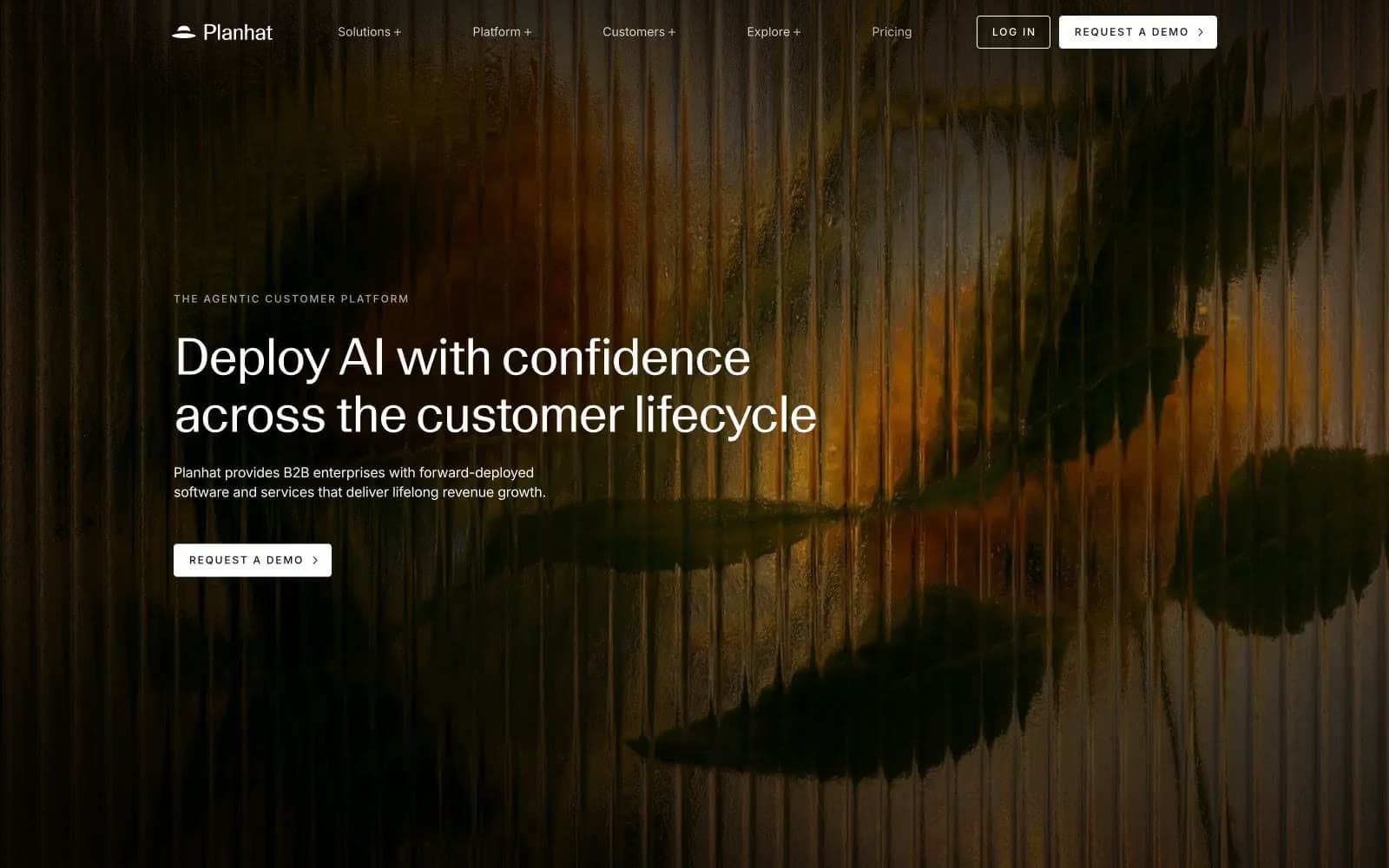
Planhat
SaaS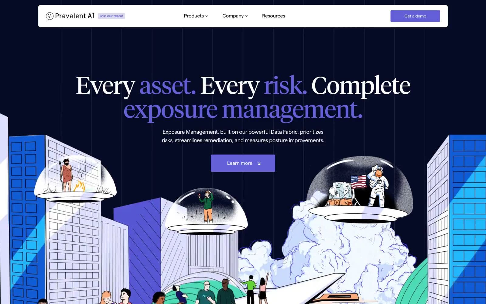
Prevalent
SaaS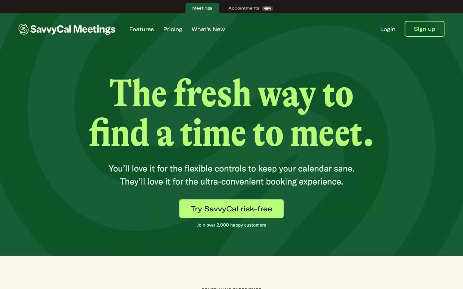
Savvycal
SaaS


