
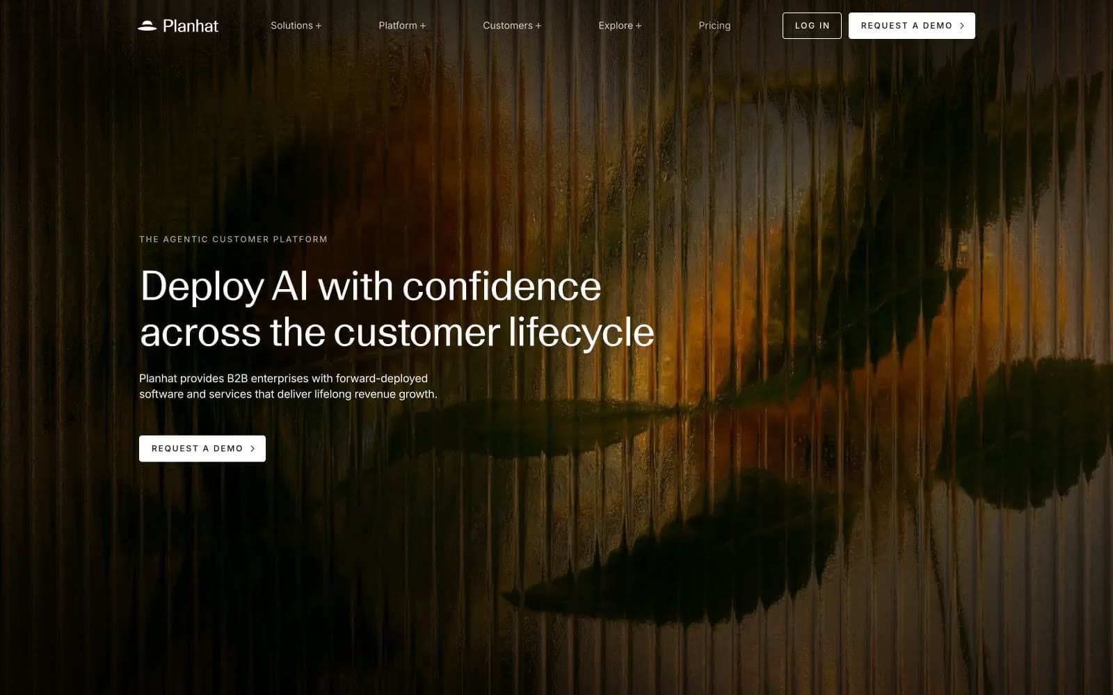
Planhat. A darkroom print on cold-pressed paper.
- SaaS
- Mixed theme
- 6 colors
- 3 typefaces
Planhat speaks in a near-monochrome editorial voice: a cinematic dark hero — photographic forest warmth fading into black — gives way to cool white space below, where content breathes between hairline borders and large, tightly-tracked display type. The system is almost entirely black, white, and a warm taupe; chromatic color is absent from the marketing surface, making any accent feel intentional when it appears. Type does the heavy lifting: a custom neo-grotesque variable face with aggressive negative tracking carries headlines up to 113px, while Inter handles UI and body at a compact rhythm. The overall feel is a printed annual report crossed with a darkroom — quiet authority, generous whitespace, and the confidence to leave large areas of the page nearly empty.
Planhat design system

Accent1
Product-UI accent visible in feature mockups (agent tags, handoff markers) — the only chromatic punctuation, kept small and functional
Neutrals5
Neutral form states, badge text, and quiet UI feedback where color should stay understated. Do not promote it to the primary CTA color
Secondary text and input field treatment — a near-black that softens long-form body copy without losing contrast
Muted helper text and secondary descriptions — a mid-gray that recedes behind Obsidian labels
Tertiary text, subdued link and border accents — a desaturated taupe that warms the otherwise cold grayscale
Page canvas, card surfaces, filled-button text — the bright stage everything sits on
Try a pairing
Pick any two colors from the palette to check whether text stays readable on top.
Aa
Obsidian on Ember Tag
5.77 : 1 contrast
- Body textPasses AA 4.5
- Large textPasses AA 3
- StrictFails AAA 7
More DESIGN.md files. Same web, different personalities.
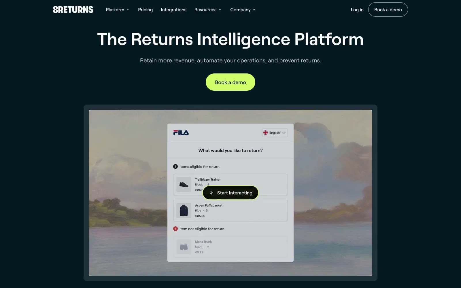
8returns
SaaS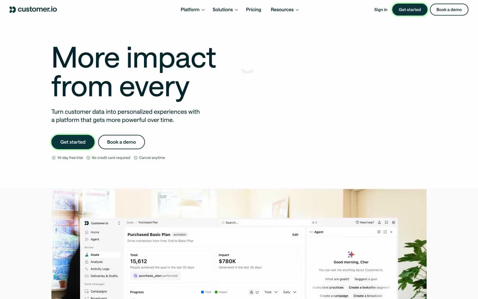
Customer.io
SaaS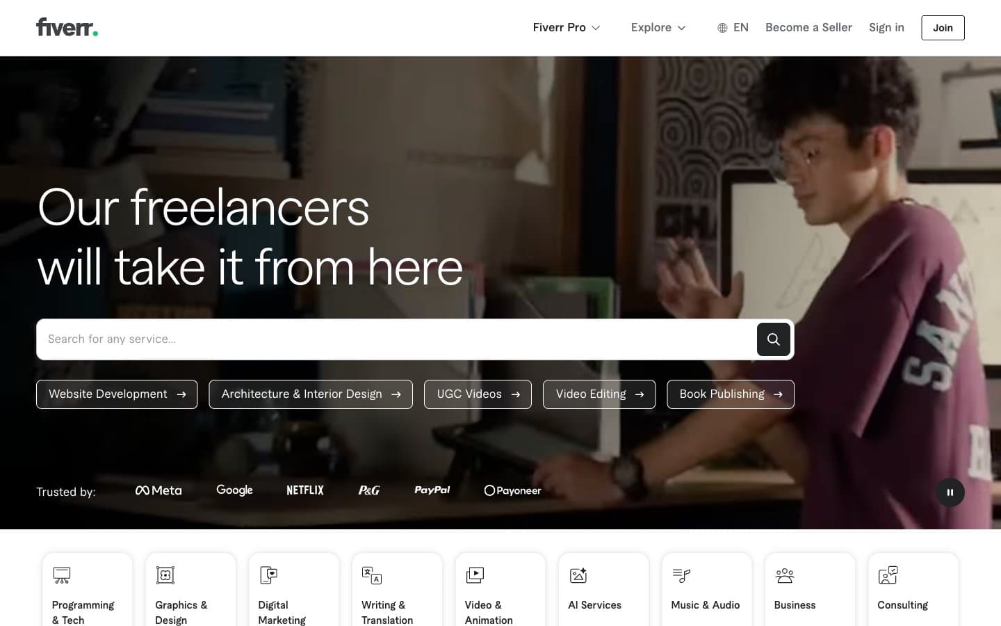
Fiverr.com
SaaS
Flecto
SaaS
Flighty
SaaS
Ghost
SaaS
Linktr
SaaS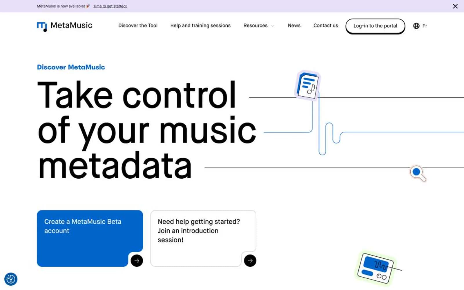
MetaMusic
SaaS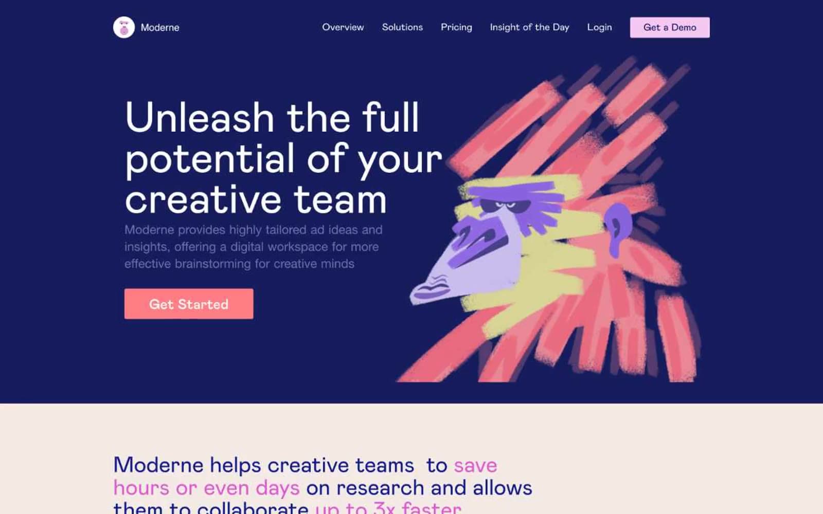
Moderne
SaaS
Passionfroot
SaaS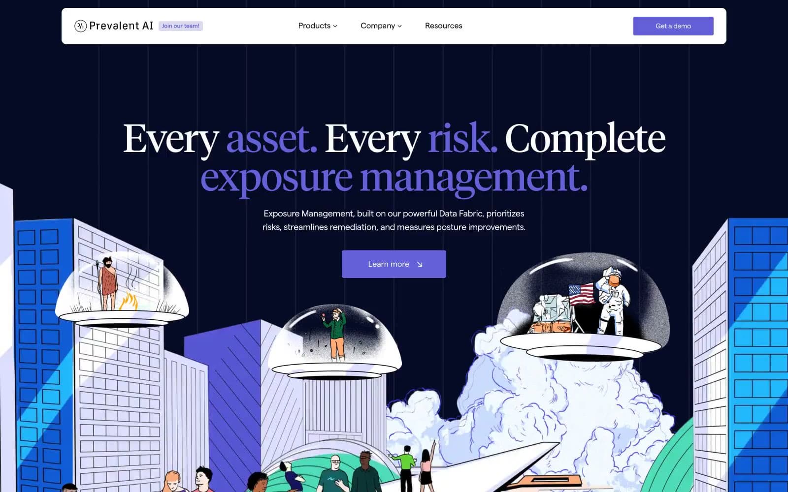
Prevalent
SaaS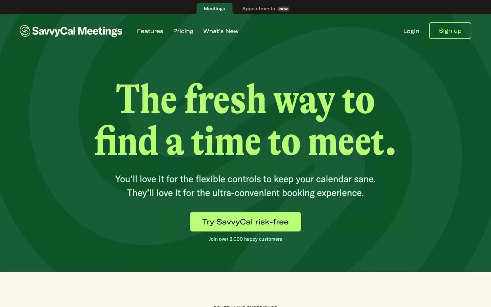
Savvycal
SaaS


