Flecto. Botanical greenhouse glasshouse.
- SaaS
- Mixed theme
- 10 colors
- 3 typefaces
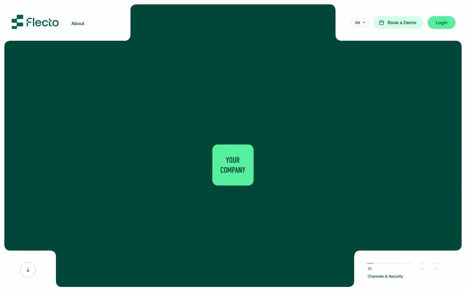
Flecto is a warm botanical rental platform aesthetic: a cream canvas (#fffbec) replaces pure white, deep forest teal (#004737) anchors hero sections and borders, and vivid mint (#56f09f) punctuates interactive moments. Typography is exclusively Aeonik at weight 400 — no bold, no light — relying on negative letter-spacing (-0.043em at display sizes) to create contrast through tightness rather than weight. The system is flat, border-driven, and color-blocked: large rounded surfaces (40–60px radius) in deep teal sit directly on the warm cream, with thin chromatic borders carrying most of the structural weight instead of shadows. Mint appears sparingly as a functional accent on filled buttons, icons, and decorative shapes, never as large surface area.
Flecto design system
Brand2
Dominant brand surface — hero panels, section backgrounds, thick structural borders, nav header, footer blocks. Deep teal absorbs the page and makes cream text glow
Green outline accent for tags, dividers, and focused UI edges. Do not promote it to the primary CTA color
Accent2
Green accent for outlined action borders, linked labels, and lightweight interactive emphasis. Do not promote it to the primary CTA color
Violet outline accent for tags, dividers, and focused UI edges.
Neutrals6
Text color on cream surfaces, subtle dark borders. Near-black with a green undertone that harmonizes with the Forest Ink brand color
Body text and standard button borders in neutral contexts. Used when chromatic text is not appropriate
Muted body text and secondary borders — desaturated green-gray that recedes on cream while staying tonally consistent with the brand palette
Hairline dividers, icon borders, subtle background tints on cards within light sections
Soft warm card background — slightly warmer and more saturated than cream canvas, used to lift specific content blocks without breaking the tonal family
Page background — warm off-white replaces pure white. Border-color on teal sections, card fills on light areas, heading text on dark surfaces
Try a pairing
Pick any two colors from the palette to check whether text stays readable on top.
Aa
Cream Canvas on Forest Ink
10.36 : 1 contrast
- Body textPasses AA 4.5
- Large textPasses AA 3
- StrictPasses AAA 7
More DESIGN.md files. Same web, different personalities.

8returns
SaaS
Customer.io
SaaS
Fiverr.com
SaaS
Flighty
SaaS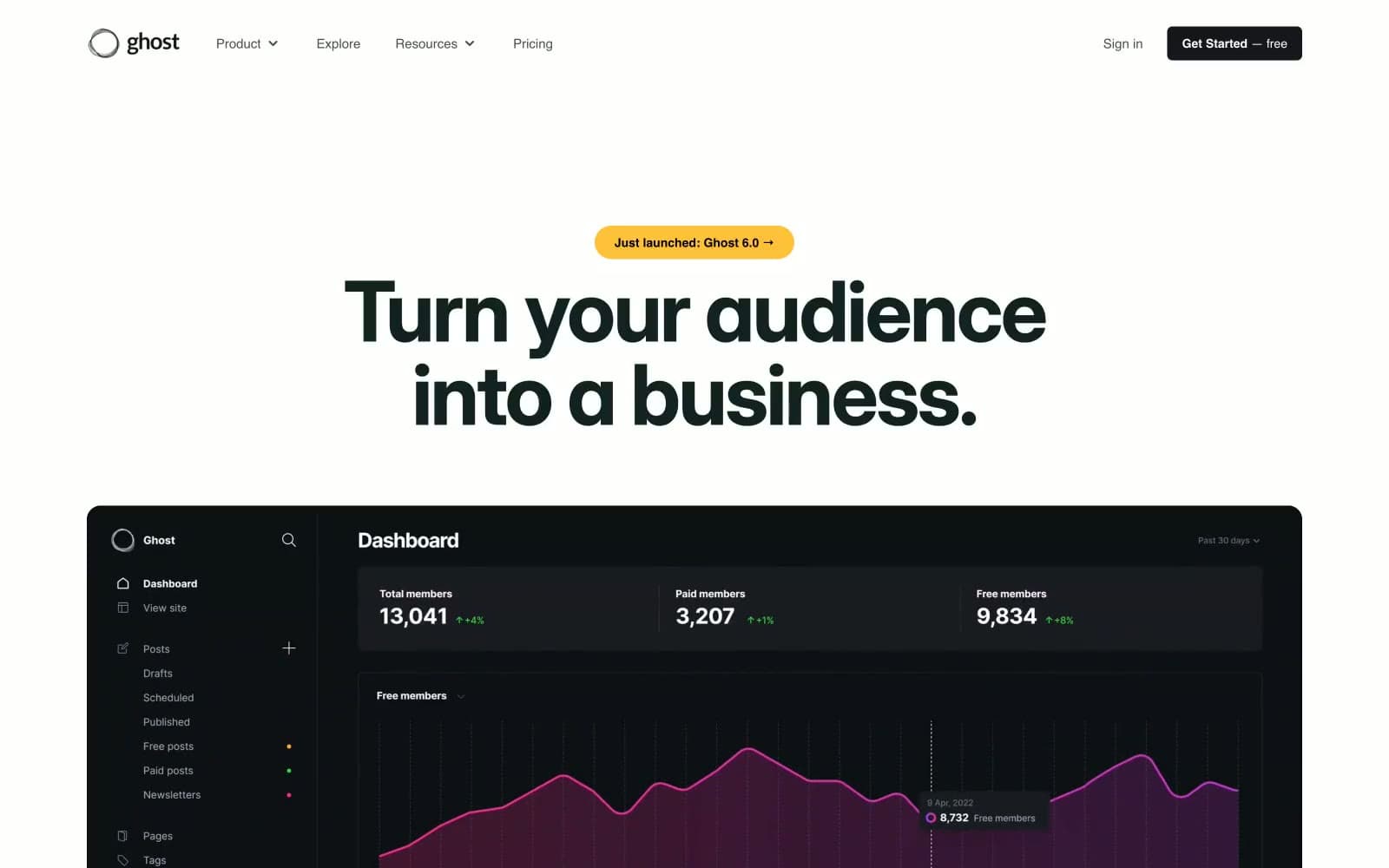
Ghost
SaaS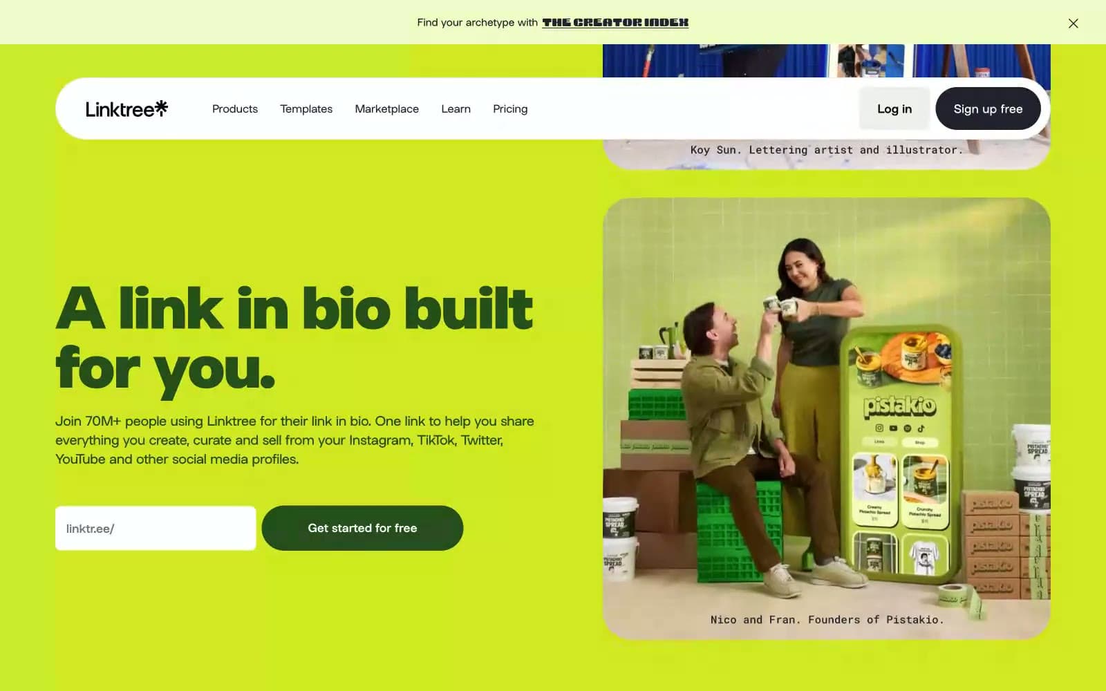
Linktr
SaaS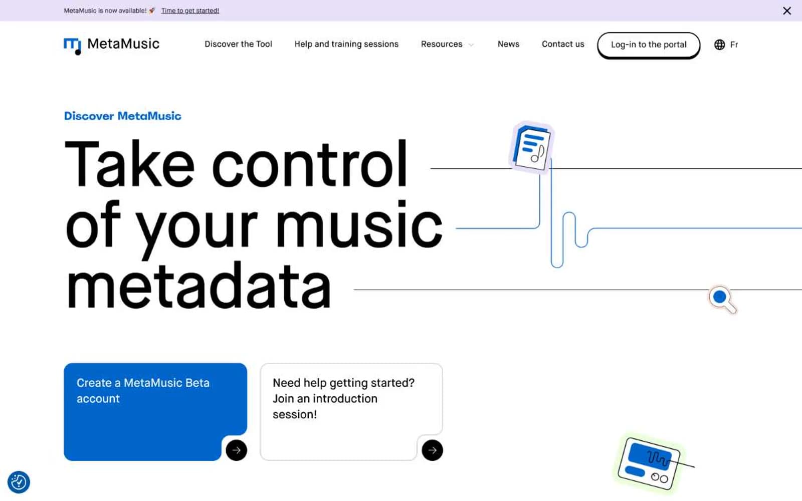
MetaMusic
SaaS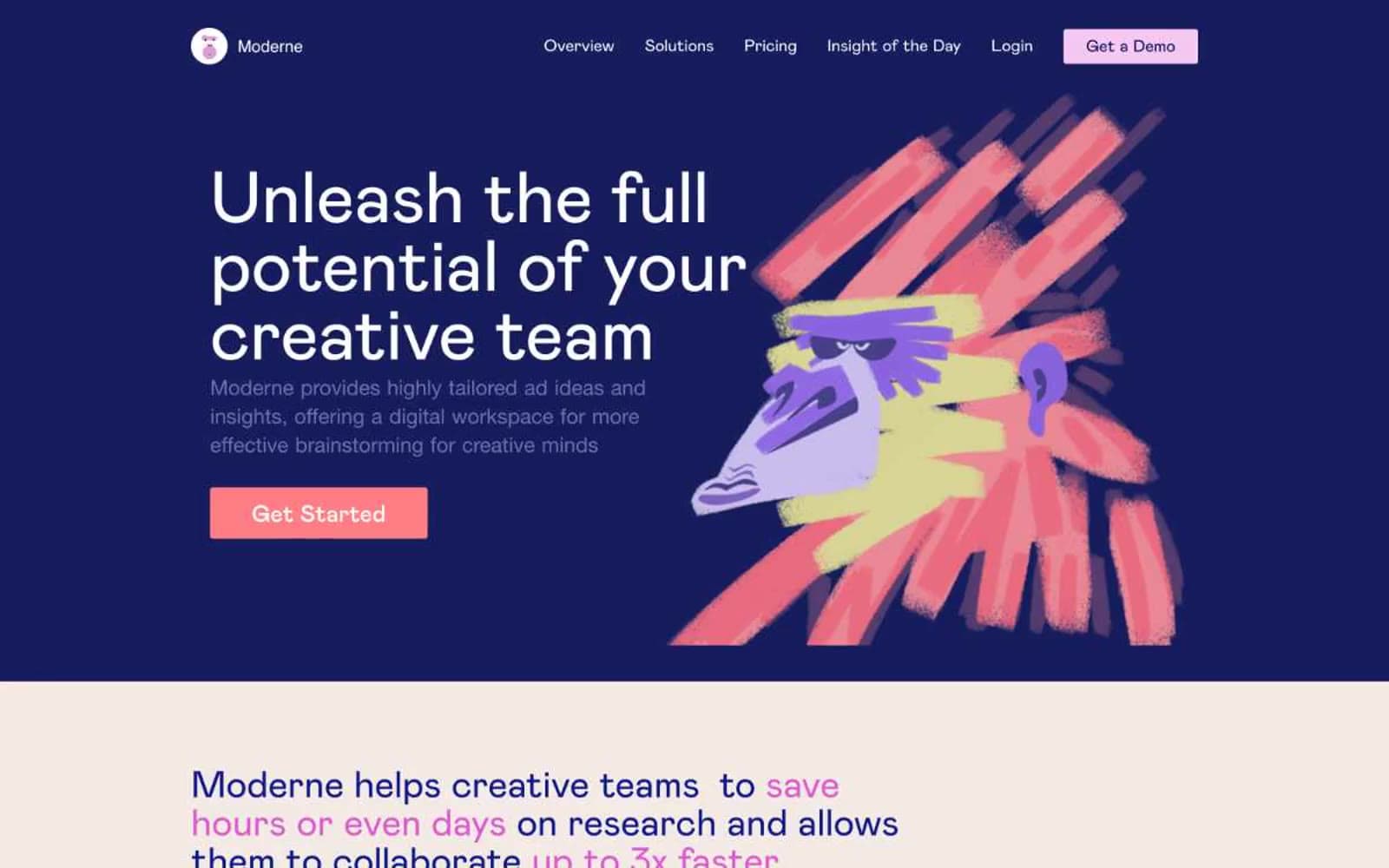
Moderne
SaaS
Passionfroot
SaaS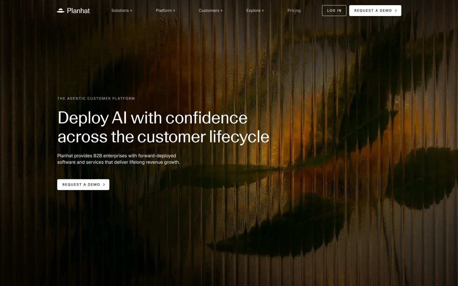
Planhat
SaaS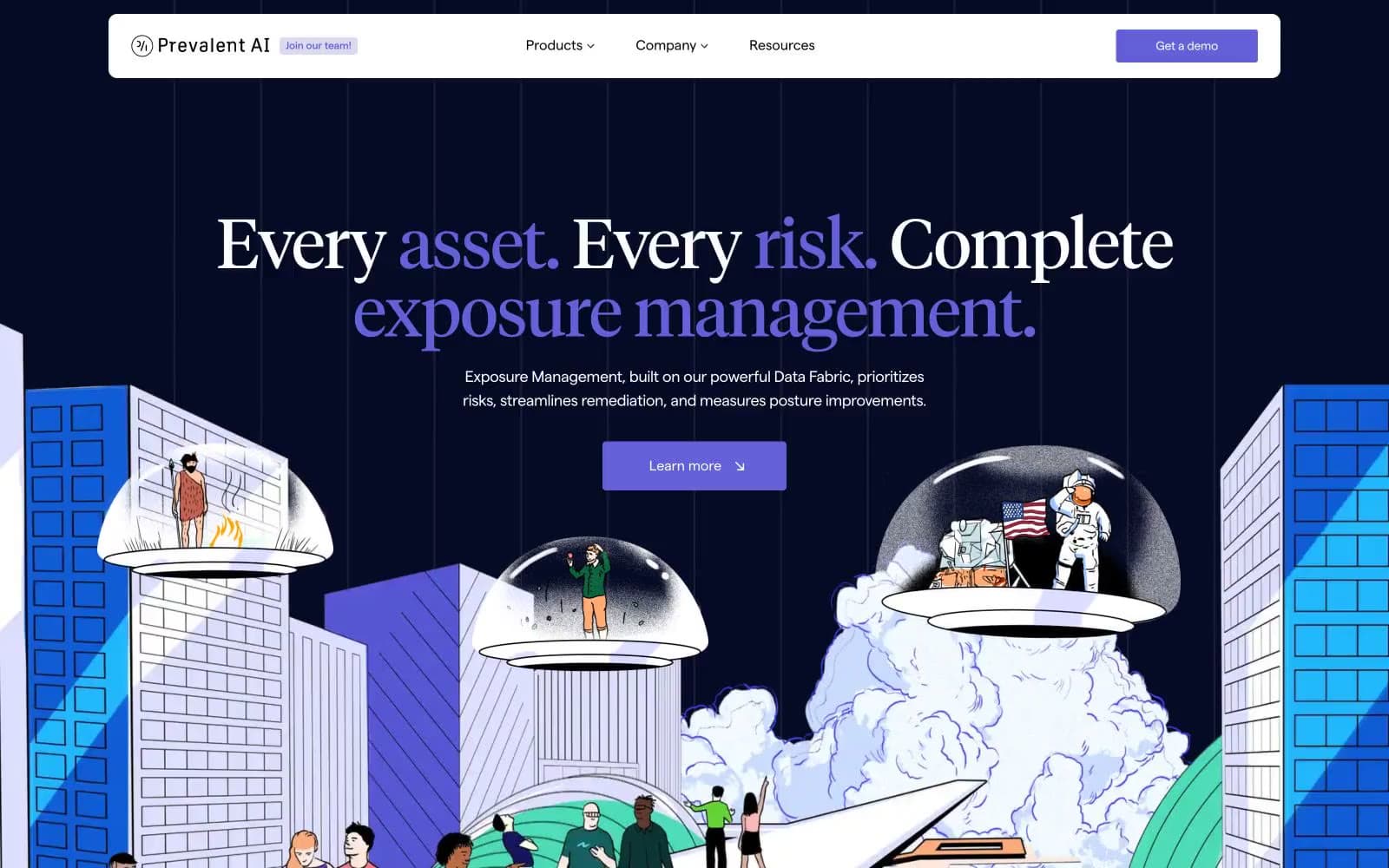
Prevalent
SaaS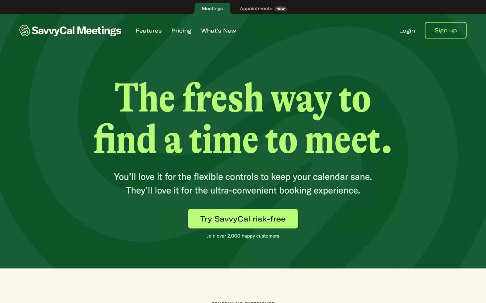
Savvycal
SaaS


