
Moderne. Expressive creative studio on warm blush paper.
- SaaS
- Mixed theme
- 17 colors
- 2 typefaces
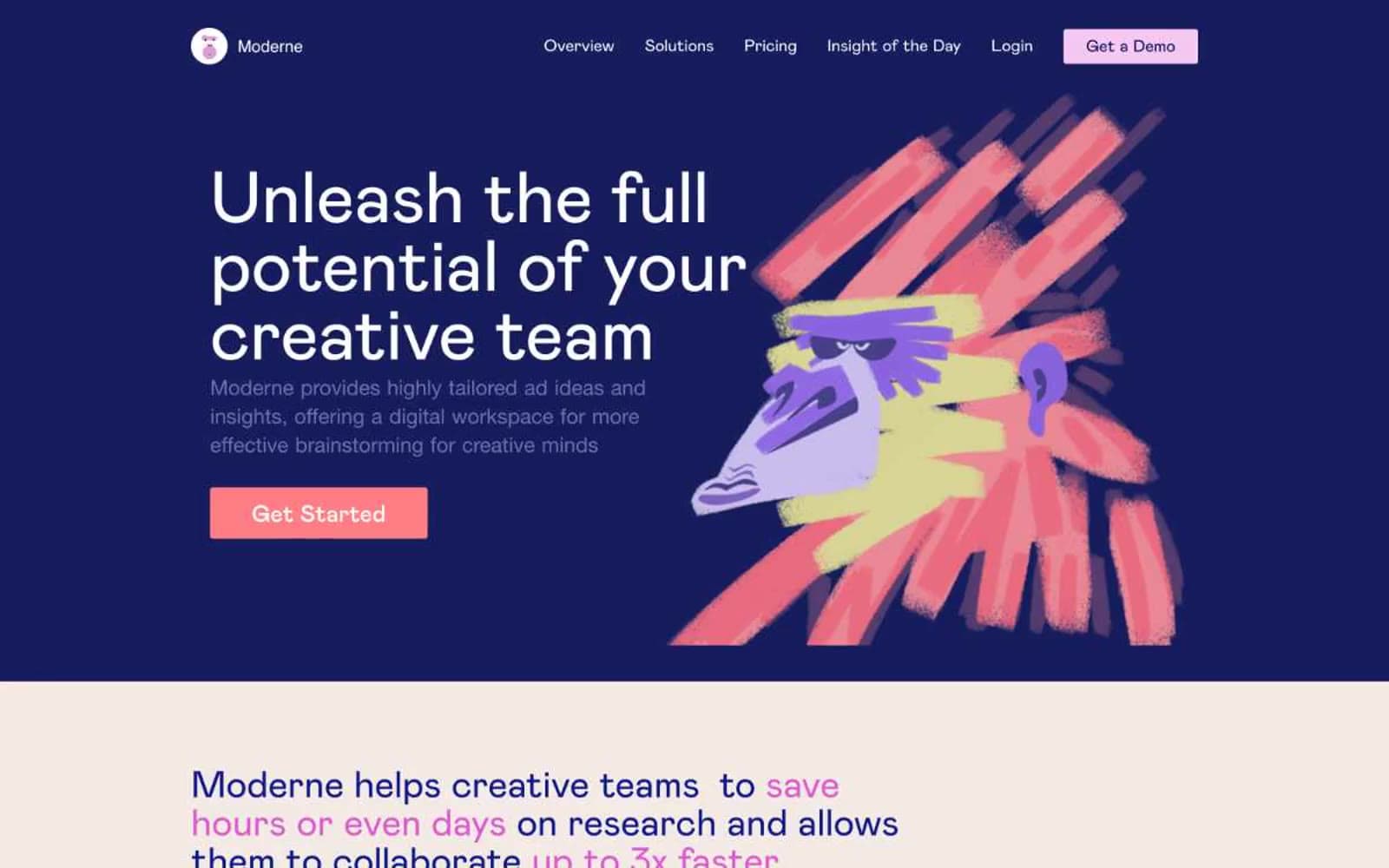
Moderne operates as a creative-zine-meets-SaaS: a warm blush-paper canvas (#f3eae5) hosts large confident Mabry Pro headlines, while a single full-bleed deep-indigo hero band (#000647) acts as the dramatic opening spread before the page returns to cream. The color system is deliberately polychrome — a riot of coral, violet, magenta, teal, and orange accents painted across expressive hand-drawn illustrations and gradient headline fills, never reduced to a single brand hue. Typography is oversized and weight-500, giving every section an editorial poster feel rather than a dashboard feel. UI chrome stays light: 4px radii, thin dark borders, ghost buttons on the dark hero, filled coral buttons on the light sections, and illustrations do the heavy emotional lifting.
Moderne design system

Brand3
Violet wash for highlight backgrounds, decorative bands, and soft emphasis behind content. Do not promote it to the primary CTA color
Primary filled CTA background on light sections — the single warm action color that punctuates the cream canvas
Headline gradient anchor and brand-defining deep accent — used at the start of gradient text fills (violet → magenta → coral)
Accent9
Mid-stop in headline gradient fills — the vivid pink bridge between violet and coral that gives gradient headlines their signature tri-color arc
Gradient headline end-stop and accent strokes in illustrations — a hotter pink than Coral Pop, reserved for type treatments
Secondary brand anchor — used for headings and icon strokes, providing the cool counterpoint to all the warm pinks and corals
Lighter teal companion for heading treatments and badge icons
Illustration accent — a warm orange that appears in brush-stroke artwork and icon details
Outlined/ghost link and button border color — the soft violet used for secondary text-link treatments throughout the page
Decorative pastel surface — soft pink fill for feature-card backgrounds and illustration halos
Decorative pastel surface — mint green fill used in feature illustration backgrounds
Decorative pastel surface — peach fill for illustration backgrounds and soft card zones
Neutrals4
Primary body text and high-emphasis headings on light surfaces — a near-black with a hint of warmth rather than a cold #000
Muted secondary text, badge labels, and input helper copy
Primary page canvas — warm off-white with a rosy undertone that gives every section a paper-stock feel rather than a digital white
Card surfaces on the dark hero, button text fills, and inverse typography on dark bands
semantic1
Green state accent for badges, validation surfaces, and short status labels.
Try a pairing
Pick any two colors from the palette to check whether text stays readable on top.
Aa
Pure White on Deep Indigo
18.80 : 1 contrast
- Body textPasses AA 4.5
- Large textPasses AA 3
- StrictPasses AAA 7
More DESIGN.md files. Same web, different personalities.
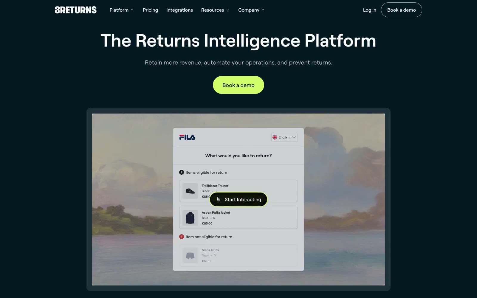
8returns
SaaS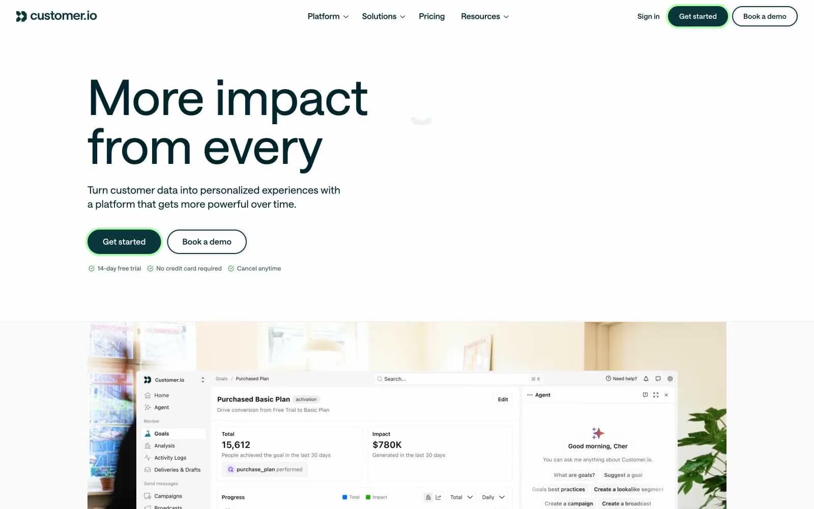
Customer.io
SaaS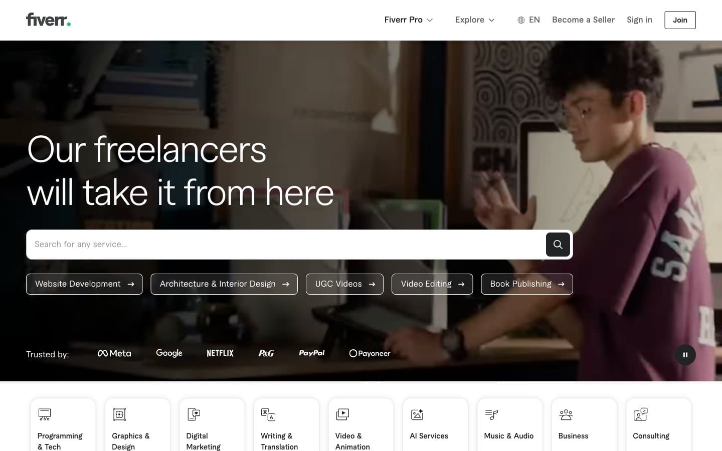
Fiverr.com
SaaS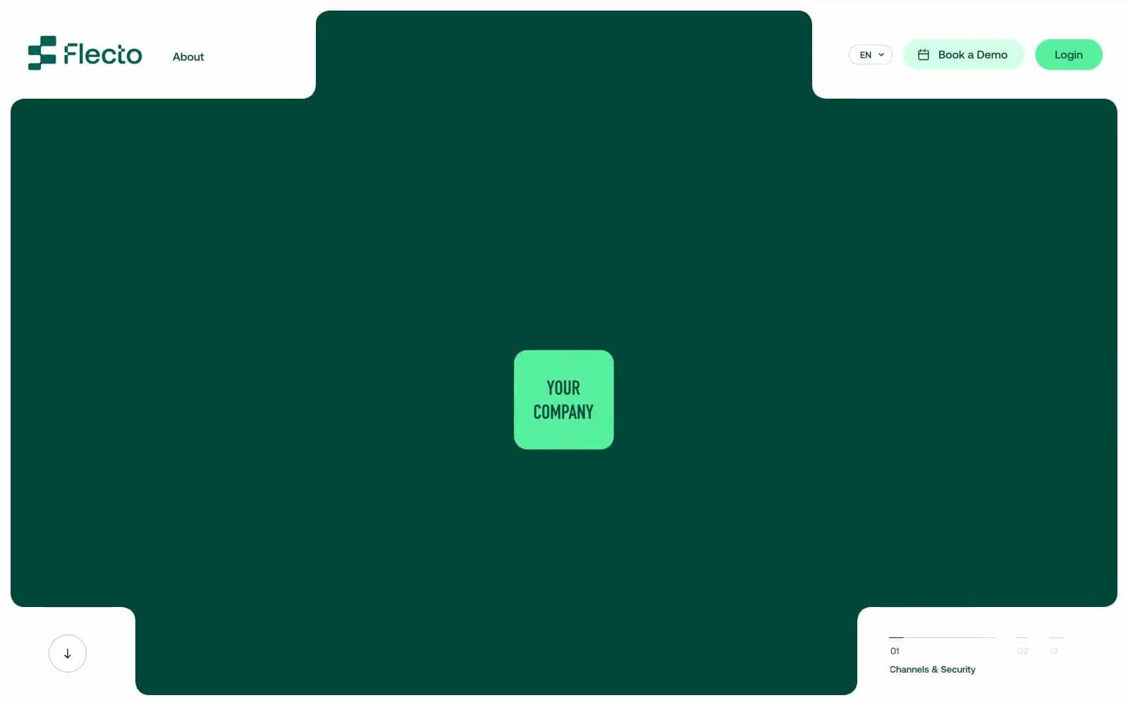
Flecto
SaaS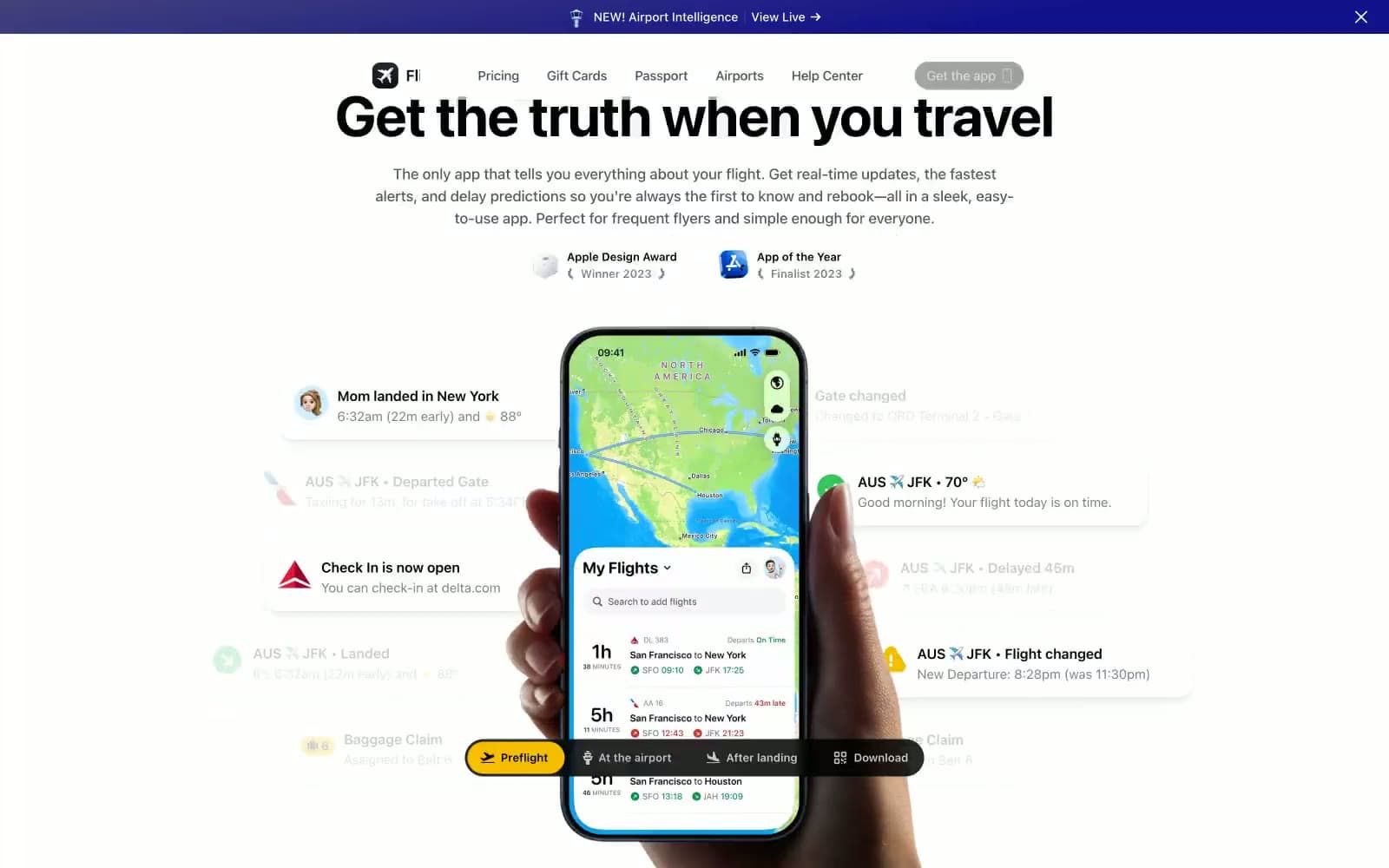
Flighty
SaaS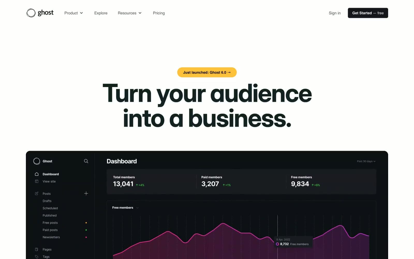
Ghost
SaaS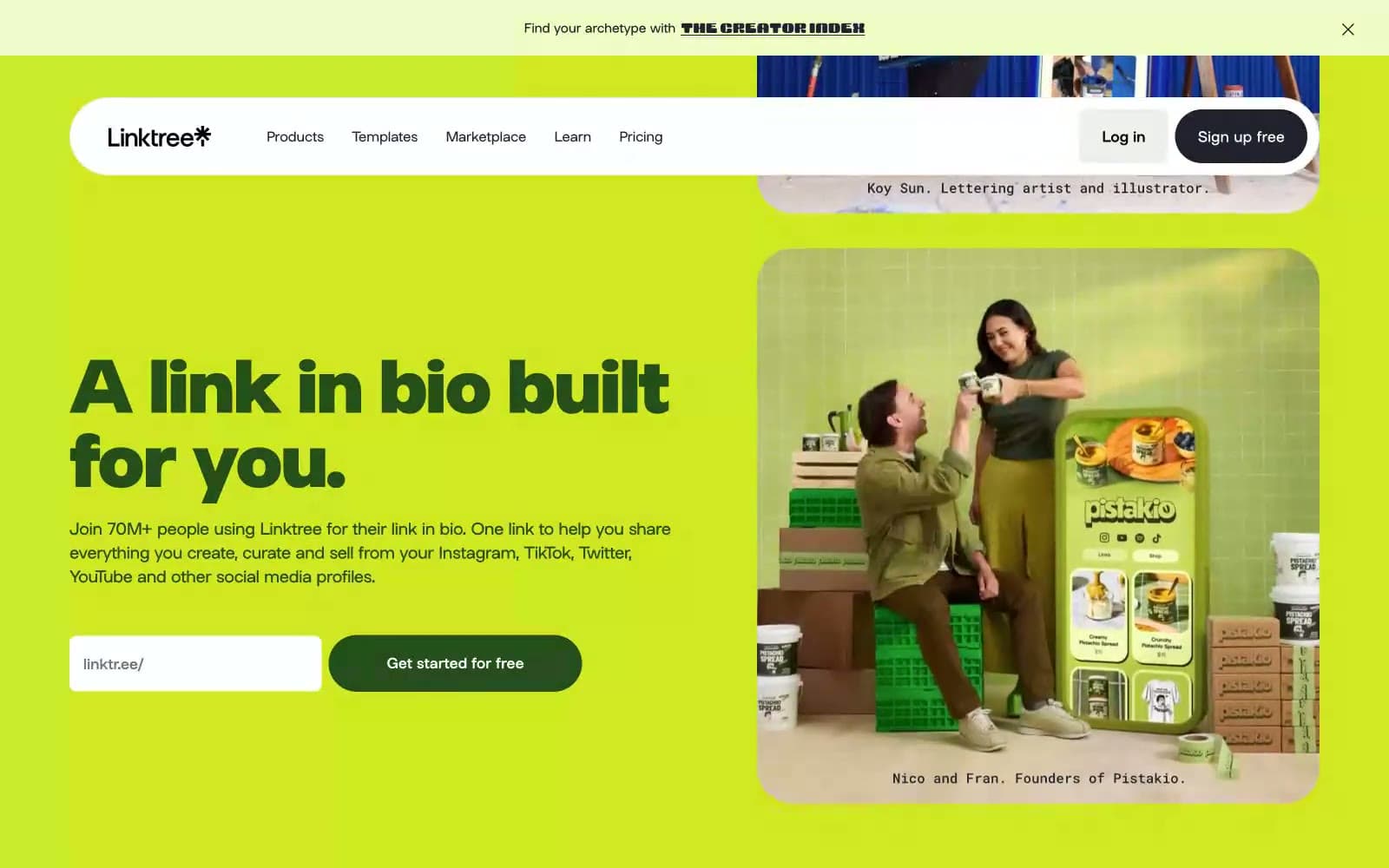
Linktr
SaaS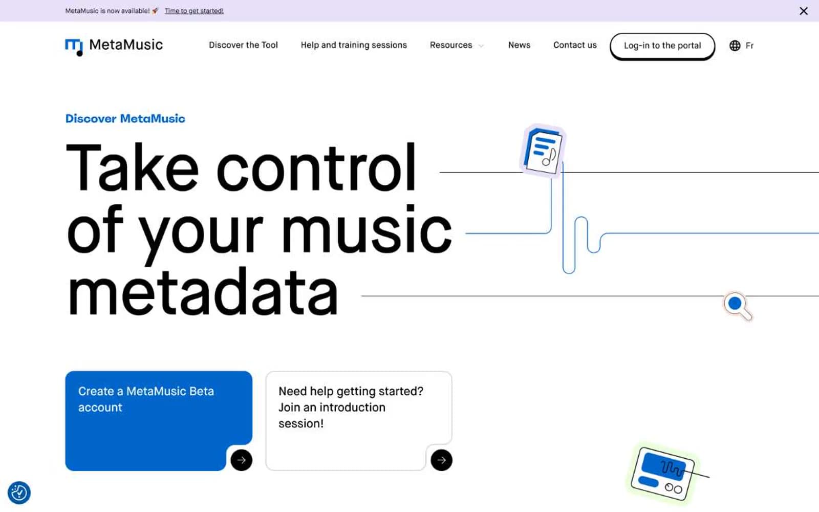
MetaMusic
SaaS
Passionfroot
SaaS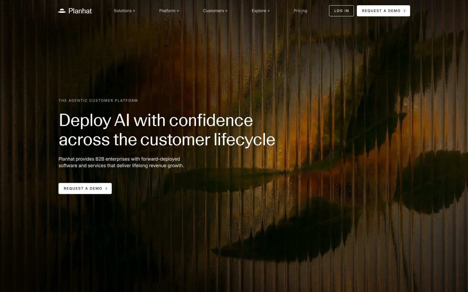
Planhat
SaaS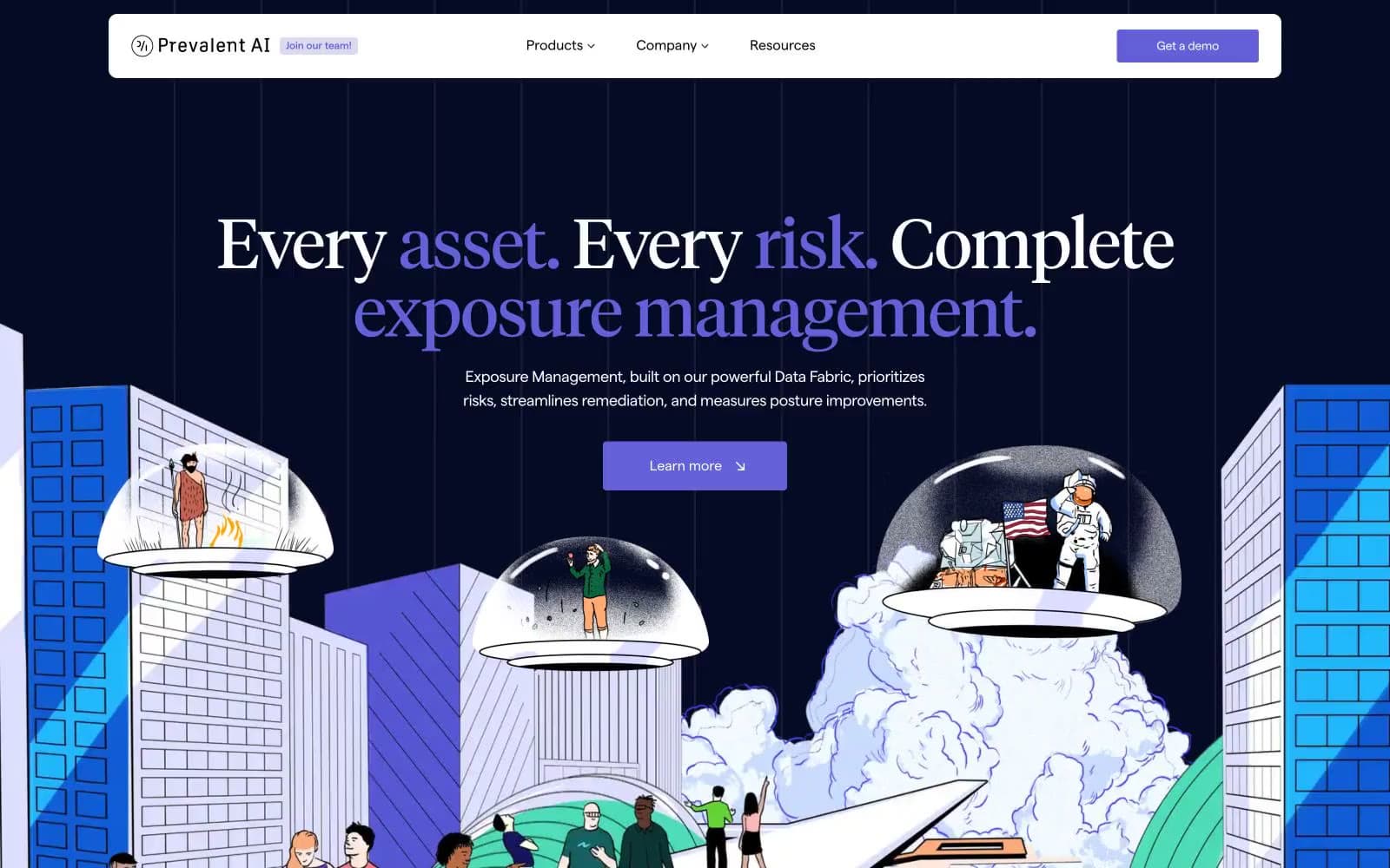
Prevalent
SaaS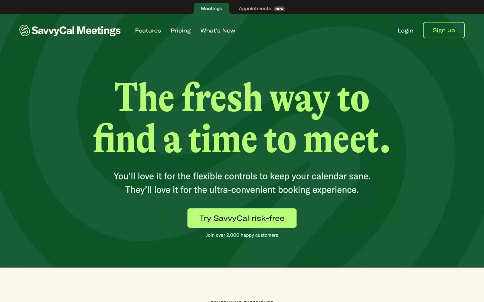
Savvycal
SaaS


