
8returns. A single electric accent that wakes up an otherwise monochrome workspace.
- SaaS
- Mixed theme
- 9 colors
- 1 typeface
8returns uses a split-canvas design language: a near-black deep navy hero that opens into a bright, workspace-grade white interior. The visual identity hinges on contrast — a single electric lime (#cfff69) is the only chromatic accent allowed to glow against the dark hero, while the white product surfaces stay neutral, spacious, and almost clinical. Cards float on a cool steel-mist canvas (#eef0f2) with 16px corners, and the only decorative color inside the white sections is a cobalt iris (#6289ff) used sparingly for tags, icons, and highlight chips. Typography is a single geometric sans (roobert) running a tight, slightly positive-tracked scale from 11px captions to 64px displays, with no serif, no mono, no script — one voice across every surface.

8returns design system

Brand1
Primary action — filled CTA buttons, active tab underline, highlight chips. The only vivid color permitted against the dark hero; its near-fluorescent chroma against #051923 creates urgency without warmth or aggression
Accent1
Violet outline accent for tags, dividers, and focused UI edges
Neutrals7
Primary text, hero background, dark section canvas, button text on lime fills. Near-black with a cool teal undertone — not pure black, the slight blue cast keeps it feeling engineered rather than flat
Muted body text and secondary borders. Zinc-family dark gray for hierarchy below the primary text level
Dark card surfaces and gradient endpoints — the bridge color between Midnight Abyss and the deep teal radial gradient. Used for elevated dark cards and inset panels
Secondary body text, caption labels, metadata. Mid-gray for body content that must read but recede
Icon strokes, tertiary text, disabled states, and subtle dividers. The lightest chrome in the interface
Light neutral action fill for buttons on dark surfaces.
Card surfaces, button text, and form inputs — the brightest point in the surface stack. Cards on the Steel Mist canvas read as crisp white panels
Try a pairing
Pick any two colors from the palette to check whether text stays readable on top.
Aa
Midnight Abyss on Lime Volt
15.53 : 1 contrast
- Body textPasses AA 4.5
- Large textPasses AA 3
- StrictPasses AAA 7
More DESIGN.md files. Same web, different personalities.
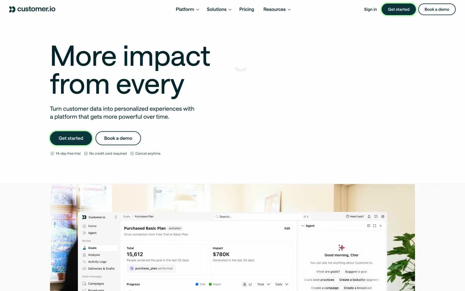
Customer.io
SaaS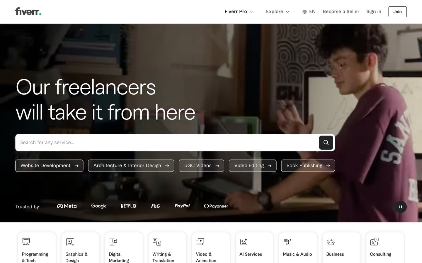
Fiverr.com
SaaS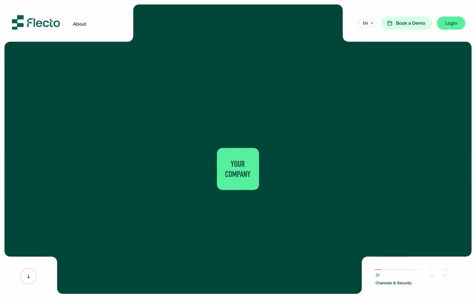
Flecto
SaaS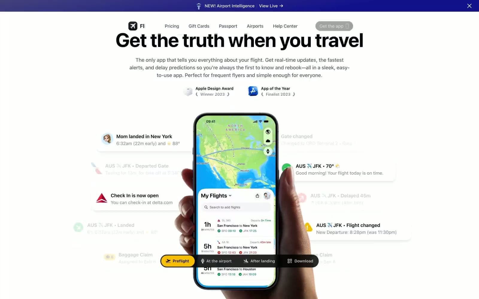
Flighty
SaaS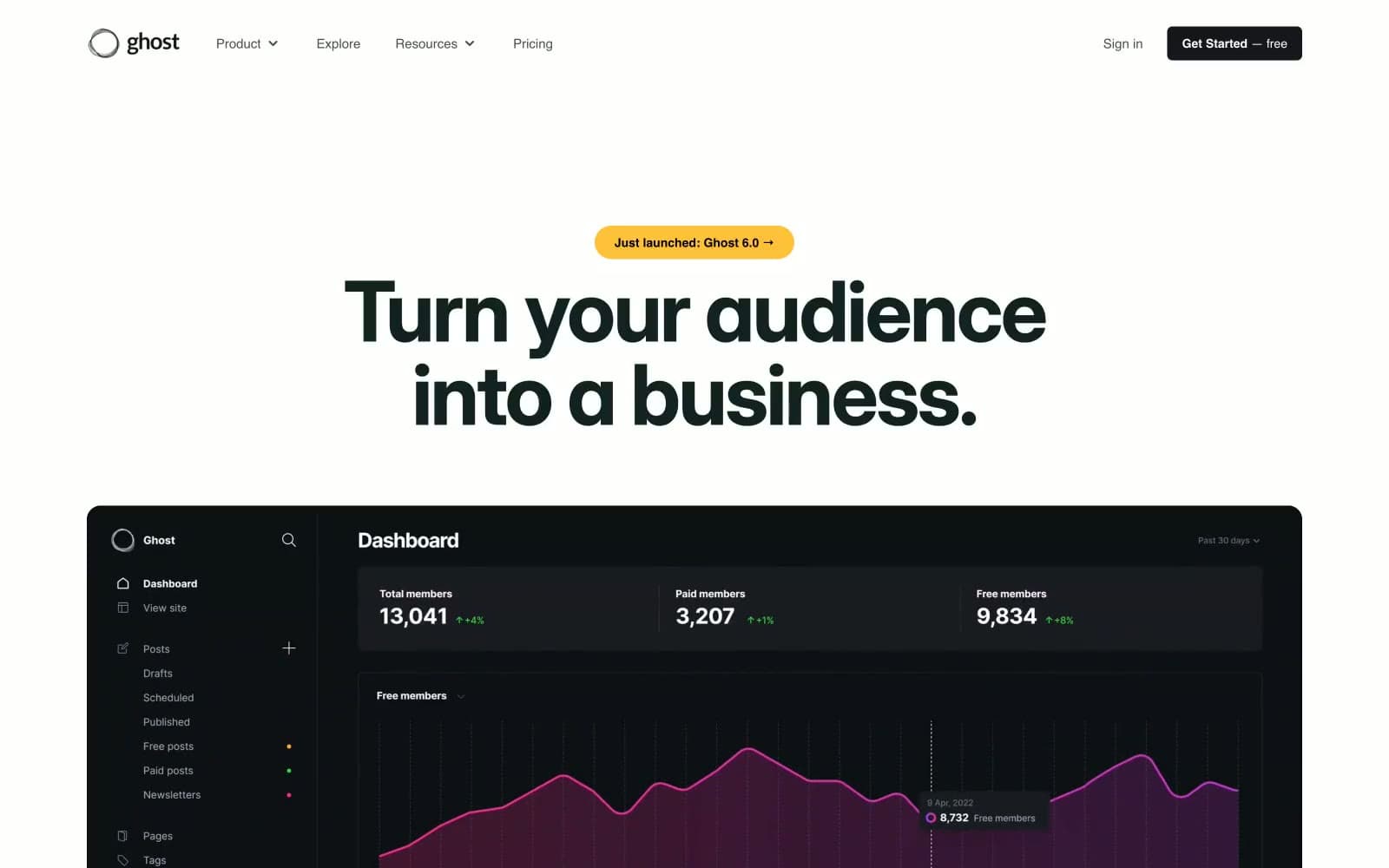
Ghost
SaaS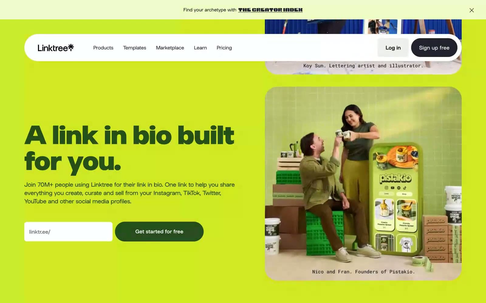
Linktr
SaaS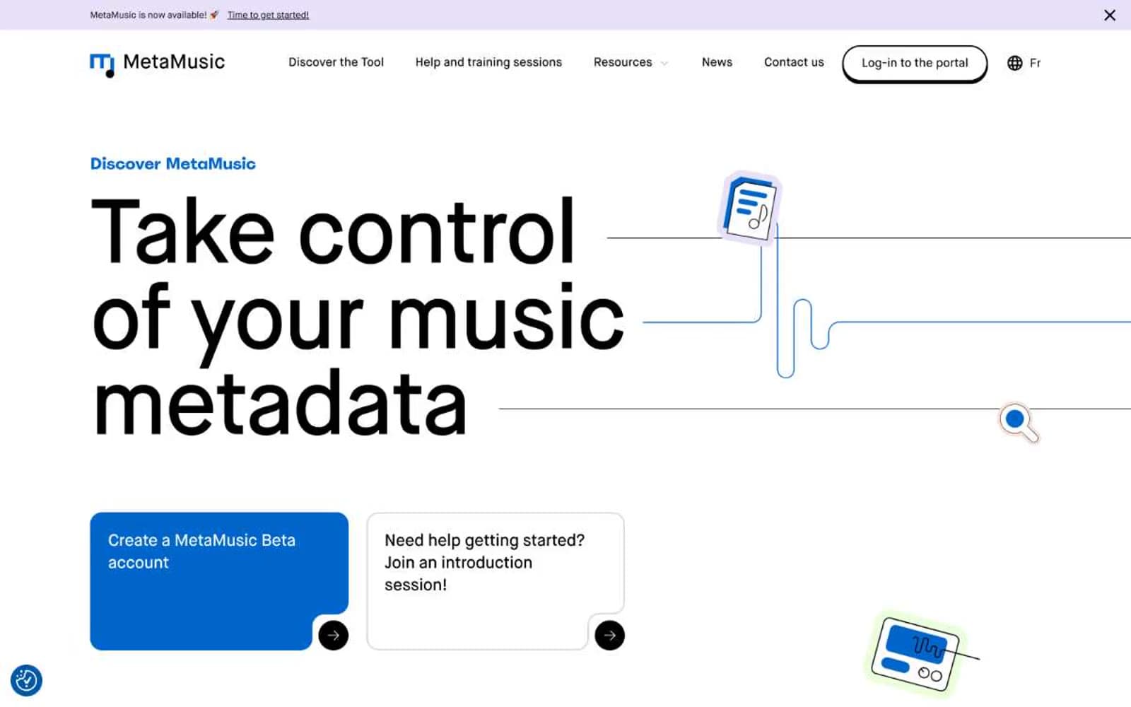
MetaMusic
SaaS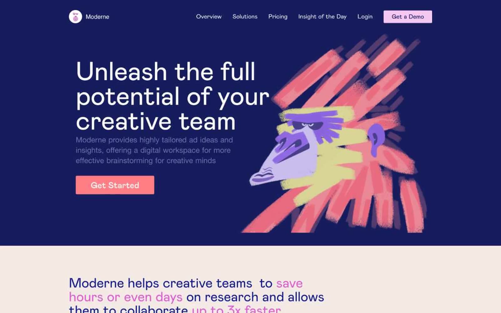
Moderne
SaaS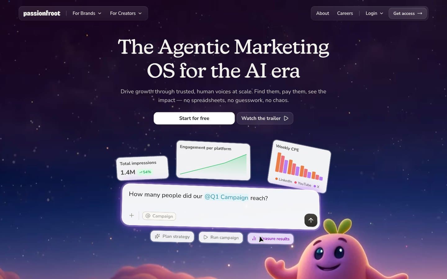
Passionfroot
SaaS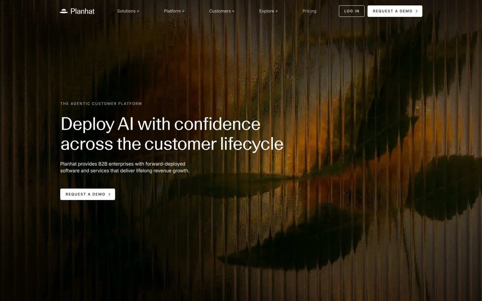
Planhat
SaaS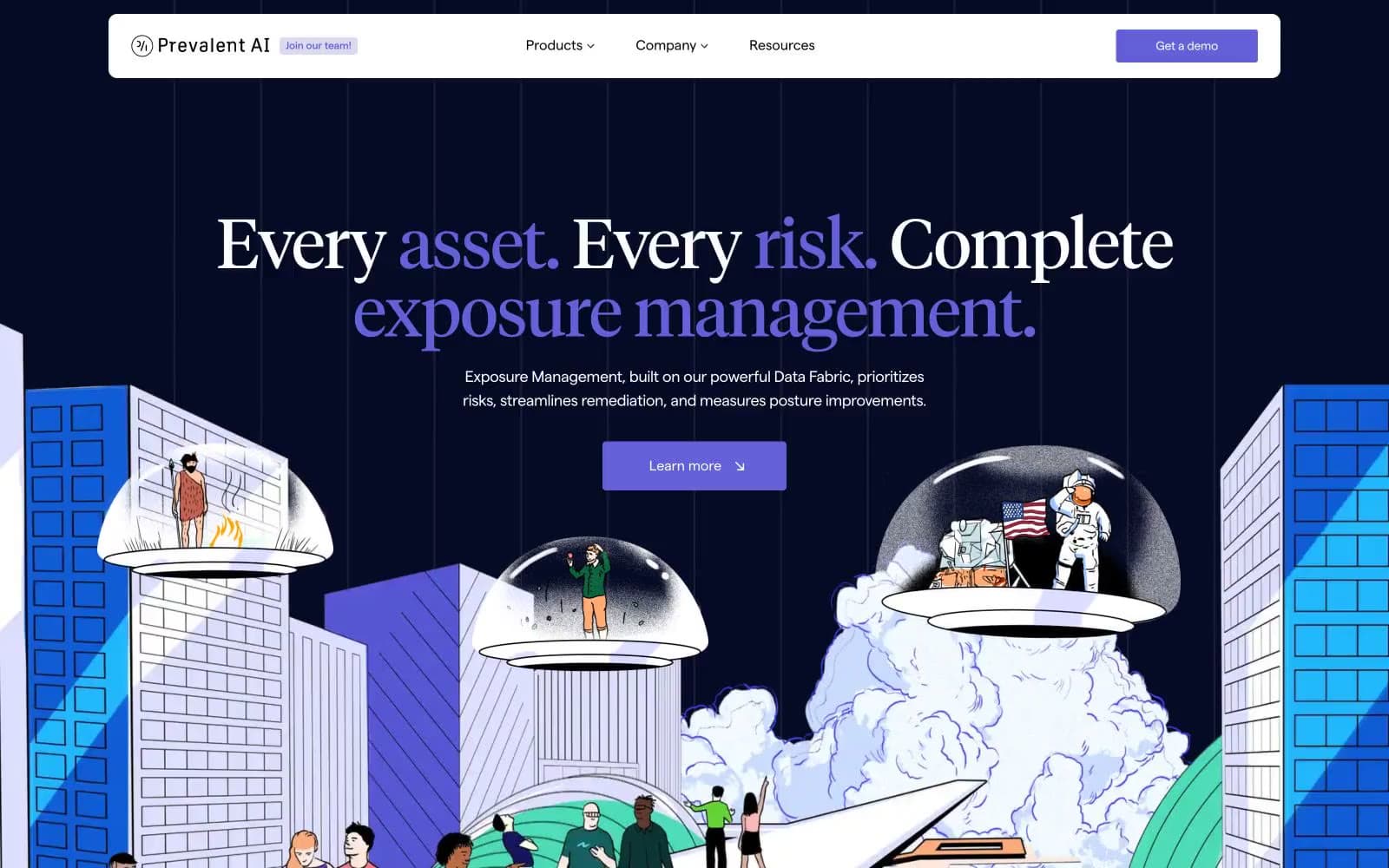
Prevalent
SaaS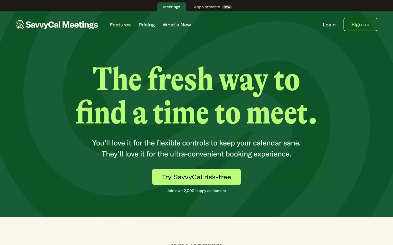
Savvycal
SaaS


