
Prevalent. Serif intelligence briefings under a navy planetarium dome.
- SaaS
- Mixed theme
- 6 colors
- 2 typefaces
Prevalent's visual system is an editorial intelligence briefing set inside a dark observatory: a near-black navy hero anchors large serif headlines in Tiempos, while the body switches to a humanist sans (Matter) for UI, captions, and controls. A single vivid violet (#6360d8) carries the entire chromatic load — it paints the most important nouns in every headline, fills the primary CTA, and underlines article links — leaving the rest of the page in pure black-on-white. The product is illustrated, not photographed: whimsical hand-drawn scenes of miniature people navigating futuristic architecture replace the usual SaaS 3D renders, giving the brand a storybook quality that contrasts sharply with its serious cybersecurity subject matter. Components are flat, borderless by default, and depend on thin black hairlines rather than shadows for separation.
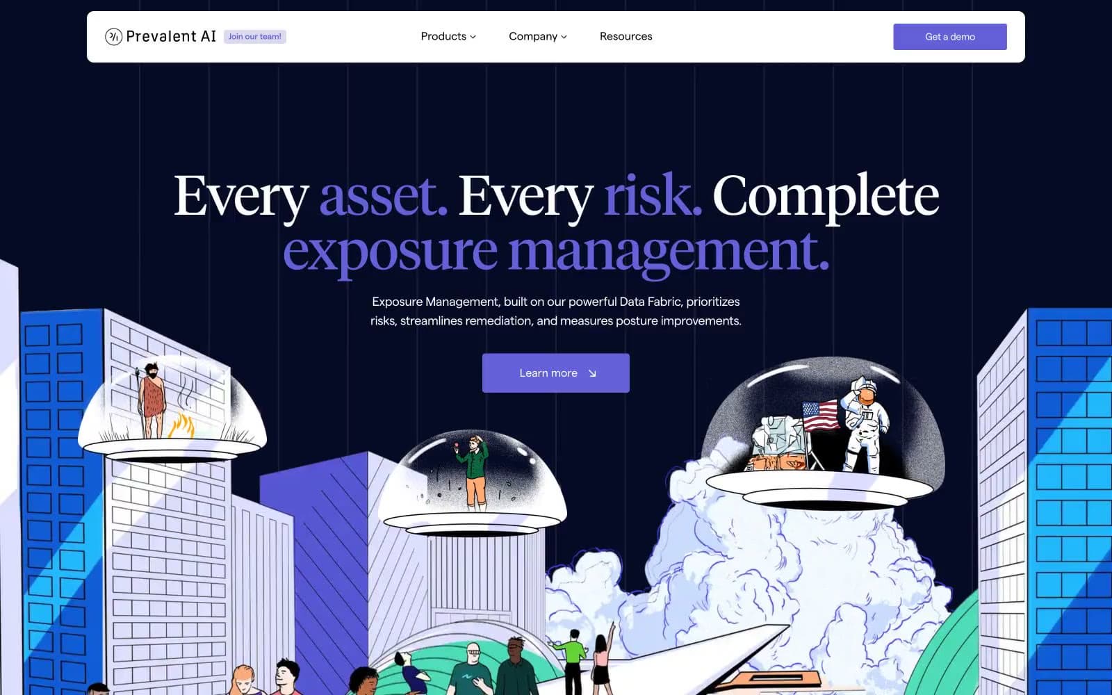
Prevalent design system

Brand1
Brand accent for primary CTAs, link color, accent words inside serif headlines, and the thin violet underlines/arrows on navigation and article links
Accent1
Light neutral action fill for buttons on dark surfaces.
Neutrals4
Primary text, default hairlines, and the 1px borders that separate every card, section, and image
Hero and footer canvas — the deep navy that frames the largest serif headlines and the top of the page
Cool desaturated border and secondary text — sits between Pure Ink and Midnight Vault when a softer line or muted label is needed
Page canvas, card surfaces, button text on violet, and inverse text on the dark hero
Try a pairing
Pick any two colors from the palette to check whether text stays readable on top.
Aa
Paper White on Iris Voltage
5.01 : 1 contrast
- Body textPasses AA 4.5
- Large textPasses AA 3
- StrictFails AAA 7
More DESIGN.md files. Same web, different personalities.

8returns
SaaS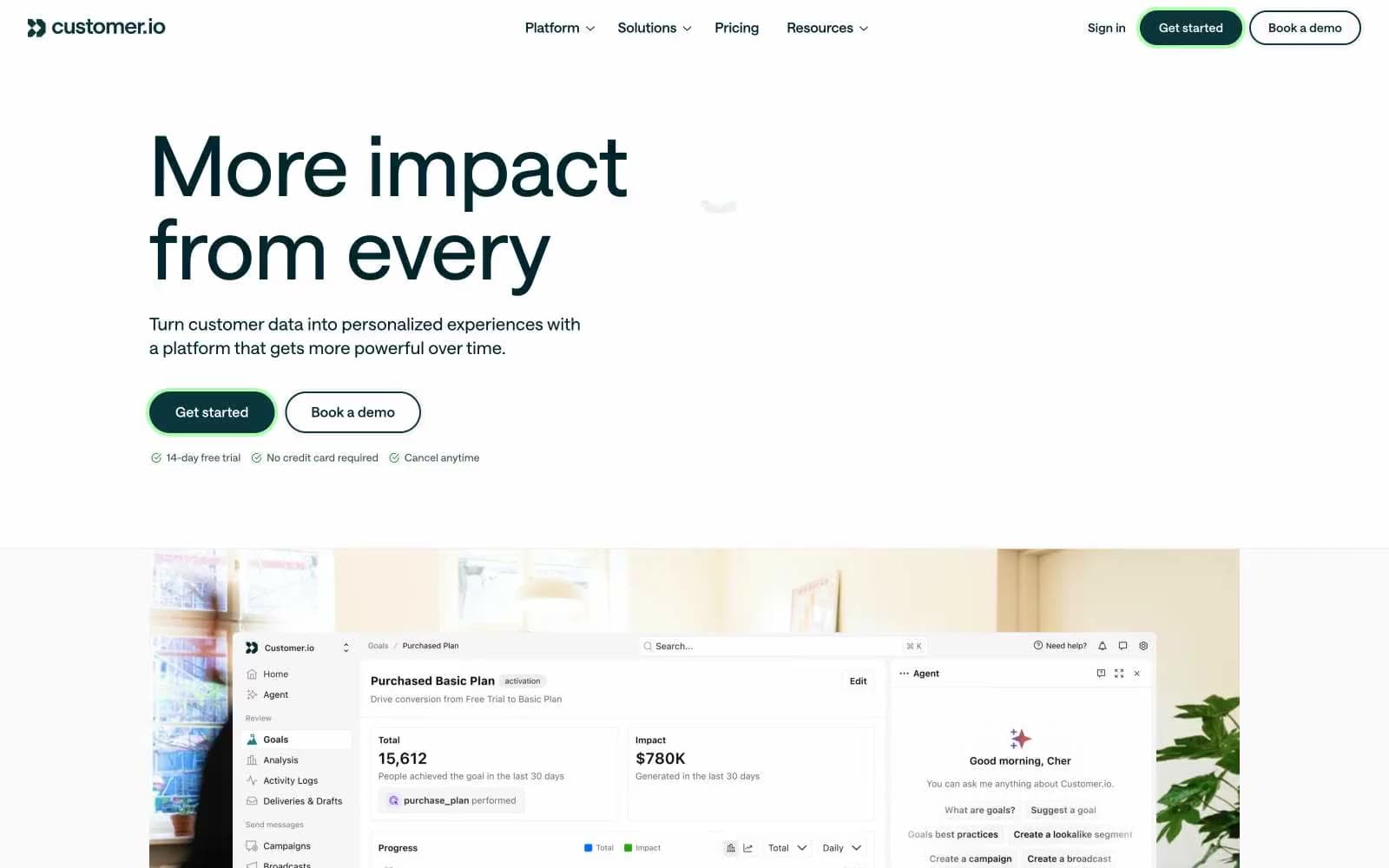
Customer.io
SaaS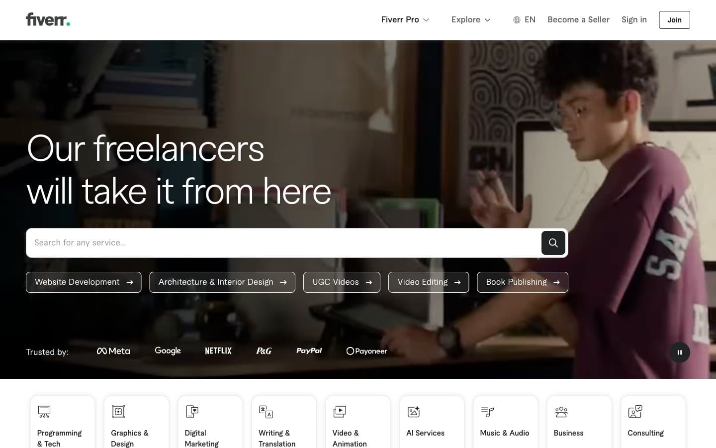
Fiverr.com
SaaS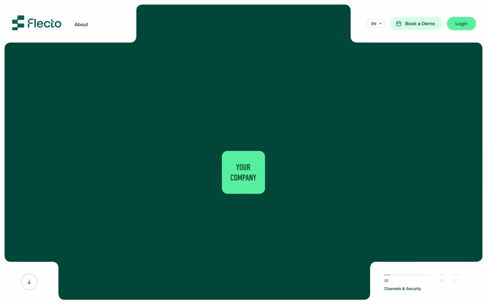
Flecto
SaaS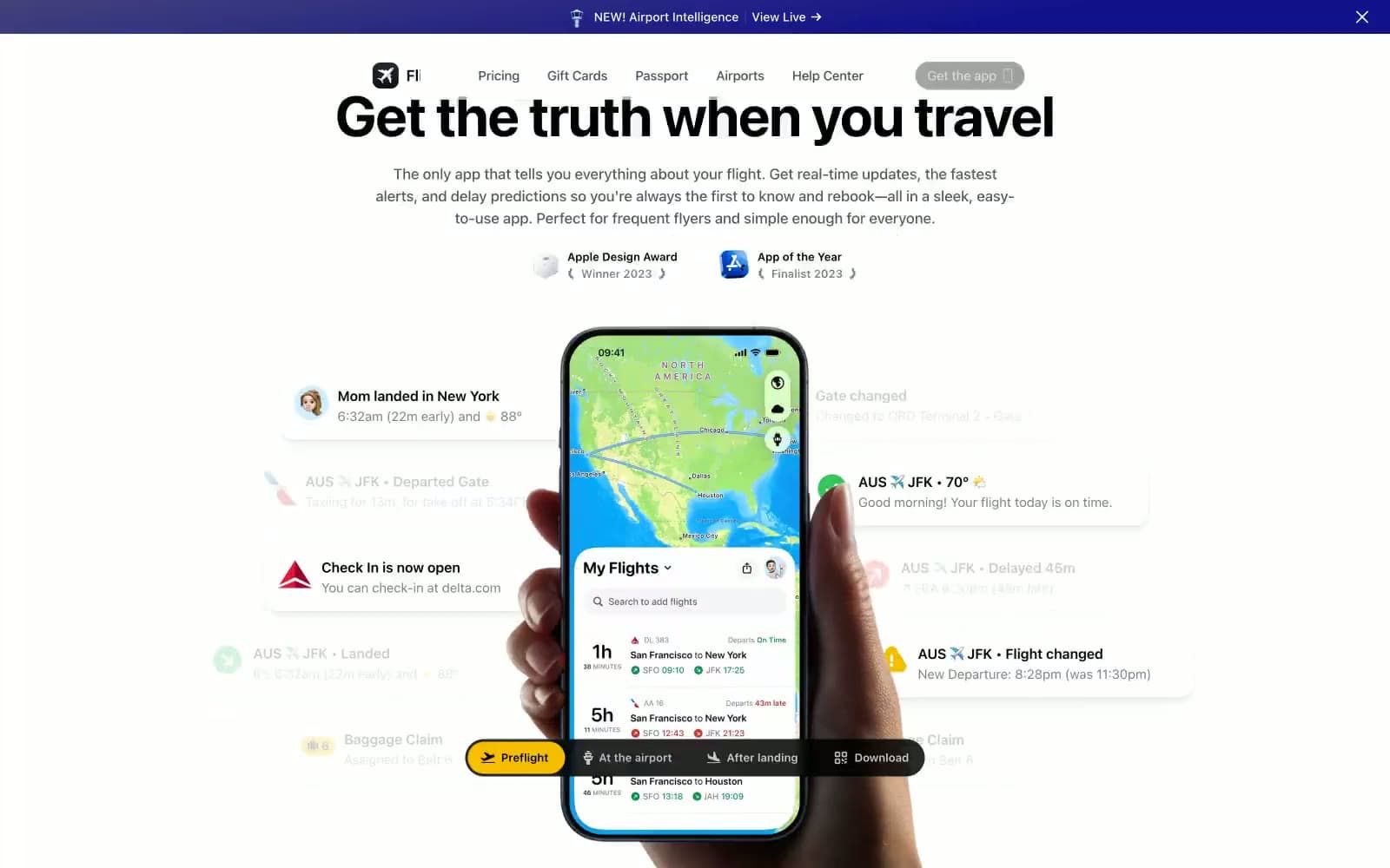
Flighty
SaaS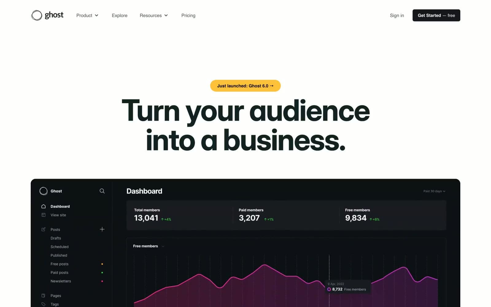
Ghost
SaaS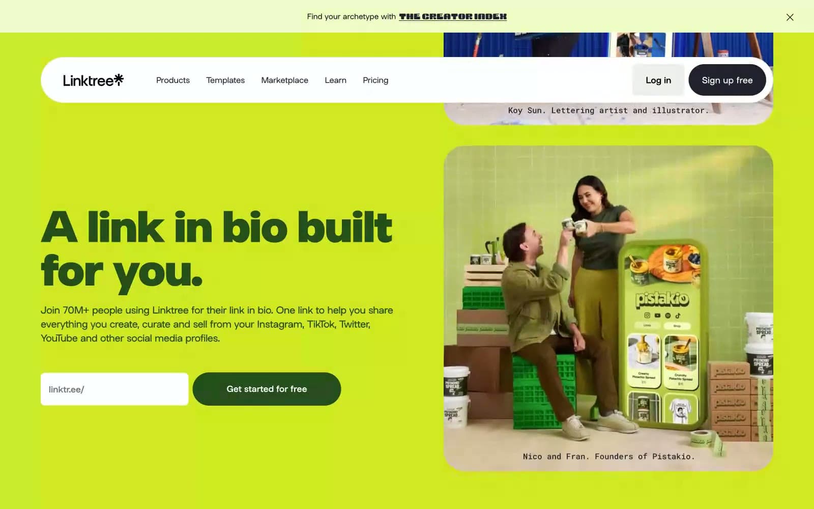
Linktr
SaaS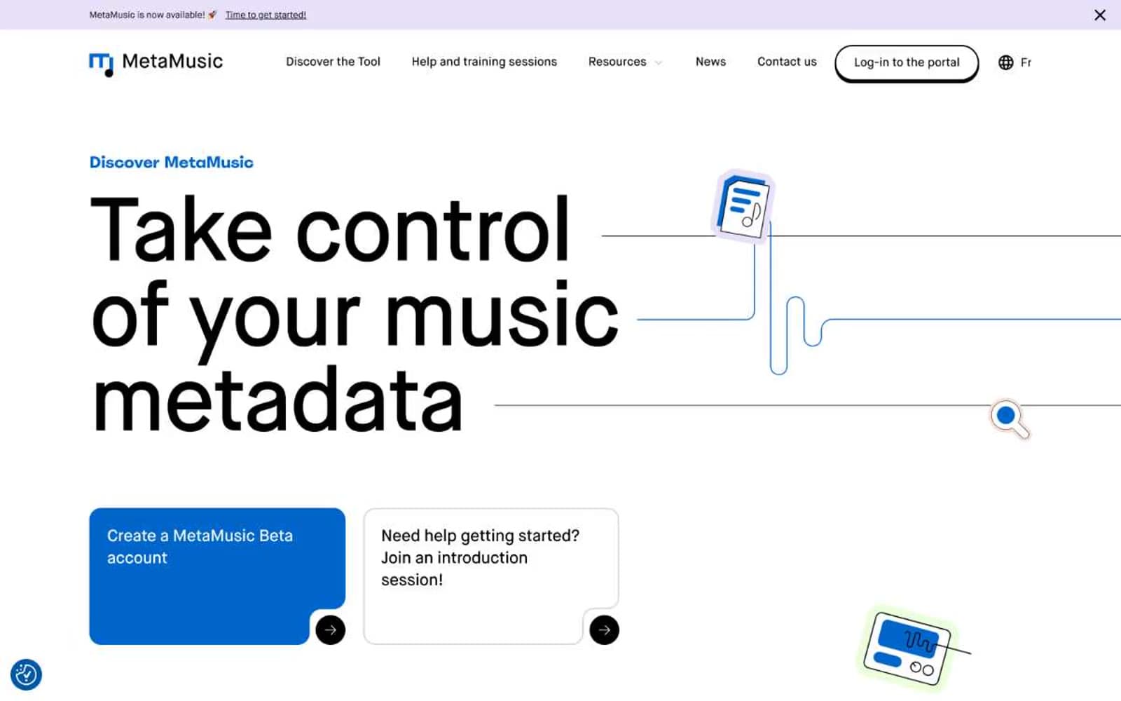
MetaMusic
SaaS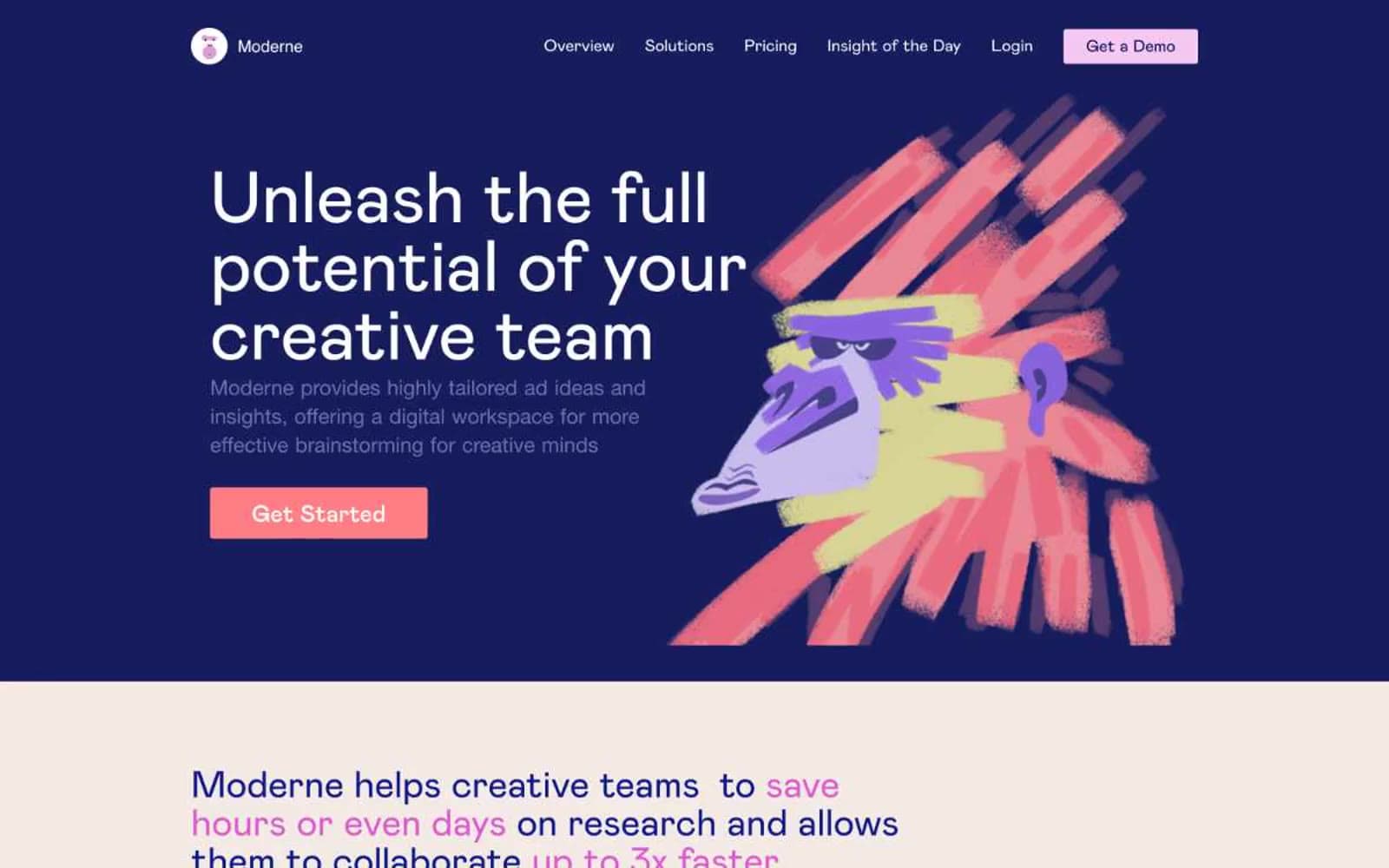
Moderne
SaaS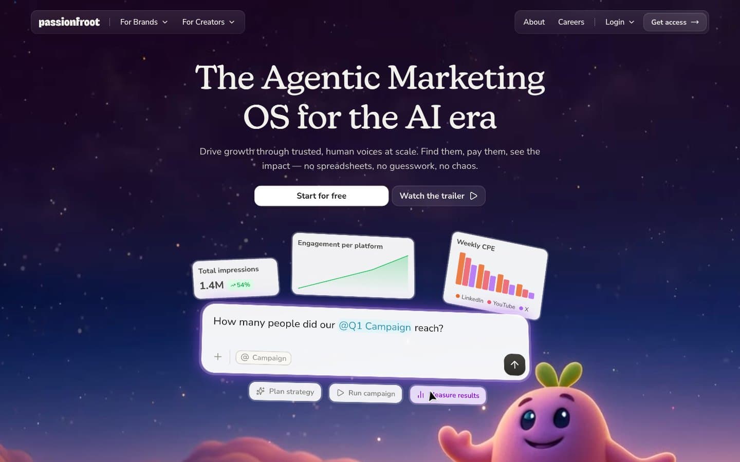
Passionfroot
SaaS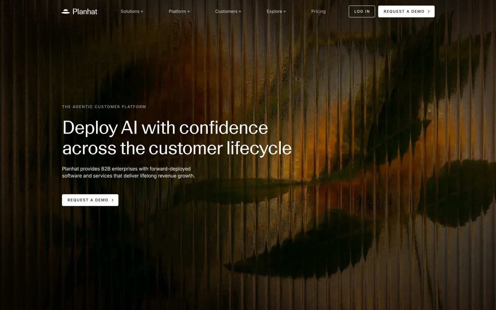
Planhat
SaaS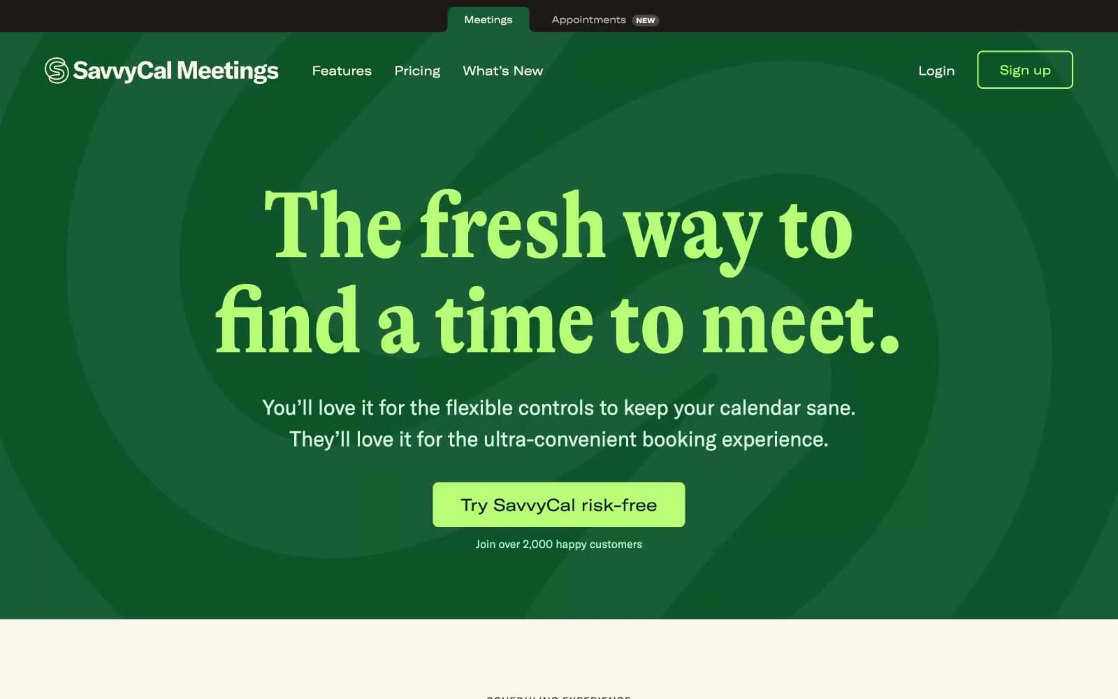
Savvycal
SaaS


