
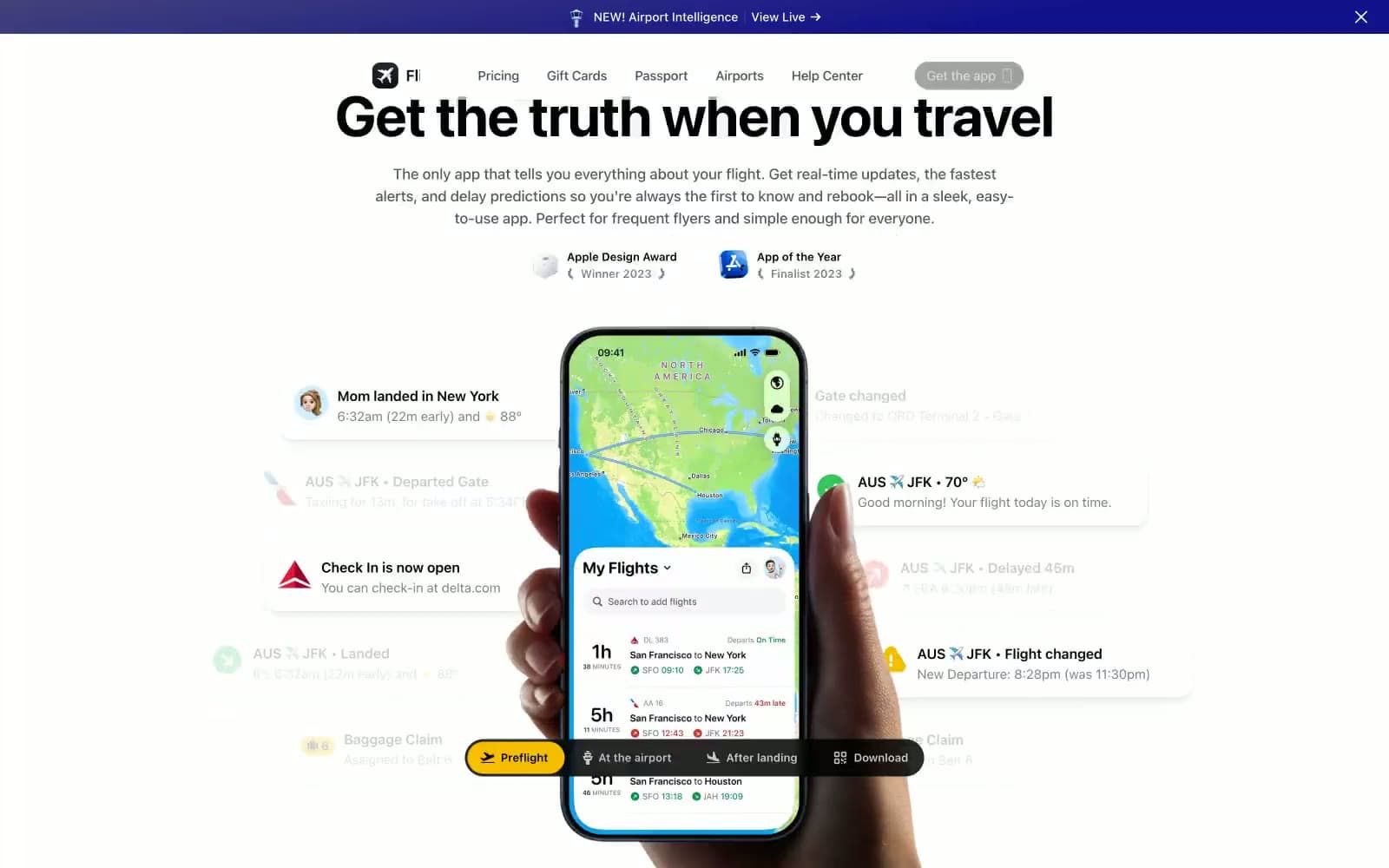
Flighty. A luminous control room with glowing screens floating around a single device.
- SaaS
- Mixed theme
- 14 colors
- 6 typefaces
Flighty is a departure-board-meets-control-tower: the upper page reads as a crisp white airport information panel, then the page drops into a deep midnight-violet control room with glowing screens in the dark. The palette is overwhelmingly achromatic, with one vivid blue (#007bff) reserved for actions and one amber-yellow (#f7be00) for the download conversion — a signal-light system against the dark and light surfaces. Typography is confident and heavy: a 56px display headline with tight -0.025em tracking that lands like a gate-change announcement, supported by compact system-ui body text. The signature element is the phone mockup surrounded by floating notification cards — soft, shadowed, slightly tilted cards showing real-time flight data (delays, gate changes, check-in opens) that orbit the device and make the product feel alive rather than static. Surfaces are nearly flat with ultra-low-opacity shadows (0.02–0.04) and hairline borders, so depth comes from layering and the page's light-to-dark transition, not from heavy drop shadows.
Flighty design system

Brand2
Primary action button fill, active link states, focus indicators — the single chromatic action color in an otherwise achromatic system
Dark section backgrounds, announcement bar, hero gradient base — the midnight-violet that makes screens glow
Accent2
Download CTA, high-priority callouts, notification accents — warm yellow against dark surfaces for the conversion moment
Red outline accent for tags, dividers, and focused UI edges. Use as a supporting accent, not as a status color
Neutrals10
Primary text, icon strokes, hairline borders, ghost button fills — the structural ink of the system
Dark card surfaces, deepest background layer — near-black with a violet undertone
Secondary text, subdued body copy — reads softer than pure black for paragraph-length content
Tertiary text, metadata, timestamps in notification cards
Muted body text, disabled states, inactive nav items
Placeholder text, dimmed labels, low-priority metadata
Cool gray for pressed states and slightly cooler text — the only neutral with a slight blue cast
Hairline borders, card outlines, subtle dividers, very light surface tint
Warm off-white surface — alternate card background, subtle tonal shift from pure white
Light canvas, notification card surfaces, text on dark — the dominant surface color in the upper page
Try a pairing
Pick any two colors from the palette to check whether text stays readable on top.
Aa
Pure Black on Signal Blue
5.28 : 1 contrast
- Body textPasses AA 4.5
- Large textPasses AA 3
- StrictFails AAA 7
More DESIGN.md files. Same web, different personalities.
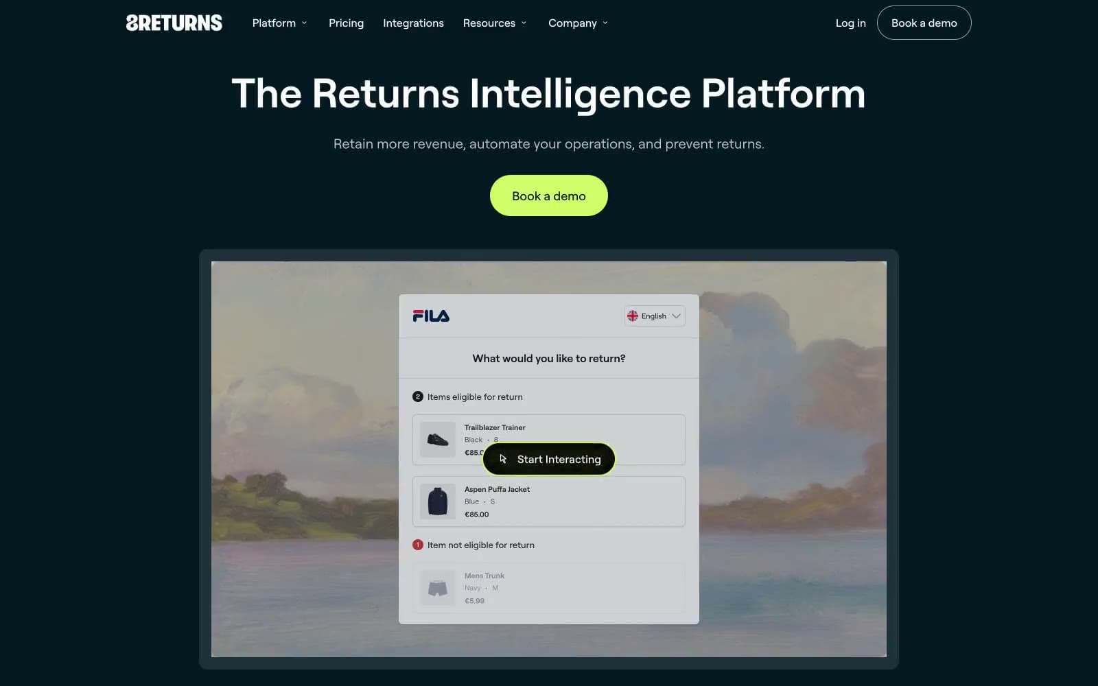
8returns
SaaS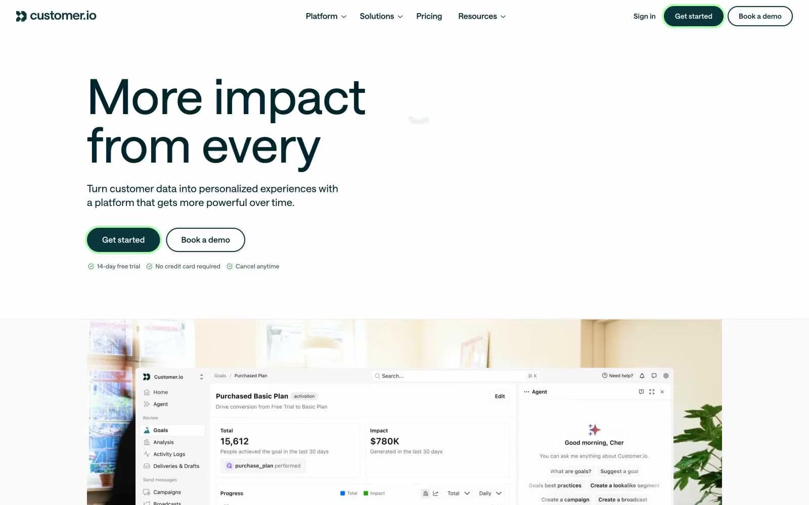
Customer.io
SaaS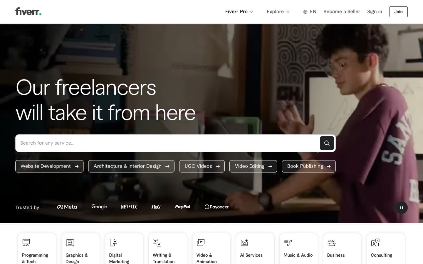
Fiverr.com
SaaS
Flecto
SaaS
Ghost
SaaS
Linktr
SaaS
MetaMusic
SaaS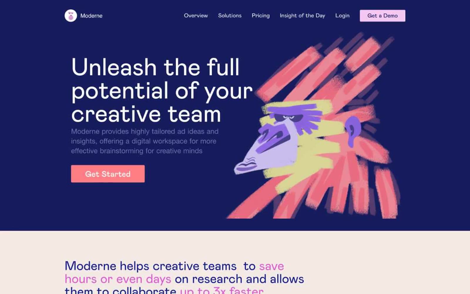
Moderne
SaaS
Passionfroot
SaaS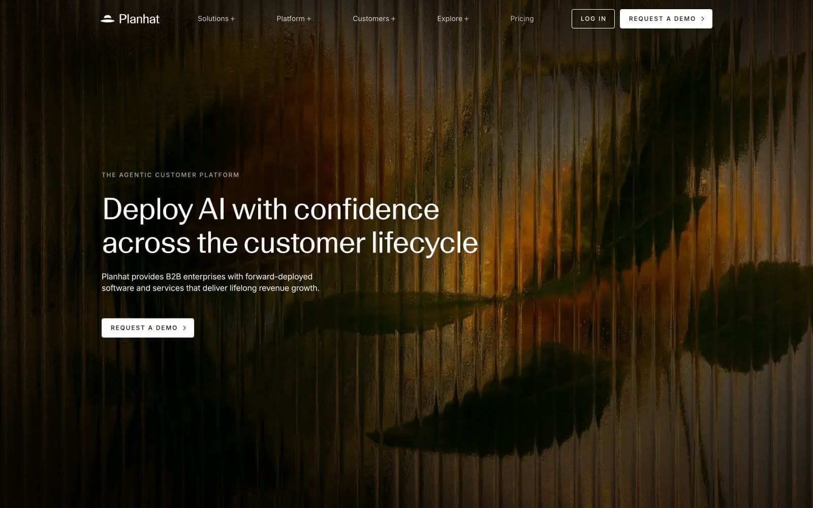
Planhat
SaaS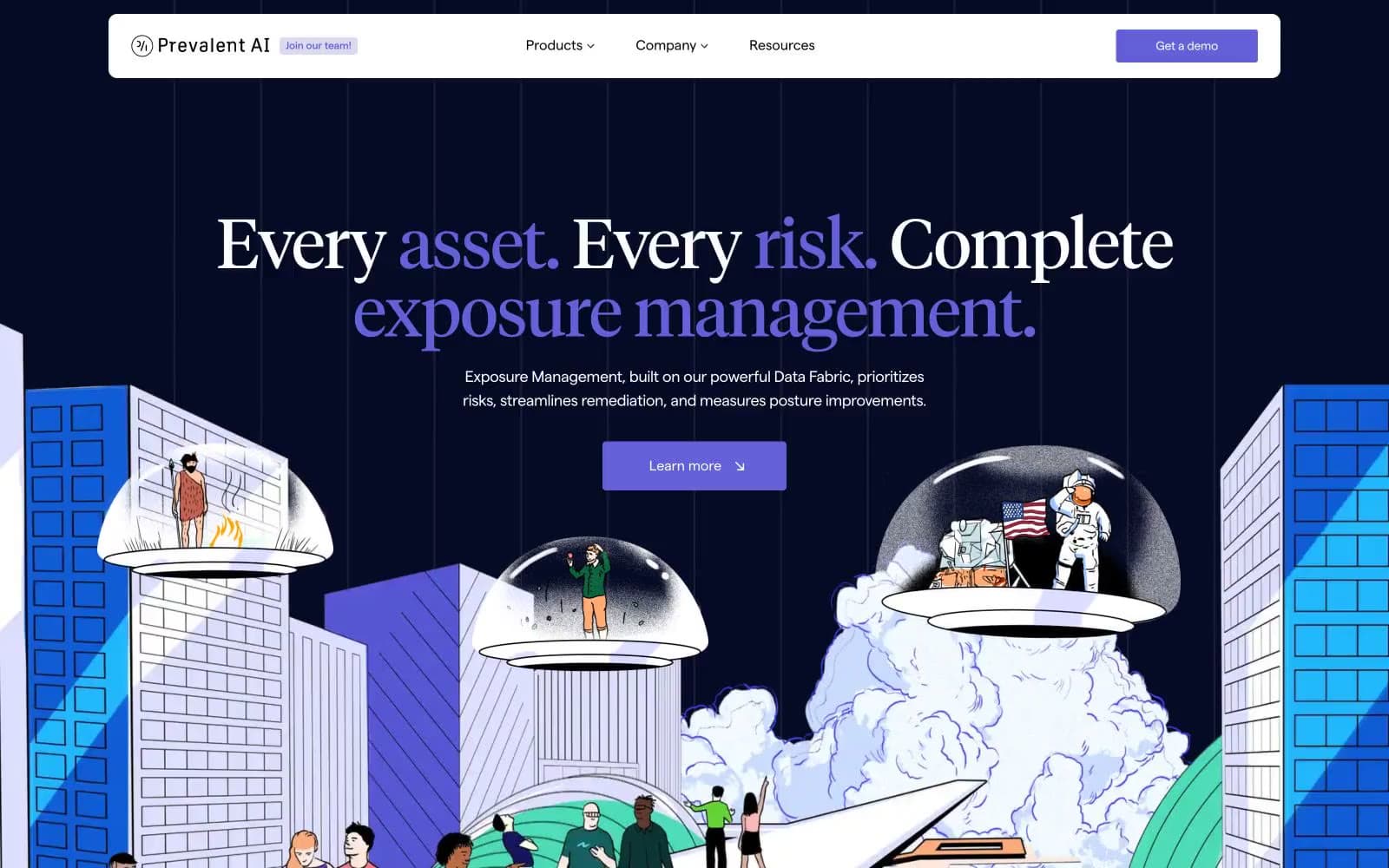
Prevalent
SaaS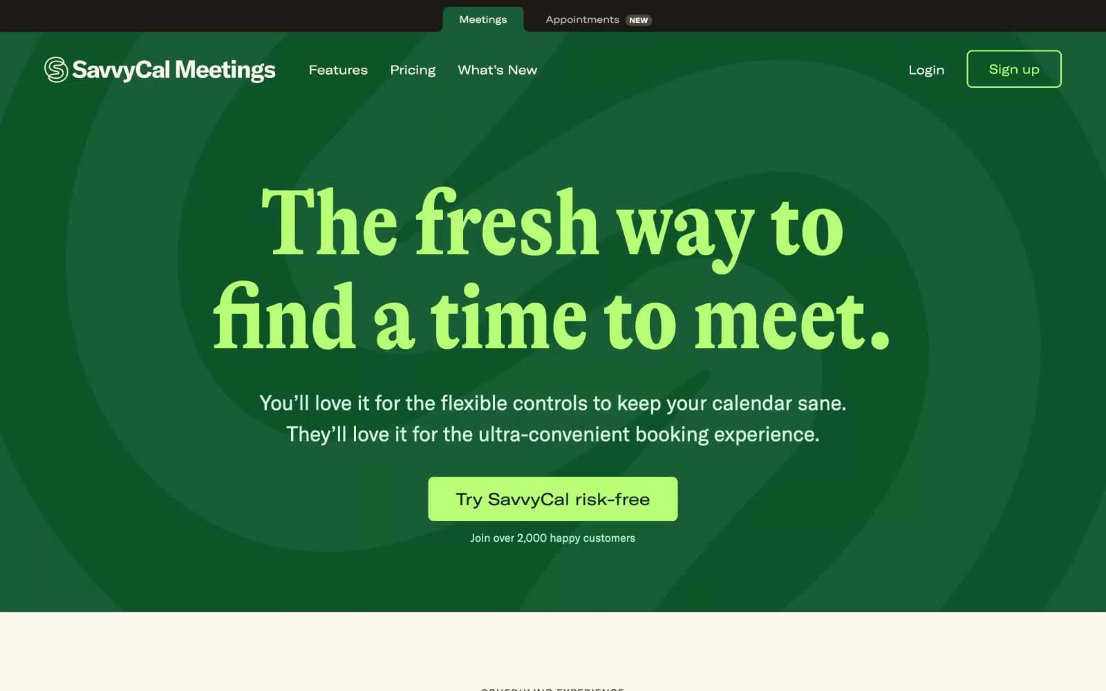
Savvycal
SaaS


