
Linktr. Editorial posters stacked like candy.
- SaaS
- Mixed theme
- 13 colors
- 4 typefaces
Linktree speaks in full-volume color blocks: each section is a saturated wall of lime, cobalt, or maroon, and content floats on top as white pills and dark text. The system treats color as the layout, not decoration — headers, cards, and CTAs inherit the section hue rather than fighting it, while a recurring chartreuse green acts as the brand's singular action accent. Typography is a single custom geometric sans (Linksans) set extra-bold with tight negative tracking at display sizes, giving headlines a compressed, poster-like weight. Shapes are aggressively rounded: nav bars and buttons become perfect pills, cards become lozenges, and only form inputs keep a modest 8px corner. The result reads as a series of bold editorial spreads rather than a conventional product page.
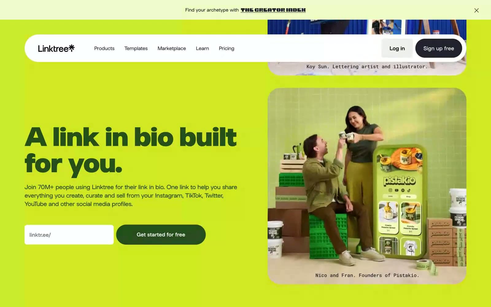
Linktr design system

Brand3
Primary action buttons, highlighted headlines, accent surfaces — the brand's signature chartreuse, used sparingly as functional punctuation across every section
Full-bleed section backgrounds, link accents — saturated blue used as an alternate hero band
Full-bleed FAQ and deep sections — dark wine red for high-contrast blocks
Accent4
Decorative borders, icon strokes, soft accent washes — pastel pink used for outlines and ornaments
Deep card surfaces, tertiary button backgrounds — saturated navy
Headline outlines, bordered cards, body emphasis — dark forest green as an alternate text color
Card accent backgrounds — warm gold for variety blocks
Neutrals6
Deep button text and borders for inverted controls
Primary text, icon fills, dark UI outlines — near-black with a faint blue undertone, the default ink color
Muted link text, secondary borders, low-emphasis text — warm desaturated olive-gray
Muted card backgrounds, disabled or secondary surfaces
Page background base, subtle button surfaces — warm off-white with a faint green cast
Card surfaces, button text, pill nav background — pure white floats above the colored sections
Try a pairing
Pick any two colors from the palette to check whether text stays readable on top.
Aa
Carbon on Voltage Lime
11.60 : 1 contrast
- Body textPasses AA 4.5
- Large textPasses AA 3
- StrictPasses AAA 7
More DESIGN.md files. Same web, different personalities.

8returns
SaaS
Customer.io
SaaS
Fiverr.com
SaaS
Flecto
SaaS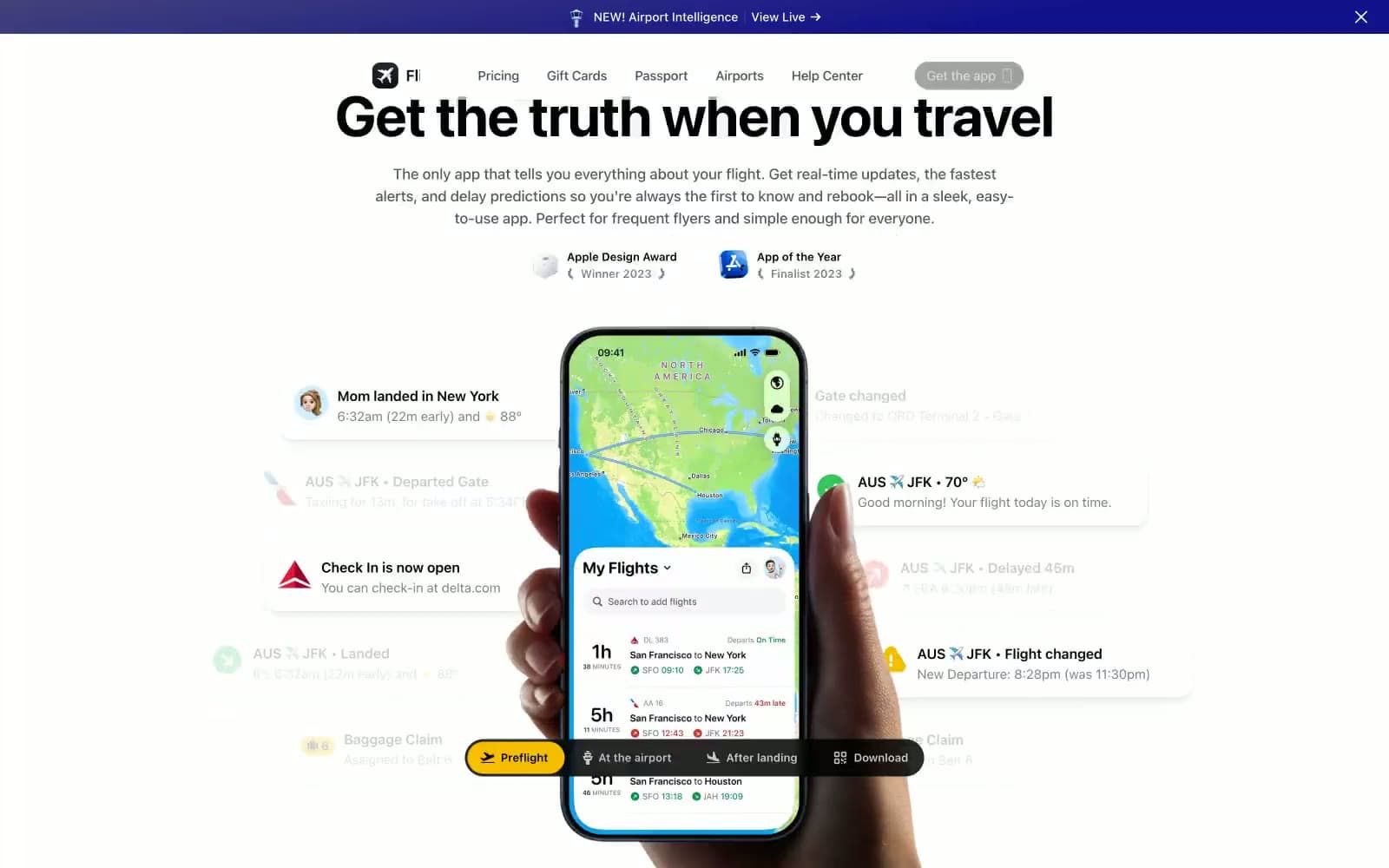
Flighty
SaaS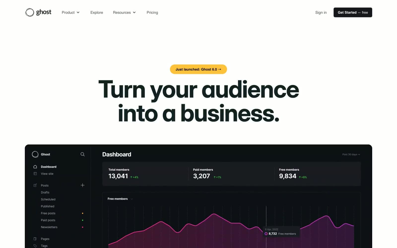
Ghost
SaaS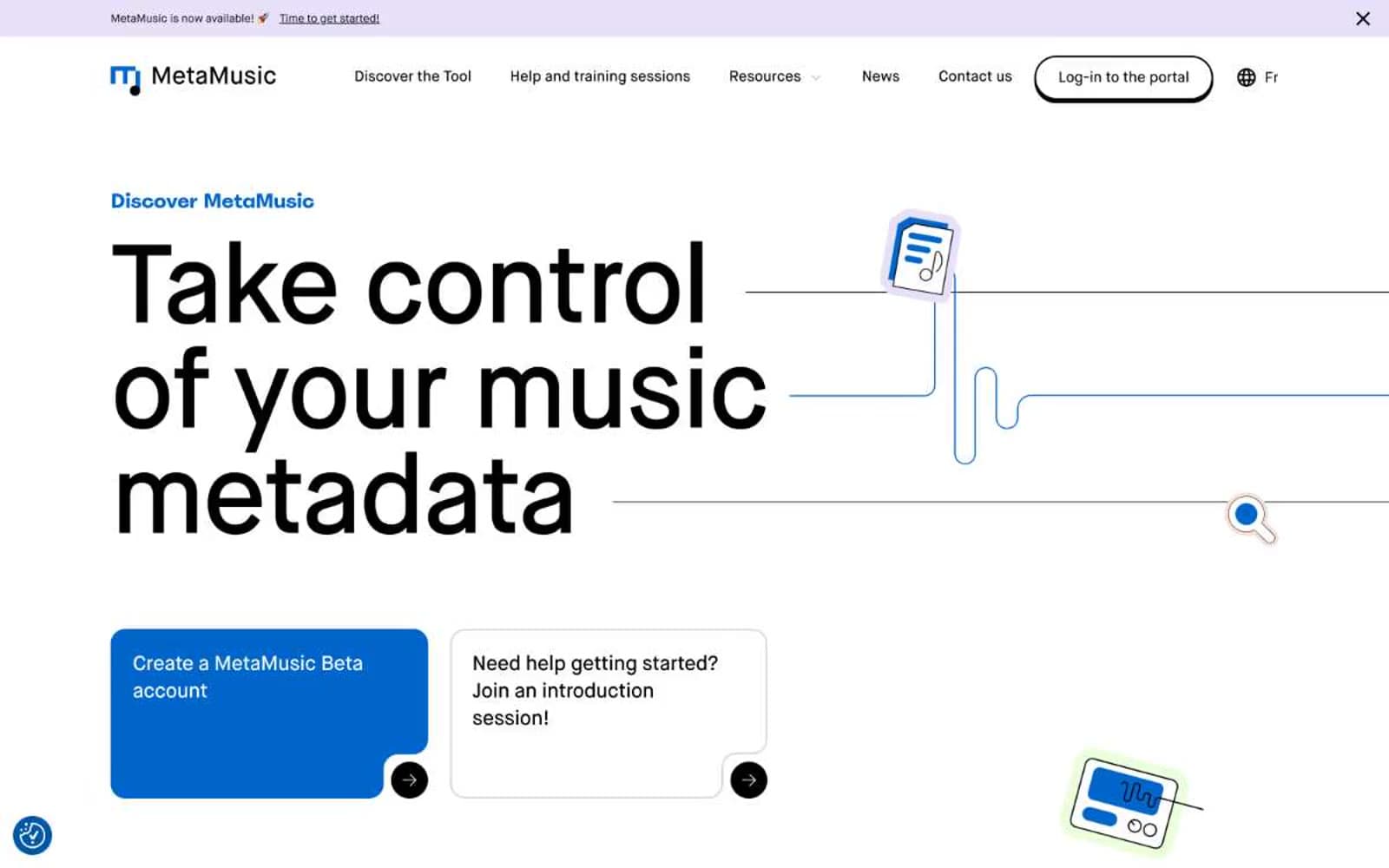
MetaMusic
SaaS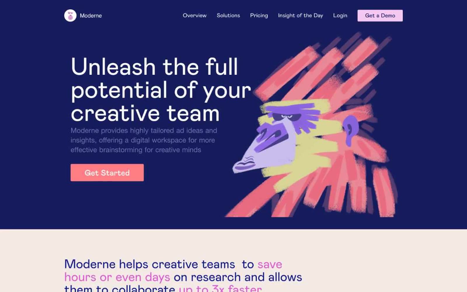
Moderne
SaaS
Passionfroot
SaaS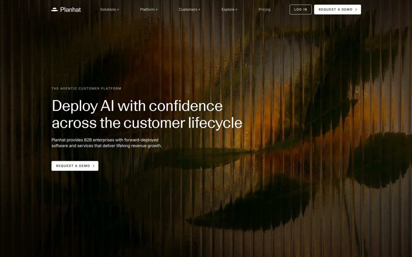
Planhat
SaaS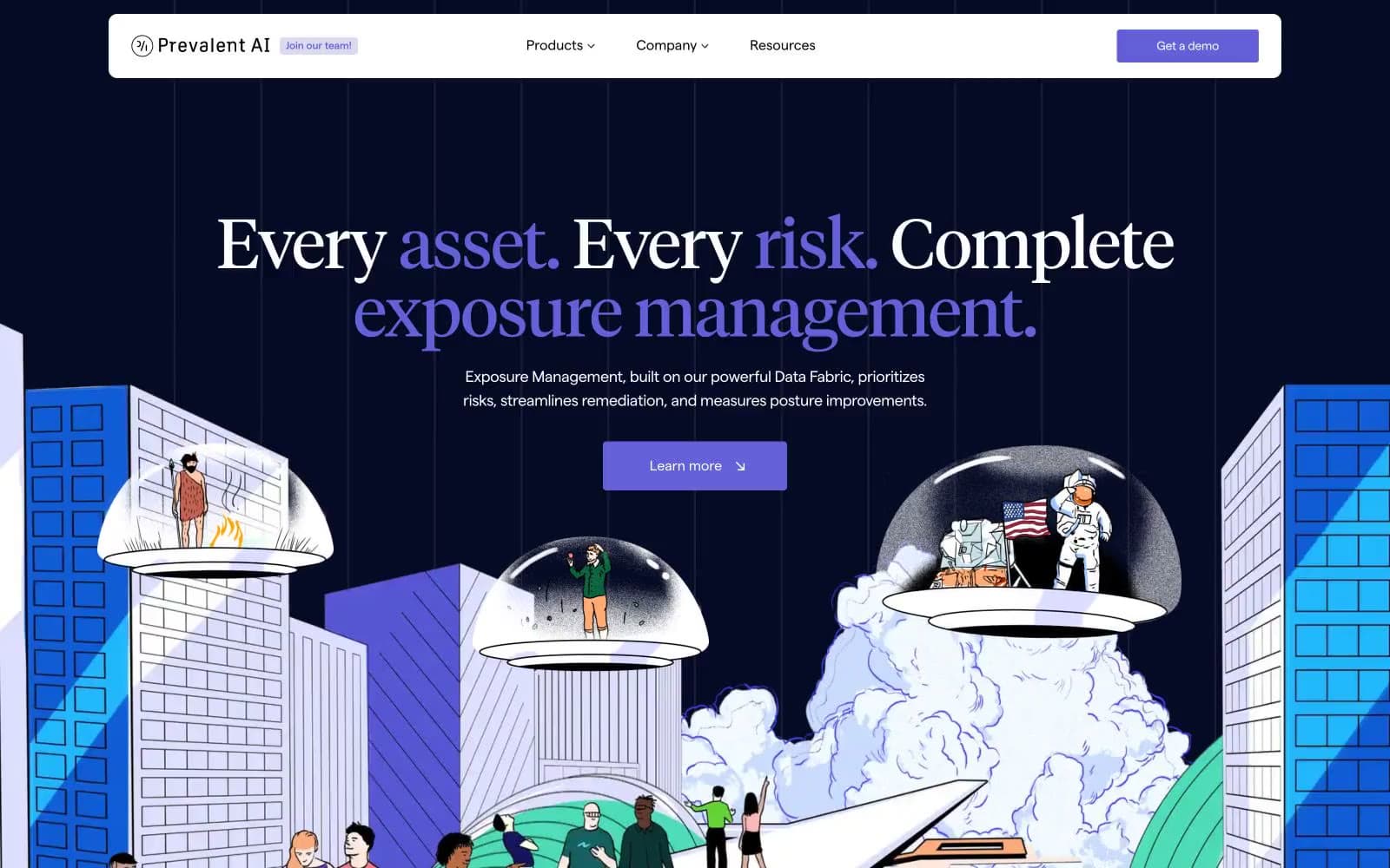
Prevalent
SaaS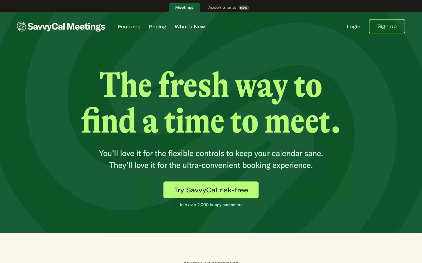
Savvycal
SaaS


