
VITURE. A blacked-out showroom where one orange beam cuts through the dark to illuminate a pair of glasses on a pedestal.
- Commerce
- Mixed theme
- 14 colors
- 1 typeface
VITURE projects a premium consumer-electronics showroom: near-black canvases, photographic product stages lit with neon rim-lighting, and one searing orange accent (#ff5f34) that acts as the brand's heartbeat across links, emphasis text, and filled CTAs. The interface is intentionally restrained — a single custom geometric sans-serif (FontSeasonSans) carries the entire typographic voice, from 12px captions to 340px hero numerals, with positive letter-spacing that widens as type grows, giving display text an airy, almost holographic openness. Surfaces are flat and confident: pure white and pale grays for content cards, deep #0c0c0c for product showcases, and pill-shaped controls (9999px radius) that feel tactile and modern. Rounded cards (28px) and full-bleed gradient washes (orange-to-purple, blue-to-cyan) inject the futuristic XR energy without cluttering the UI.
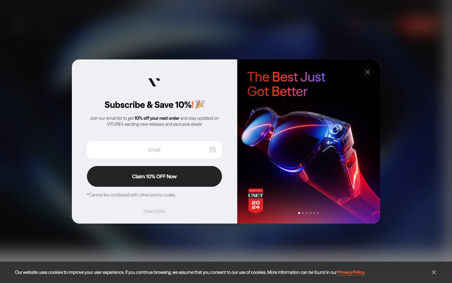
VITURE design system

Brand2
Brand accent, filled CTA buttons, active links, emphasis text, input focus — searing orange against matte black creates urgency and ownership of the brand voice
Gradient midpoint for orange-red text washes and accent streaks
Accent3
Gradient transition color in premium orange-to-violet washes (product banners, hero overlays)
Gradient terminus for the orange-to-violet premium wash — appears only inside multi-stop gradients, not as a standalone token
Gradient start for the cool-tech blue wash (secondary callouts, tech-feature banners)
Neutrals9
Deepest dark sections, modal overlay scrim, true-black accents
Primary text, dark-section canvas, product showcase background, footer, solid black CTA variant — the structural near-black that frames every screen
Tertiary text, disabled labels, subdued metadata
Body secondary text, helper text, placeholder copy, muted borders
Disabled button background, muted UI chrome, neutral placeholder fill
Hairline dividers, subtle borders, low-emphasis icon strokes
Inset card surface, nested panel background, alternating row tint
Elevated card surface, subtle panel background, light section variation
Light-section canvas, card surface, input background, inverse text on dark surfaces, modal surface
Try a pairing
Pick any two colors from the palette to check whether text stays readable on top.
Aa
Void on VITURE Ember
6.94 : 1 contrast
- Body textPasses AA 4.5
- Large textPasses AA 3
- StrictFails AAA 7
More DESIGN.md files. Same web, different personalities.

Nothing
Commerce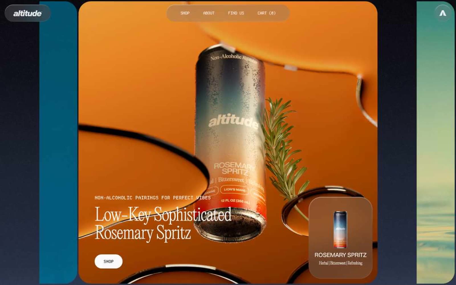
Altitude Beverages
Commerce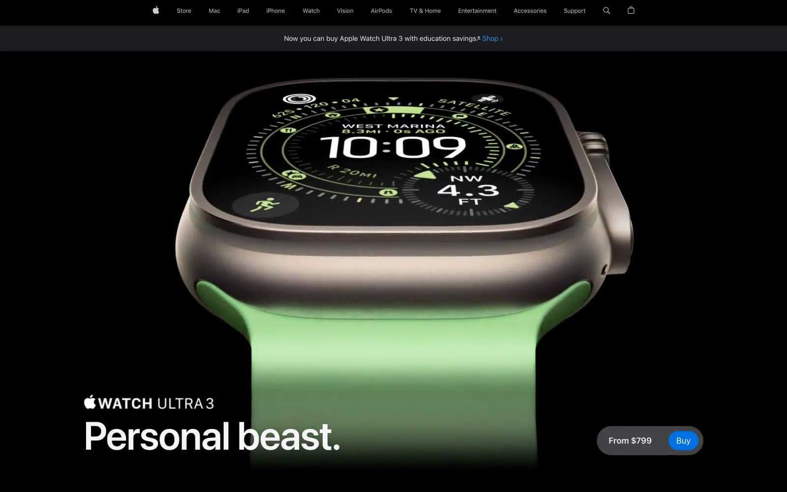
Apple Watch Ultra 3
Commerce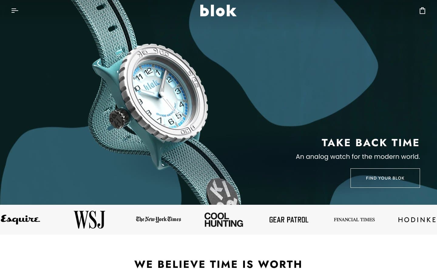
Blok
Commerce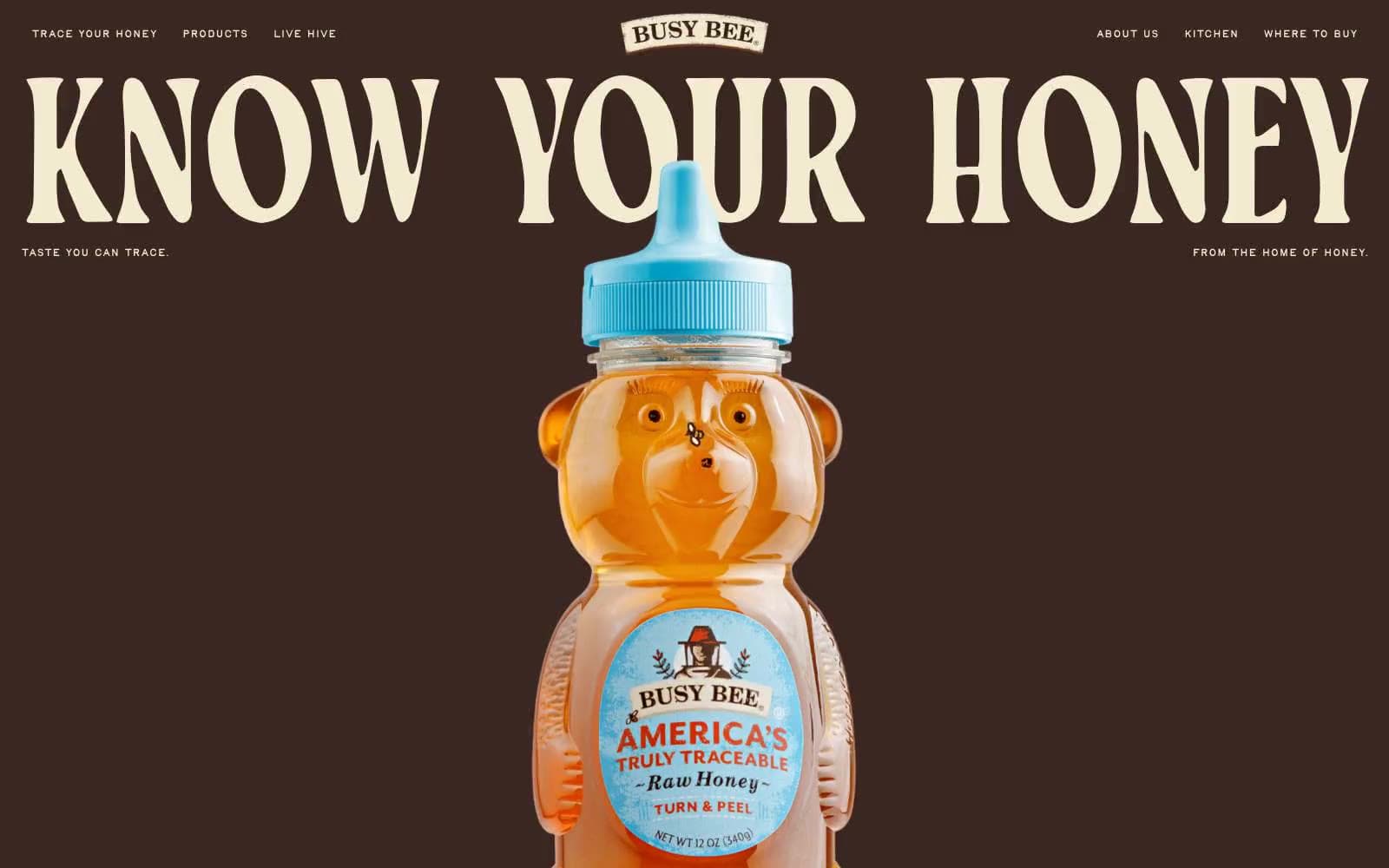
Busy Bee Honey
Commerce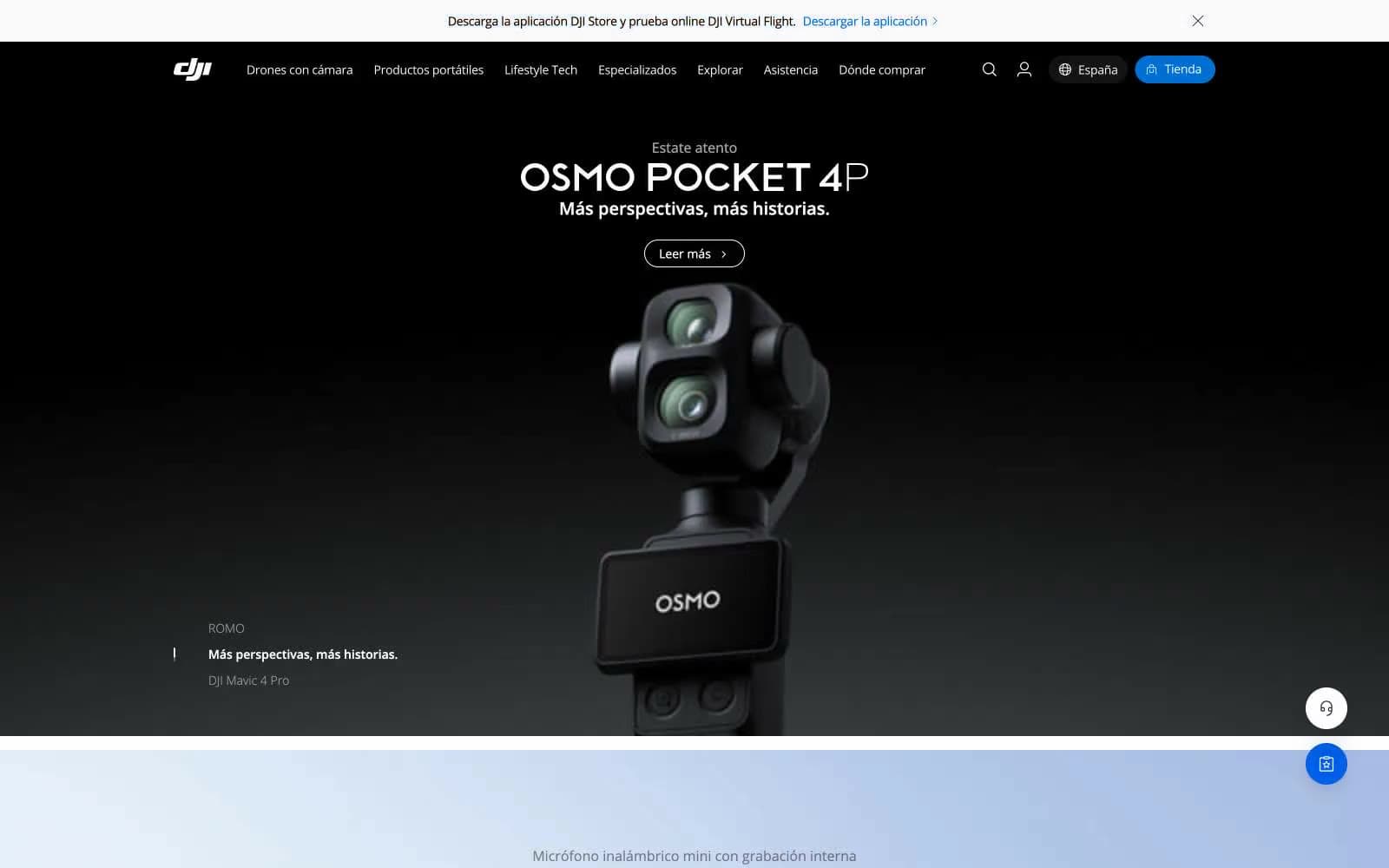
DJI
Commerce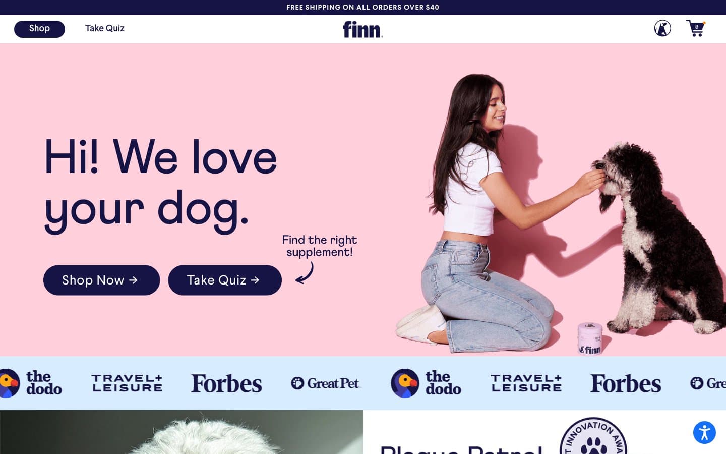
Finn
Commerce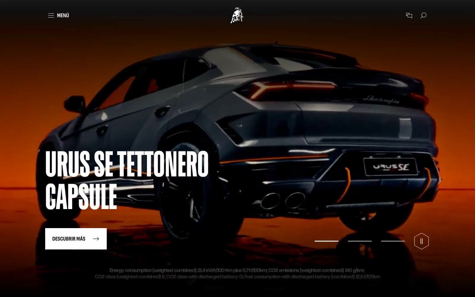
Lamborghini.com
Commerce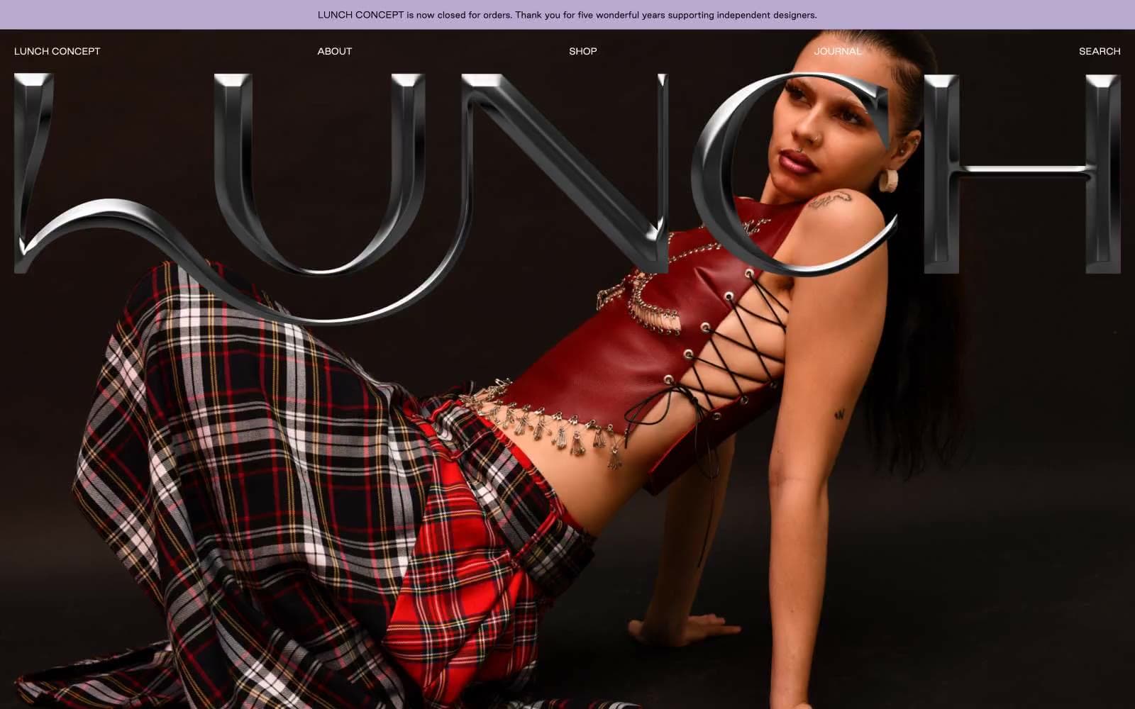
LUNCH
Commerce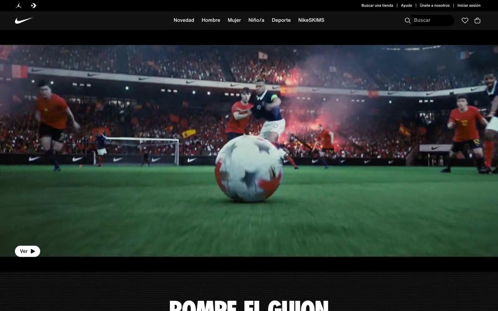
Nike.com
Commerce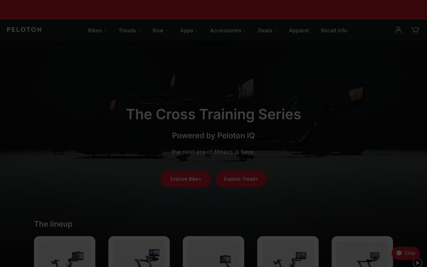
Peloton
Commerce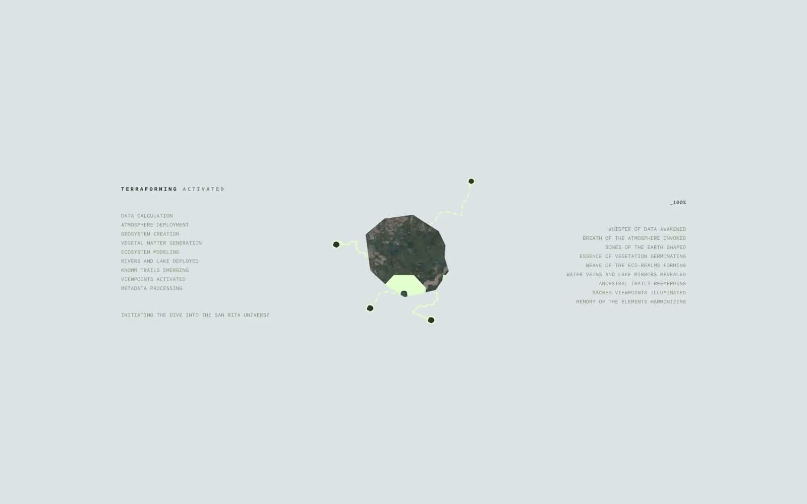
San Rita
Commerce


