
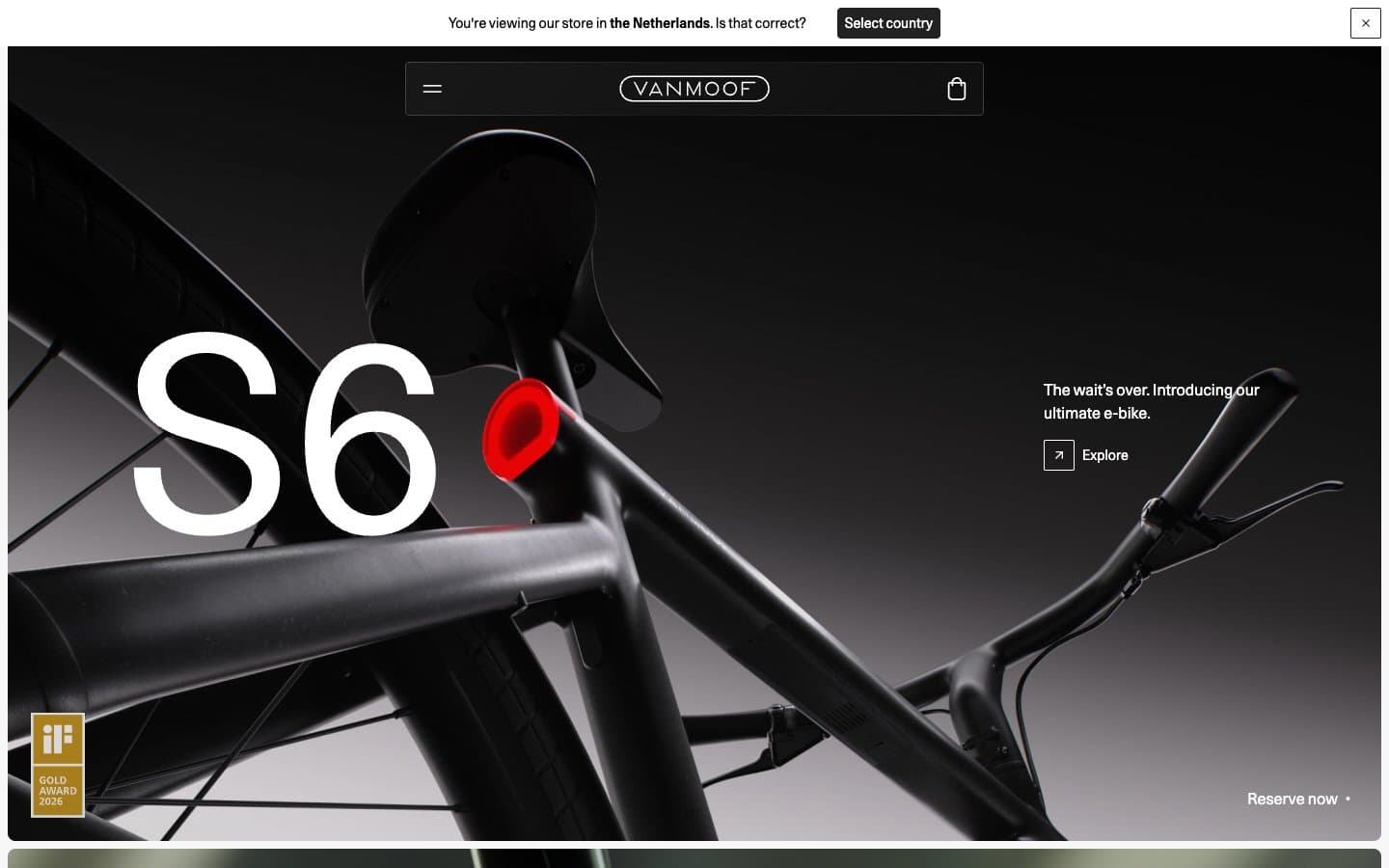
Vanmoof. Cinematic monochrome showroom.
- Commerce
- Mixed theme
- 7 colors
- 2 typefaces
Vanmoof operates on radical monochromatic discipline: a black, white, and gray system where the only visual loudness comes from 280px product-letter typography and full-bleed dark product photography. The interface itself is almost invisible — thin 1px borders at #e5e7eb, ghost controls, no accent color, no decorative gradients, no brand fills. The page alternates between dark cinematic hero panels (where the product IS the color) and white editorial sections with quiet 4-column feature grids. Every chrome decision prioritizes negative space and typographic confidence over UI density. Components feel like museum labels next to sculpture, not a software dashboard. The 2px radius on buttons and 8px on cards keep geometry sharp and architectural, reinforcing a premium industrial-product language rather than a consumer-app softness.
Vanmoof design system

Neutrals7
Body text, headline text on light surfaces, footer text — reserved for highest-emphasis type where absolute black is needed for maximum contrast (21:1 on white)
Navigation bar, dark surface panels, primary text on light, logo wordmark fill — the near-black anchor of the system, softer than pure #000 for reduced eye strain on large surfaces
Secondary text, link text on light, button labels on light surfaces — the mid-dark step between Carbon and Obsidian for hierarchy without a hue shift
Secondary surface fills, muted background panels, subtle hover states — one step deeper than Mist for surfaces that need slightly more presence
Hairline borders, dividers, nav separator lines, input borders, card outlines — the most-used color in the system by frequency (1231 occurrences), defining structural edges without visual weight
Subtle surface tint alternating with pure white for section banding, elevated card backgrounds when pure white feels too sharp
Page canvas for content sections, card surfaces, icon fills on dark hero, button text on dark fills
Try a pairing
Pick any two colors from the palette to check whether text stays readable on top.
Aa
Frost on Obsidian
21.00 : 1 contrast
- Body textPasses AA 4.5
- Large textPasses AA 3
- StrictPasses AAA 7
More DESIGN.md files. Same web, different personalities.

Nothing
Commerce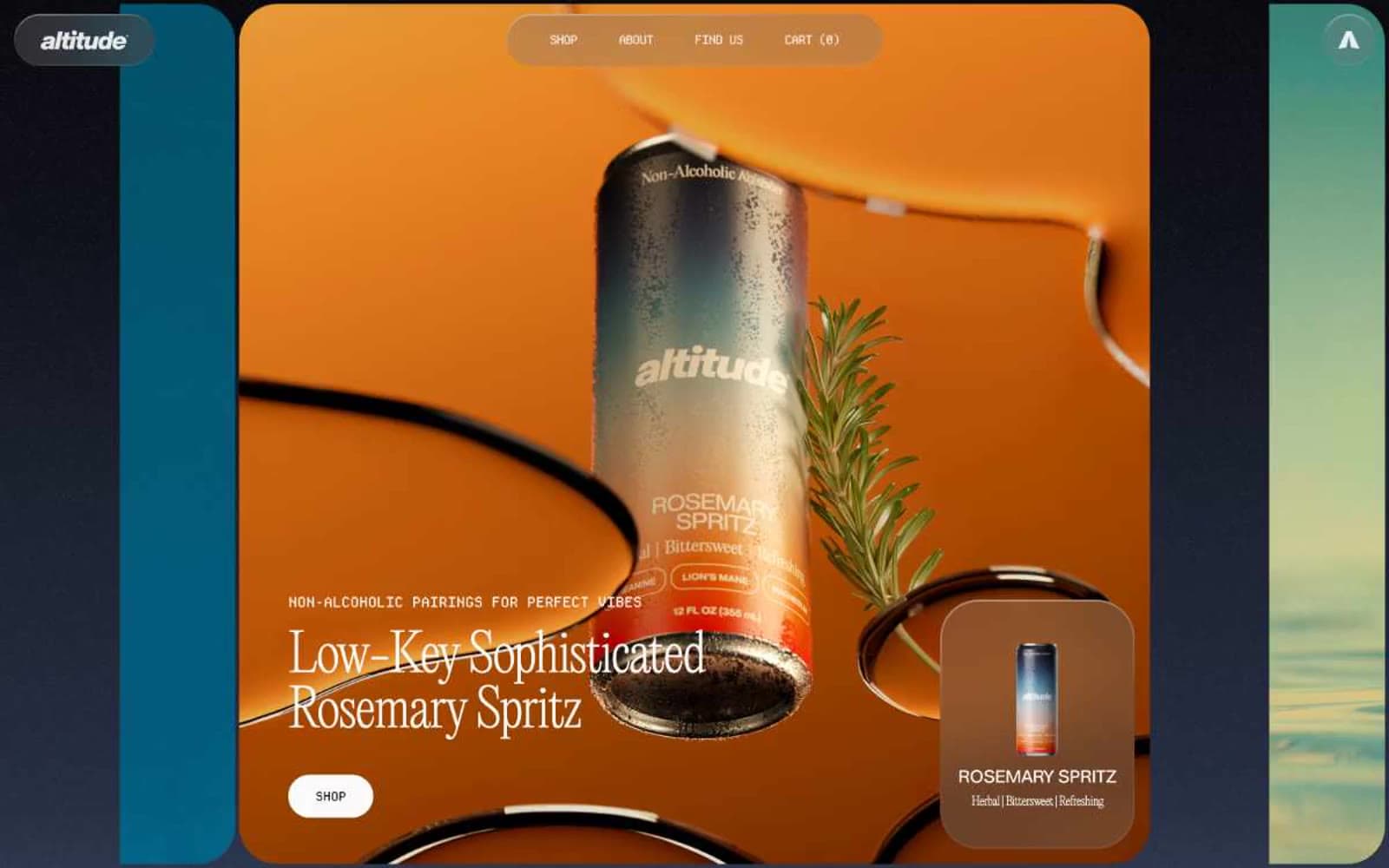
Altitude Beverages
Commerce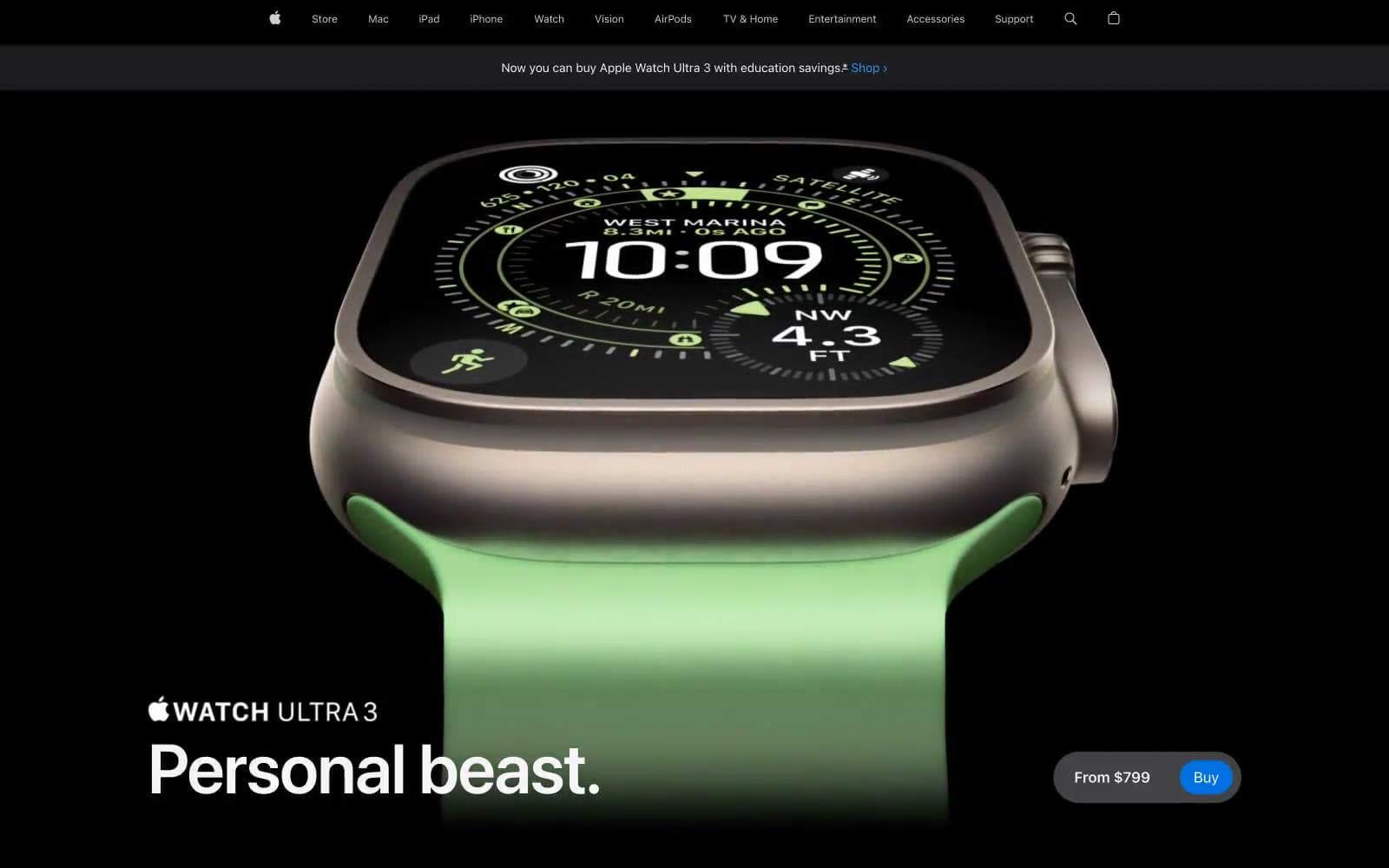
Apple Watch Ultra 3
Commerce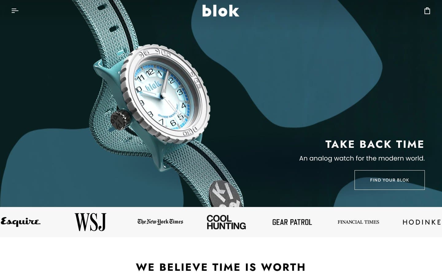
Blok
Commerce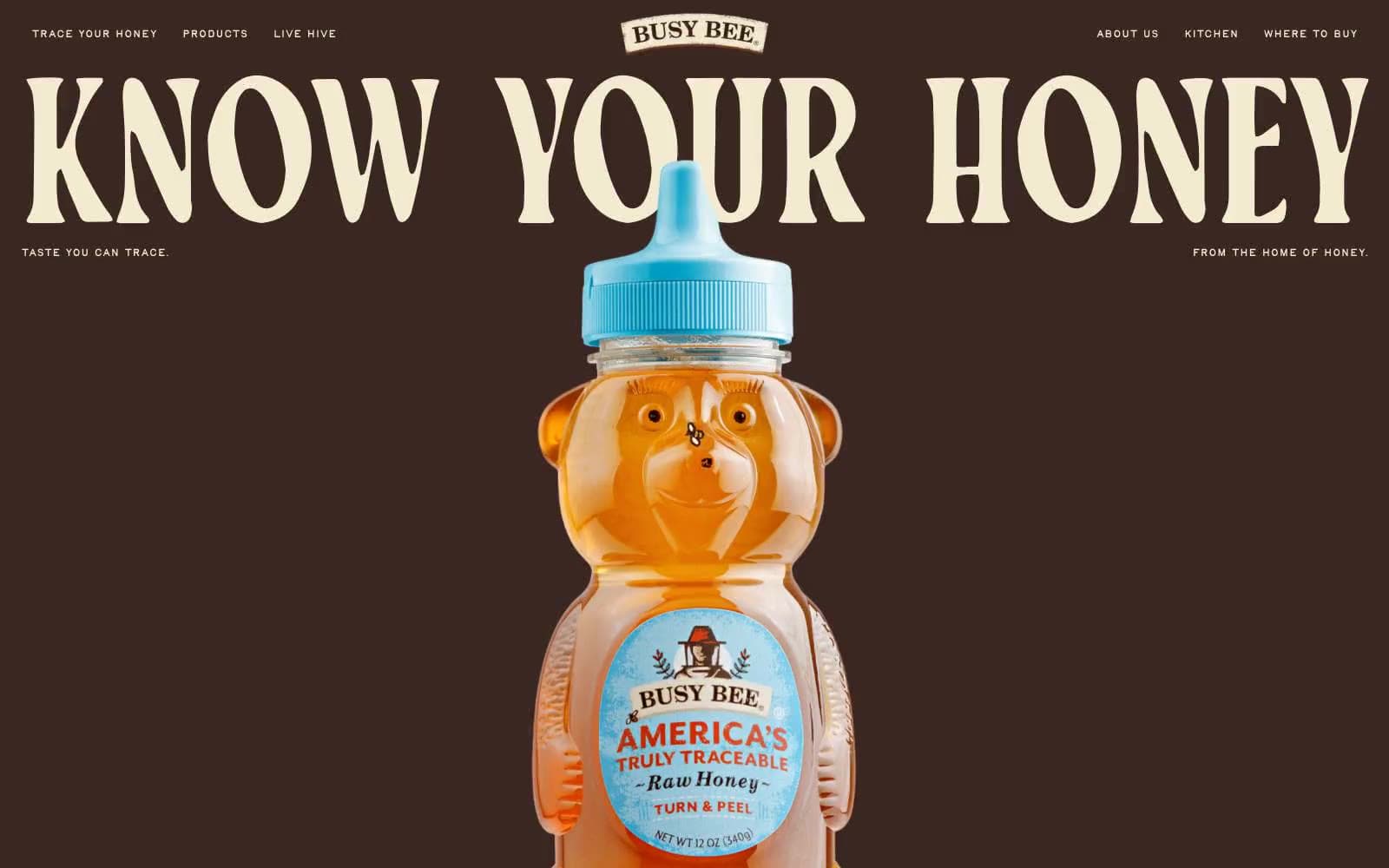
Busy Bee Honey
Commerce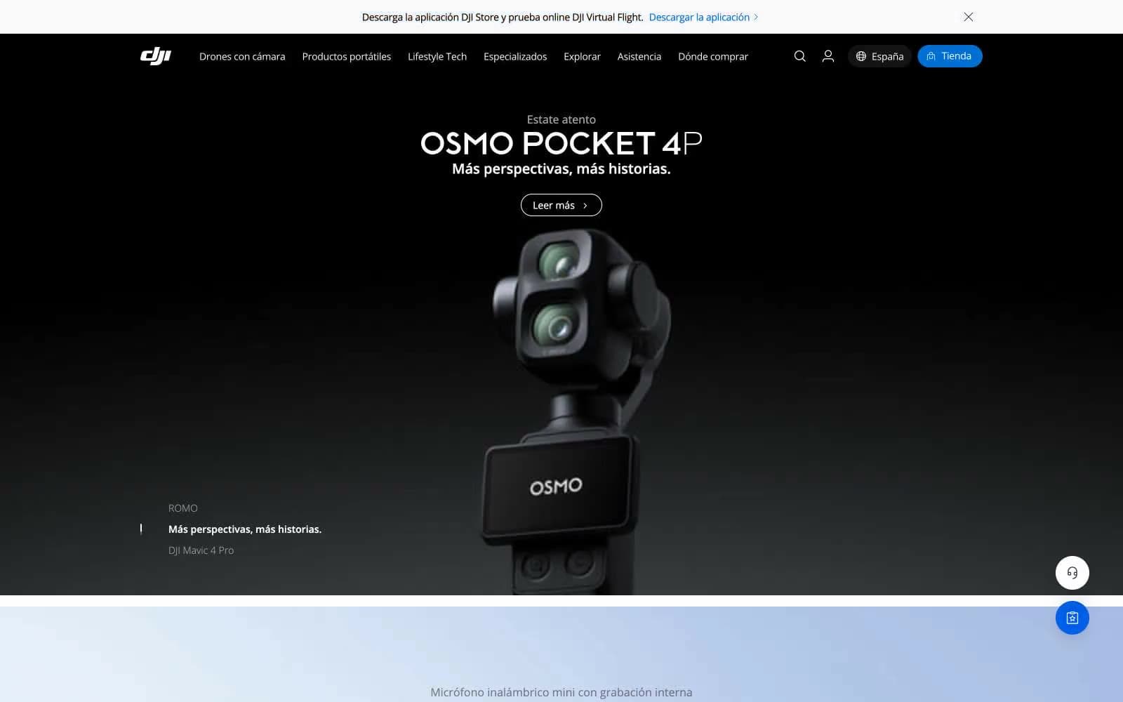
DJI
Commerce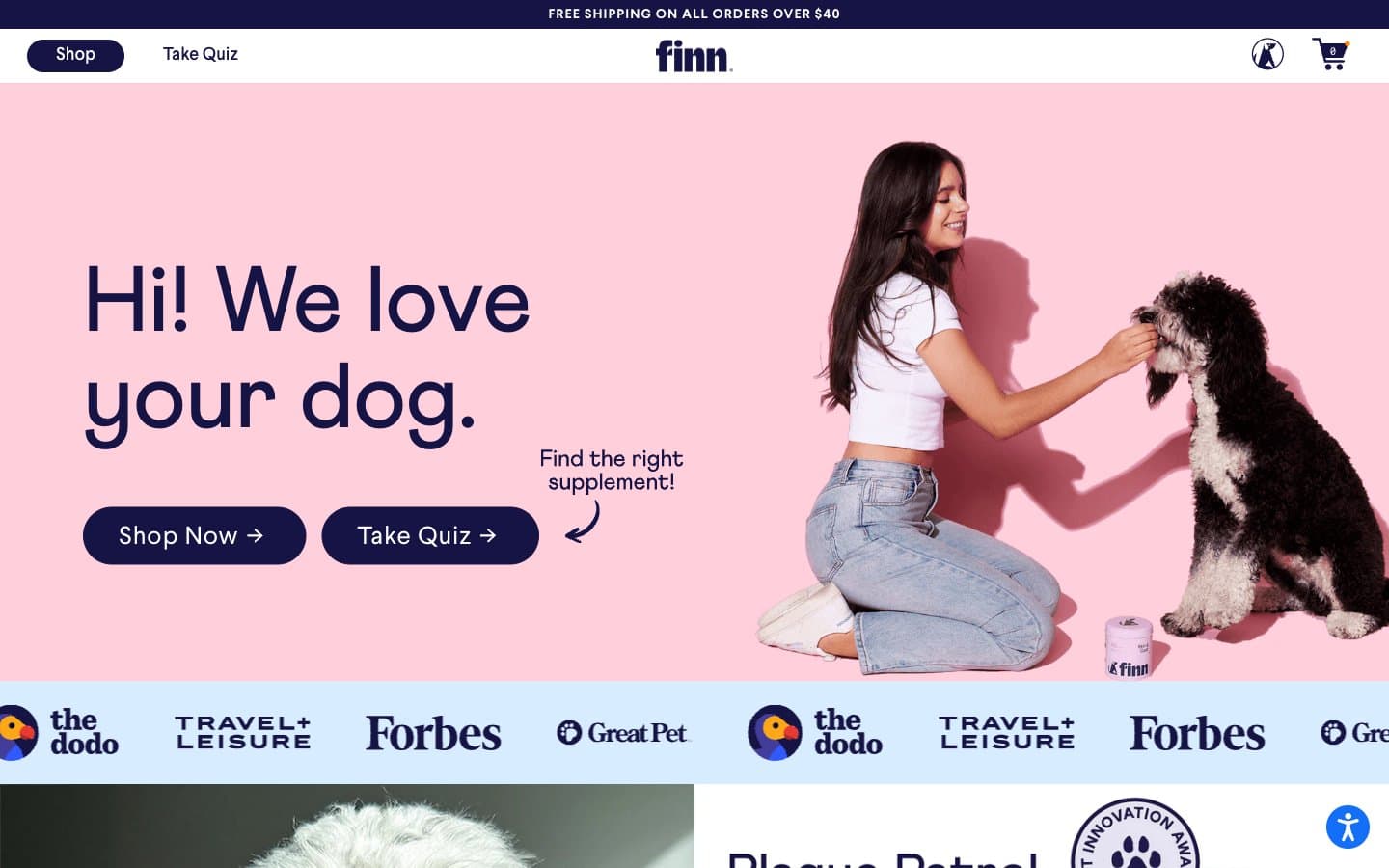
Finn
Commerce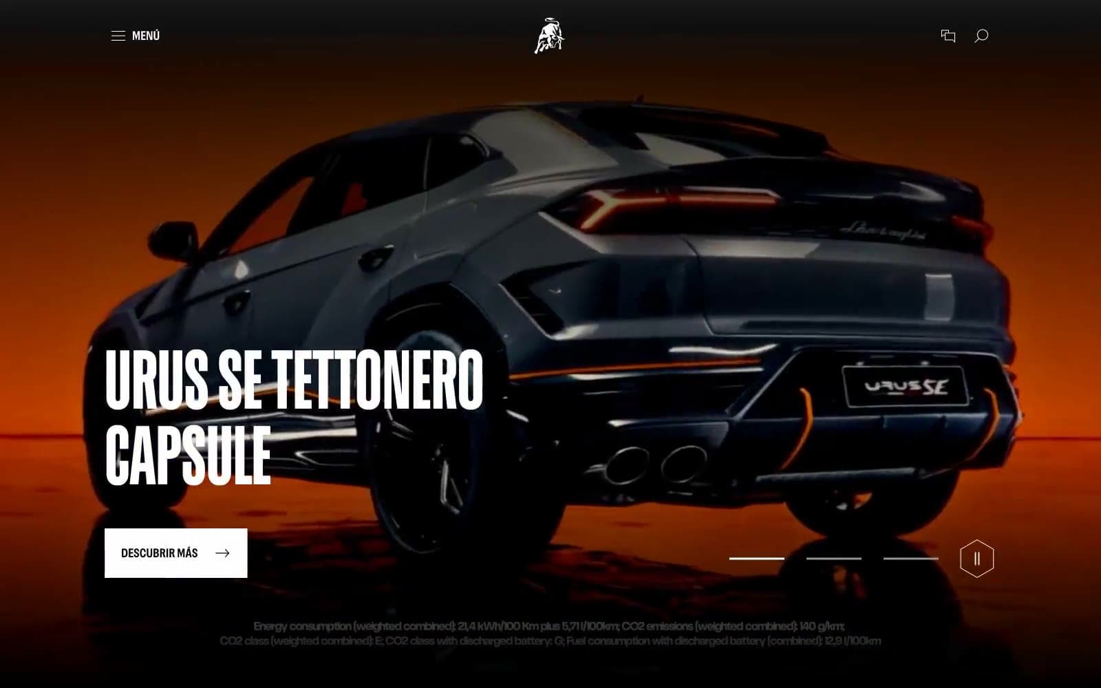
Lamborghini.com
Commerce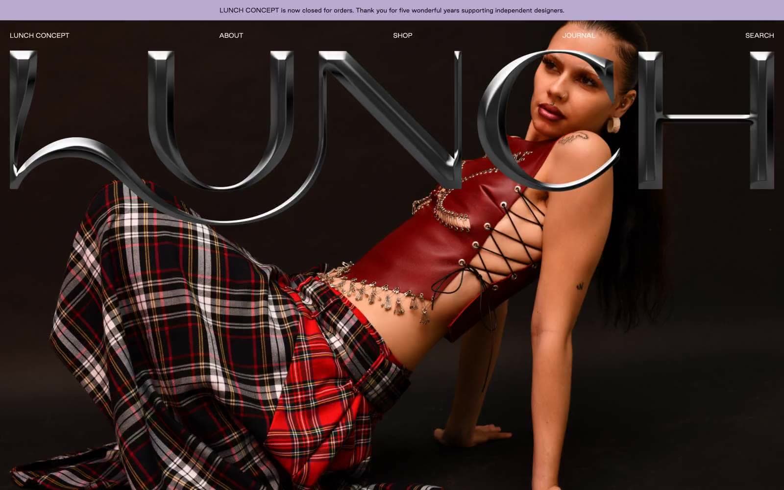
LUNCH
Commerce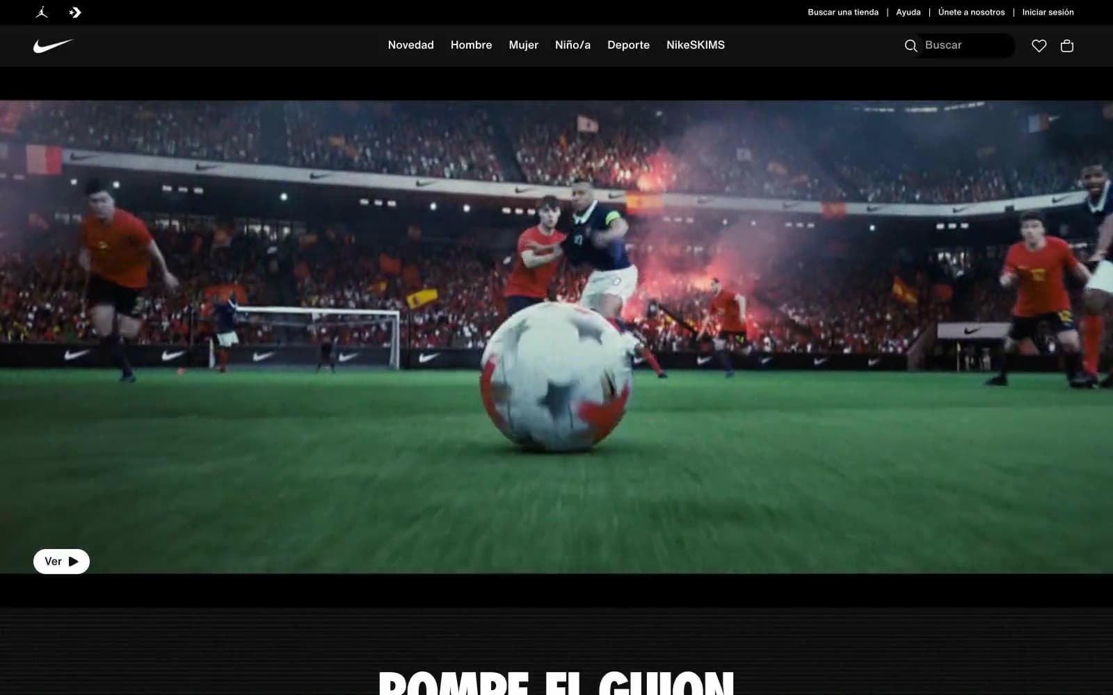
Nike.com
Commerce
Peloton
Commerce
San Rita
Commerce


