
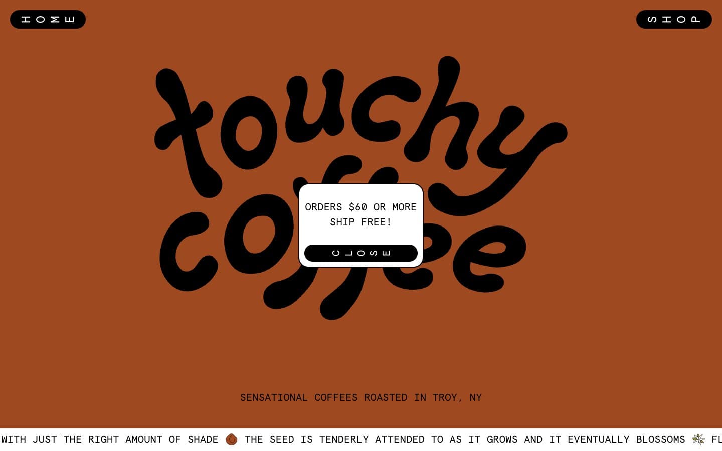
Touchy Coffee. Earthy paint bands, typewriter labels, and extreme pill buttons on warm matte surfaces.
- Commerce
- Mixed theme
- 8 colors
- 3 typefaces
Touchy Coffee operates like an indie zine meets corner coffee shop: a rotating cast of earthy, hand-mixed backgrounds (terracotta, sage, sky blue) where the product photography and a bouncy custom script logo do the heavy lifting, and the UI chrome stays deliberately lo-fi. Everything readable is set in Apercu Mono — a monospaced face that reads like a typewriter label, reinforcing the craft, small-batch identity over glossy e-commerce polish. Controls are extreme pills (100px radius), cards are softly rounded (20px), and the color system behaves like a set of paint swatches — lavender, terracotta, moss green, sage gray — applied to full-bleed section bands rather than used as accent dots. Borders are bold and black, text is unapologetically black-on-color, and the overall effect is tactile, warm, and personal rather than slick or optimized.
Touchy Coffee design system

Brand1
Hero section background, circular product label accents — warm clay red that grounds the brand in earth and roast
Accent3
Violet outline accent for tags, dividers, and focused UI edges
Green accent for outlined action borders, linked labels, and lightweight interactive emphasis. Do not promote it to the primary CTA color
Surface band accent, subtle background wash — buttery yellow used as a section break between terracotta and sage
Neutrals4
Body text, borders, pill button fills, logo — the structural constant across every section
Dominant neutral for section backgrounds, form borders, and the shop canvas — carries the largest surface area on the site
Testimonial section background — washed pale blue providing a cool, airy counterpoint to the warm dominant tones
Card surfaces, input fills, text on dark pill buttons — the only true white, used sparingly as a counterpoint to the painted section bands
Try a pairing
Pick any two colors from the palette to check whether text stays readable on top.
Aa
Cream on Terracotta
6.09 : 1 contrast
- Body textPasses AA 4.5
- Large textPasses AA 3
- StrictFails AAA 7
More DESIGN.md files. Same web, different personalities.

Nothing
Commerce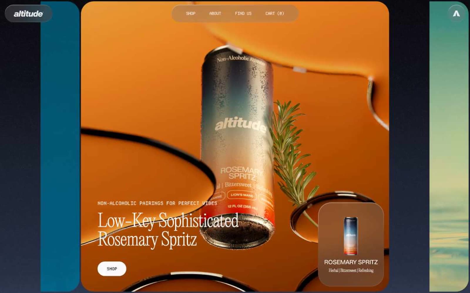
Altitude Beverages
Commerce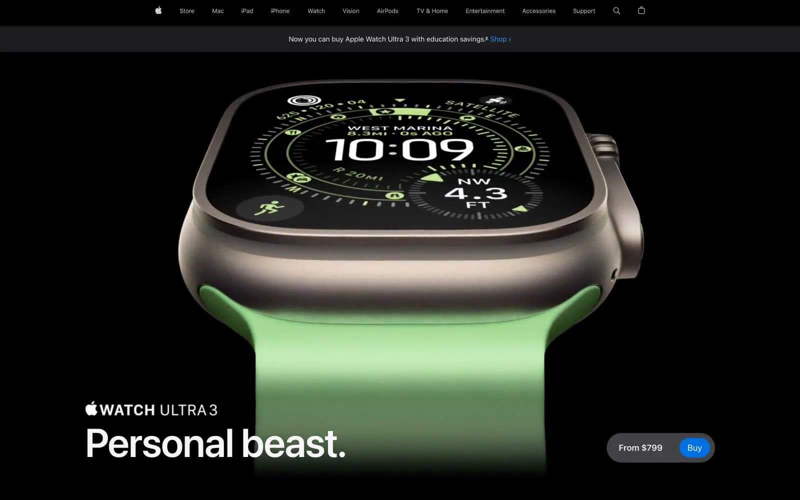
Apple Watch Ultra 3
Commerce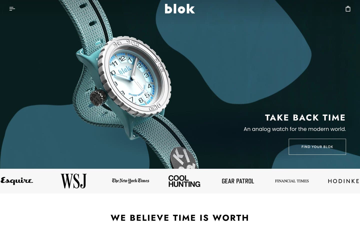
Blok
Commerce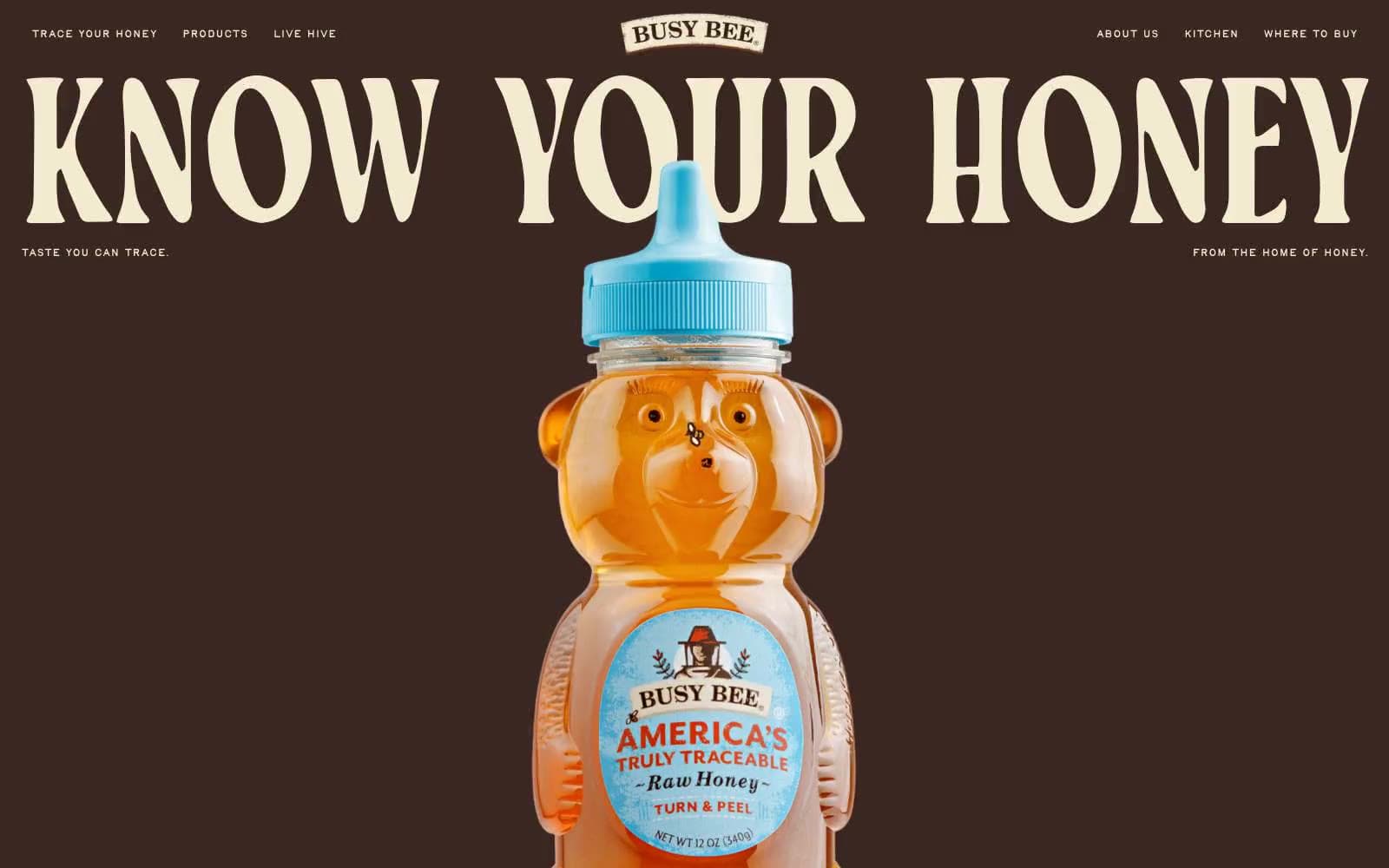
Busy Bee Honey
Commerce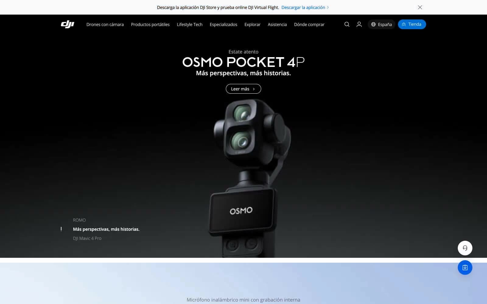
DJI
Commerce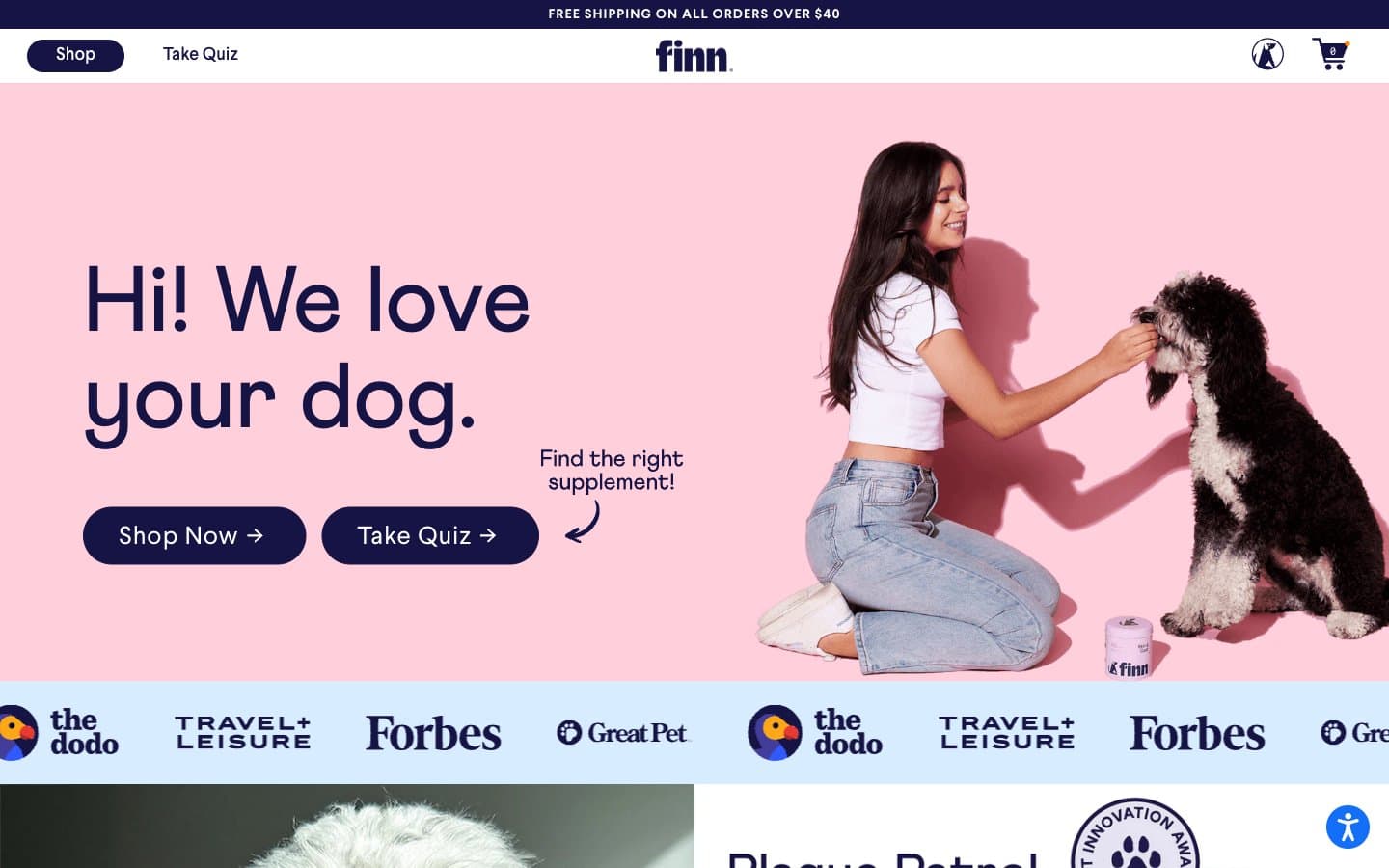
Finn
Commerce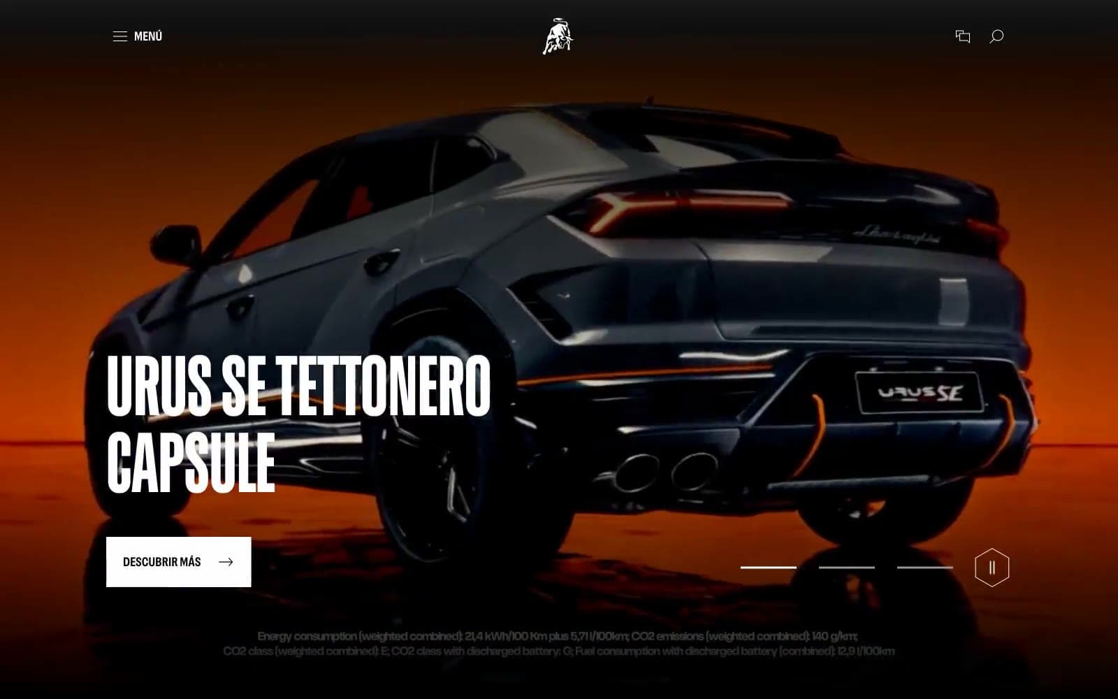
Lamborghini.com
Commerce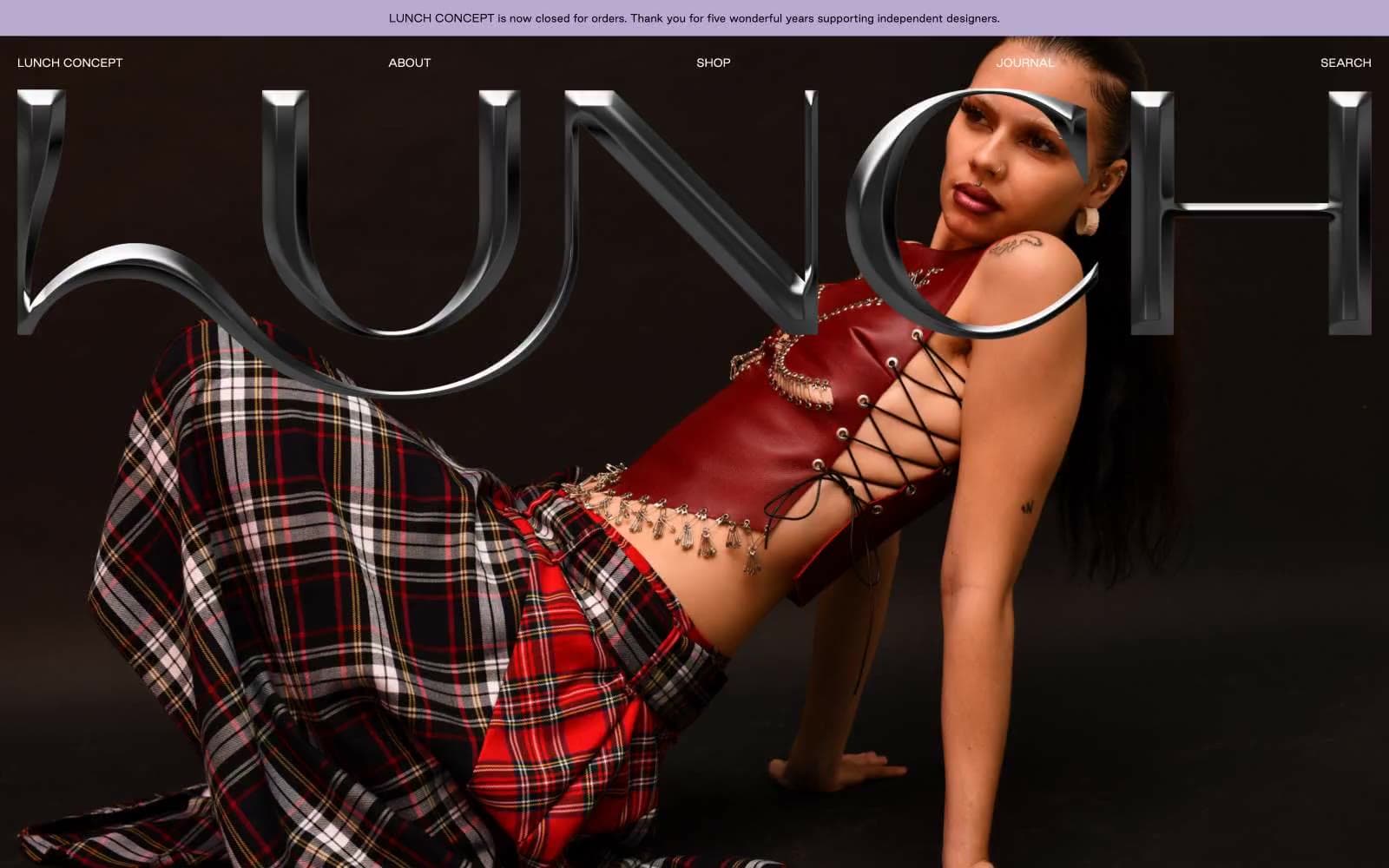
LUNCH
Commerce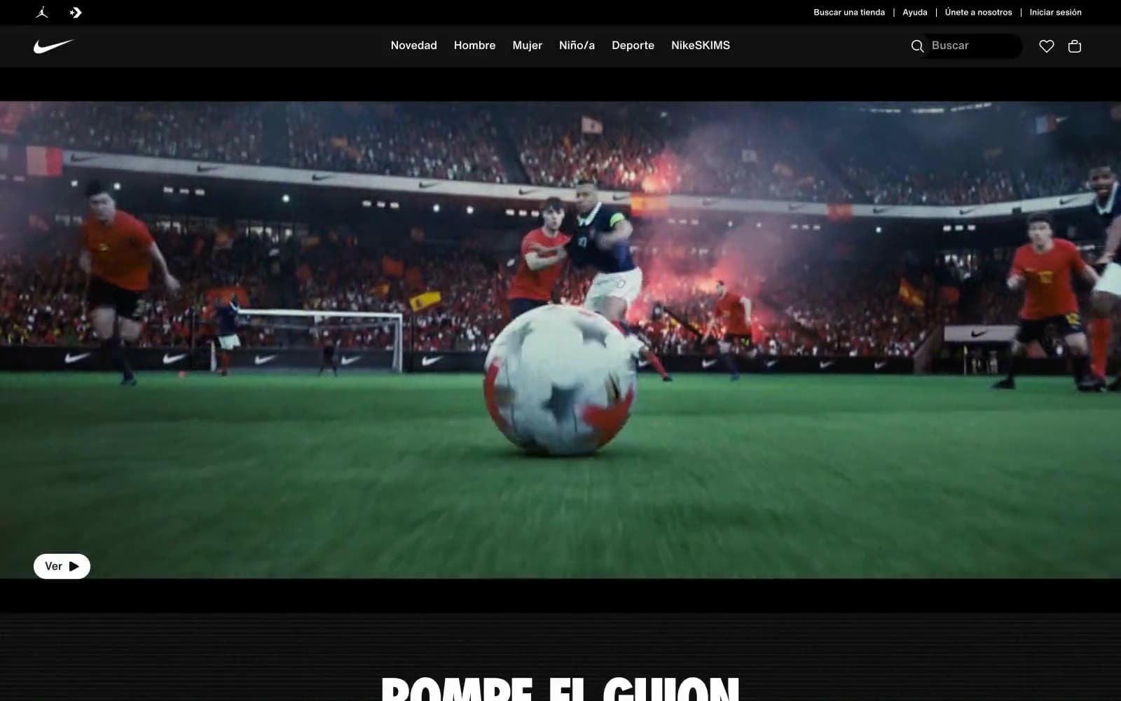
Nike.com
Commerce
Peloton
Commerce
San Rita
Commerce


