
Tomorro. Electric Sprout neon pierces the deep forest canvas and bone-white beds below.
- SaaS
- Mixed theme
- 14 colors
- 3 typefaces
Tomorro is a contract-management platform that renders in a neo-botanical dark-and-light system: deep forest-canvas sections alternate with warm bone-white panels, both fed by the same Moss-Shadow text and punctuated by an Electric Sprout green. The visual language is quiet, mature, editorial — Ozik display type at ultra-tight 0.86 line-height anchors the hero, Aeonik carries every UI surface, and Instrument Serif drops in sparingly as accent italic-adjacent voice inside badges. Components are mostly pill-shaped (28-40px radius) rather than squared, the floating nav bar looks like a pressed seed, and the green CTA is treated as botanical accent paint, not a brand wallpaper. Pages should read as 70% typography on flat surfaces, 20% product mockups floating at slight angles, 10% abstract green orb atmosphere.
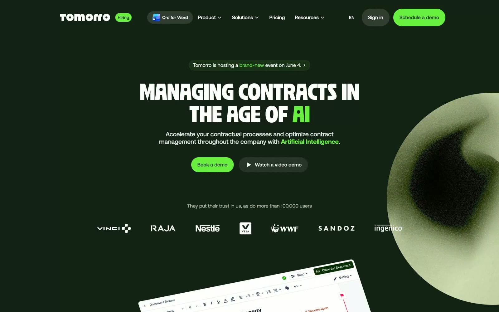
Tomorro design system

Brand6
Dark elevated surface for cards, headers, and contained panels. Do not promote it to the primary CTA color
Gray action color for filled buttons, selected navigation states, and focused conversion moments.
Secondary muted text, link underline on dark, and badge border color — sits between Moss Shadow and Pure White as the off-tone voice
Medium-contrast borders, control outlines, and structural separators.
Green action color for filled buttons, selected navigation states, and focused conversion moments.
Secondary accent for link borders, icon strokes, and hover-active states — a quieter green that supports Sprout without competing
Accent2
Light green badge background and success-tint surface — the diluted form of Electric Sprout for soft status chips
Light sage link border and chip outline on bone surfaces — a low-contrast divider that reads as green without demanding attention
Neutrals6
Link text and border on light surfaces — darker than Onyx Olive, used only where the link must read as a typographic accent rather than a button
Primary achromatic dark — body copy on white, borders on light cards, and the dominant hairline color across the whole system
Muted UI surface for disabled controls, low-emphasis panels, and placeholder blocks.
Cool-tinted heading rule and quiet secondary border — the only neutral that isn't green-tinted
Card surface on light sections — warm off-white that prevents the page from reading sterile, never pure #fff when elevated
Light-section page background, text on dark surfaces, and inverted badge fills — the greenhouse bench
Try a pairing
Pick any two colors from the palette to check whether text stays readable on top.
Aa
Pure White on Forest Depths
16.45 : 1 contrast
- Body textPasses AA 4.5
- Large textPasses AA 3
- StrictPasses AAA 7
More DESIGN.md files. Same web, different personalities.
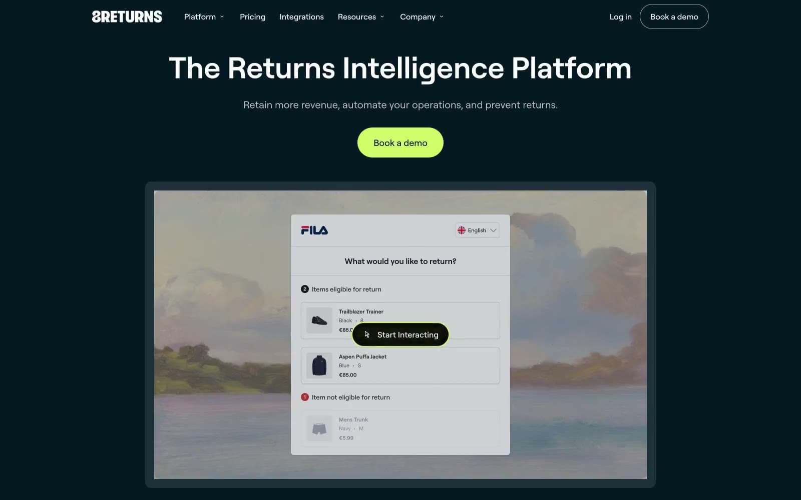
8returns
SaaS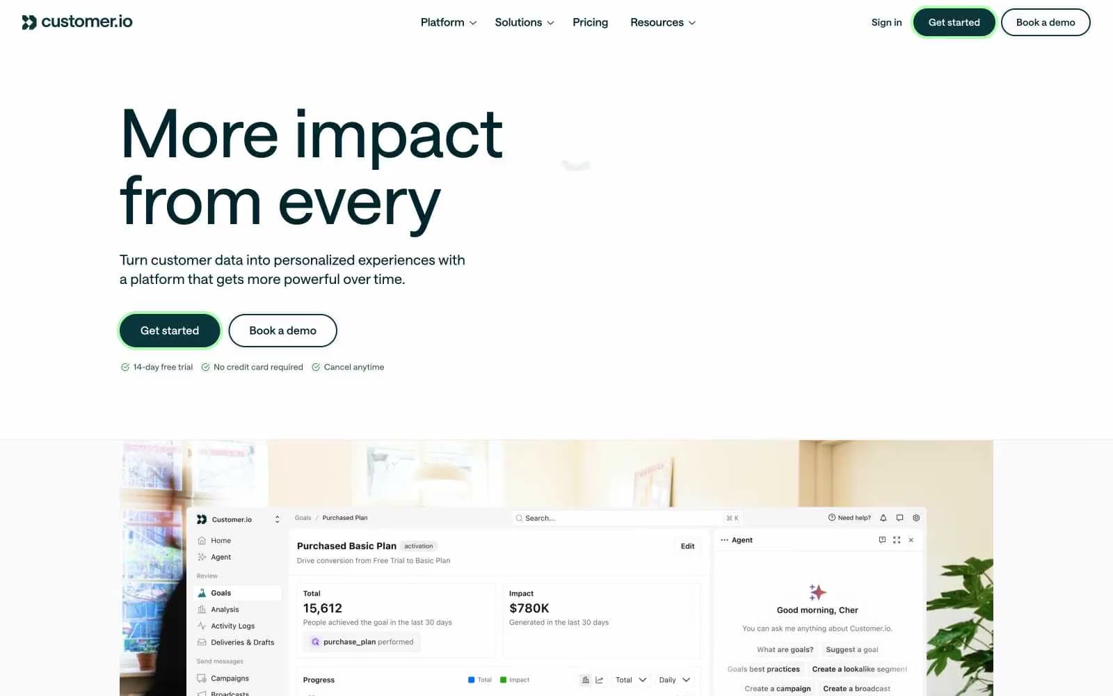
Customer.io
SaaS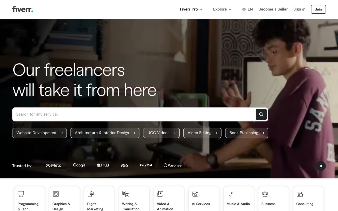
Fiverr.com
SaaS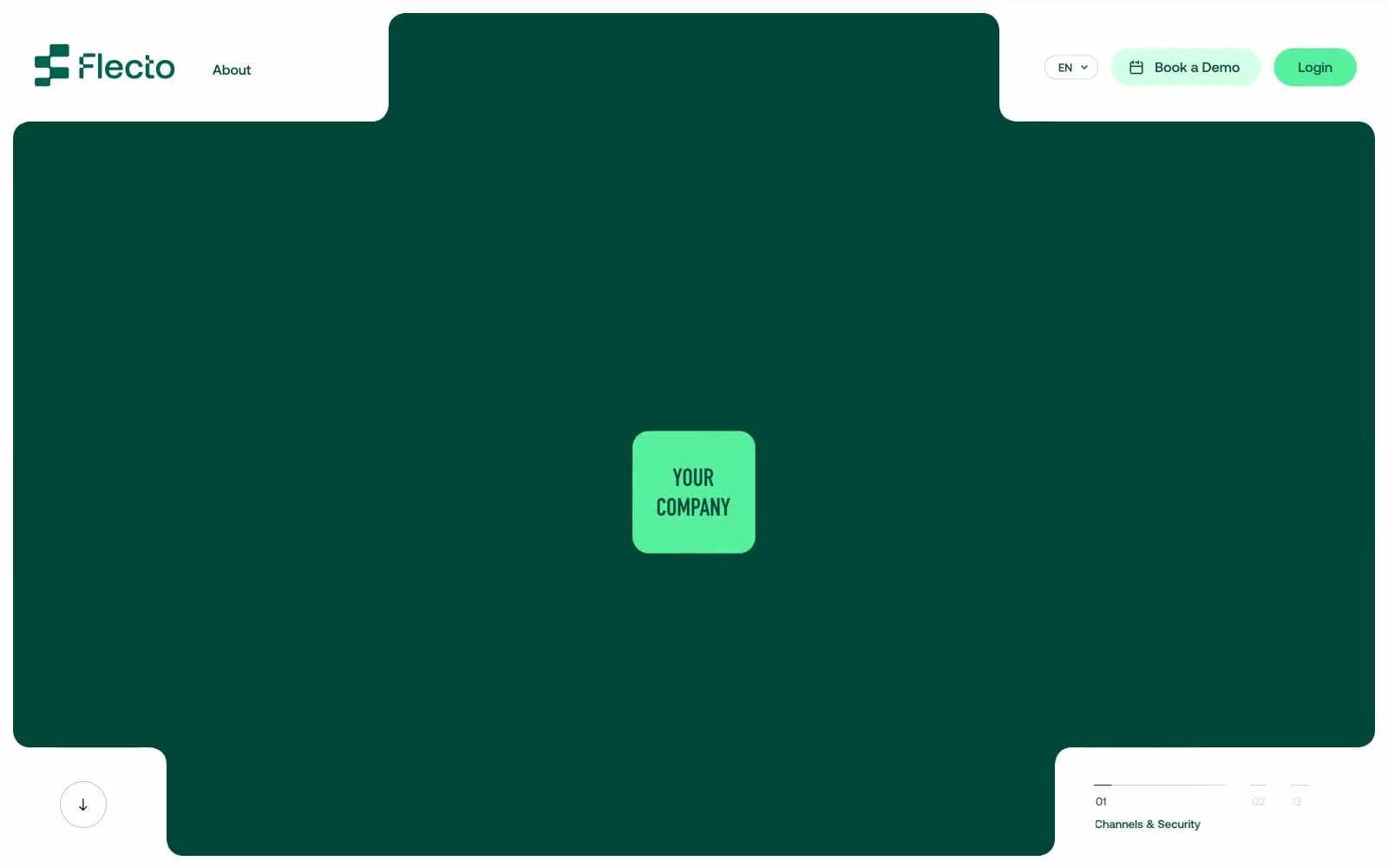
Flecto
SaaS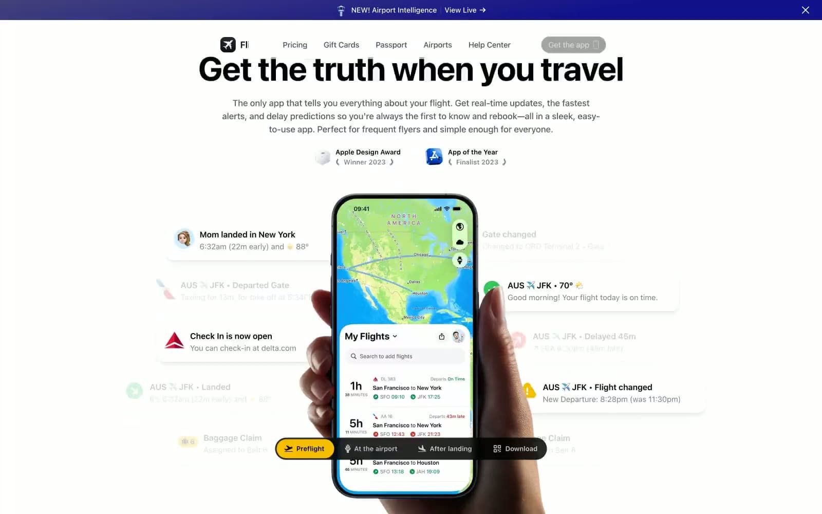
Flighty
SaaS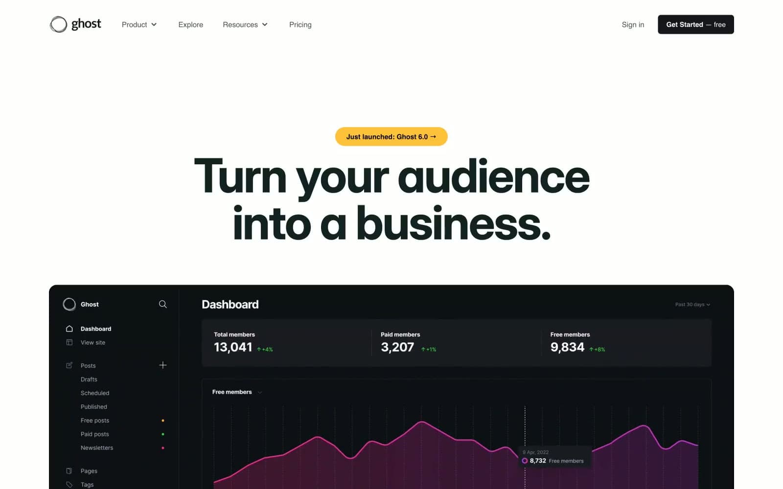
Ghost
SaaS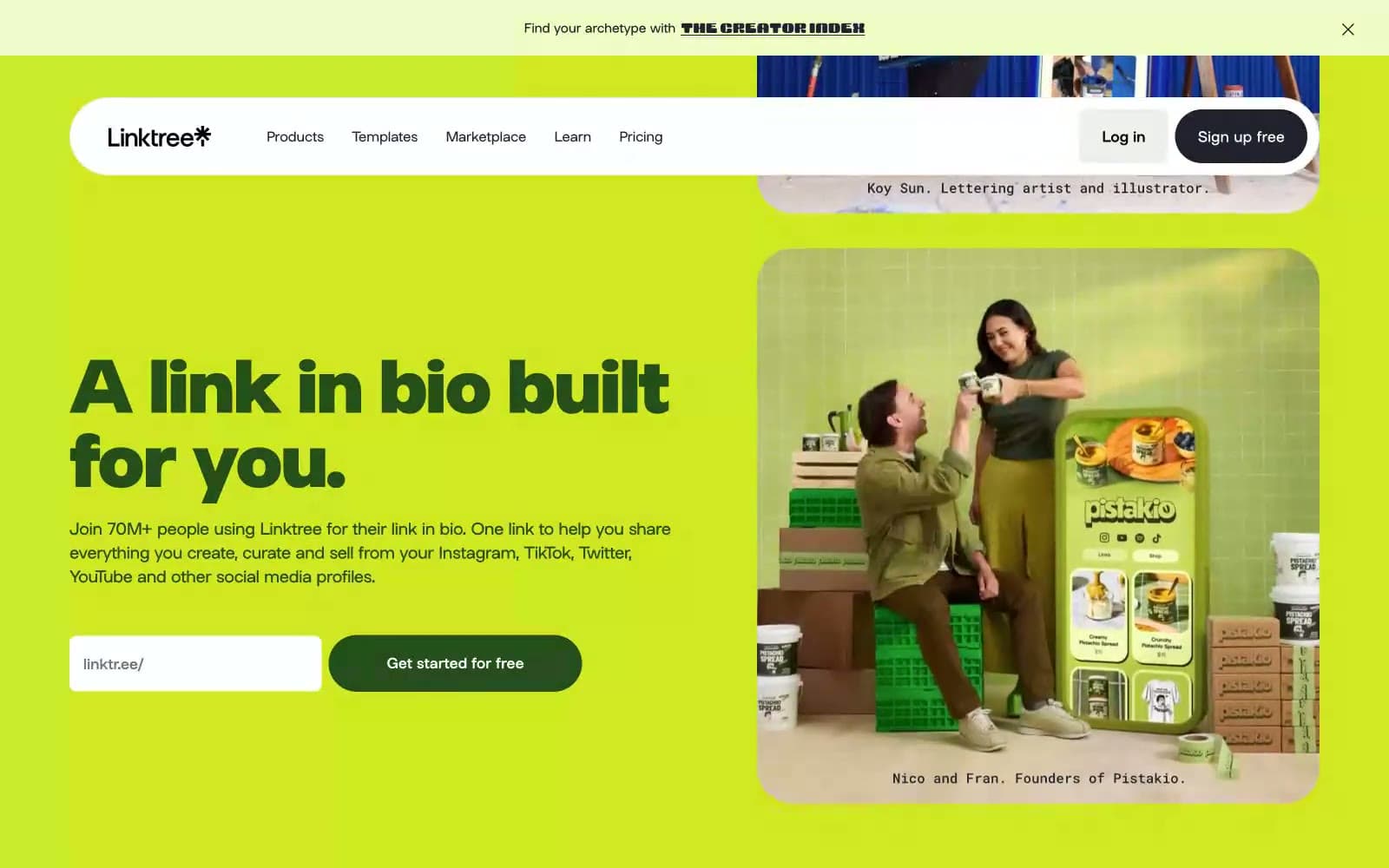
Linktr
SaaS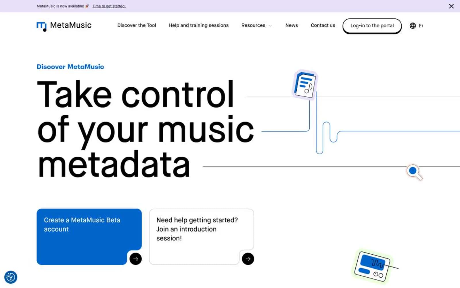
MetaMusic
SaaS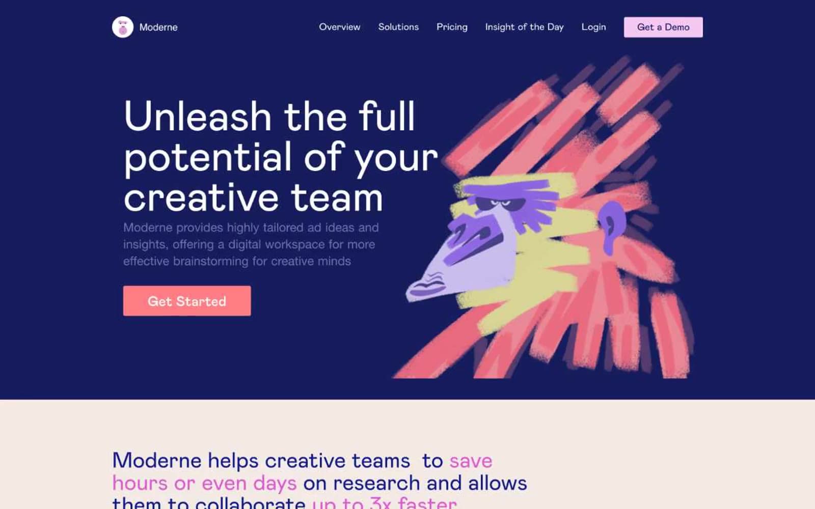
Moderne
SaaS
Passionfroot
SaaS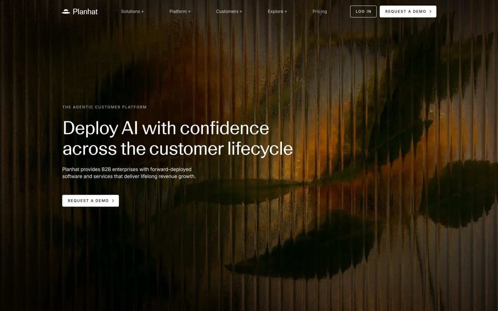
Planhat
SaaS
Prevalent
SaaS


