
The Verge. Midnight control room, mint alerts.
- Media
- Dark theme
- 12 colors
- 5 typefaces
The Verge reads as a late-night newsroom: a near-black canvas where type carries the weight and teal appears only as functional punctuation. The Signal Mint accent (#3cffd0) marks everything that is alive — section labels, author bylines, active states, the subscribe button — while the rest of the page stays achromatic. Display headlines run at Manuka weight 900, 60–107px, creating editorial impact at near-zero line-height, then article bodies switch to Fk Roman Standard serif to separate reading mode from chrome. The vertical 'Verge' wordmark pinned to the left margin is the page's most distinctive structural element — a constant typographic frame, not a logo. Violet (#5200ff) and red-orange (#ff3d00) appear only as section-card fills (Most Popular, Podcasts), giving the monochrome feed two moments of color without breaking the dark mood.
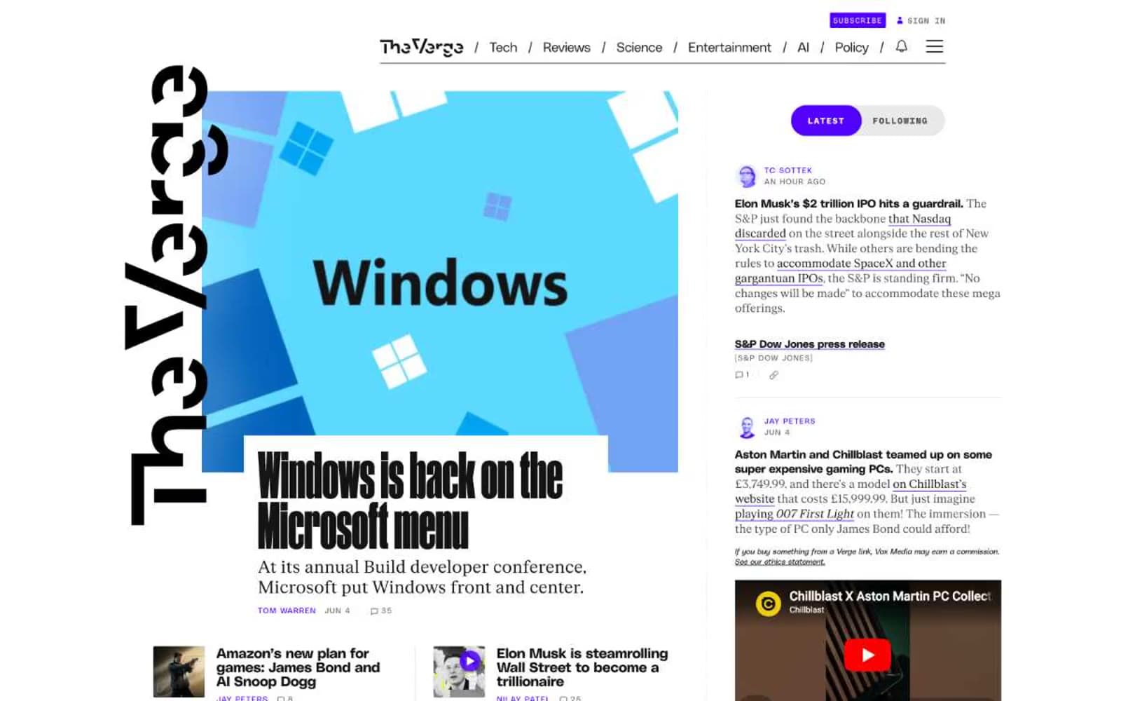
The Verge design system

Brand1
Teal supporting accent for decorative details and low-frequency emphasis. Do not promote it to the primary CTA color
Accent3
Most Popular section card background, ranked-list emphasis
Podcasts section card background, audio content emphasis
Secondary green accent for category labels and subdued highlights
Neutrals8
Deepest darks, shadows, text on light surfaces
Page canvas, primary background, inverted sections
Supporting neutral for secondary UI, dividers, and muted labels. Do not promote it to the primary CTA color
Elevated card surface, image-adjacent panels
Supporting neutral for secondary UI, dividers, and muted labels
Tertiary text, subdued metadata
Light hairline borders, high-contrast meta text on dark
Primary text, inverted surfaces, light icons
Try a pairing
Pick any two colors from the palette to check whether text stays readable on top.
Aa
Onyx on Signal Mint
16.41 : 1 contrast
- Body textPasses AA 4.5
- Large textPasses AA 3
- StrictPasses AAA 7
More DESIGN.md files. Same web, different personalities.

Stripe Press
Media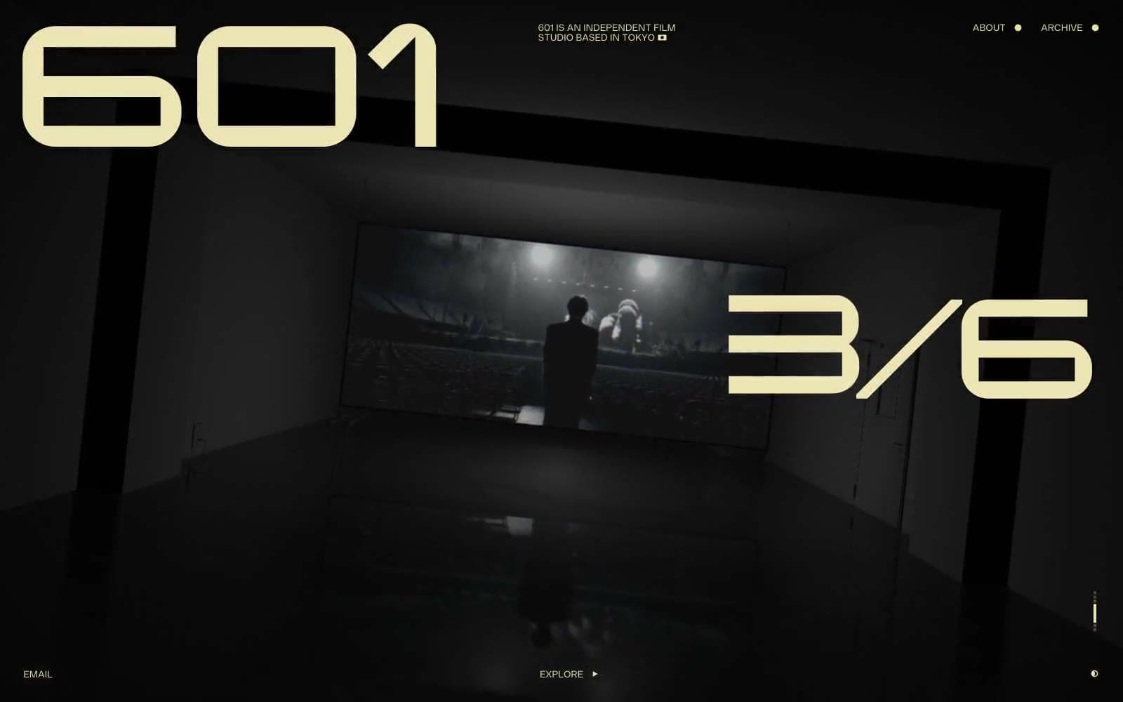
601 Inc.
Media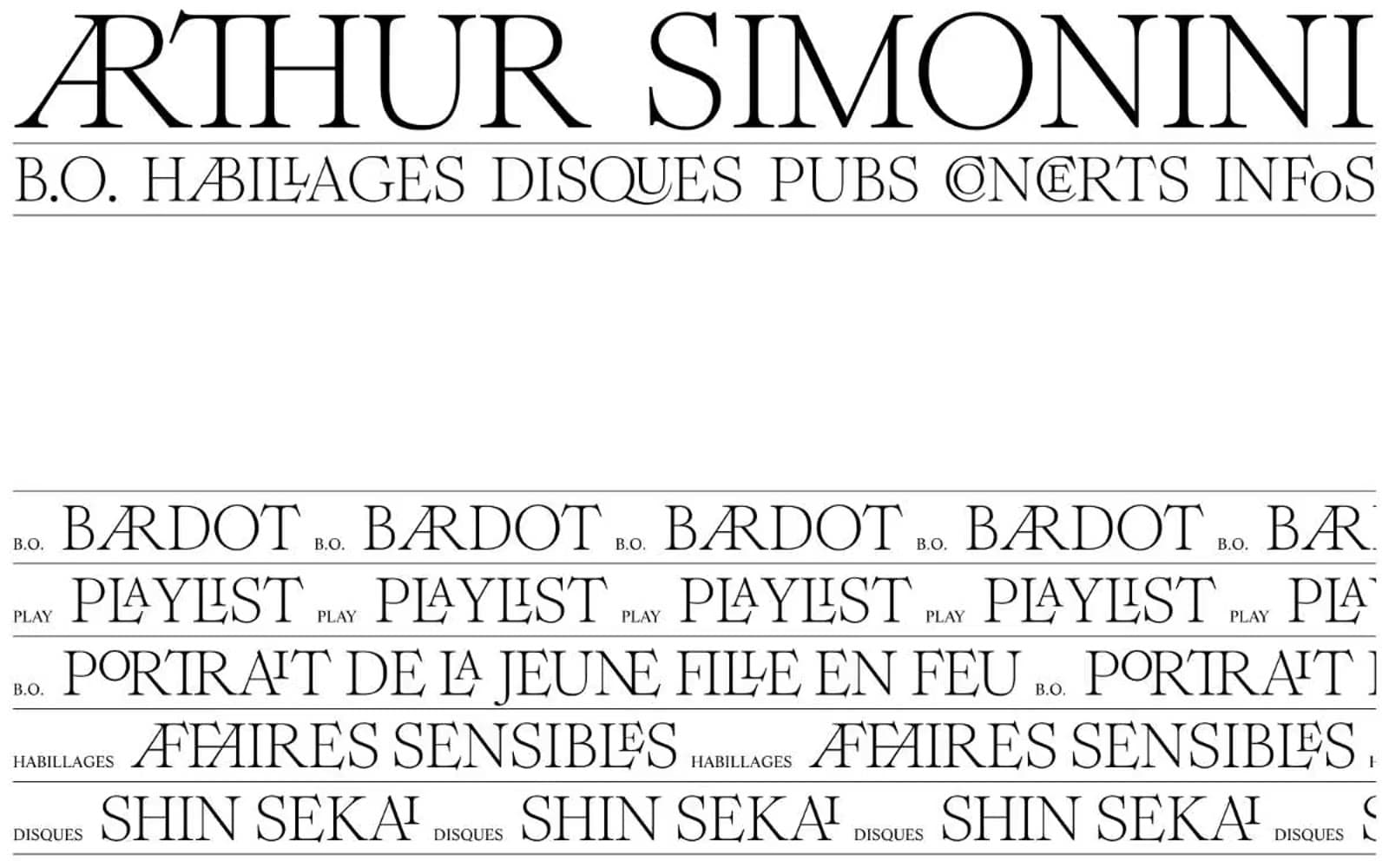
Arthursimonini
Media

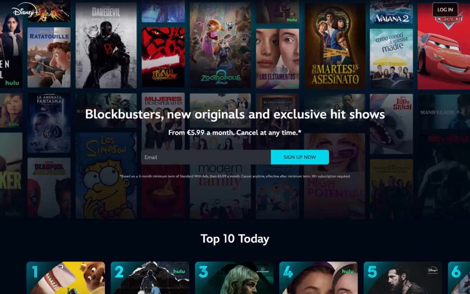
Disney+
Media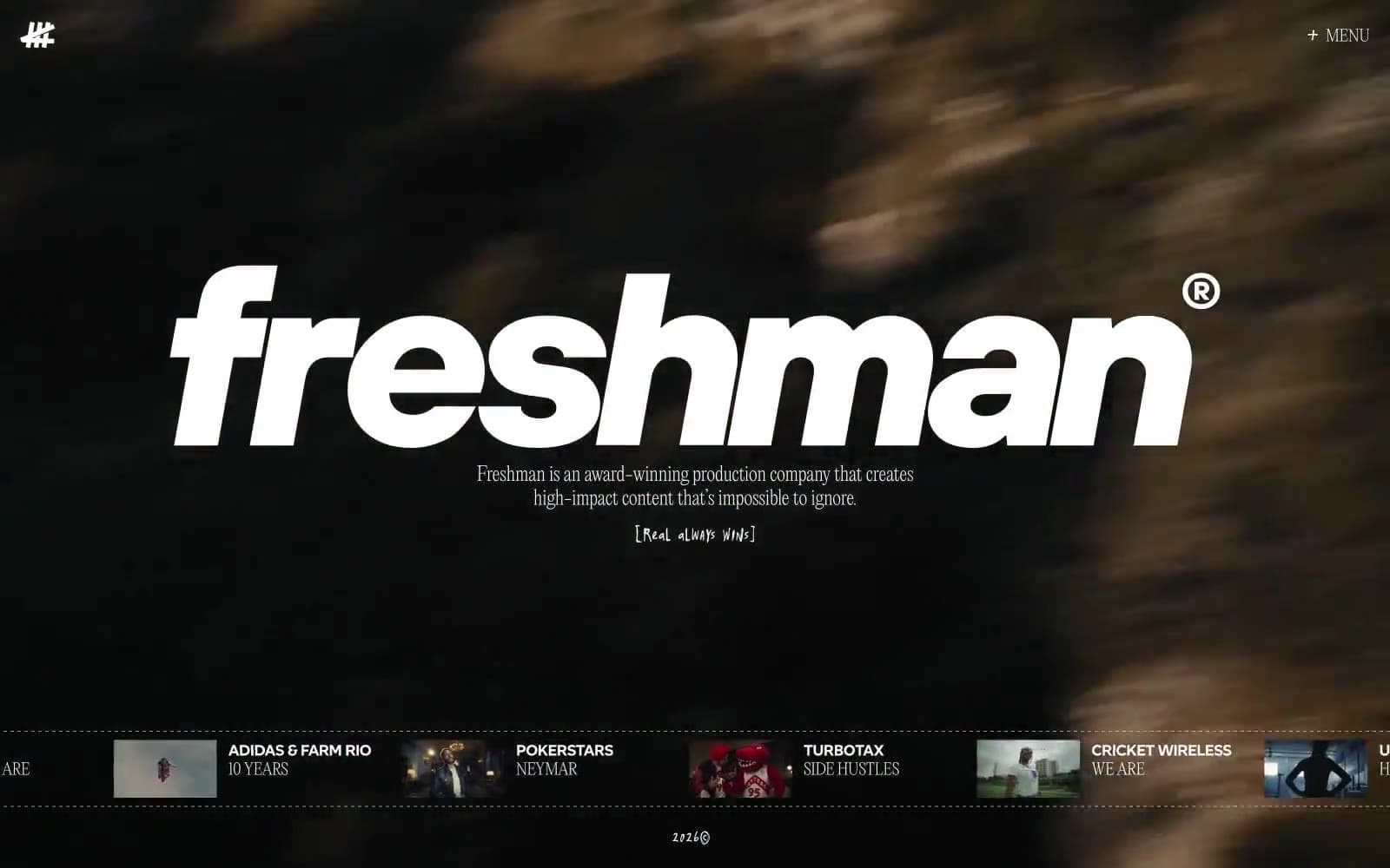
Freshman
Media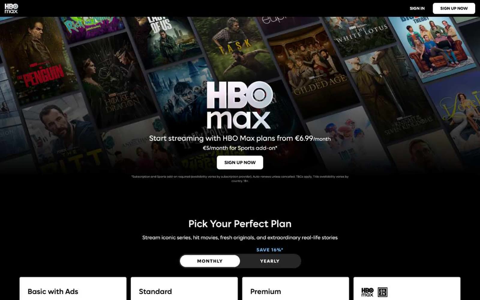
HBO Max
Media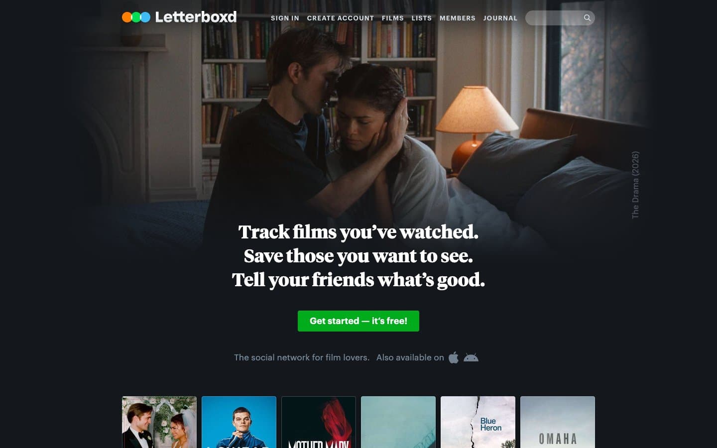
Letterboxd
Media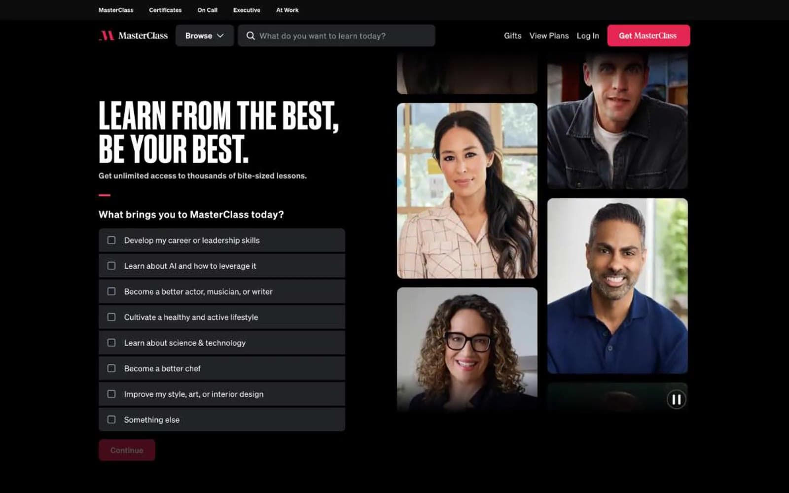
MasterClass
Media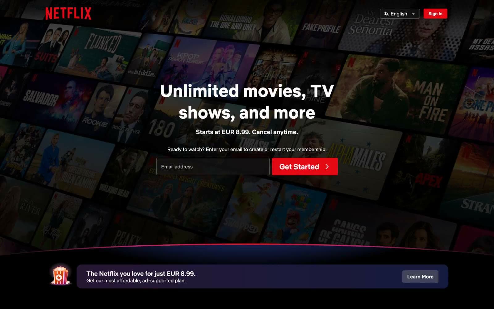
Netflix Spain
Media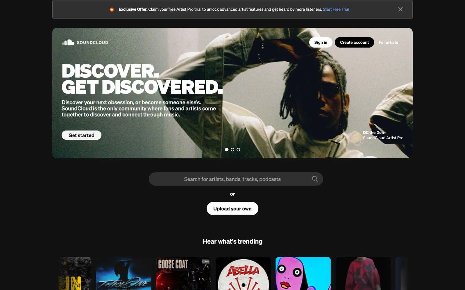
SoundCloud
Media


