
Disney+. Cinematic void with electric spotlight.
- Media
- Dark theme
- 13 colors
- 1 typeface
Disney+ operates as a dark theatrical canvas: a near-black void ( #040714) where movie and series artwork is the protagonist, and UI chrome recedes into the periphery. The interface relies on extreme contrast (white #fafafa on near-black) and a single chromatic accent — electric cyan (#33ddff) — that functions as the only reason to look away from the content. Typography is a single custom sans-serif (Inspire) at modest sizes, with positive letter-spacing (0.025em) that gives even short labels a measured, premium cadence. The system is content-first: cards are poster-aspect tiles, sections are horizontal scroll rails, and the only elevated color decisions (cyan CTA fills, teal link text) exist to drive conversion, never decoration.
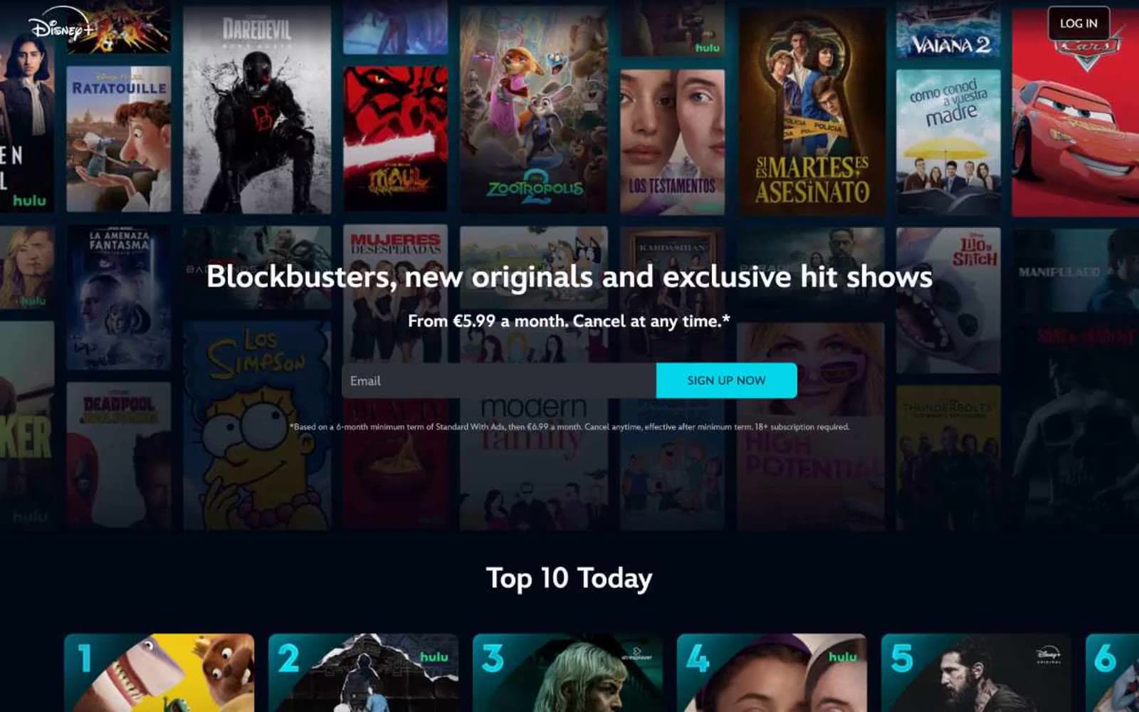
Disney+ design system

Brand1
Primary CTA buttons (SIGN UP NOW, plan tier cards) — the sole chromatic action color; neon-cyan against the void creates cinema-marquee urgency
Accent1
Accent text, promotional price highlights (€4.99), link emphasis, body emphasis — the slightly darker teal sibling used for inline chromatic moments that aren't buttons
Neutrals11
Deepest surface layer, navigation background — the near-pure black undercarriage beneath the canvas
Page background, hero background, primary canvas — deep near-black navy that absorbs the eye and makes artwork pop
Footer background, alternate dark surface — slightly warmer dark for depth variation
Gray text accent for links, tags, and emphasized short phrases. Do not promote it to the primary CTA color
Dark text for inverted or high-contrast button labels on light fills
Elevated dark surface — used for cards or panels sitting above the canvas
Neutral form states, badge text, and quiet UI feedback where color should stay understated. Do not promote it to the primary CTA color
Body text, secondary text, helper copy — muted gray for non-primary reading
List text, icon fills, secondary metadata — the lightest level of secondary text
Border color used at scale (hairs, dividers, card edges) — the structural skeleton of the UI
Primary text, heading text, icon fills, link text, button labels — the dominant light element across the interface
Try a pairing
Pick any two colors from the palette to check whether text stays readable on top.
Aa
Abyss on Electric Cyan
12.83 : 1 contrast
- Body textPasses AA 4.5
- Large textPasses AA 3
- StrictPasses AAA 7
More DESIGN.md files. Same web, different personalities.
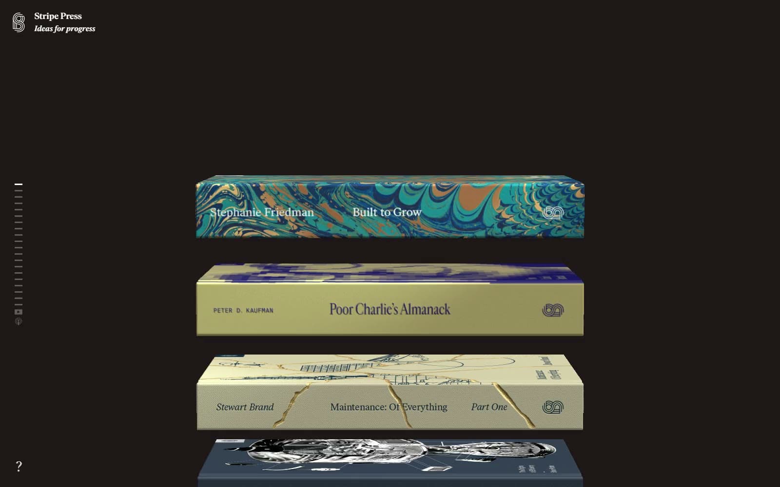
Stripe Press
Media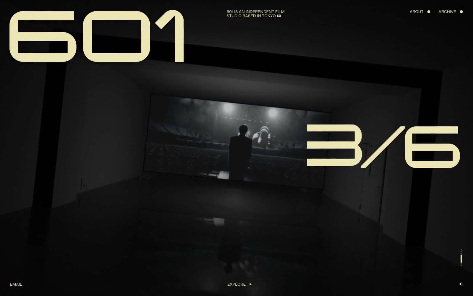
601 Inc.
Media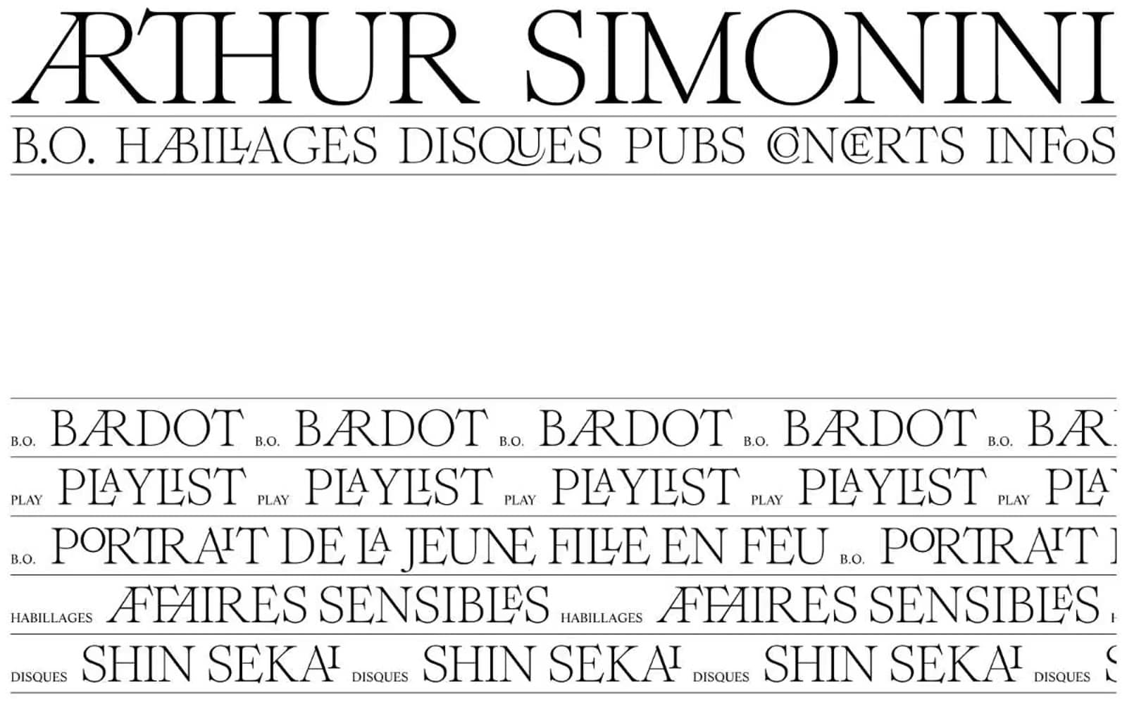
Arthursimonini
Media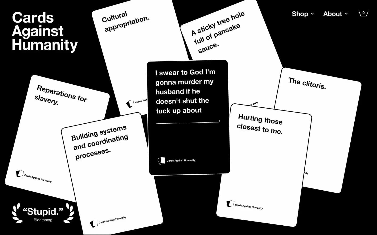
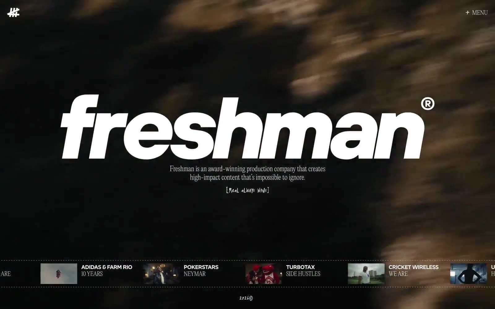
Freshman
Media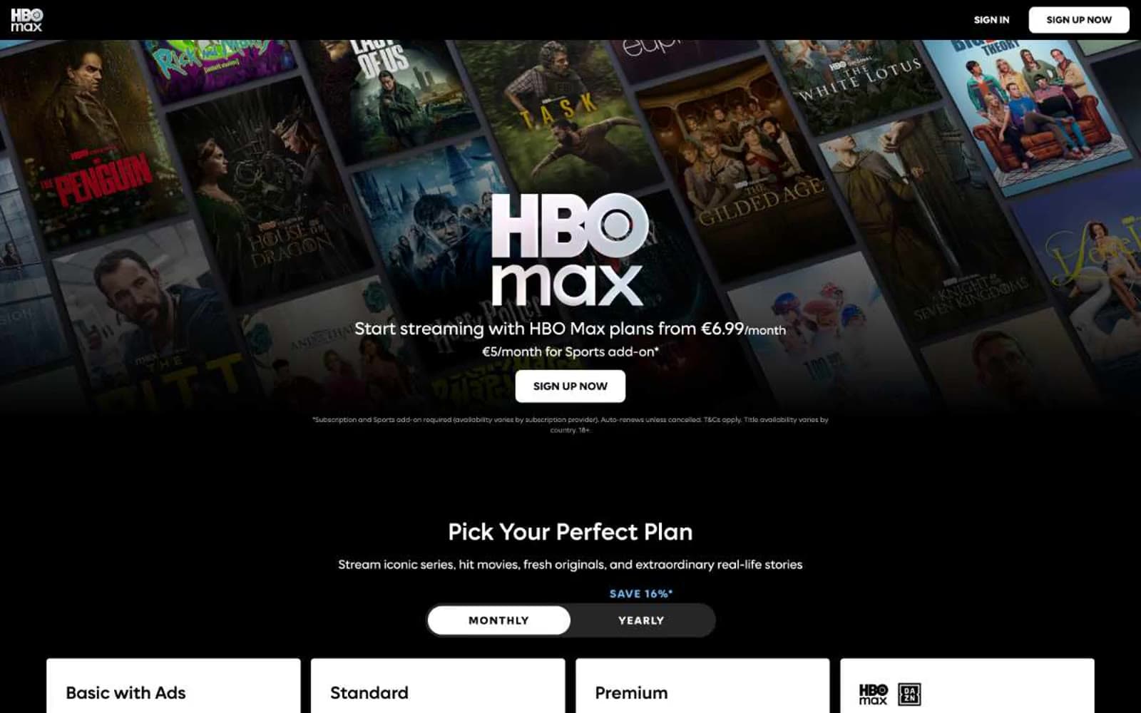
HBO Max
Media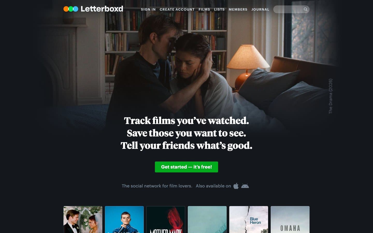
Letterboxd
Media
MasterClass
Media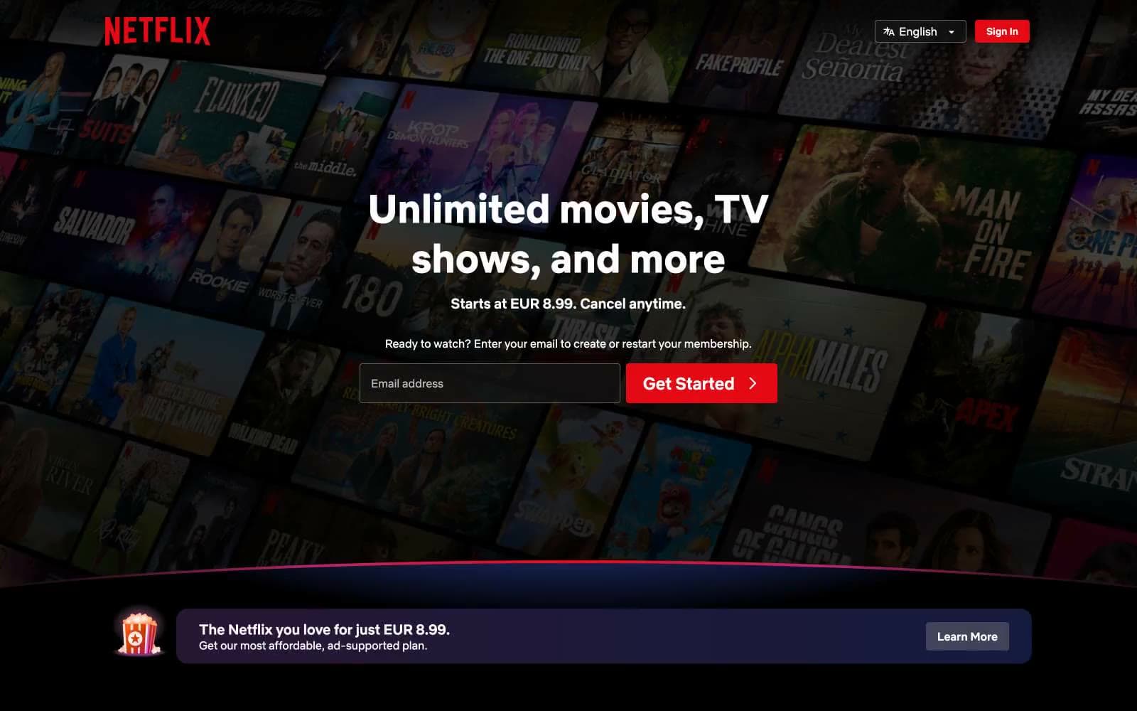
Netflix Spain
Media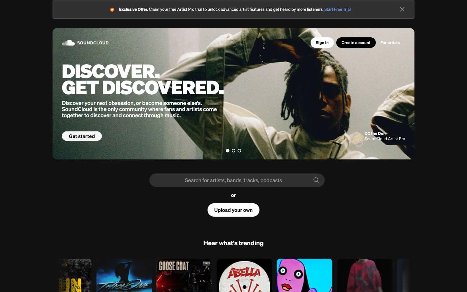
SoundCloud
Media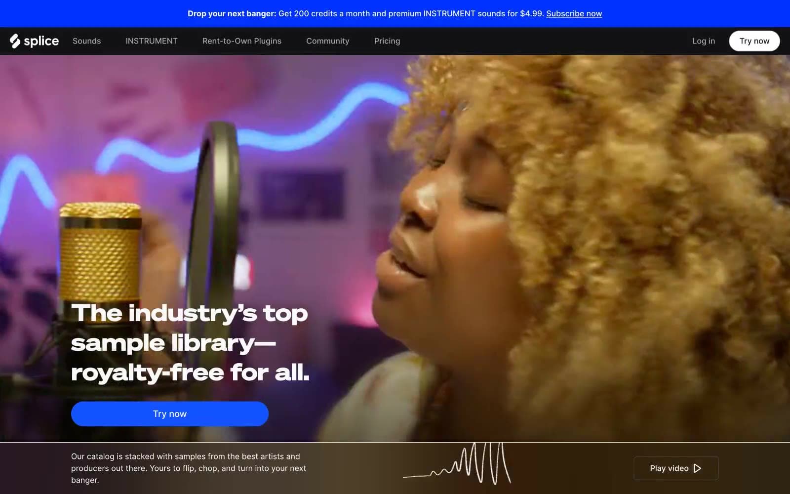
Splice
Media


