
601 Inc.. Warm film marquee in darkness.
- Media
- Dark theme
- 3 colors
- 1 typeface
601 is a Tokyo film studio whose visual system reduces the web to the ingredients of cinema itself: a near-black void, one warm cream tone pulled from aged celluloid, and a single custom typeface rendered at architectural scale. The entire palette is functional — cream for everything that addresses the viewer, black for the screen behind it — which forces every compositional decision to be about scale, photography, and silence rather than chrome or ornament. Borders are 1px hairlines, elevation is absent, and the only structure is the photograph itself and the oversized numerals that float beside it like a screening schedule. Every page behaves like a single reel unspooling: a wordmark, a date, a still, and room to breathe.
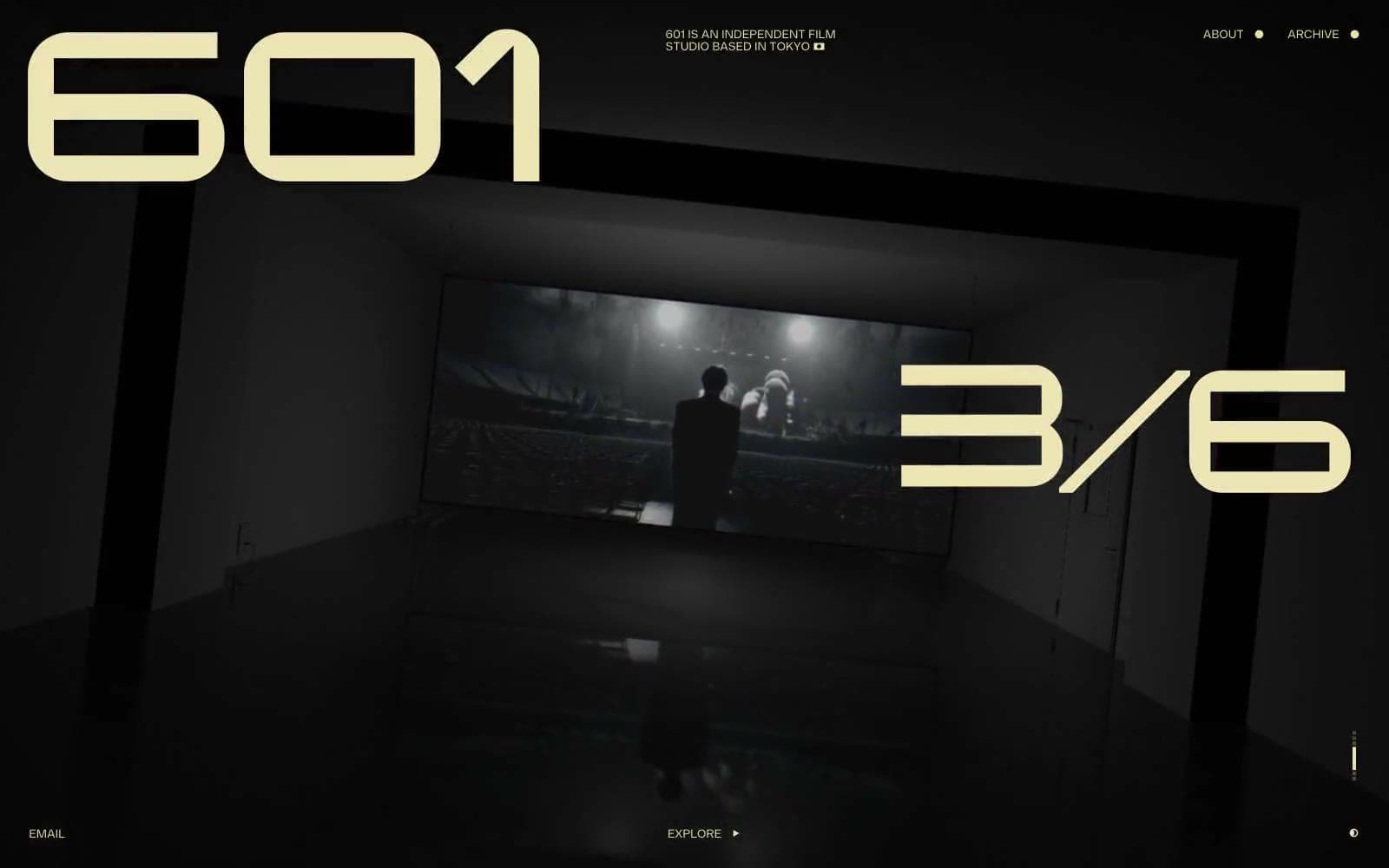
601 Inc. design system

Brand1
Primary text, all icon strokes, 1px hairline borders, and the only outlined-link action border in the system — a warm off-white that reads as aged film stock against black
Neutrals2
Deep canvas void used for the darkest recesses of the page and behind embedded media; the floor beneath everything
Atmospheric mid-surface visible around and between film stills — a desaturated warm olive-black that softens the page from pure void into projection-room dimness
Try a pairing
Pick any two colors from the palette to check whether text stays readable on top.
Aa
Projection Black on Celluloid Cream
16.32 : 1 contrast
- Body textPasses AA 4.5
- Large textPasses AA 3
- StrictPasses AAA 7
More DESIGN.md files. Same web, different personalities.

Stripe Press
Media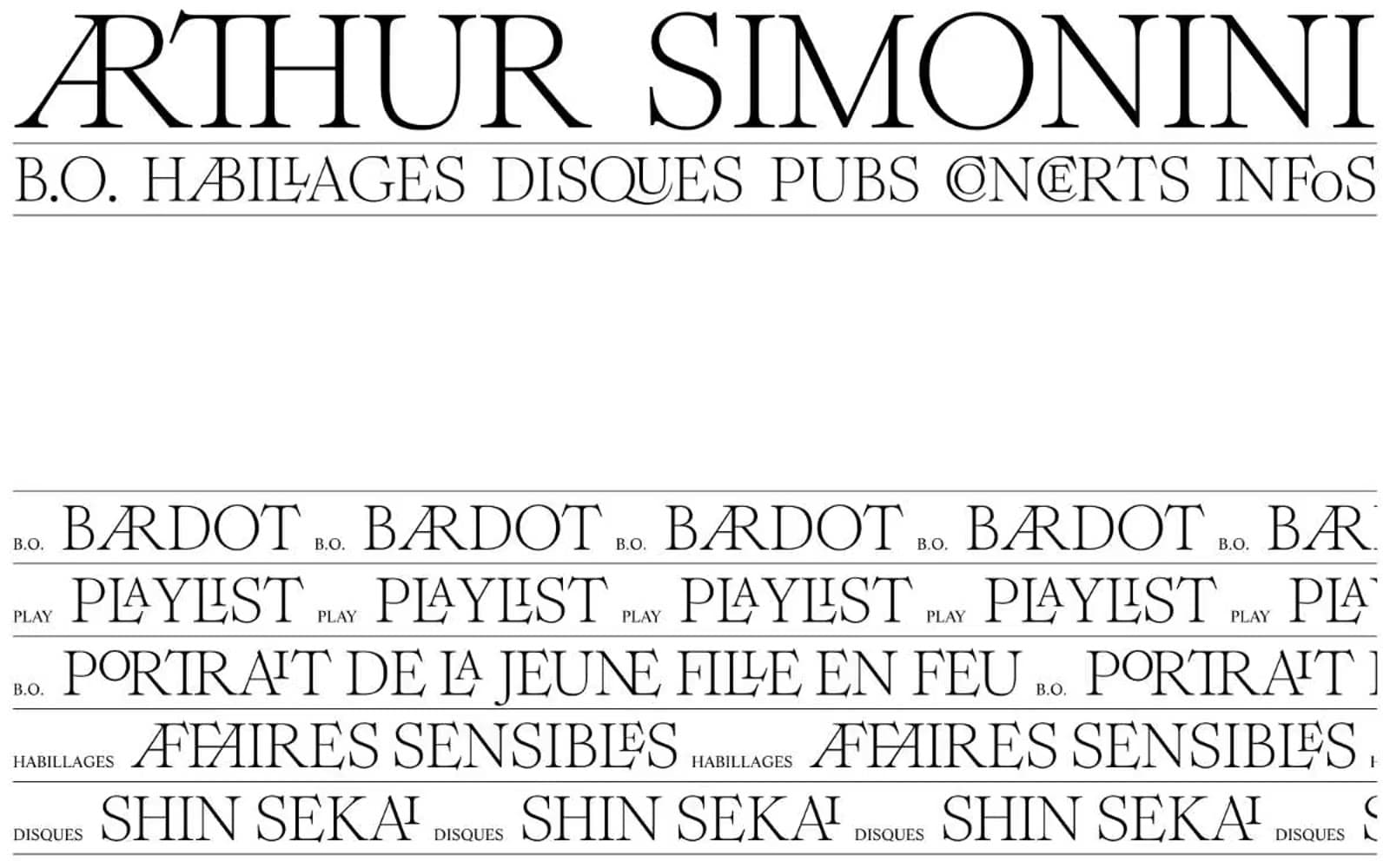
Arthursimonini
Media

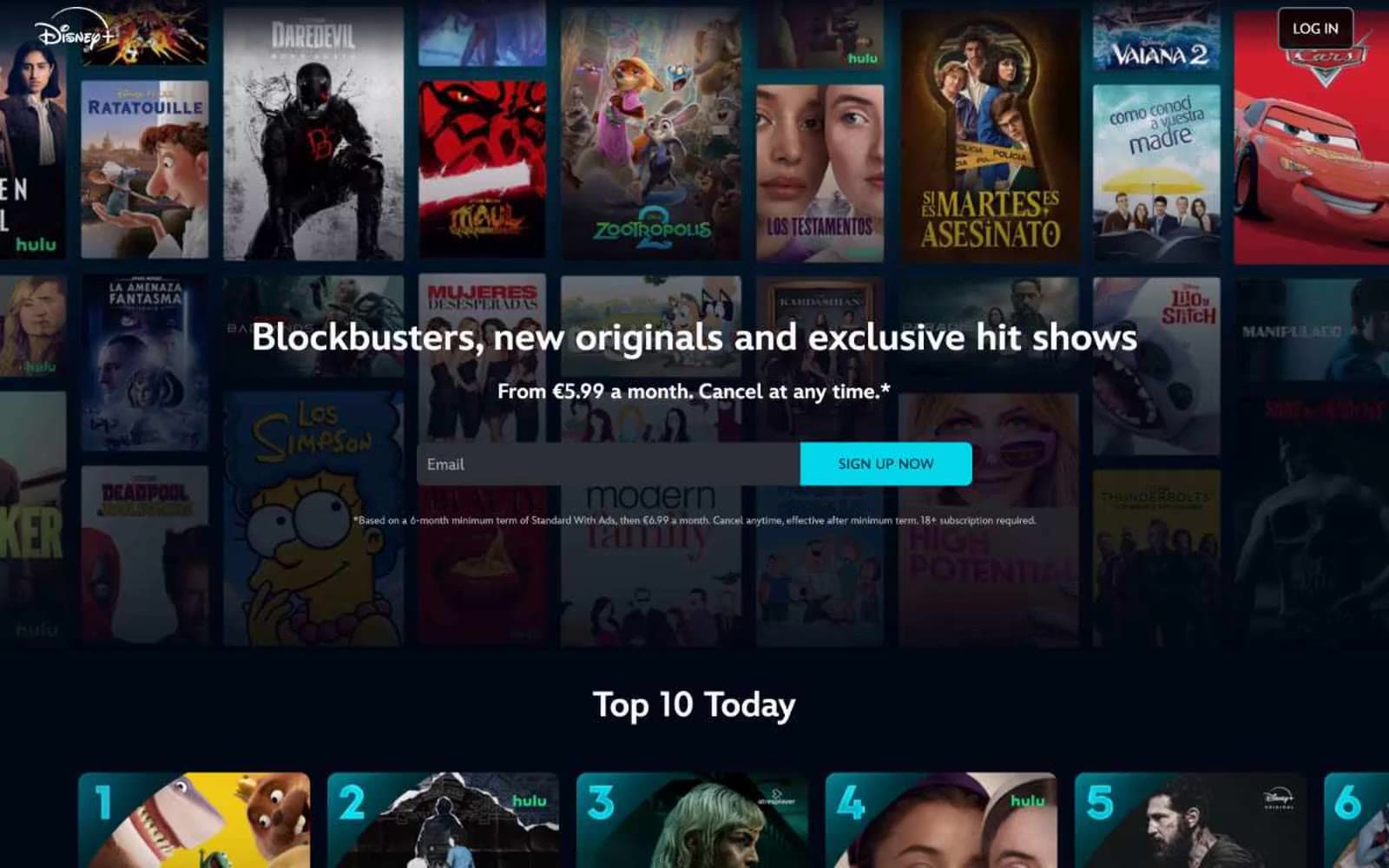
Disney+
Media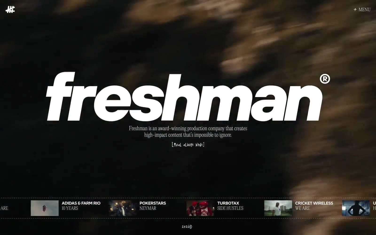
Freshman
Media
HBO Max
Media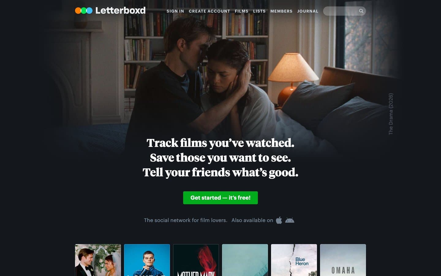
Letterboxd
Media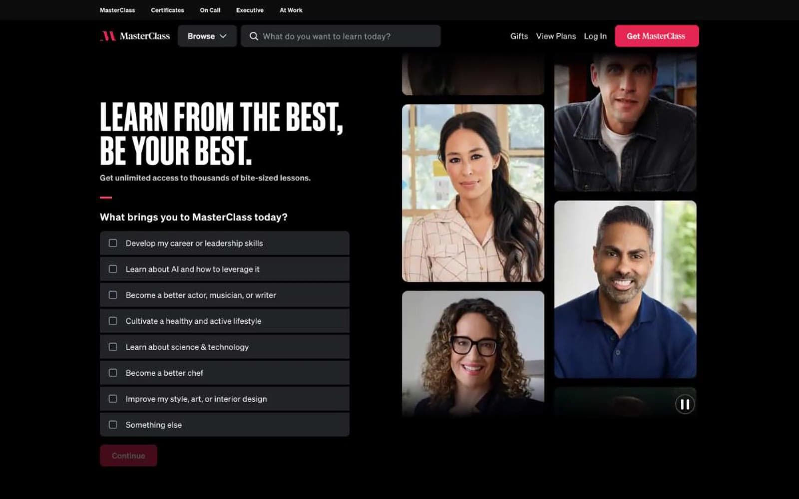
MasterClass
Media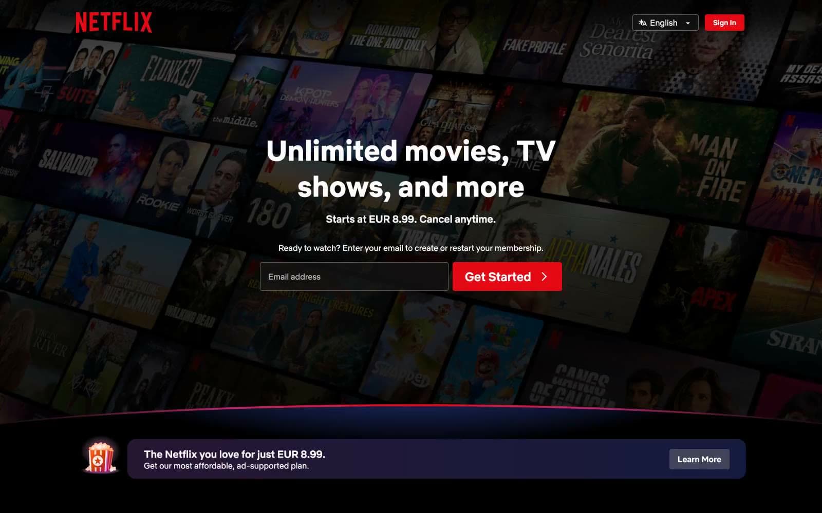
Netflix Spain
Media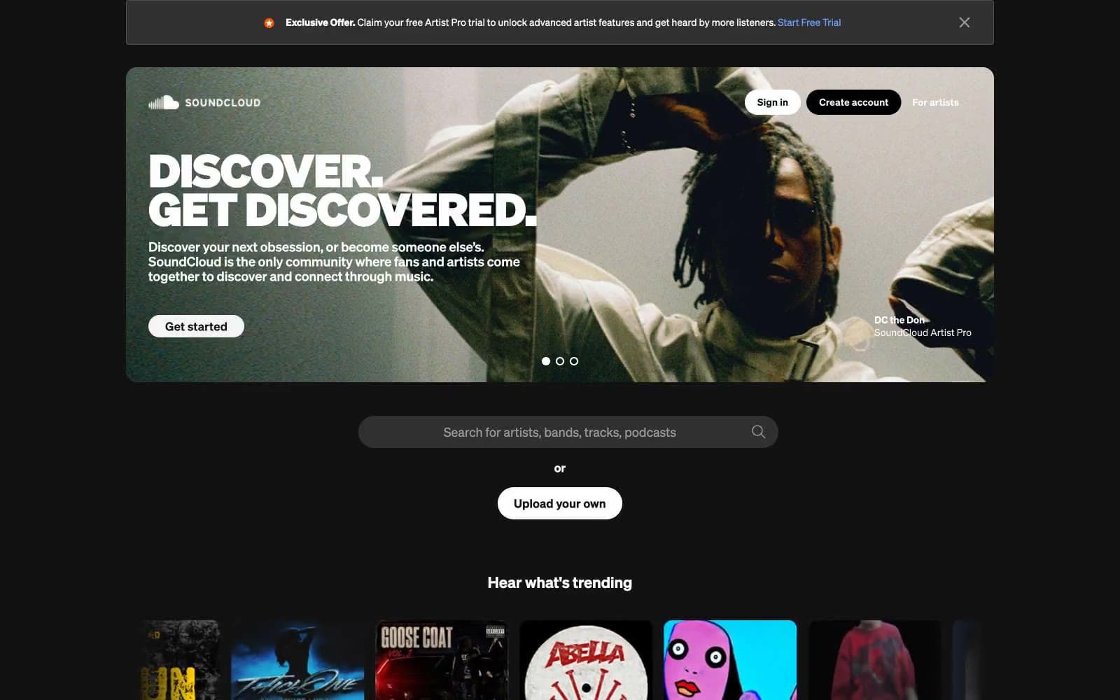
SoundCloud
Media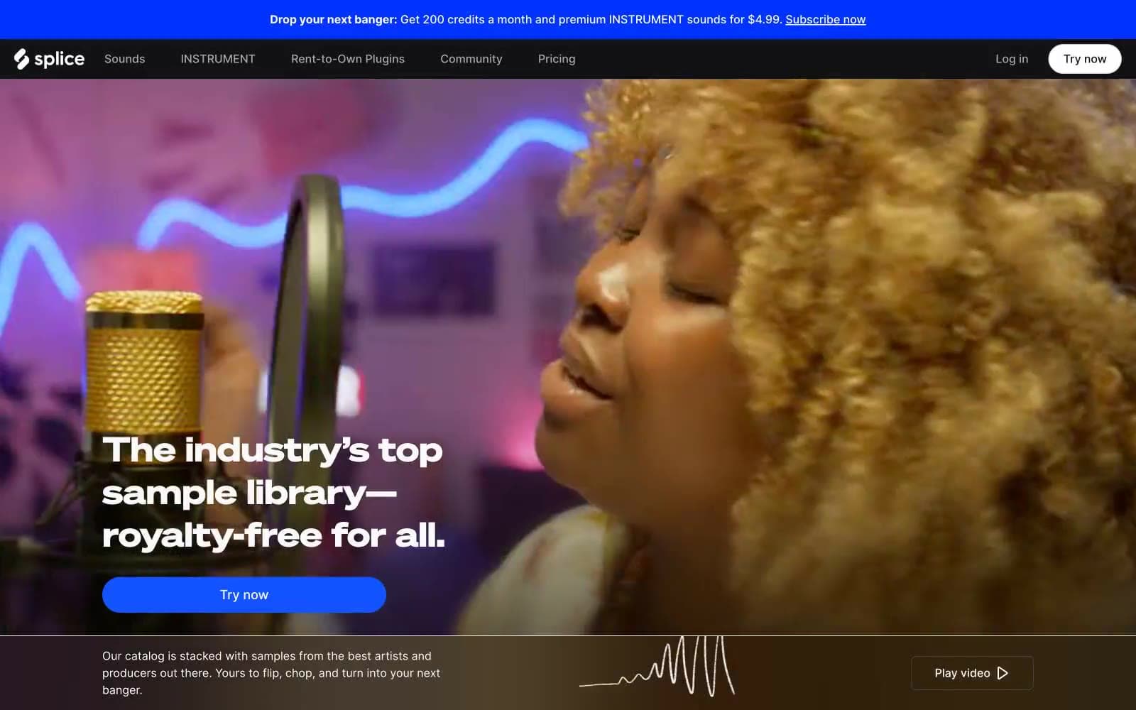
Splice
Media


