
Arthursimonini. Printed film programme in black ink.
- Media
- Dark theme
- 2 colors
- 2 typefaces
Arthur Simonini is a high-contrast editorial showcase built on absolute monochrome: pure black canvas, pure white type, and nothing in between. The visual identity is carried entirely by two custom serif faces — a quiet text-grade serif for navigation and metadata, and an ornamental didone with discretionary ligatures reserved for oversized display moments. Layout is ruled by hairline white borders that act as section dividers and grid rails, not by cards, shadows, or color. Content is presented like a printed film programme or a French luxury maison lookbook: typographic marquees scroll repeated section titles, film posters fill grids in grayscale, and generous negative space lets the ligature-rich display type breathe. No color, no gradients, no fills, no elevation — the entire system is an exercise in typographic and structural discipline.
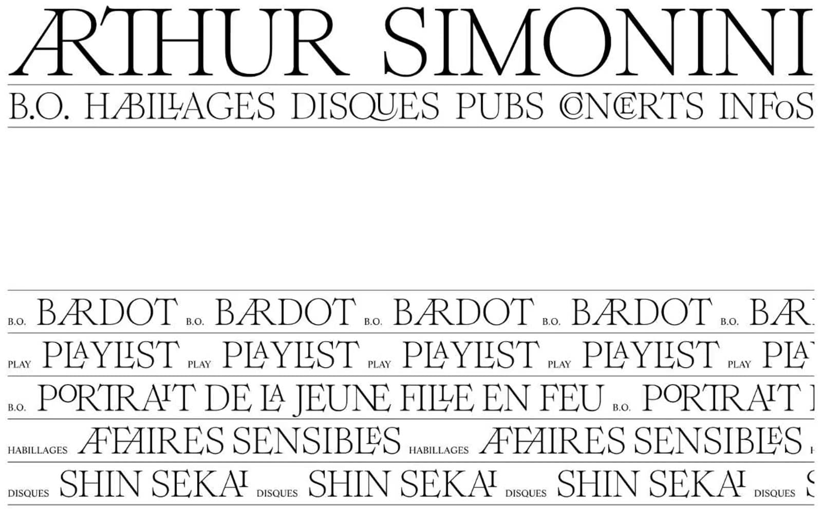
Arthursimonini design system

Neutrals2
Page canvas, nav background, poster grid ground
All text, hairline section borders, image borders, icon strokes
Try a pairing
Pick any two colors from the palette to check whether text stays readable on top.
Aa
Bone on Obsidian
21.00 : 1 contrast
- Body textPasses AA 4.5
- Large textPasses AA 3
- StrictPasses AAA 7
More DESIGN.md files. Same web, different personalities.

Stripe Press
Media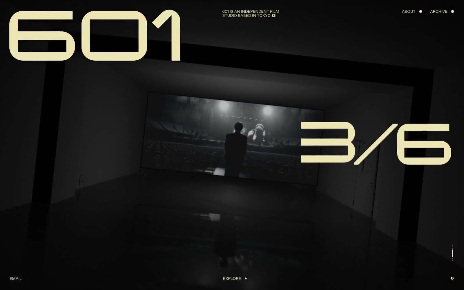
601 Inc.
Media
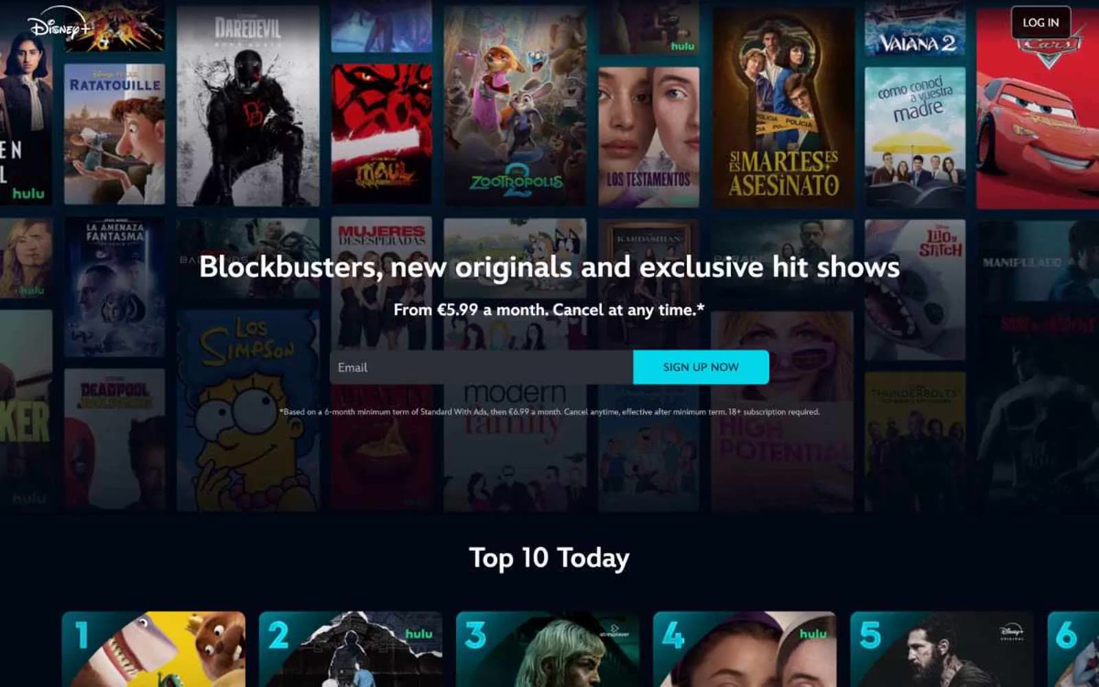
Disney+
Media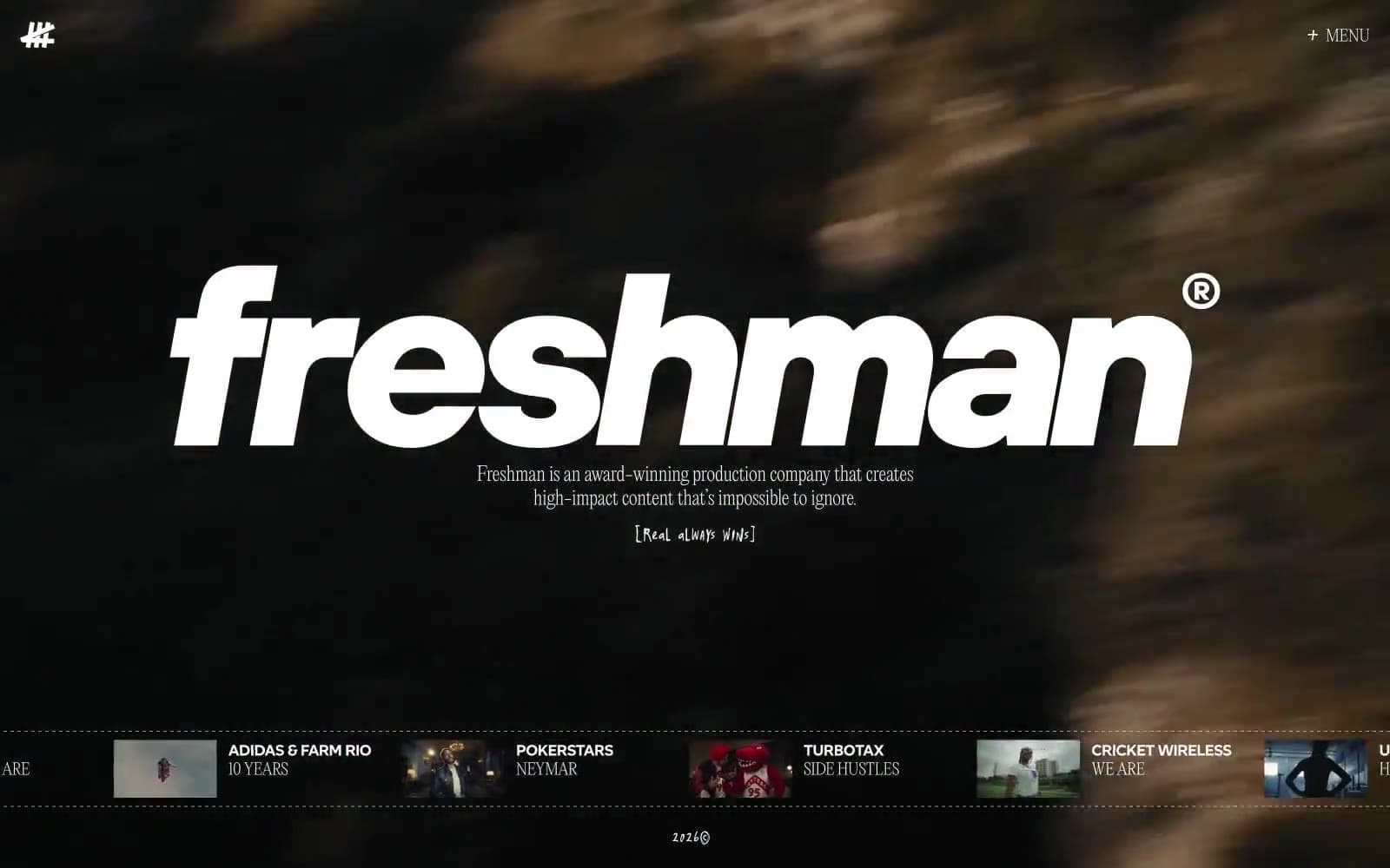
Freshman
Media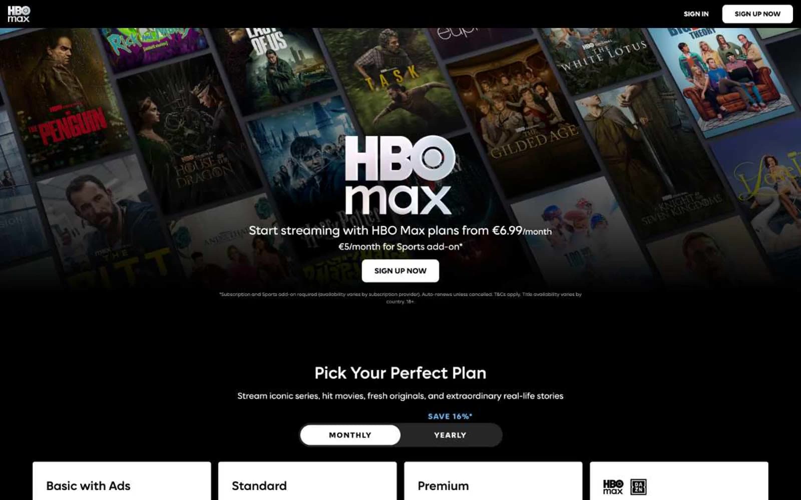
HBO Max
Media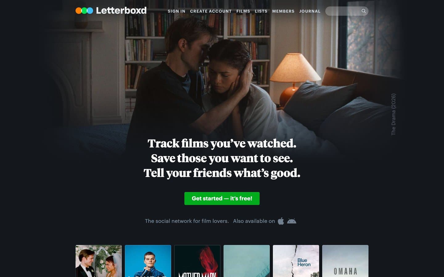
Letterboxd
Media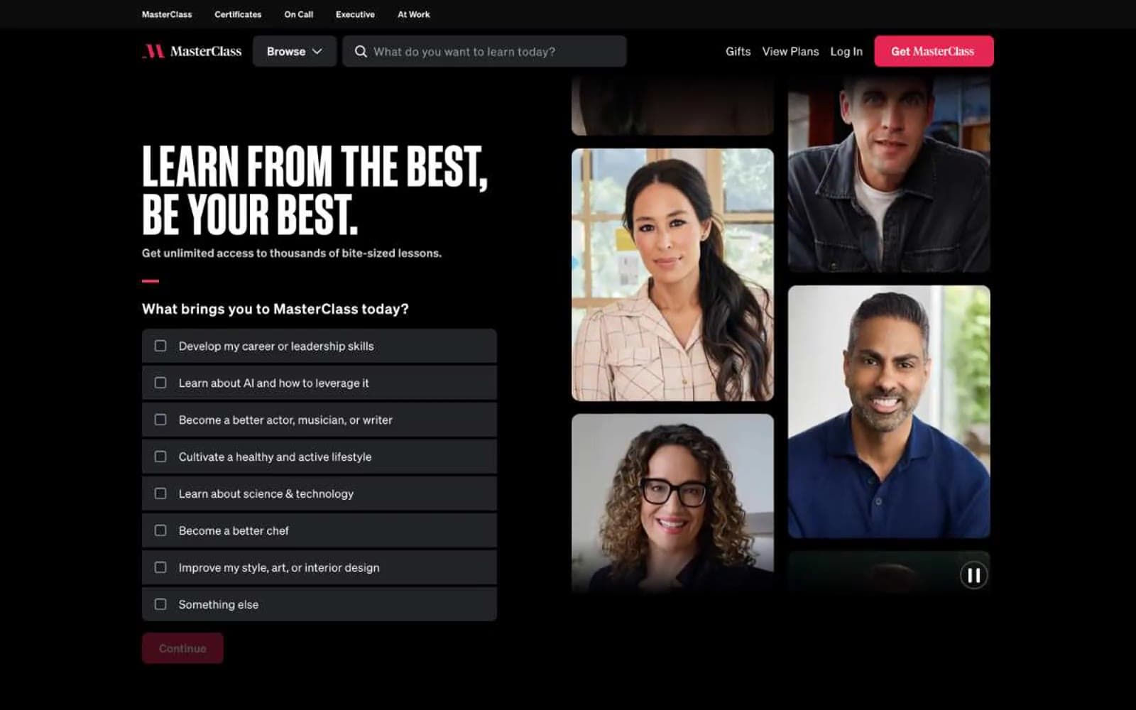
MasterClass
Media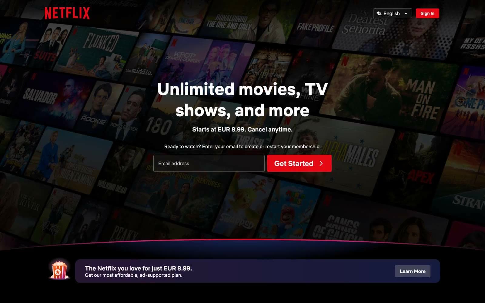
Netflix Spain
Media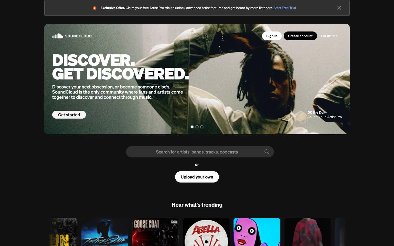
SoundCloud
Media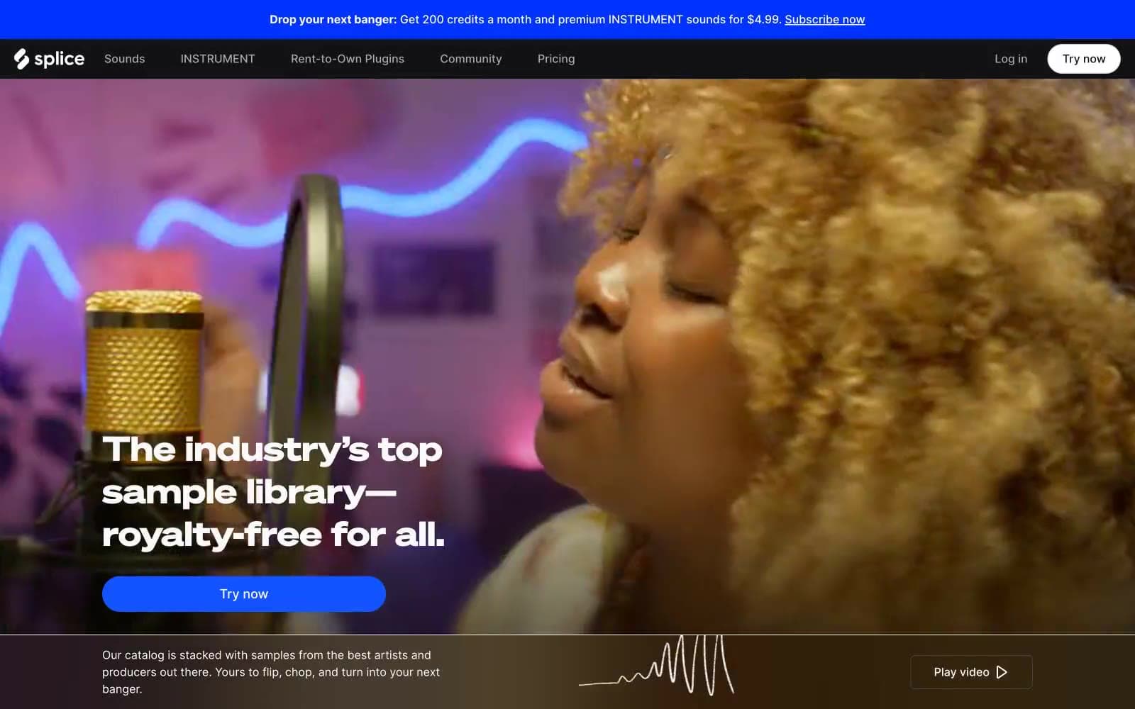
Splice
Media


