
Freshman. Cinema title card on black velvet.
- Media
- Dark theme
- 4 colors
- 4 typefaces
Freshman runs a near-black canvas with almost no color noise — the white type and the lone red accent do all the heavy lifting. The visual language borrows from high-end print and cinema: a massive italicized wordmark anchors every screen, type is set ultra-light (weight 200) in Editorial New and tight in Altform, and a thin horizontal project ticker acts as the page's spine. Surfaces are flat with no shadows or gradients; hierarchy comes from scale and weight contrast, not elevation. Interaction is restrained — a single + MENU trigger, bracket-wrapped editorial labels, and a project reel that feels like a film festival credit roll rather than a SaaS nav.
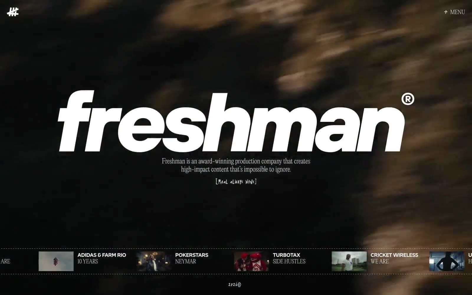
Freshman design system

Accent1
Sparingly-applied accent for active states, marquee highlights, and high-emphasis punctuation — used as a single saturated note against the monochrome system
Neutrals3
Base canvas and primary background — the default surface for every page
Secondary surface for icon wells, sub-panels, and slight tonal lift above the pure-black canvas
Primary text, logotype fill, border strokes, and the dominant foreground on the dark canvas — carries 92% of all color instances
Try a pairing
Pick any two colors from the palette to check whether text stays readable on top.
Aa
Carbon Black on Signal Red
5.62 : 1 contrast
- Body textPasses AA 4.5
- Large textPasses AA 3
- StrictFails AAA 7
More DESIGN.md files. Same web, different personalities.

Stripe Press
Media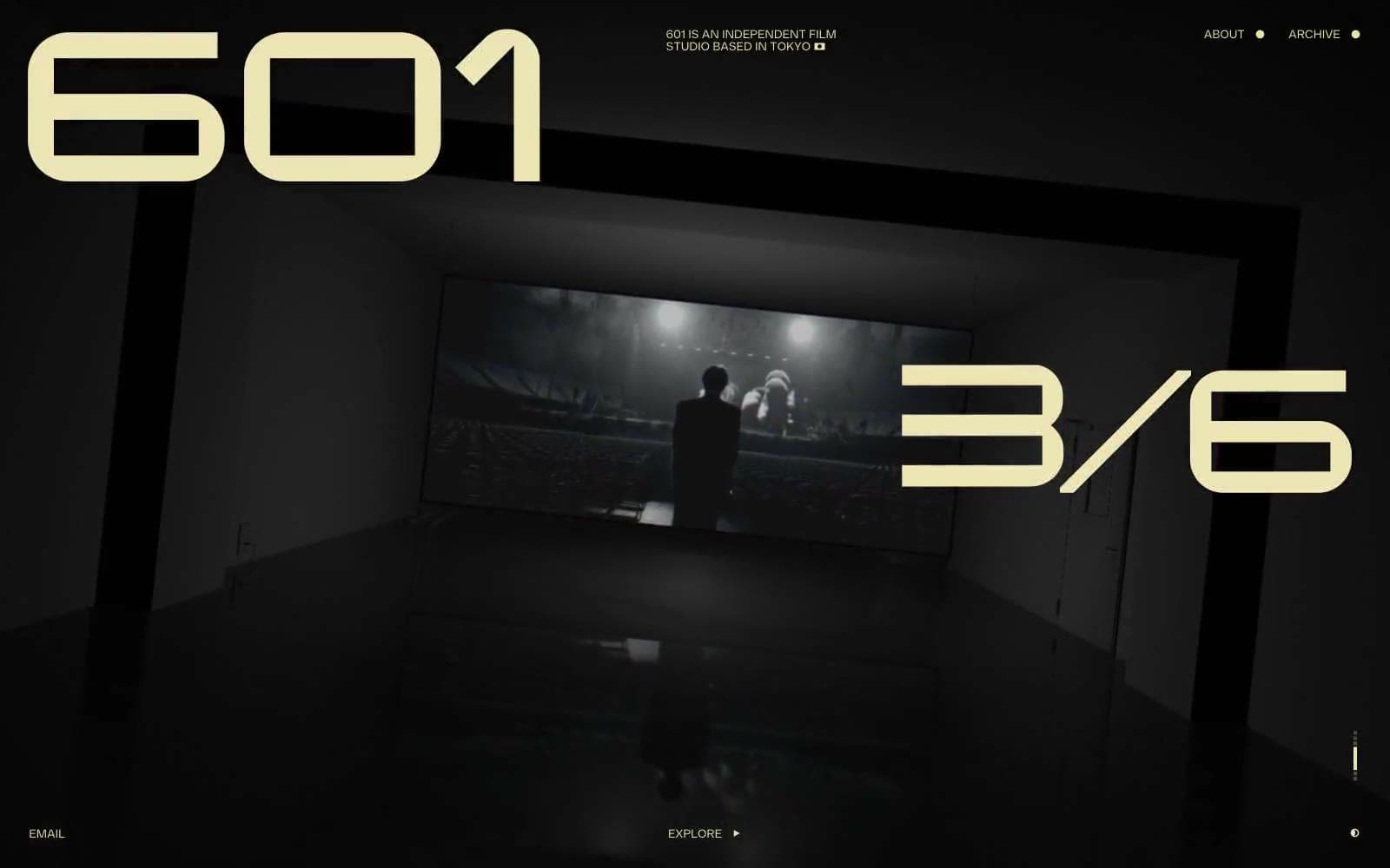
601 Inc.
Media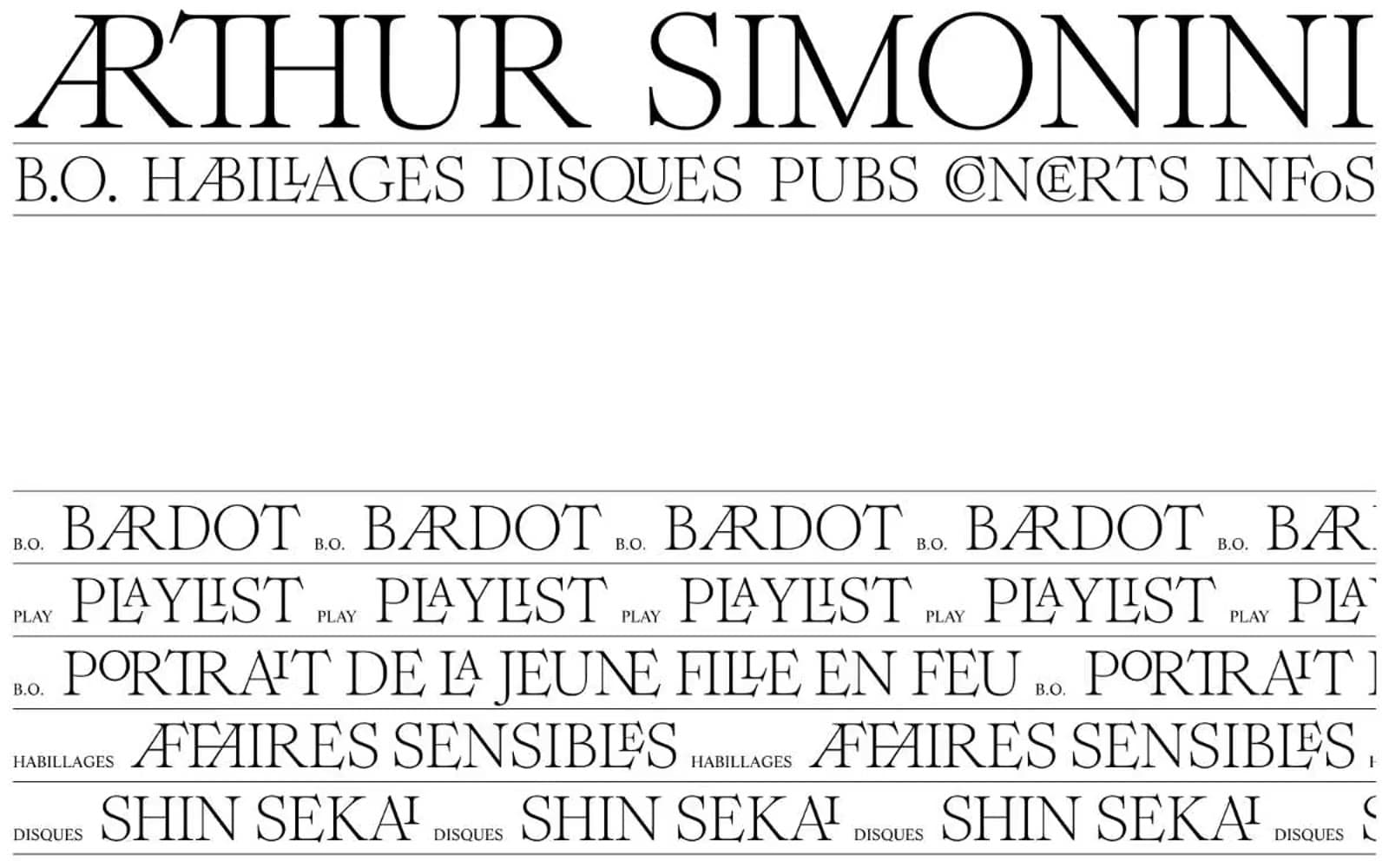
Arthursimonini
Media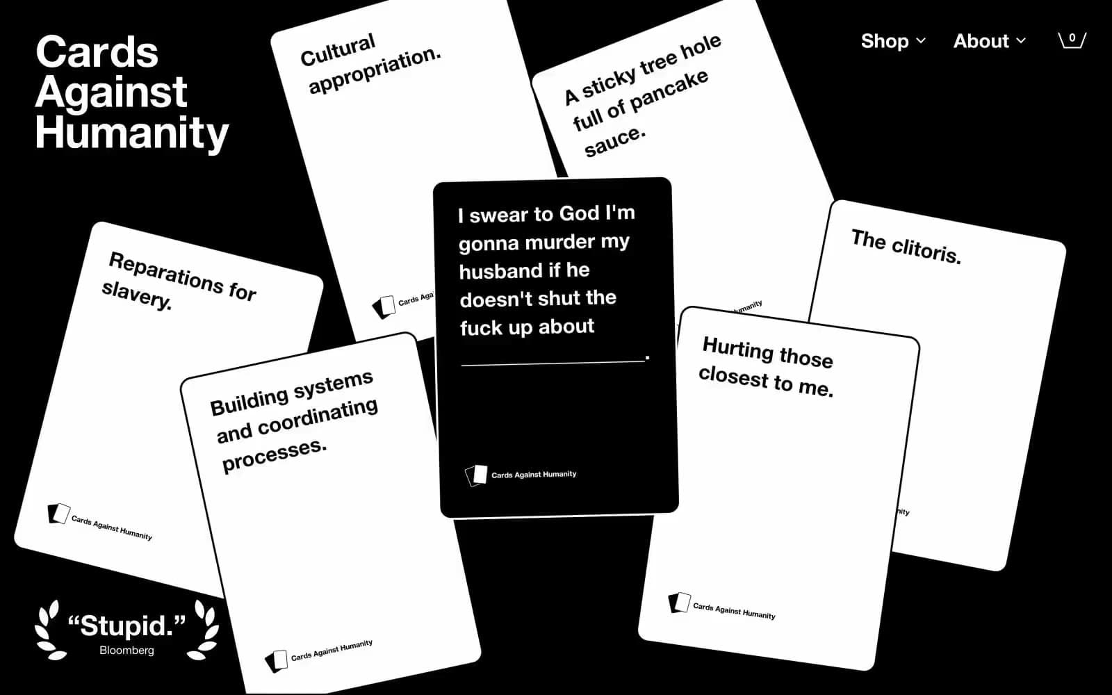

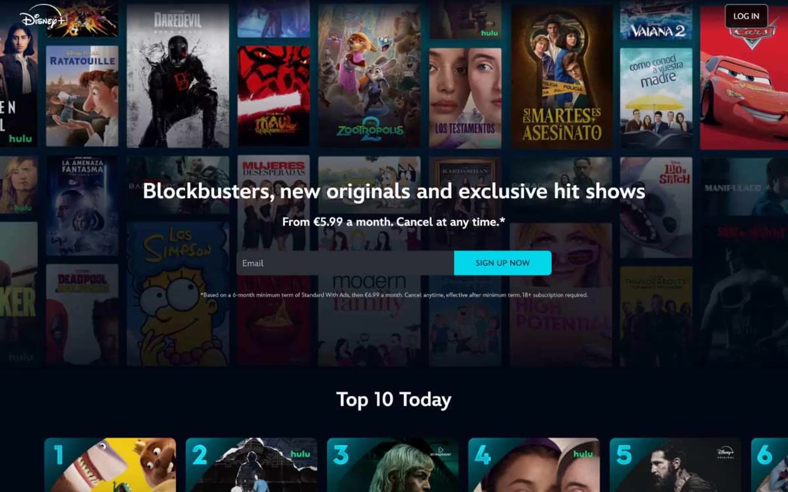
Disney+
Media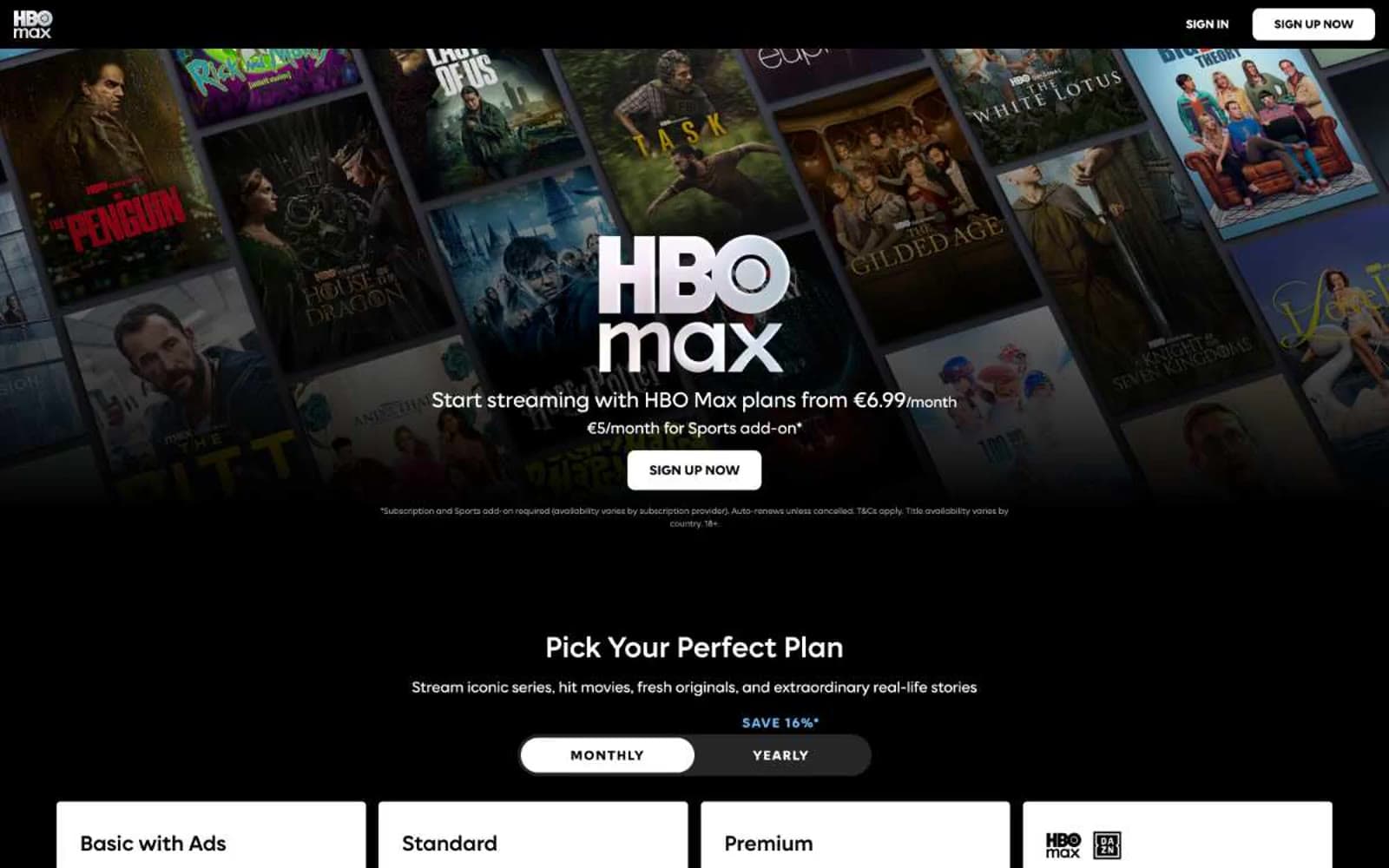
HBO Max
Media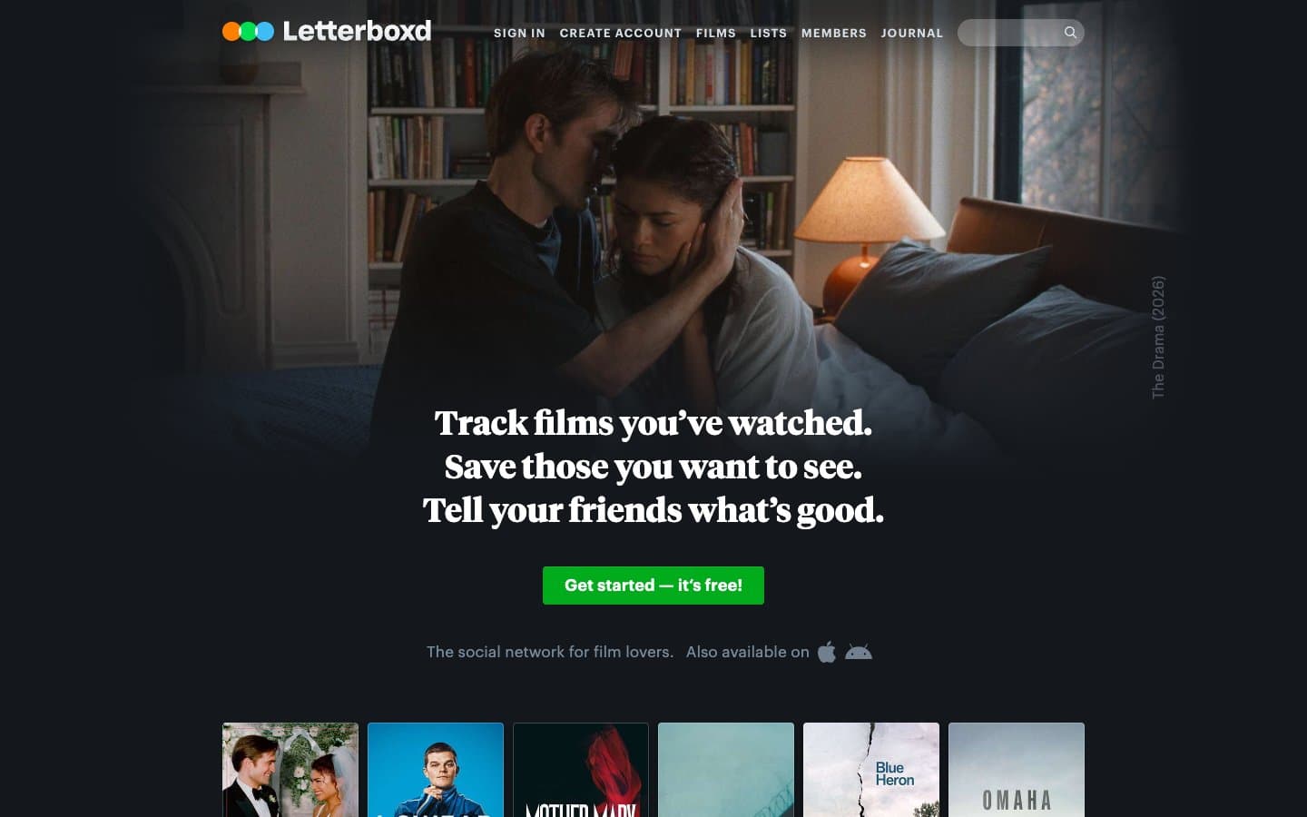
Letterboxd
Media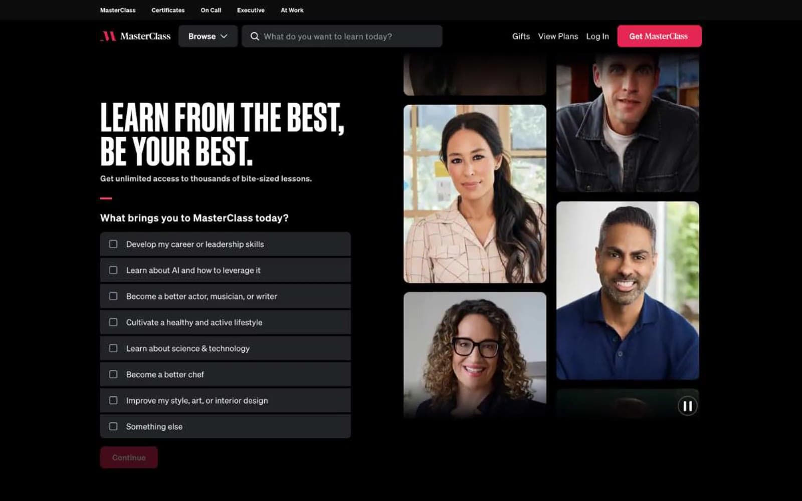
MasterClass
Media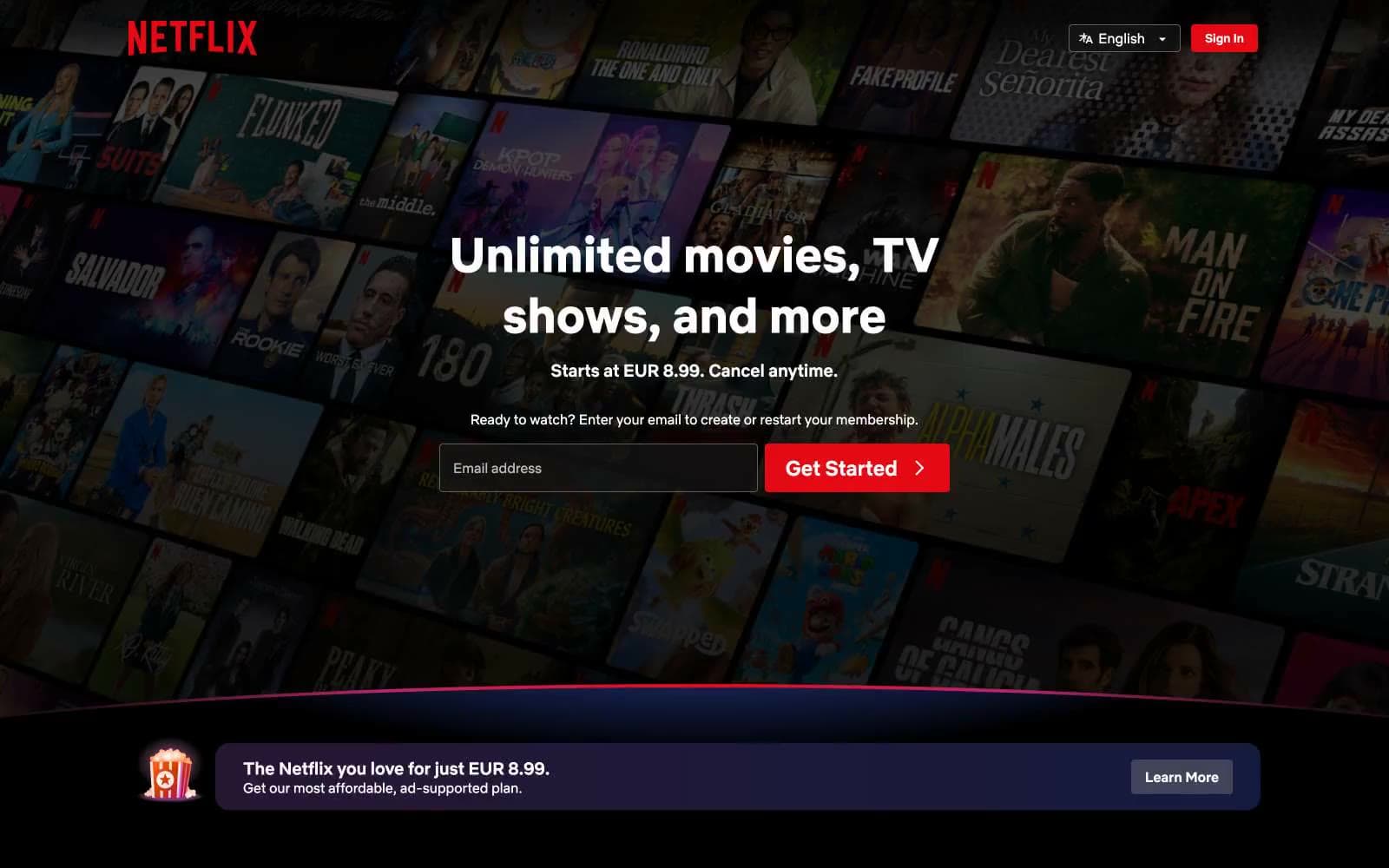
Netflix Spain
Media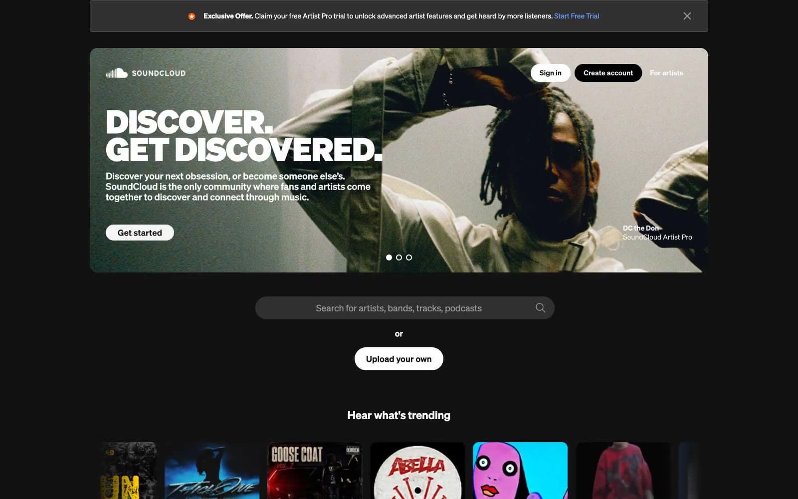
SoundCloud
Media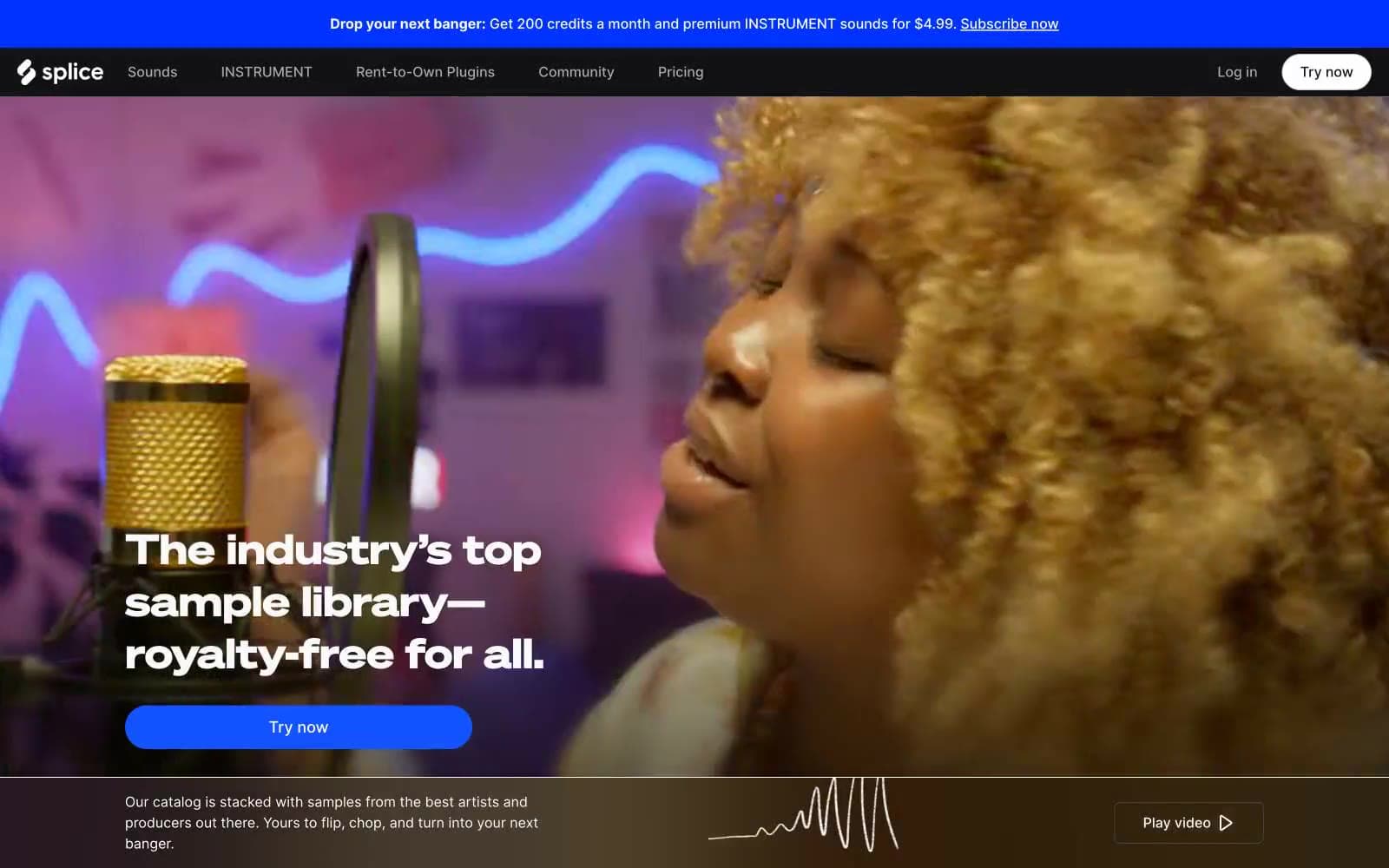
Splice
Media


