
HBO Max. Cinema lobby at midnight.
- Media
- Dark theme
- 9 colors
- 1 typeface
HBO Max is a cinema-dark streaming interface: deep black canvas, content poster art as the primary visual unit, and a single steel-blue accent that powers every interactive element. The design is deliberately sparse — white text floats on black, pricing cards flip the polarity to white-on-light to signal commerce zones, and typography does the heavy lifting through size and spacing rather than color. Components stay flat and minimal: 8px-radius buttons, hairline borders, no shadows, no gradients. The custom Max Sans typeface carries a slight positive letter-spacing on small labels, giving even utility text a cinematic, editorial quality.
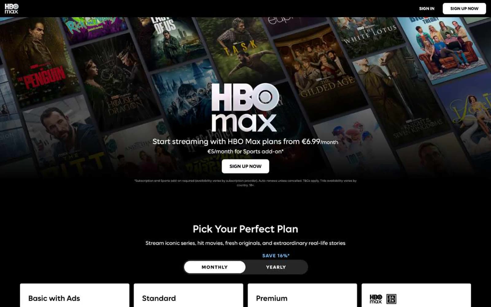
HBO Max design system

Brand1
Primary CTA fill, active link color, brand accent on icons and borders — the single chromatic note that powers all interactivity
Accent1
Blue text accent for links, tags, and emphasized short phrases. Do not promote it to the primary CTA color
Neutrals7
Page background, hero canvas, navigation surface — the default darkness that lets poster art and white text feel illuminated
Near-black secondary surface, subtle elevation layer above pure black for section separation
Near-black heading accent, subtle border tint for heading underlines
Tertiary text, inactive border outlines on controls
Lowest-priority metadata, footnote-level text and borders
Muted helper text, secondary body copy, disabled icon strokes — readable but recedes
Primary text, pricing card surfaces, icon fills, pill backgrounds — the dominant positive value in the system
Try a pairing
Pick any two colors from the palette to check whether text stays readable on top.
Aa
Snow on Signal Blue
5.65 : 1 contrast
- Body textPasses AA 4.5
- Large textPasses AA 3
- StrictFails AAA 7
More DESIGN.md files. Same web, different personalities.

Stripe Press
Media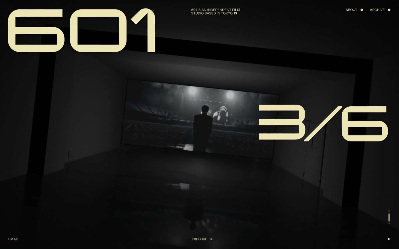
601 Inc.
Media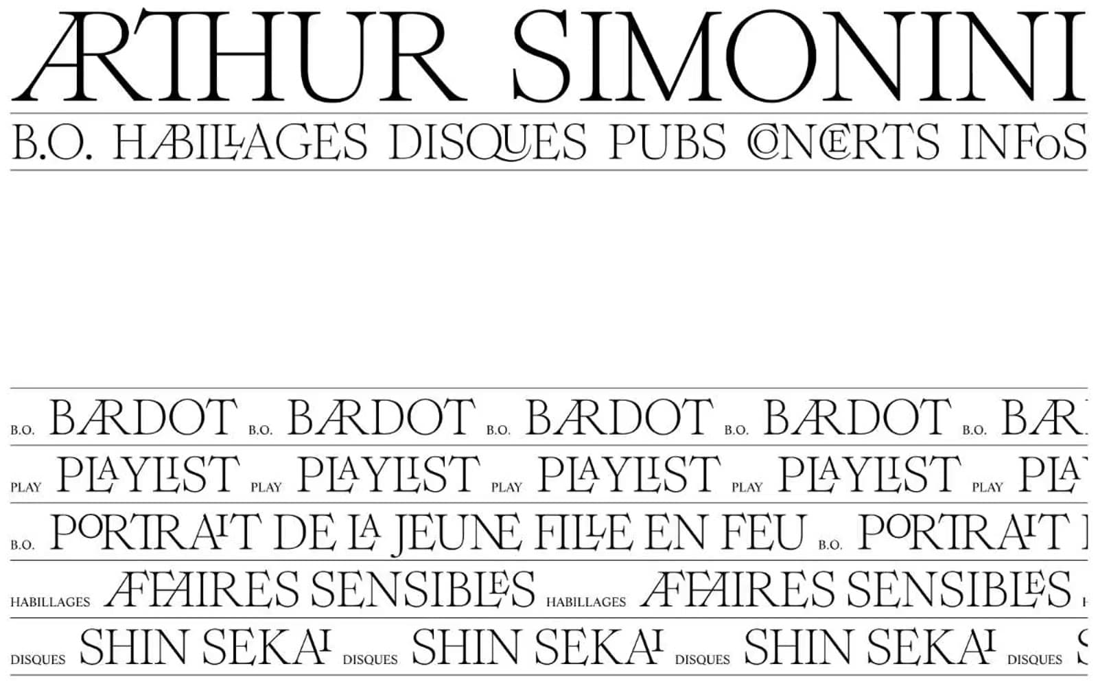
Arthursimonini
Media
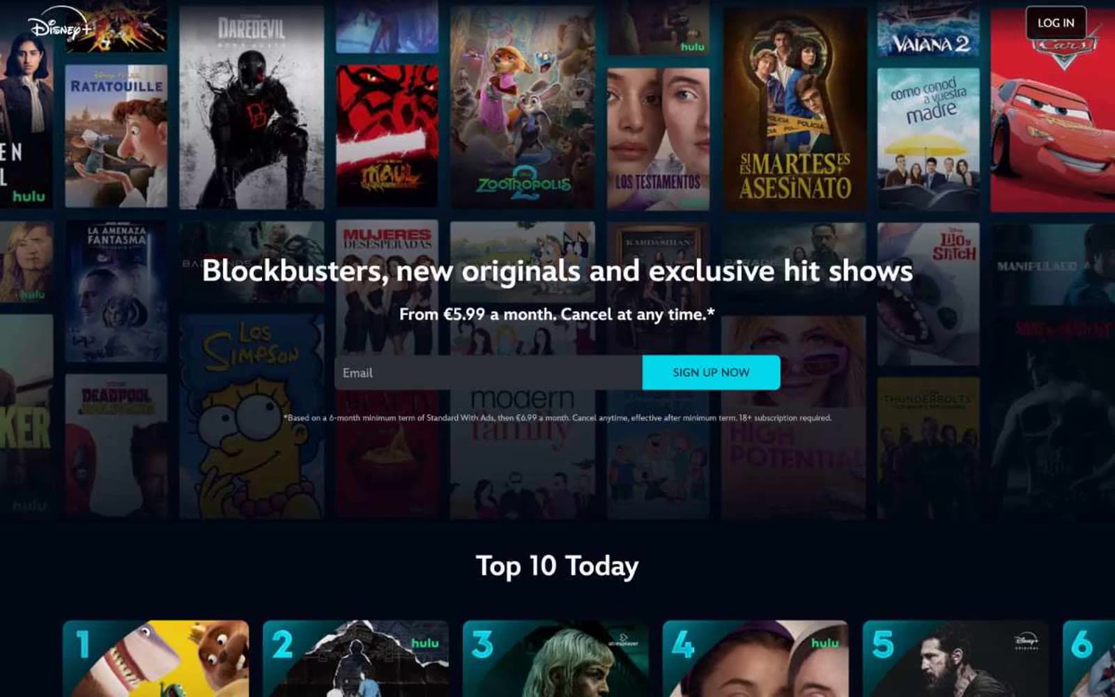
Disney+
Media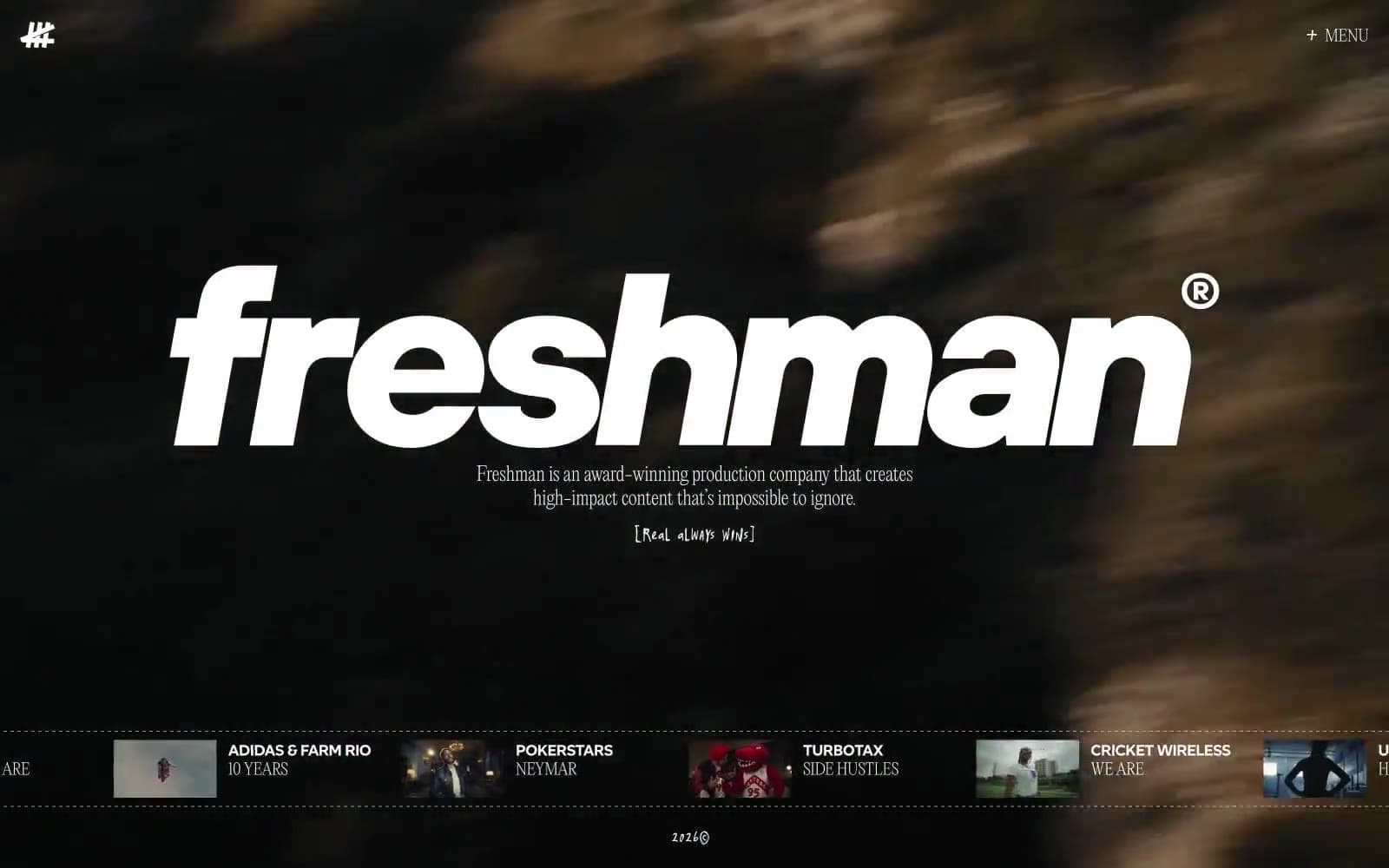
Freshman
Media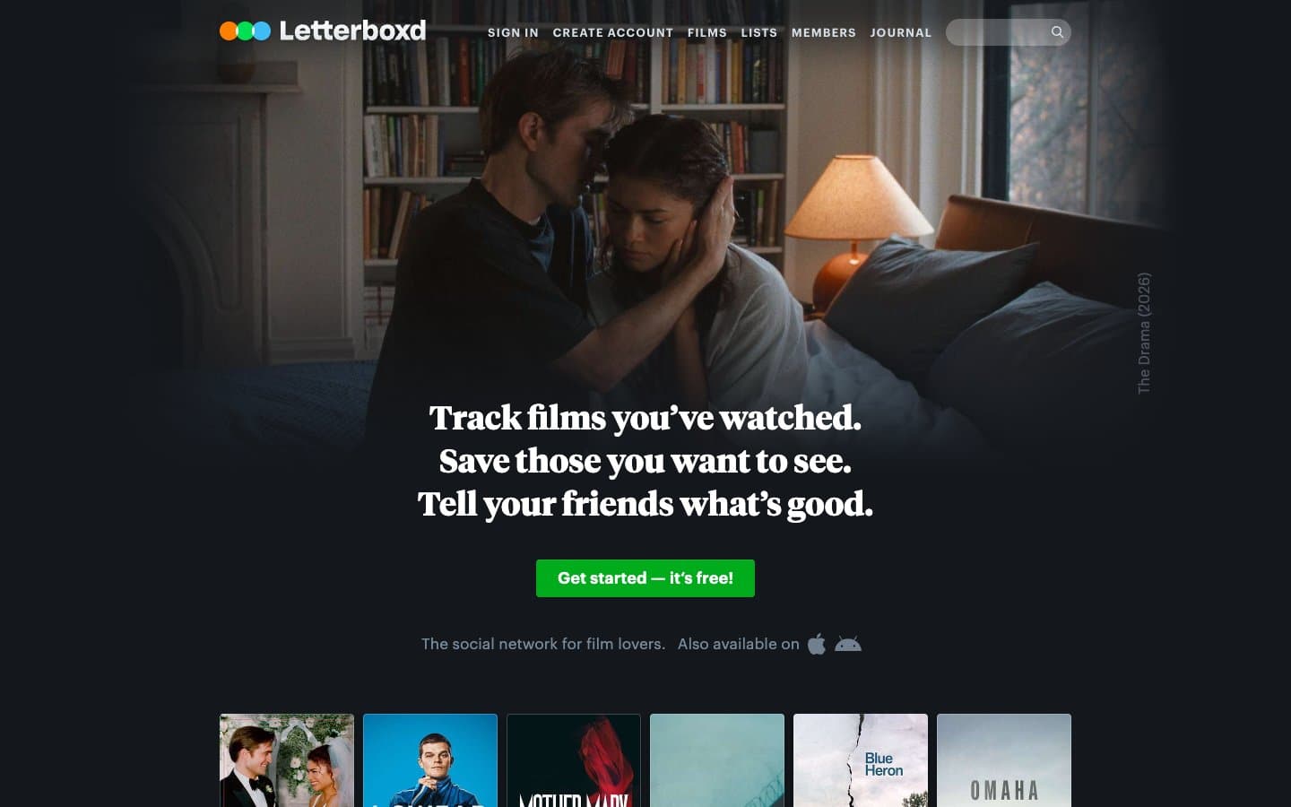
Letterboxd
Media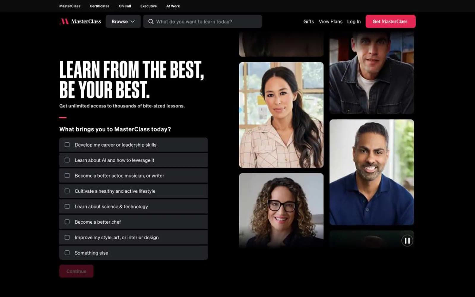
MasterClass
Media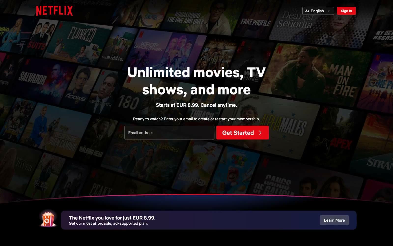
Netflix Spain
Media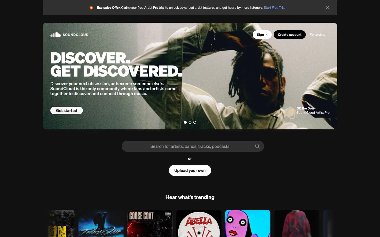
SoundCloud
Media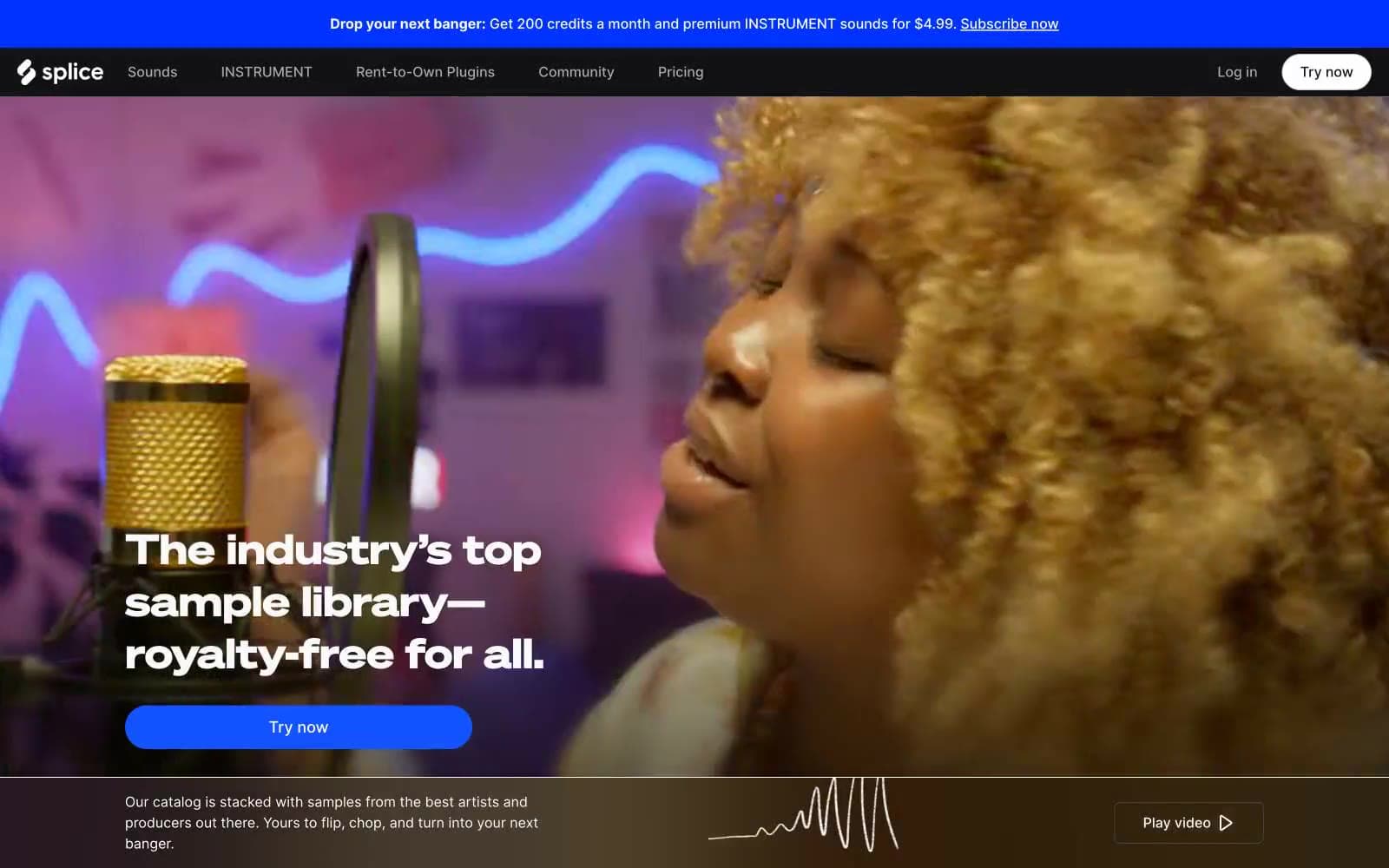
Splice
Media


