
SoundCloud. A near-black gallery where album art and one cool accent color do all the work, and the chrome around them stays invisible.
- Media
- Dark theme
- 8 colors
- 1 typeface
SoundCloud is a dark-stage media environment: near-black canvas (#121212) sets the venue, album artwork and photography carry the color, and a single cool blue (#699fff) punctuates links and interactive moments. The interface stays flat and almost shadowless — definition comes from inset hairlines and gray scale shifts rather than elevation, which keeps the focus on the visuals (artists, track artwork, lifestyle photography). Typography is a custom geometric sans (Söhne) with an unusually wide weight range including a 100-weight for whisper-thin display moments, paired with comfortable 8–16px padding and squared 4px corners that feel utilitarian and unfussy. Components are rectangular and content-dense — buttons are flat fills, cards are bare containers for cover art, inputs are minimal — letting the music content be the visual hero.
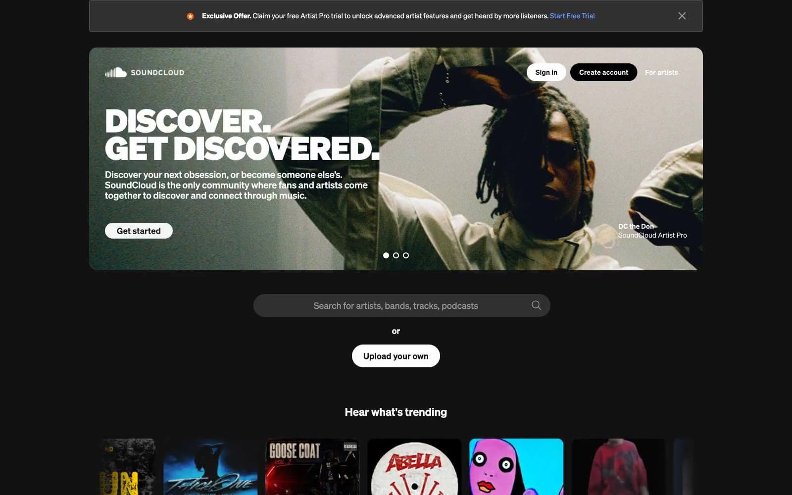
SoundCloud design system

Brand1
Violet supporting accent for decorative details and low-frequency emphasis. Do not promote it to the primary CTA color
Neutrals7
Page background, hero overlay base, primary dark surface
Elevated dark surfaces — input fields, card backgrounds over the dark canvas, nested panels
Mid-tone dividers, secondary surface tier above Graphite
Supporting neutral for secondary UI, dividers, and muted labels.
Hairline borders, subtle dividers between dark surface tiers
Light supporting surface for subtle backgrounds and section separation. Do not promote it to the primary CTA color
Primary text, primary filled buttons, headings, input text on dark — the dominant high-contrast tone
Try a pairing
Pick any two colors from the palette to check whether text stays readable on top.
Aa
Obsidian on Signal Blue
7.14 : 1 contrast
- Body textPasses AA 4.5
- Large textPasses AA 3
- StrictPasses AAA 7
More DESIGN.md files. Same web, different personalities.

Stripe Press
Media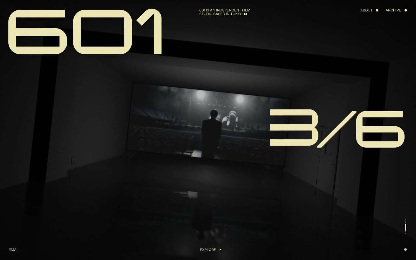
601 Inc.
Media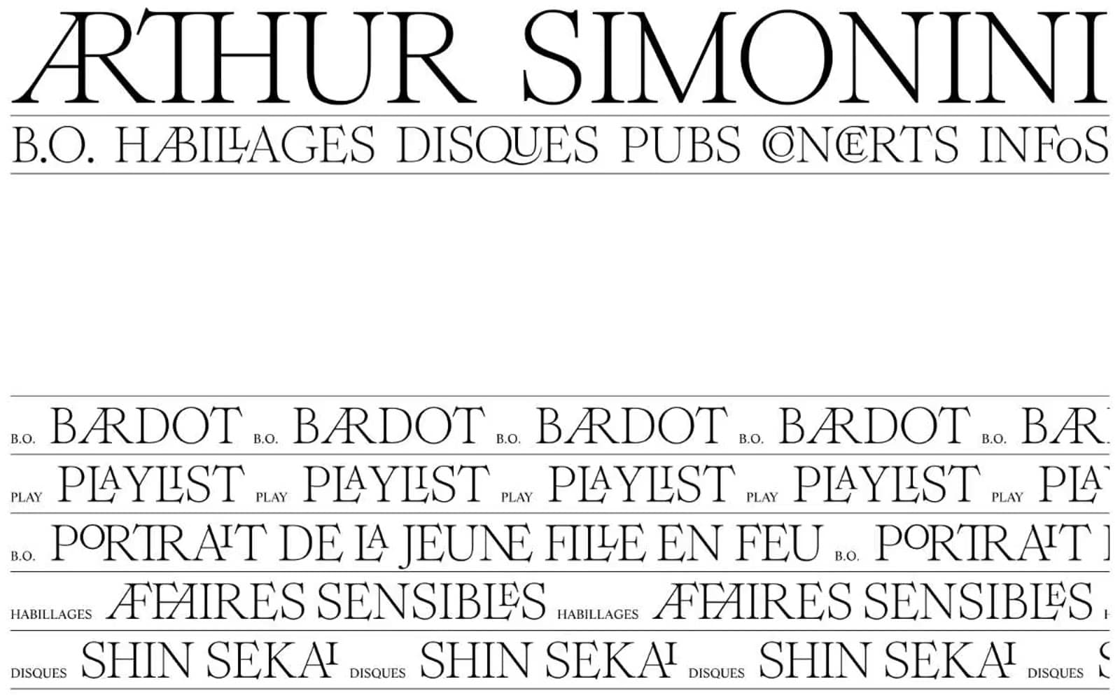
Arthursimonini
Media
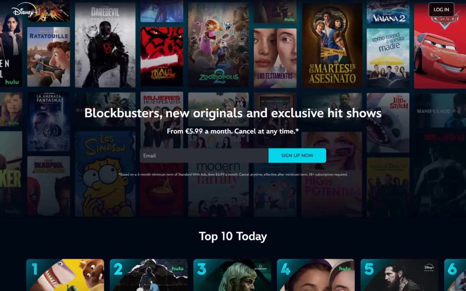
Disney+
Media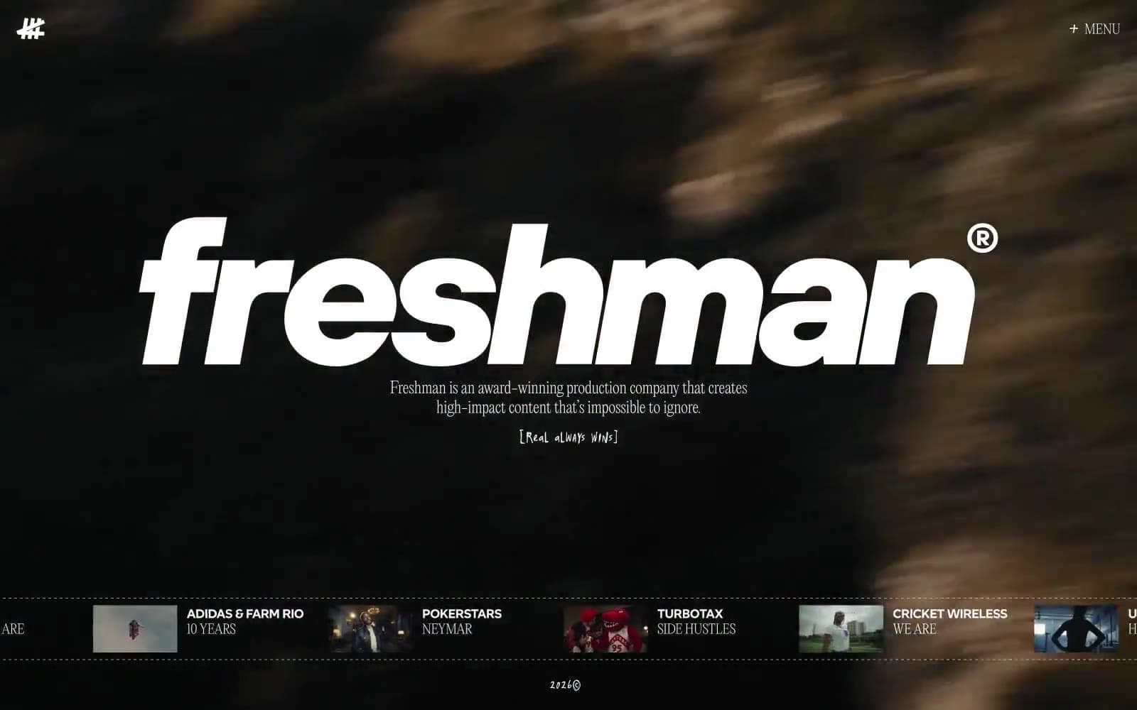
Freshman
Media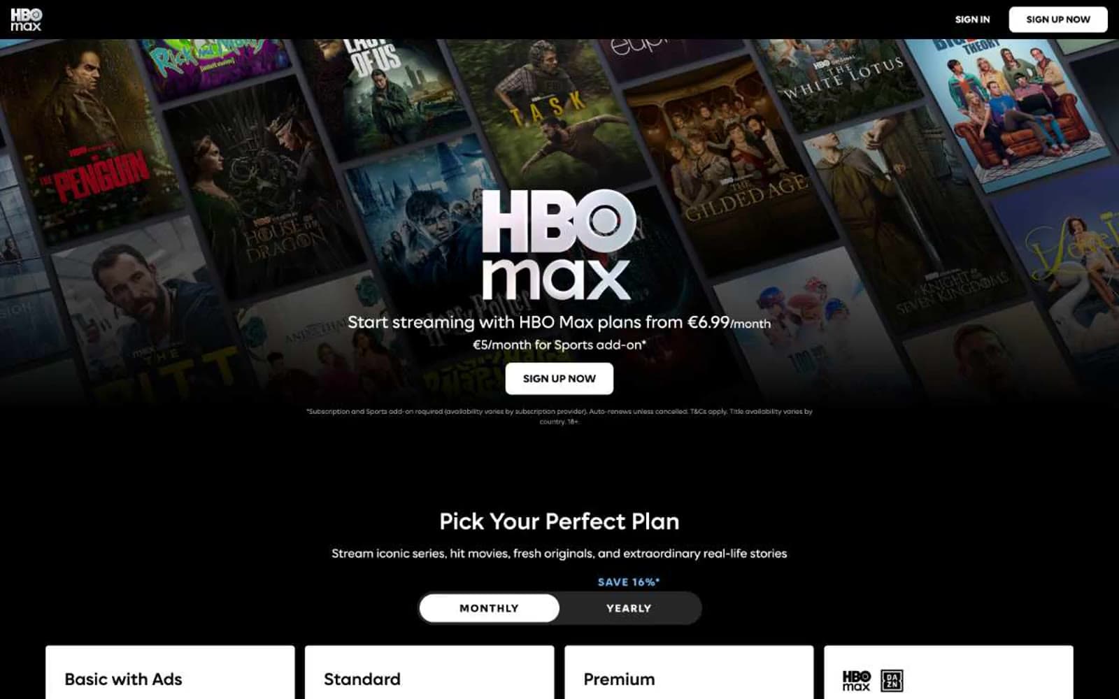
HBO Max
Media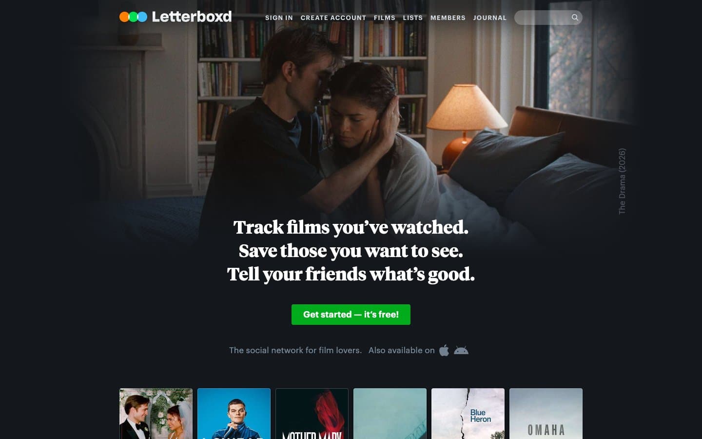
Letterboxd
Media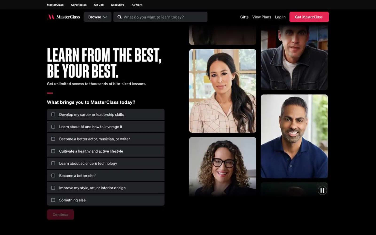
MasterClass
Media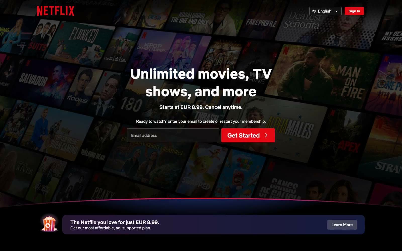
Netflix Spain
Media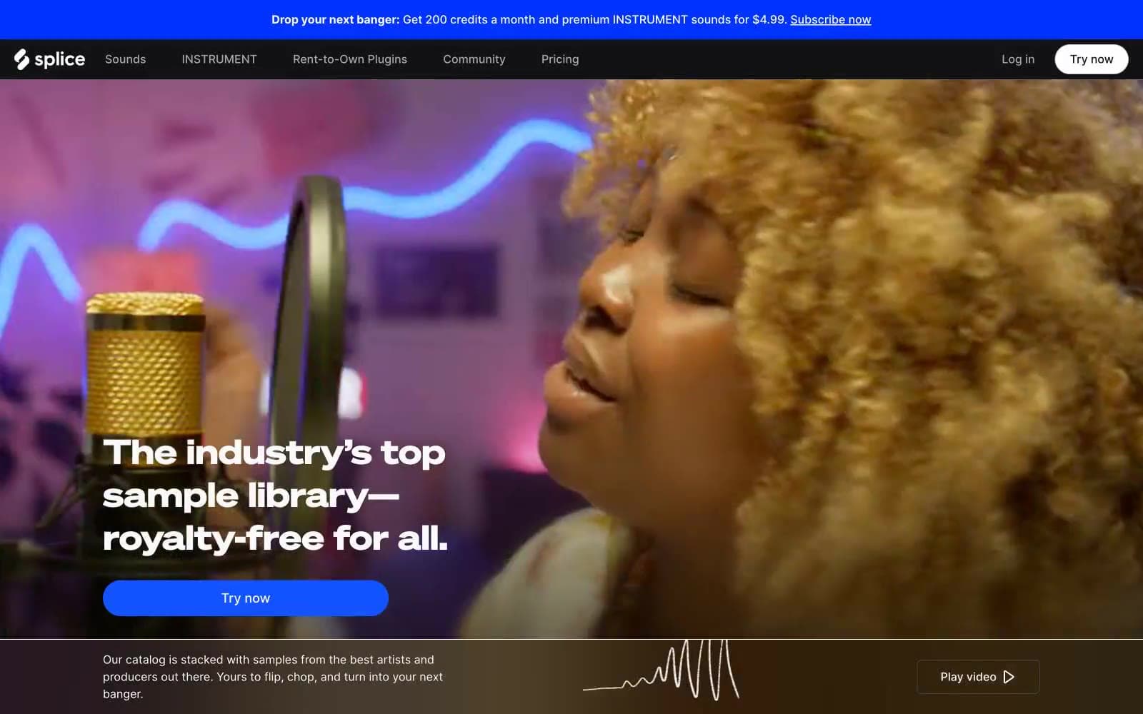
Splice
Media


