
Cards Against Humanity. The design language is the game itself, not a wrapper around it.
- Media
- Dark theme
- 12 colors
- 2 typefaces
Cards Against Humanity uses a game-night table aesthetic: near-black canvas, white card surfaces scattered at chaotic angles, and a tight three-color accent system (signal red, royal violet, antique gold) applied as thick borders rather than fills. Typography is uniformly heavy — Helvetica Neue LT at weight 800 even for mid-size copy — treating the screen like a punchline card rather than a SaaS dashboard. Buttons are chunky pills with 2px inset borders that read as physical objects sitting on the felt, not flat UI controls. The card metaphor saturates everything: content blocks, decorative backgrounds, badges, even borders adopt card-like geometry. Density is spacious but the large display sizes (55-80px) keep the vertical rhythm from feeling airy — each line lands like a card being dealt.
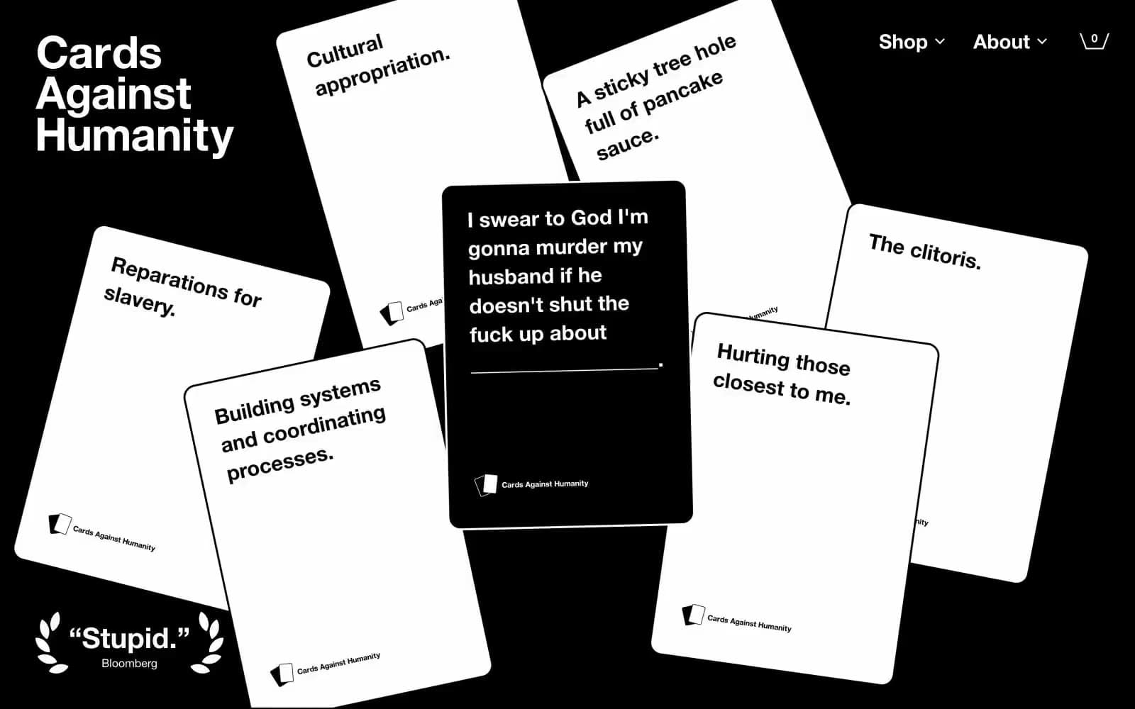
Cards Against Humanity design system

Brand3
Primary accent border on cards and badges — the brand's loudest punctuation, used as outline not fill
Primary accent border on cards and badges — deep saturated purple carrying the brand's irreverent energy
Primary accent border on cards and badges — warm yellow-gold that rounds out the three-color system
Accent7
Card face fill for highlighted playing cards in the scattered background
Card face fill for pastel playing cards, soft purple surface
Card face fill for blue playing cards, saturated blue accent surface
Card face fill for light blue playing cards
Card face fill for pink playing cards
Card face fill for green playing cards
Card face fill for orange playing cards
Neutrals2
Page background, card shadows, button borders, heading text on light surfaces
Card surfaces, body text on dark, button borders, input fills
Try a pairing
Pick any two colors from the palette to check whether text stays readable on top.
Aa
Game Night Black on Signal Red
5.66 : 1 contrast
- Body textPasses AA 4.5
- Large textPasses AA 3
- StrictFails AAA 7
More DESIGN.md files. Same web, different personalities.

Stripe Press
Media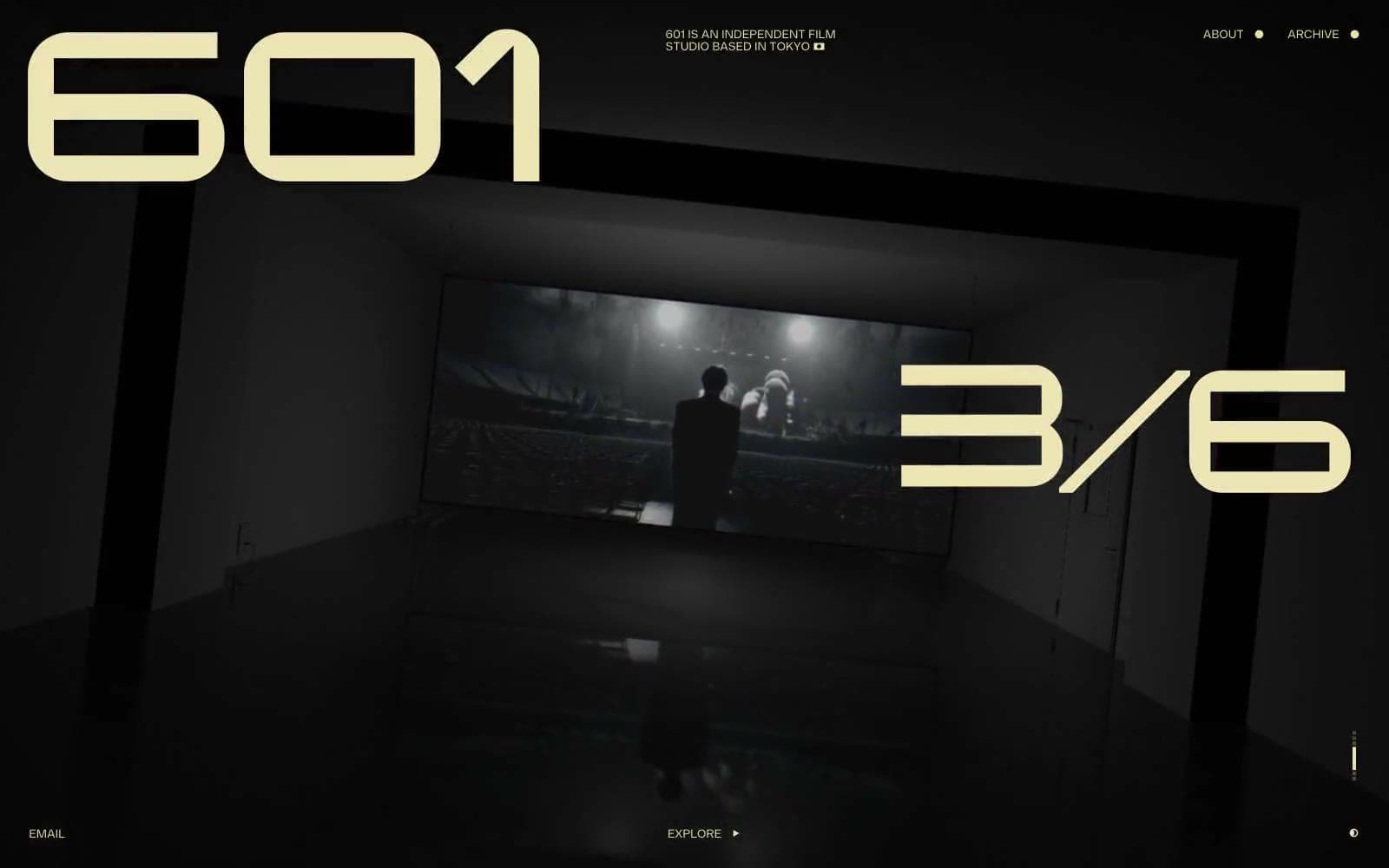
601 Inc.
Media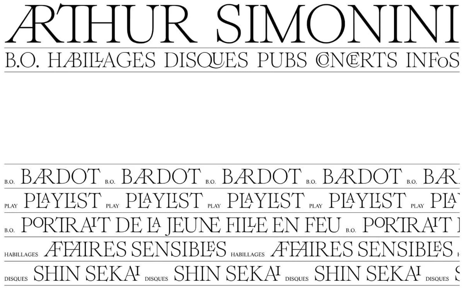
Arthursimonini
Media
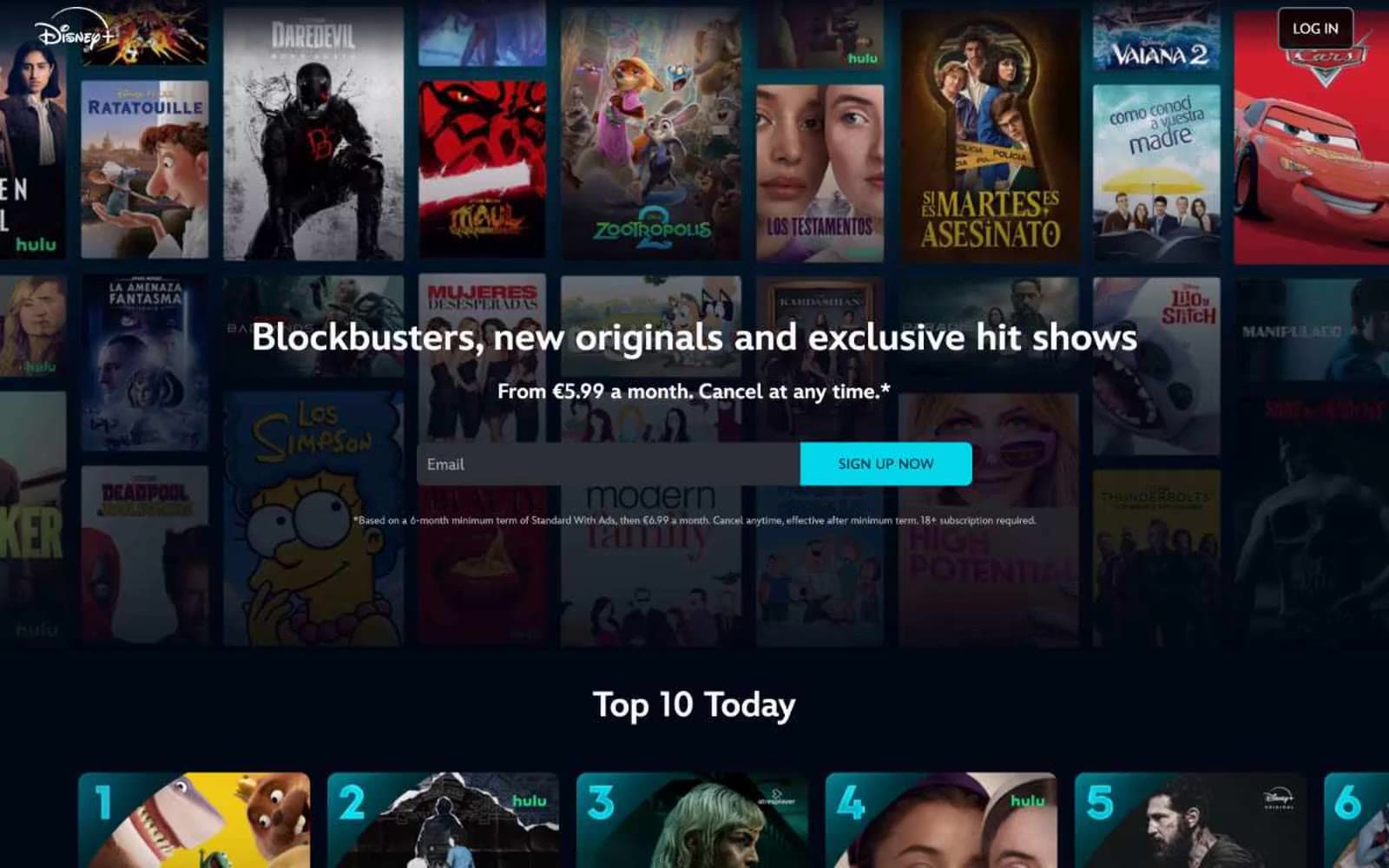
Disney+
Media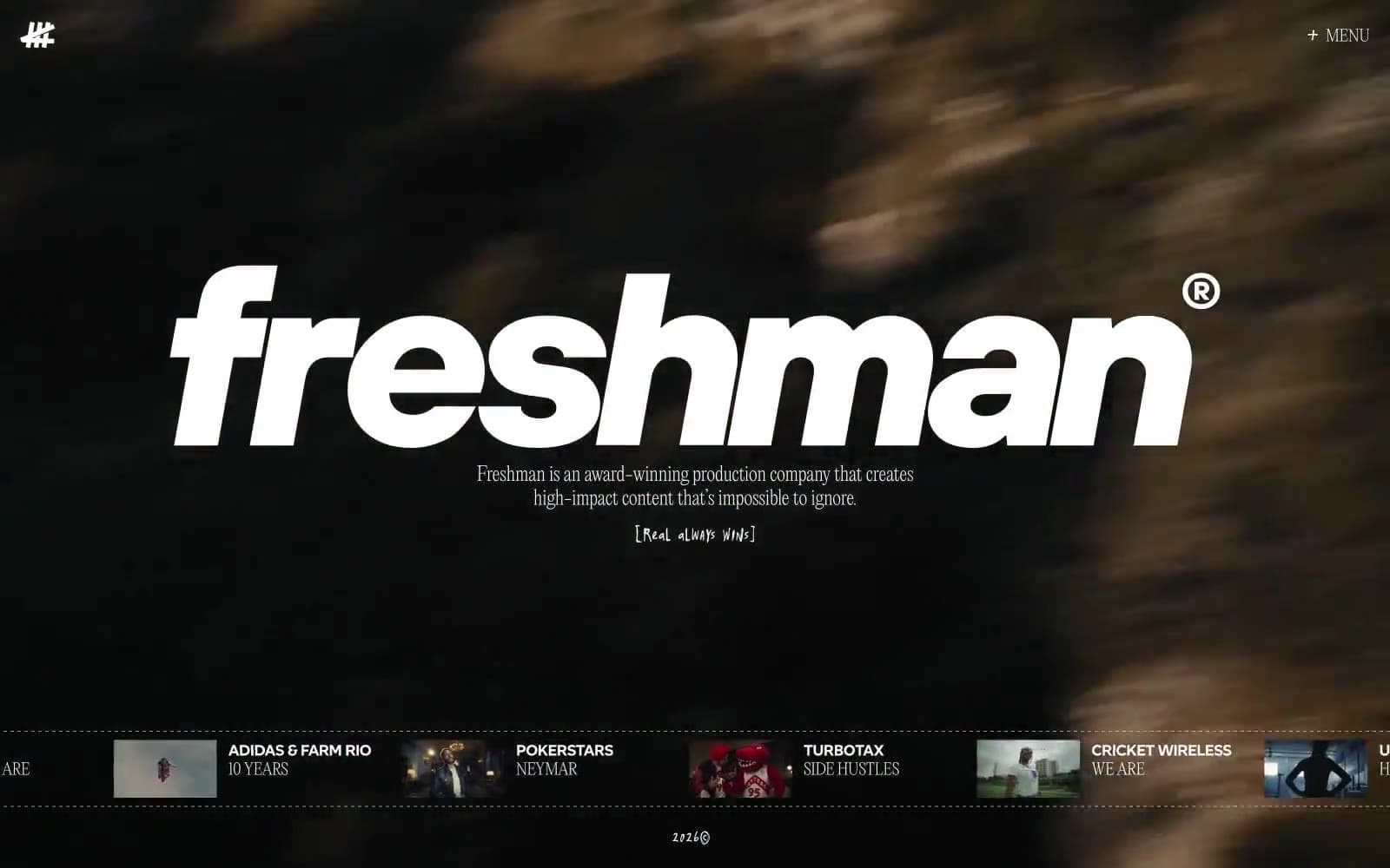
Freshman
Media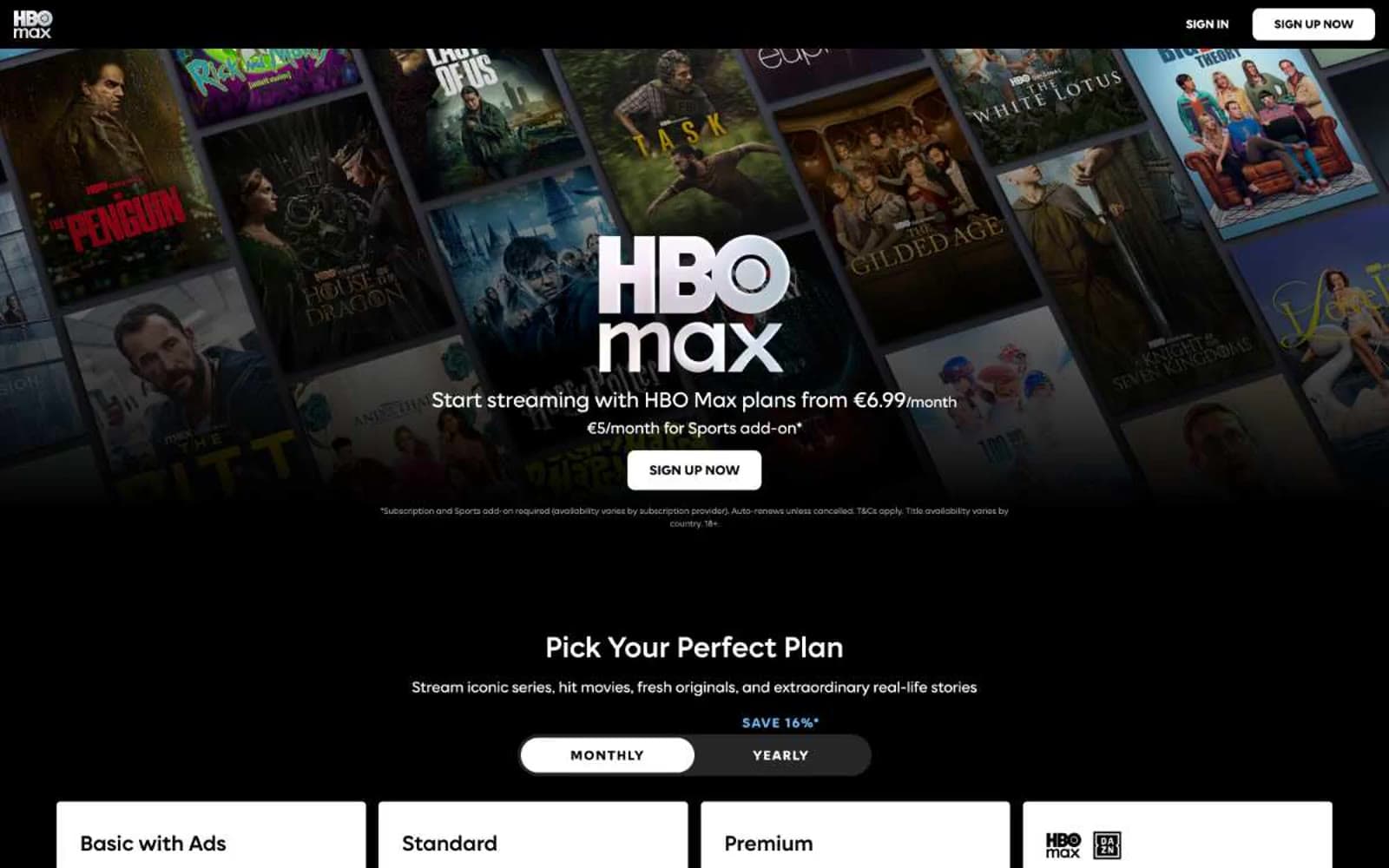
HBO Max
Media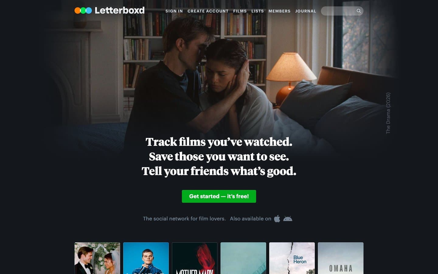
Letterboxd
Media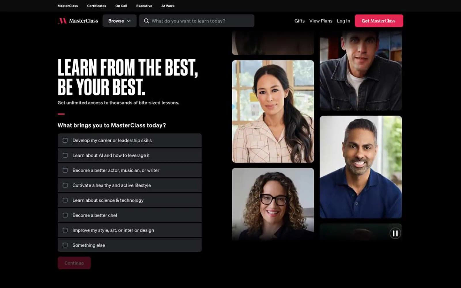
MasterClass
Media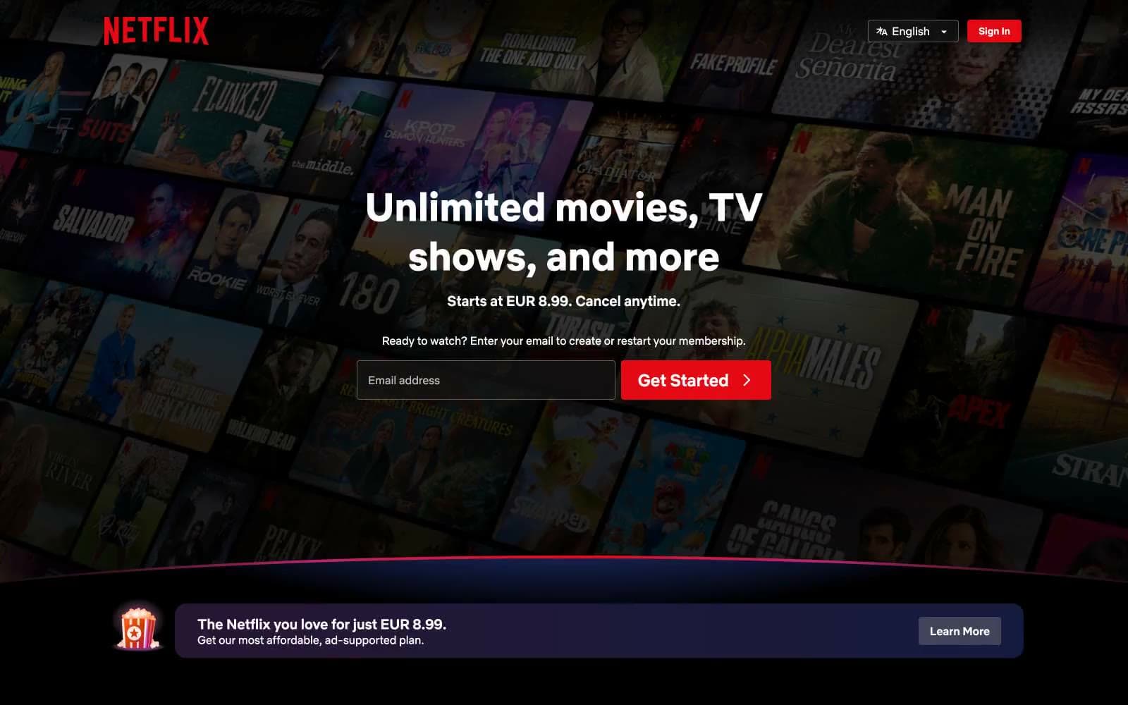
Netflix Spain
Media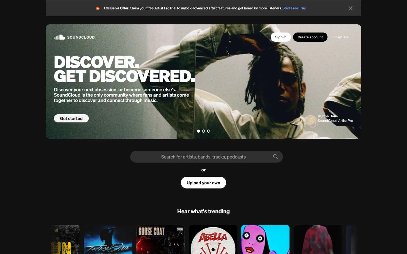
SoundCloud
Media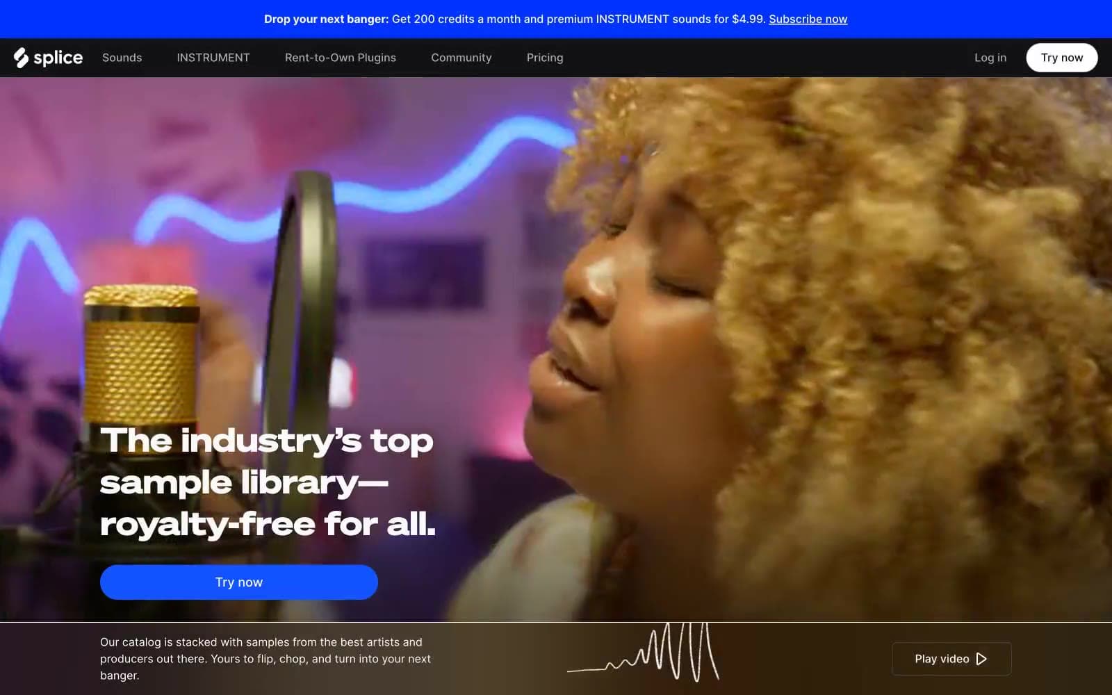
Splice
Media


