
Letterboxd. Darkened cinema lobby with neon rating glow.
- Media
- Dark theme
- 17 colors
- 5 typefaces
Letterboxd reads as a darkened cinema lobby: a near-black canvas tinted blue, content stacked in quiet horizontal bands, and one unmistakable acid-green accent that fires only at moments of action or rating. The dual-typeface system pairs a utilitarian neo-grotesque (Graphik) for chrome with a literary serif (Tiempos) for editorial moments, creating a tension between product UI and magazine. Density is comfortable, never crowded — the grid breathes around film posters and review cards, with 3px micro-radii keeping the geometry sharp and the green CTA as the only curve that matters.
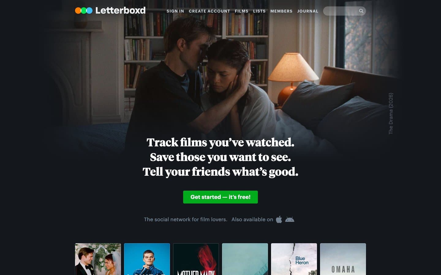
Letterboxd design system

Brand1
Green supporting accent for decorative details and low-frequency emphasis. Do not promote it to the primary CTA color
Accent1
Green supporting accent for decorative details and low-frequency emphasis. Use as a supporting accent, not as a status color
Neutrals15
Shadow base, icon glyphs, deepest contrast
Page canvas, app background
Elevated surface — cards, modals, popovers
Borders, dividers, subtle separators
Supporting neutral for secondary UI, dividers, and muted labels. Do not promote it to the primary CTA color
Supporting neutral for secondary UI, dividers, and muted labels. Do not promote it to the primary CTA color
Secondary body text, inactive icon strokes
Tertiary body text, meta information, timestamps
Muted helper text, placeholder copy
Primary body text, navigation links, dominant interface text
Headings, emphasis text, strong links
Button labels, inverted text on dark fills
Navigation hover states, light iconography
Bright accent text, active link states, highlight labels
Maximum contrast text, inverse fills, poster borders
Try a pairing
Pick any two colors from the palette to check whether text stays readable on top.
Aa
True Black on Acid Green
11.79 : 1 contrast
- Body textPasses AA 4.5
- Large textPasses AA 3
- StrictPasses AAA 7
More DESIGN.md files. Same web, different personalities.

Stripe Press
Media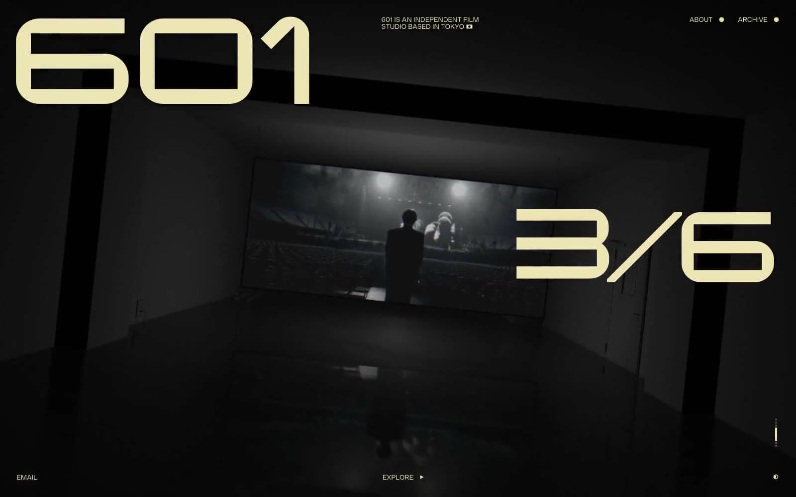
601 Inc.
Media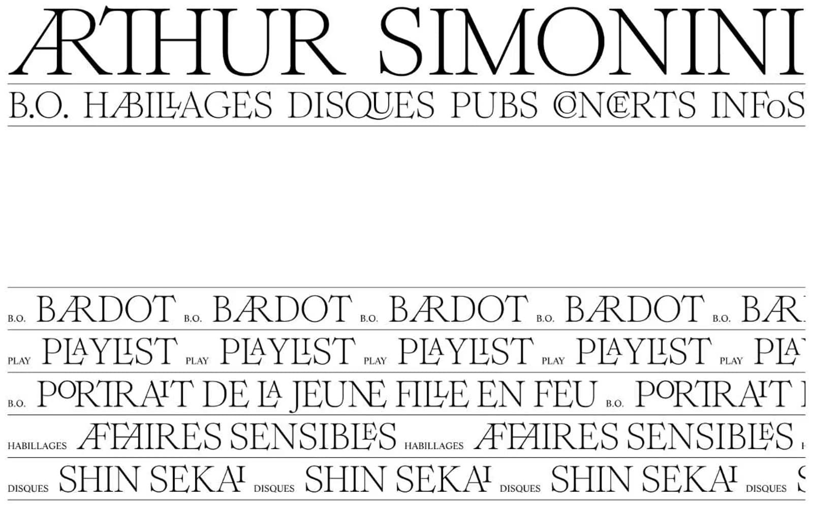
Arthursimonini
Media
Disney+
Media
Freshman
Media
HBO Max
Media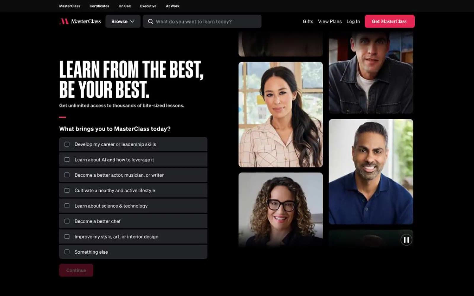
MasterClass
Media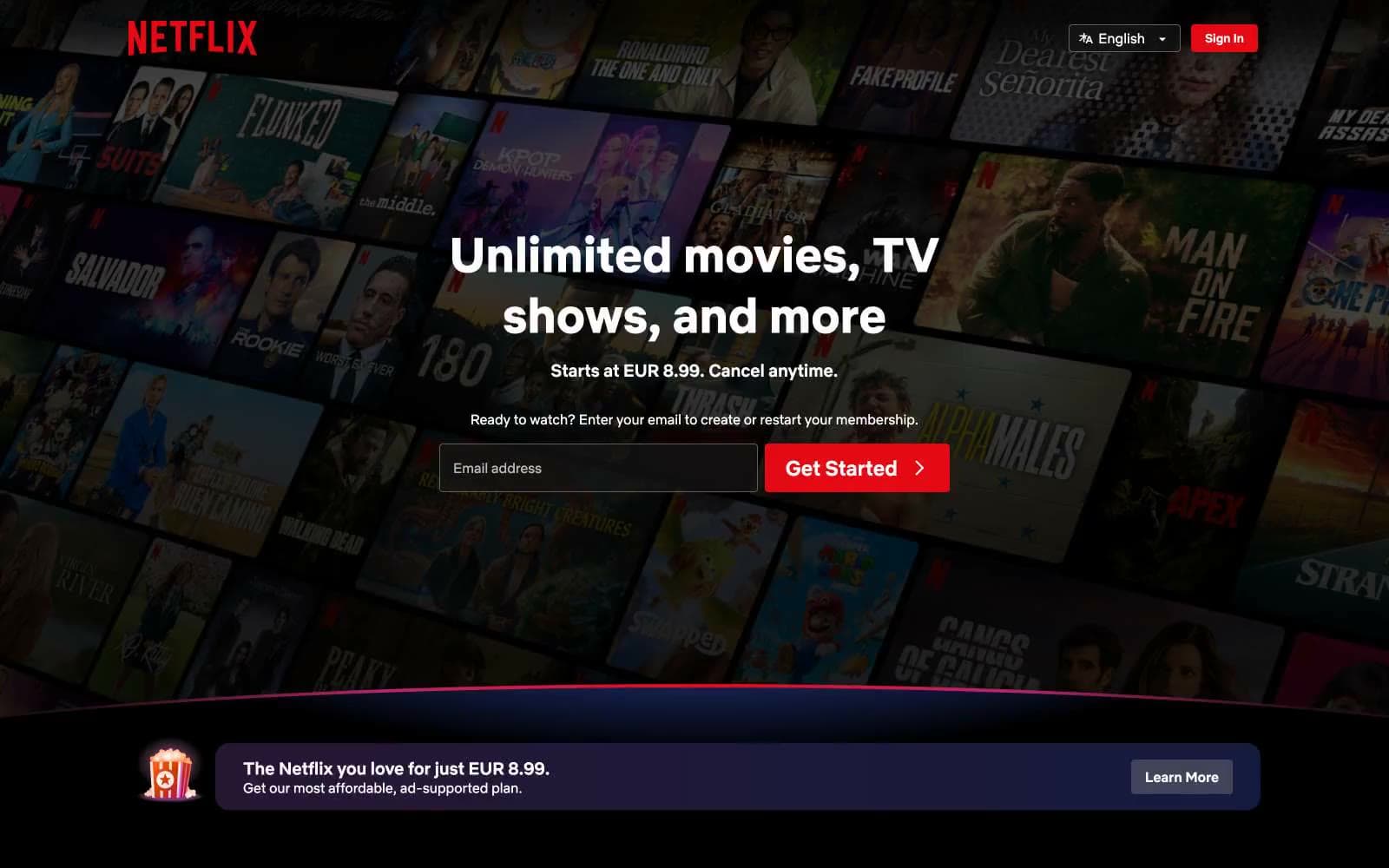
Netflix Spain
Media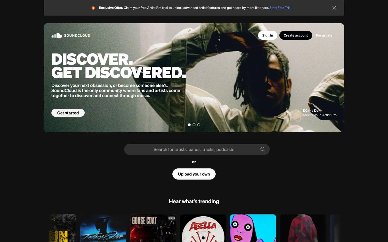
SoundCloud
Media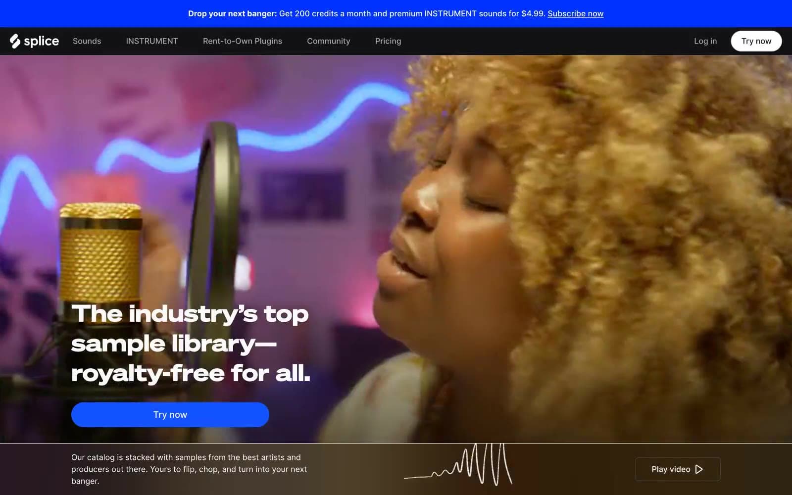
Splice
Media


