
Cards Against Humanity. Apocalypse broadcast on blackout paper.
- Media
- Dark theme
- 4 colors
- 2 typefaces
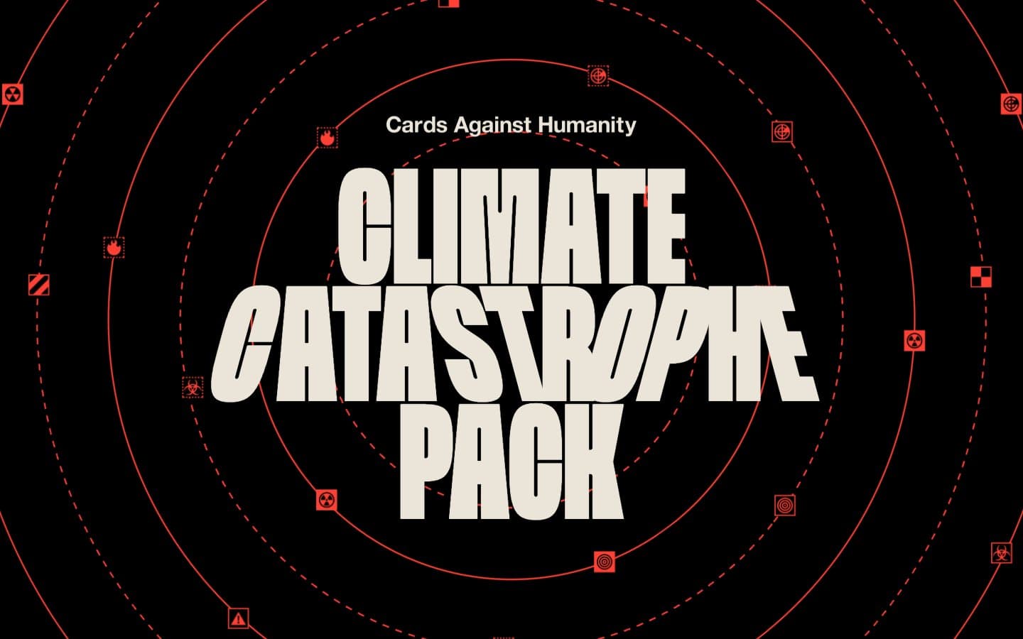
Cards Against Humanity's Climate Catastrophe Pack deploys an emergency-broadcast aesthetic: a pitch-black canvas saturated with flat, vivid red as the only chromatic signal. Typography does almost all of the heavy lifting — an extreme condensed display face (Spektra) stacked in 200+ px blocks creates poster-sized alarm, while the body text is a quiet, humanist sans (Helvetica Neue) that reads like a caption on a civil defense poster. The page is content-sparse and editorial: no dashboards, no product cards, no marketing chrome — just a large headline, centered prose, and scattered red hazard glyphs orbiting a radar/concentric-circle motif. Color is used surgically: cream for almost all readable text, red reserved for annotations (strikethrough corrections, underlined links, flame graphics, icon squares), with the red itself functioning less as decoration than as a wayfinding color for 'pay attention here.' There is essentially no elevation system, no soft cards, no shadows — the design rejects SaaS niceties in favor of a printed-flyer feel where information sits directly on the black page like ink on a wall.
Cards Against Humanity design system

Brand1
Hazard icons, strikethrough editorial links, flame illustrations, concentric radar rings — the only chromatic signal in the system, reserved for things requiring attention
Neutrals3
Page canvas, body borders, all text in dark contexts — the default background every other element sits on
Button box-shadow tint — the single warm-gray accent in the system
Primary text color, button fills, surface highlights — warm off-white that reads as paper, not screen white
Try a pairing
Pick any two colors from the palette to check whether text stays readable on top.
Aa
Void Black on Alarm Red
6.03 : 1 contrast
- Body textPasses AA 4.5
- Large textPasses AA 3
- StrictFails AAA 7
More DESIGN.md files. Same web, different personalities.

Stripe Press
Media
601 Inc.
Media
Arthursimonini
Media
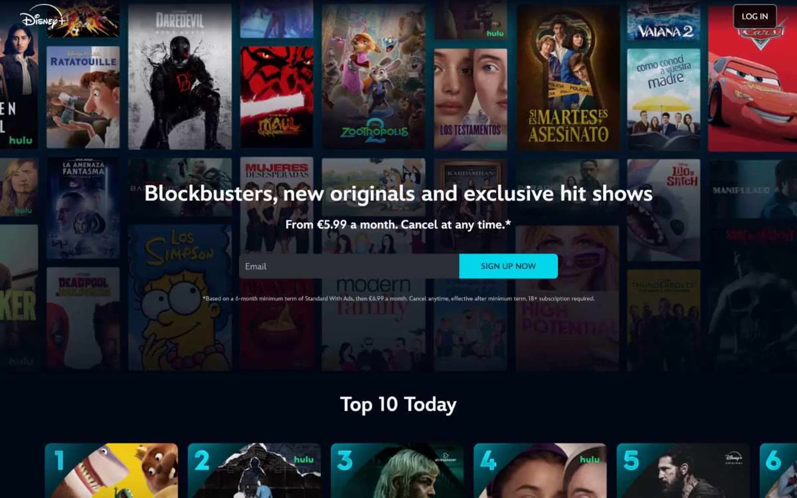
Disney+
Media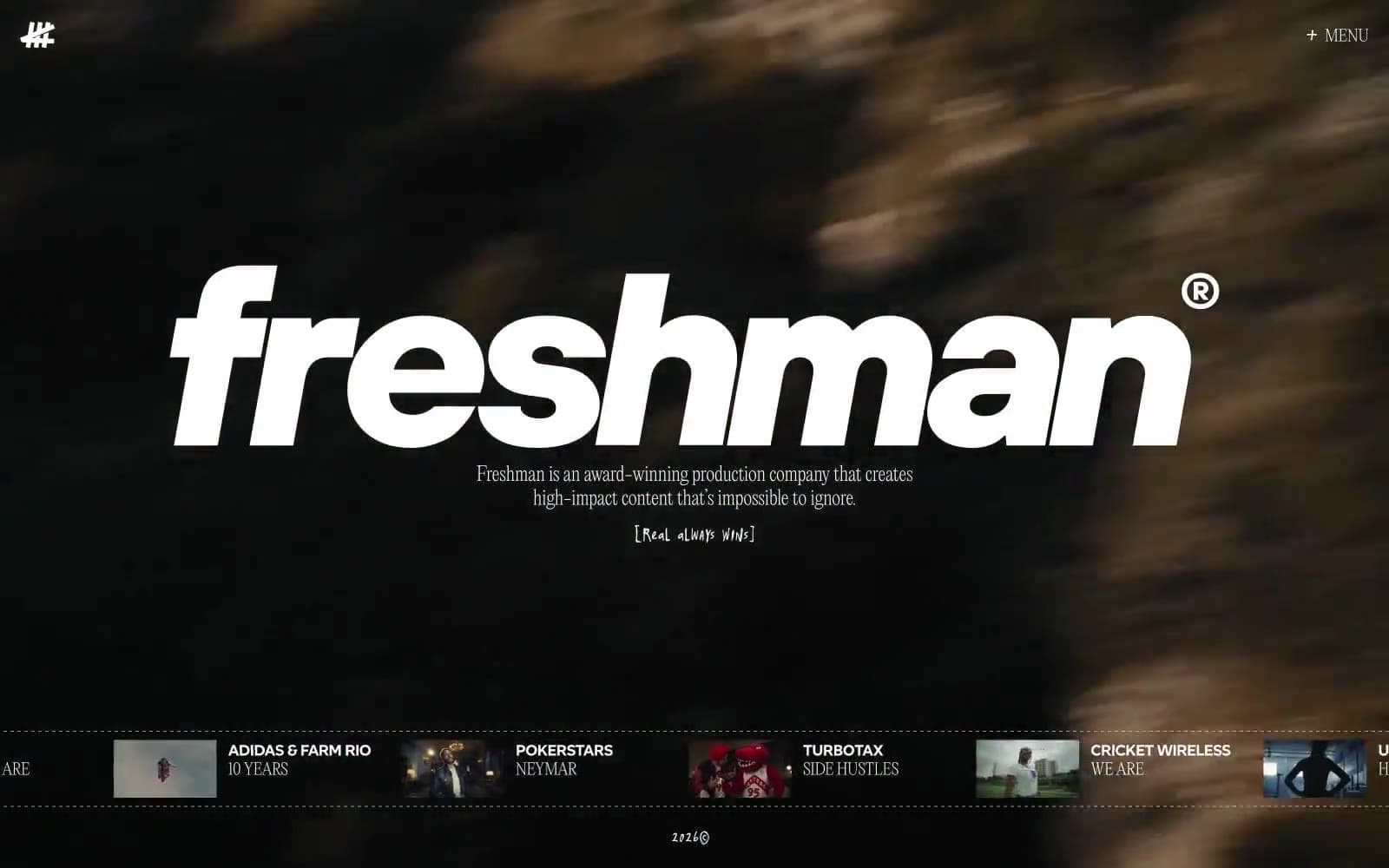
Freshman
Media
HBO Max
Media
Letterboxd
Media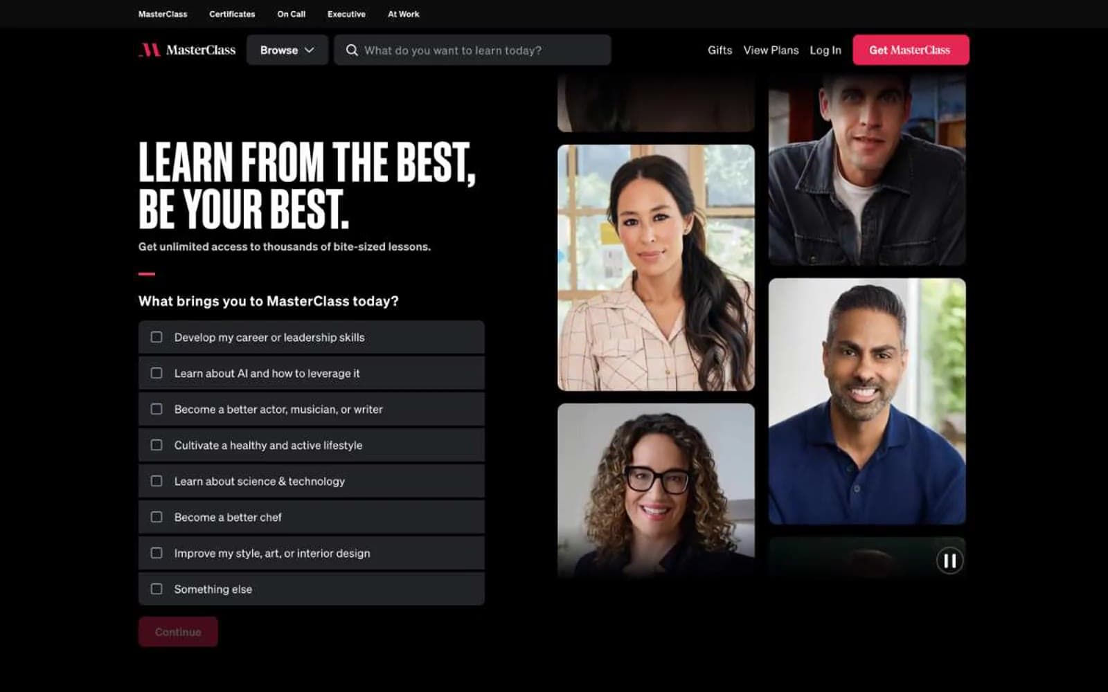
MasterClass
Media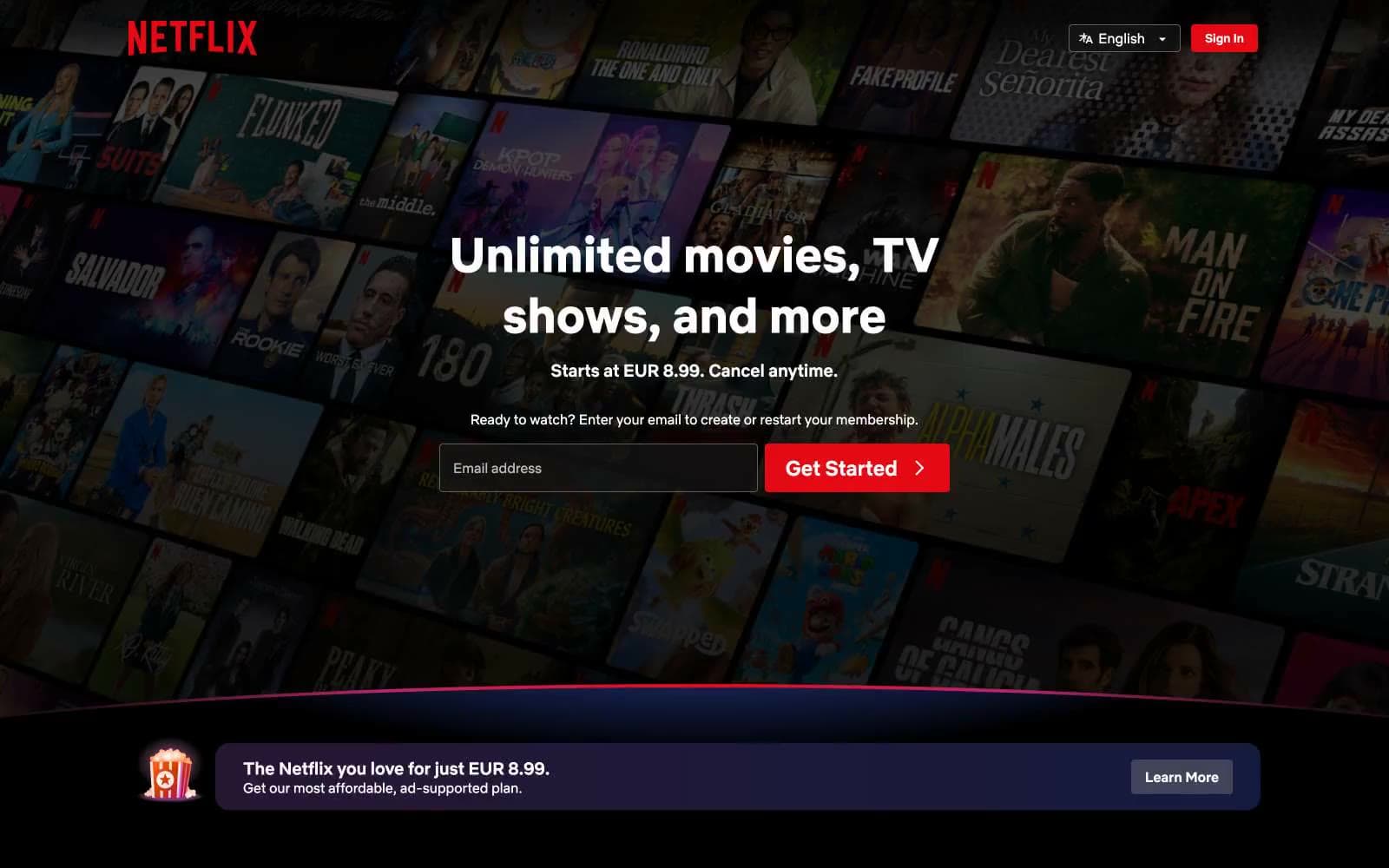
Netflix Spain
Media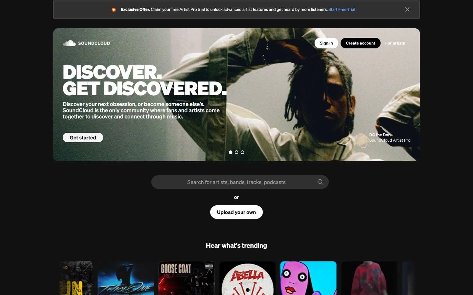
SoundCloud
Media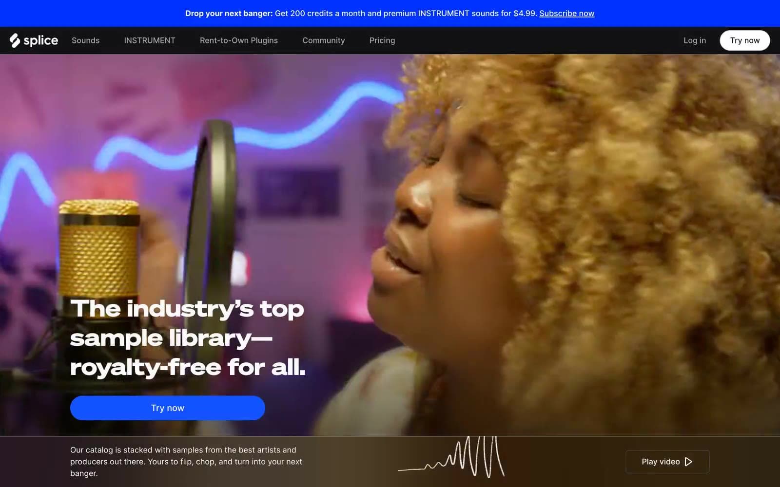
Splice
Media


