
Netflix Spain. A black cinema lobby with one red exit sign.
- Media
- Dark theme
- 14 colors
- 1 typeface
Netflix operates in cinematic darkness: a pure black void where vibrant content artwork becomes the visual hero. The interface strips itself down to typography and a single, unambiguous signal of action — Netflix Red. Every surface is some shade of near-black, creating a theatrical environment that makes movie posters, thumbnails, and show artwork explode off the screen. The system is intentionally minimal at the chrome level and maximal at the content level, with the red accent acting as the only warm temperature in an otherwise cold, immersive black space. Cards and feature tiles carry subtle dark-to-dark gradients (deep indigo, burgundy, charcoal) that add atmospheric depth without competing with the photographic content they frame.
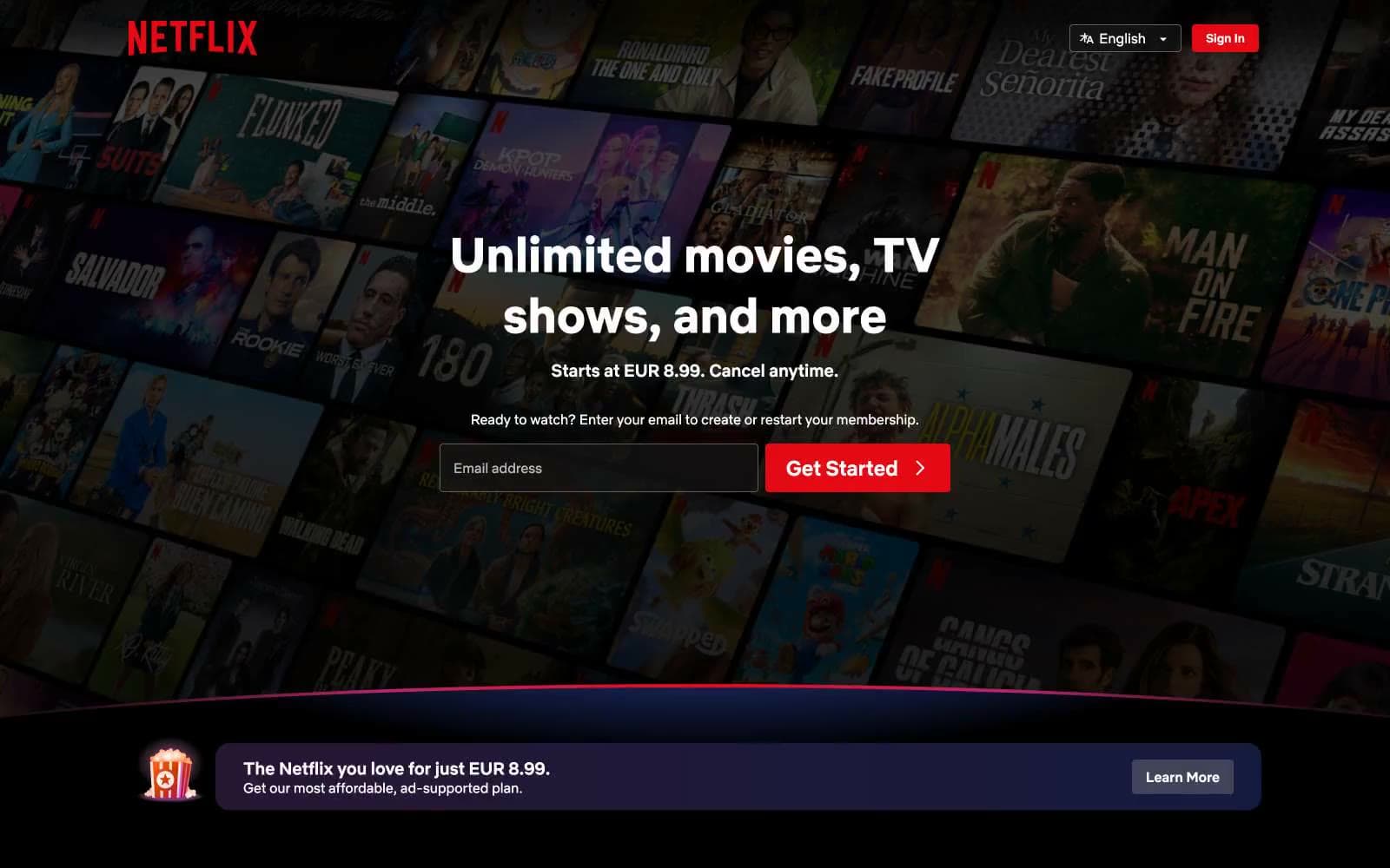
Netflix Spain design system

Brand1
Primary CTAs, brand logo, active states, and the single chromatic accent in the entire system — the only warm color allowed to break the black void
Accent3
Feature card gradient origin — deep blue-violet used as the cool terminus in card background gradients
Radial highlight origin on feature cards — a warm deep red that adds atmospheric luminosity to card edges
Horizontal light beam across card midlines — a thin warm glow that bisects feature cards with a soft red line
Neutrals10
Dominant page canvas and deepest surface — the cinematic background that swallows everything non-essential
Elevated surface tone, barely distinguishable from black — used for subtle layering and section dividers
Card and button surface background — the primary elevated layer above pure black
Deeper card surface and input field background — secondary surface level for nested elements
Rounded card backgrounds and tertiary surface treatment
Hover states and pressed button backgrounds — a step lighter than carbon for interaction feedback
Hairline borders and subtle dividers on dark surfaces
Muted body text and inactive helper copy
Secondary body text, metadata, footer links, and de-emphasized descriptions
Primary headings, body text, input text, and icon fills — the sole text color that carries information weight
Try a pairing
Pick any two colors from the palette to check whether text stays readable on top.
Aa
Pure White on Netflix Red
4.79 : 1 contrast
- Body textPasses AA 4.5
- Large textPasses AA 3
- StrictFails AAA 7
More DESIGN.md files. Same web, different personalities.

Stripe Press
Media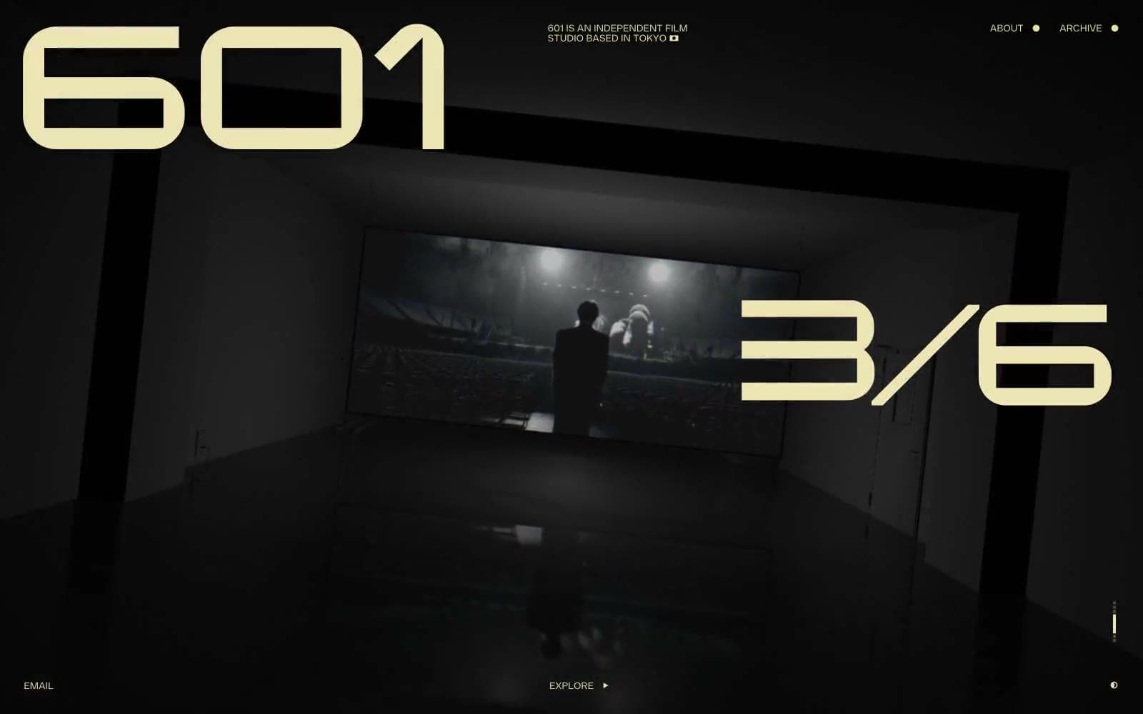
601 Inc.
Media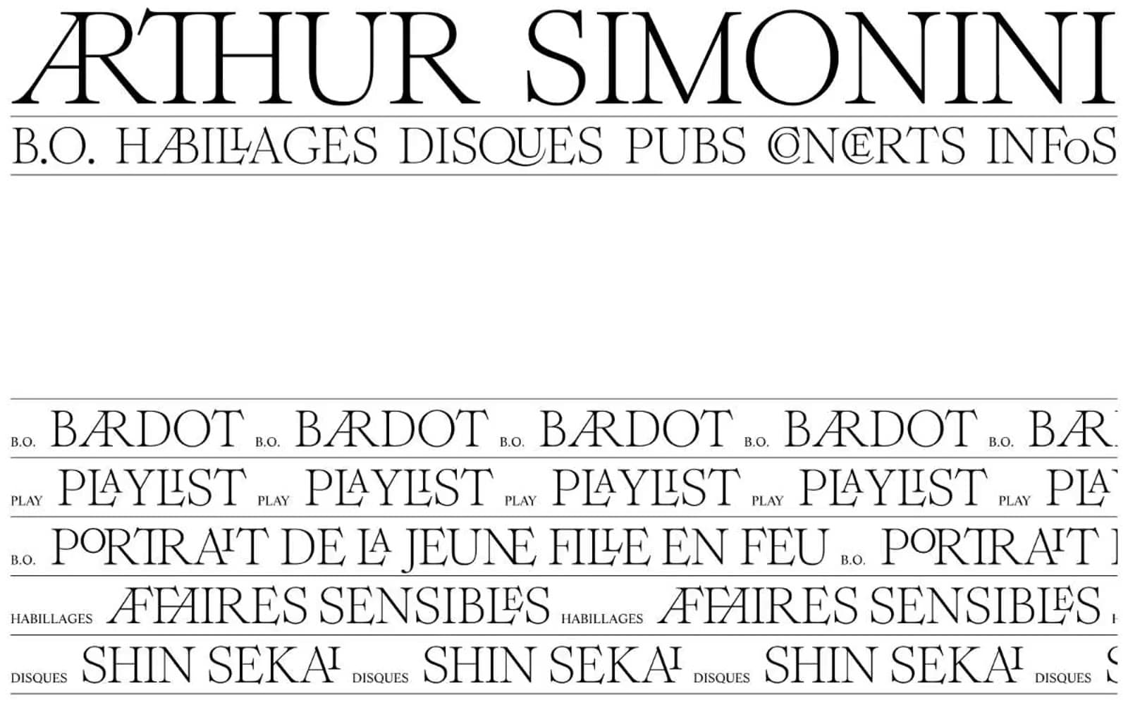
Arthursimonini
Media
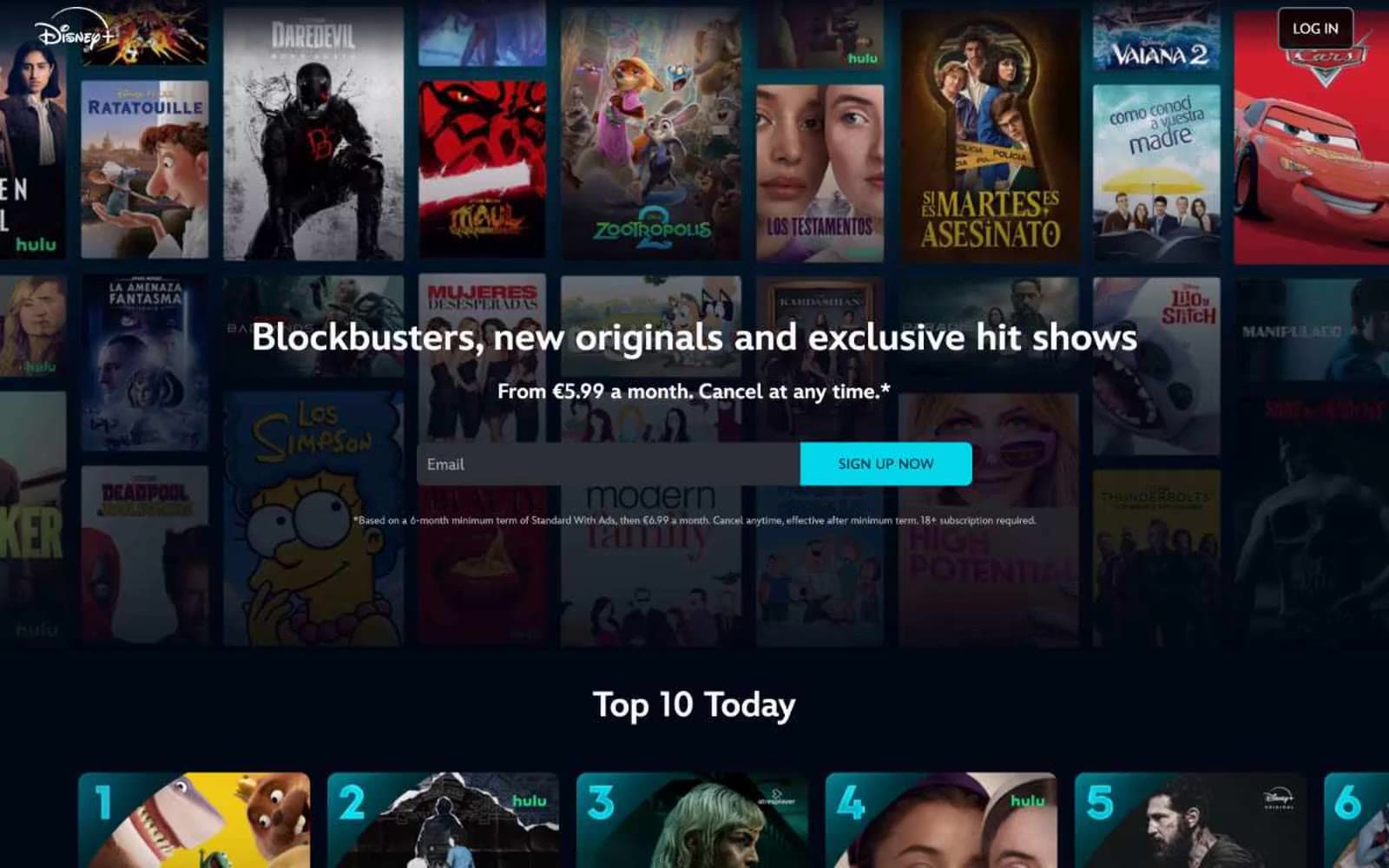
Disney+
Media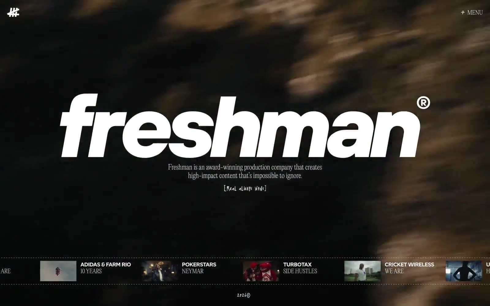
Freshman
Media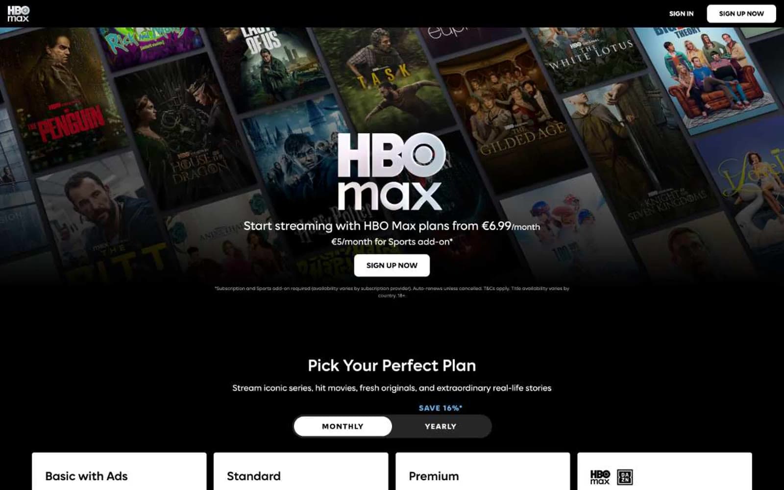
HBO Max
Media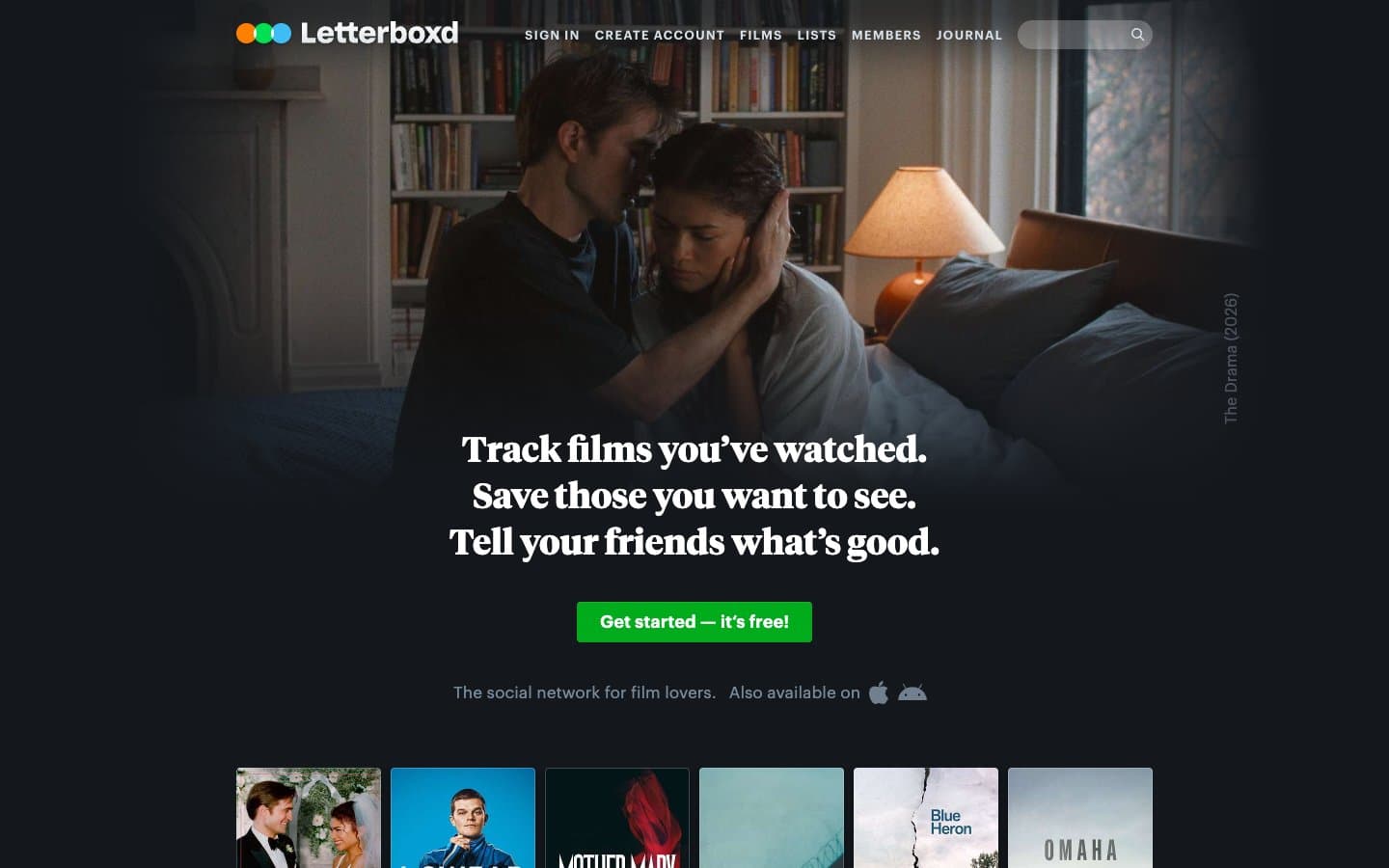
Letterboxd
Media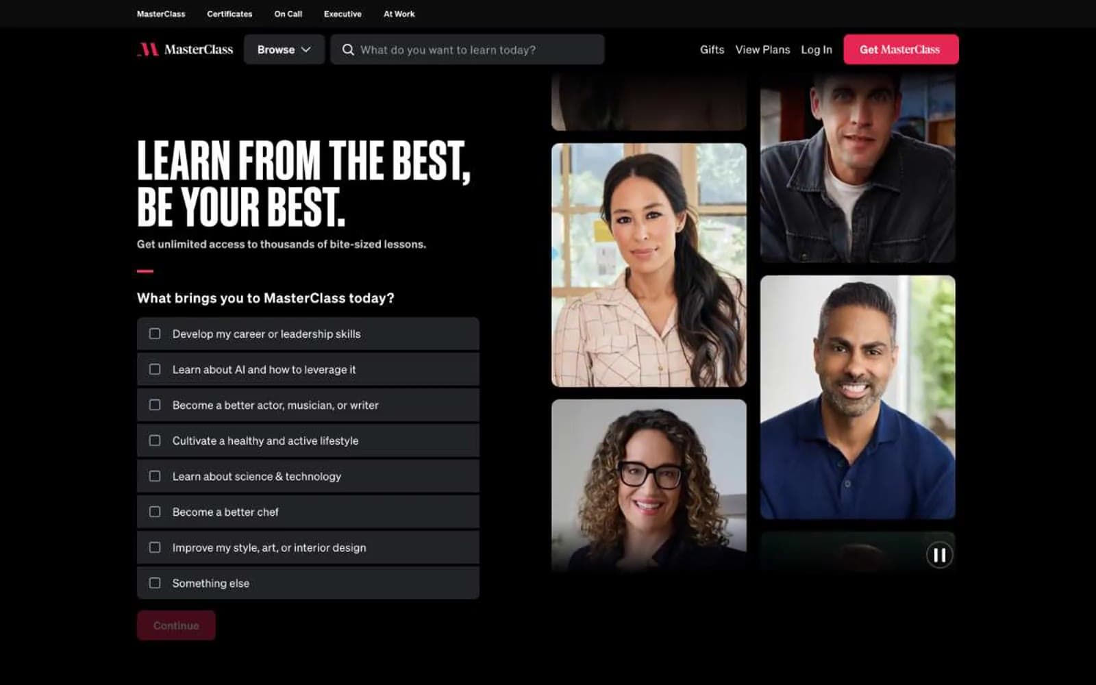
MasterClass
Media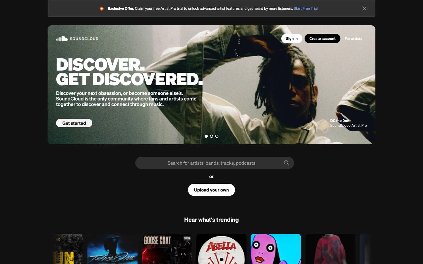
SoundCloud
Media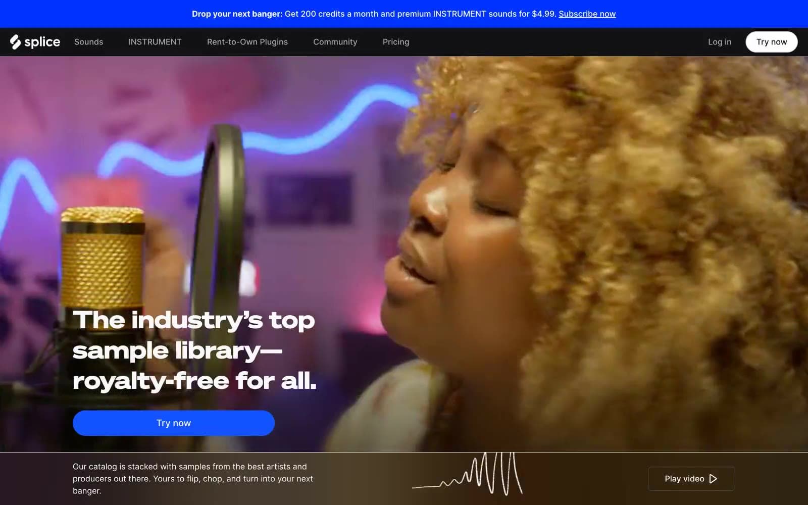
Splice
Media


