
SwimClub. Clinical dossier behind pixelated LCD readouts.
- Commerce
- Mixed theme
- 8 colors
- 3 typefaces
SwimClub runs a clinical-journal visual system: almost entirely achromatic (white, black, cool gray) with a single vivid orange (#ff9e00) used as full-bleed punctuation rather than button color. Typography does the heavy lifting — a geometric grotesque (Px Grotesk) for body and headlines, a monospace (Apercu Mono) for data labels and navigation micro-copy, and a custom pixelated display face (Swimclub) reserved for the logo and oversized statistic numbers that read like LCD readouts. Surfaces alternate between a cool off-white canvas, stark white product cards, deep navy-black hero blocks with photographic product shots, and saturated orange stat panels. The interface feels like a medical dossier viewed through a retro arcade screen: clinical, editorial, slightly playful, with sharp 0px corners and hairline dashed borders that keep everything reading as diagram rather than decoration.
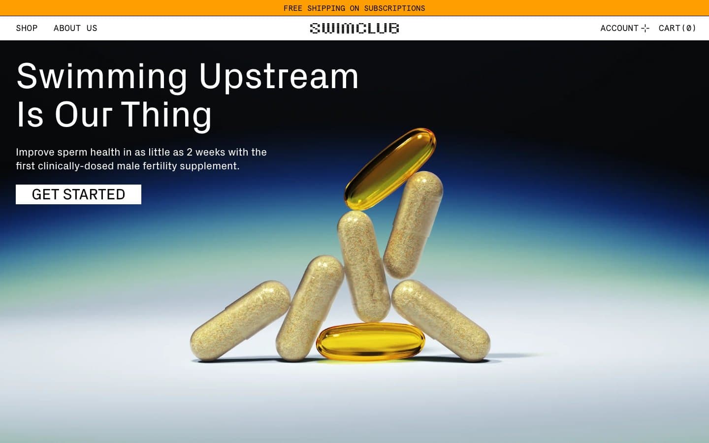
SwimClub design system

Brand2
Full-bleed section backgrounds (announcement bar, statistic panels) — the only chromatic brand color, used at maximum saturation to break the otherwise monochrome flow
Hero gradient terminal color and product photograph backgrounds — near-black with a blue undertone, not a pure black
Neutrals6
Primary text, hairline borders, navigation dividers, card outlines, button text — the dominant structural color across the entire interface
Secondary body text and low-emphasis borders — the mid-tone of the neutral scale
Tertiary borders, disabled state outlines, muted icon strokes
Dividers, dashed-border accent on feature cards, subtle separator lines
Muted UI surface for disabled controls, low-emphasis panels, and placeholder blocks.
Page background, card surfaces, product image overlays, button fills, and text on dark or orange panels
Try a pairing
Pick any two colors from the palette to check whether text stays readable on top.
Aa
Ink Black on Tabloid Orange
10.14 : 1 contrast
- Body textPasses AA 4.5
- Large textPasses AA 3
- StrictPasses AAA 7
More DESIGN.md files. Same web, different personalities.

Nothing
Commerce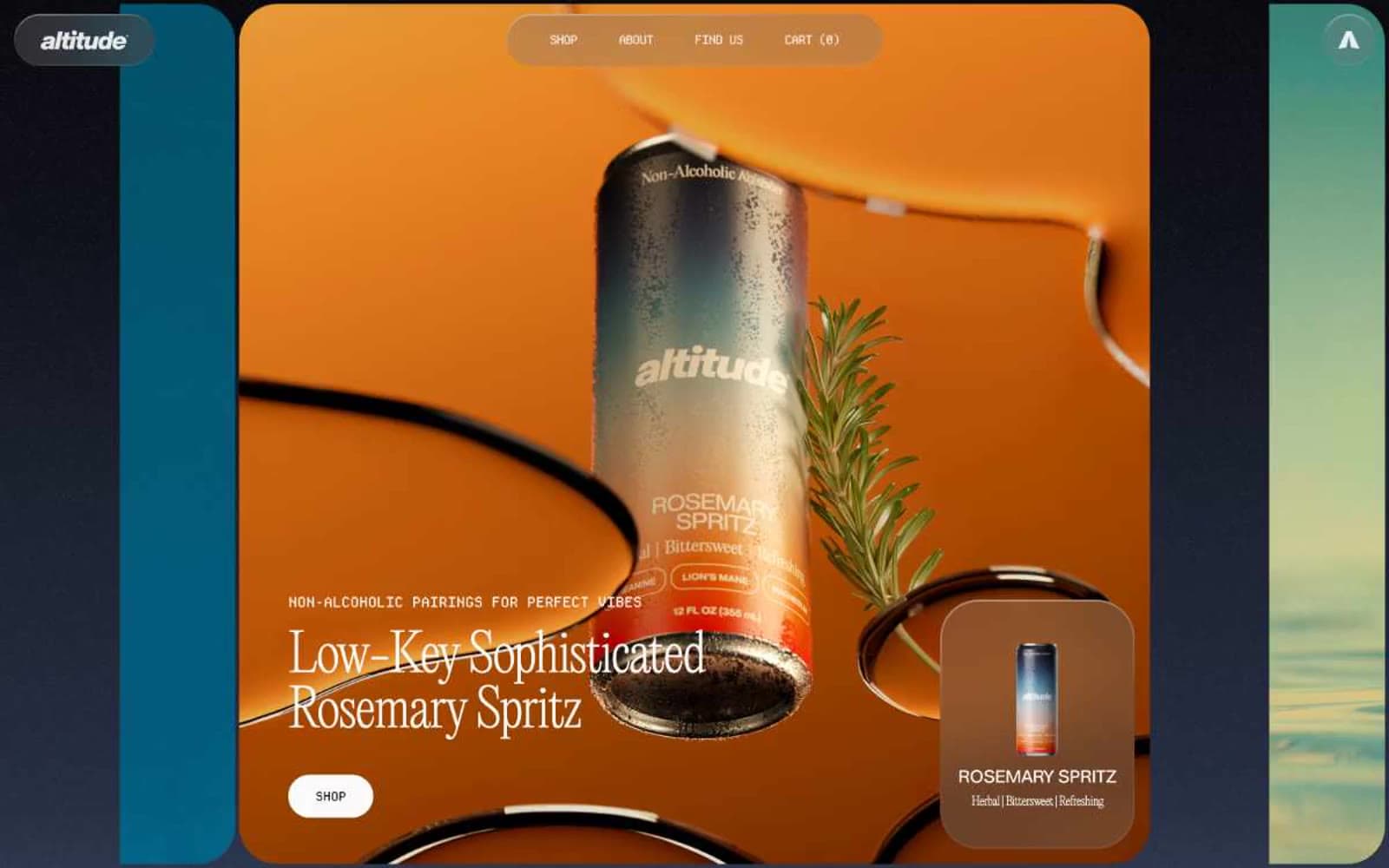
Altitude Beverages
Commerce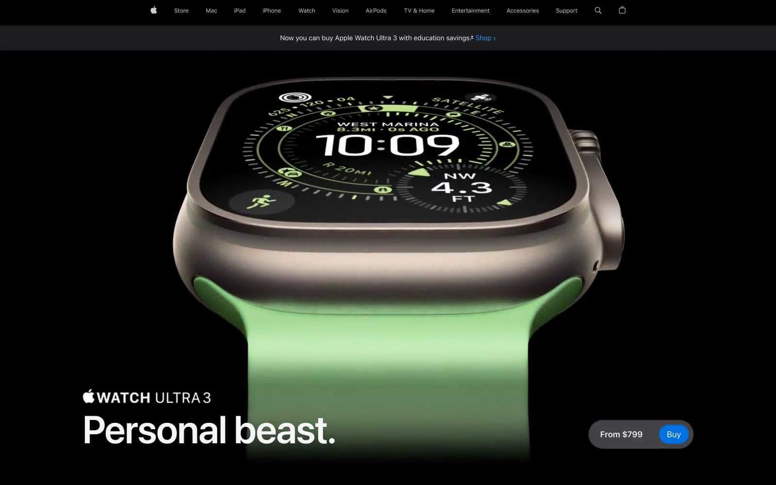
Apple Watch Ultra 3
Commerce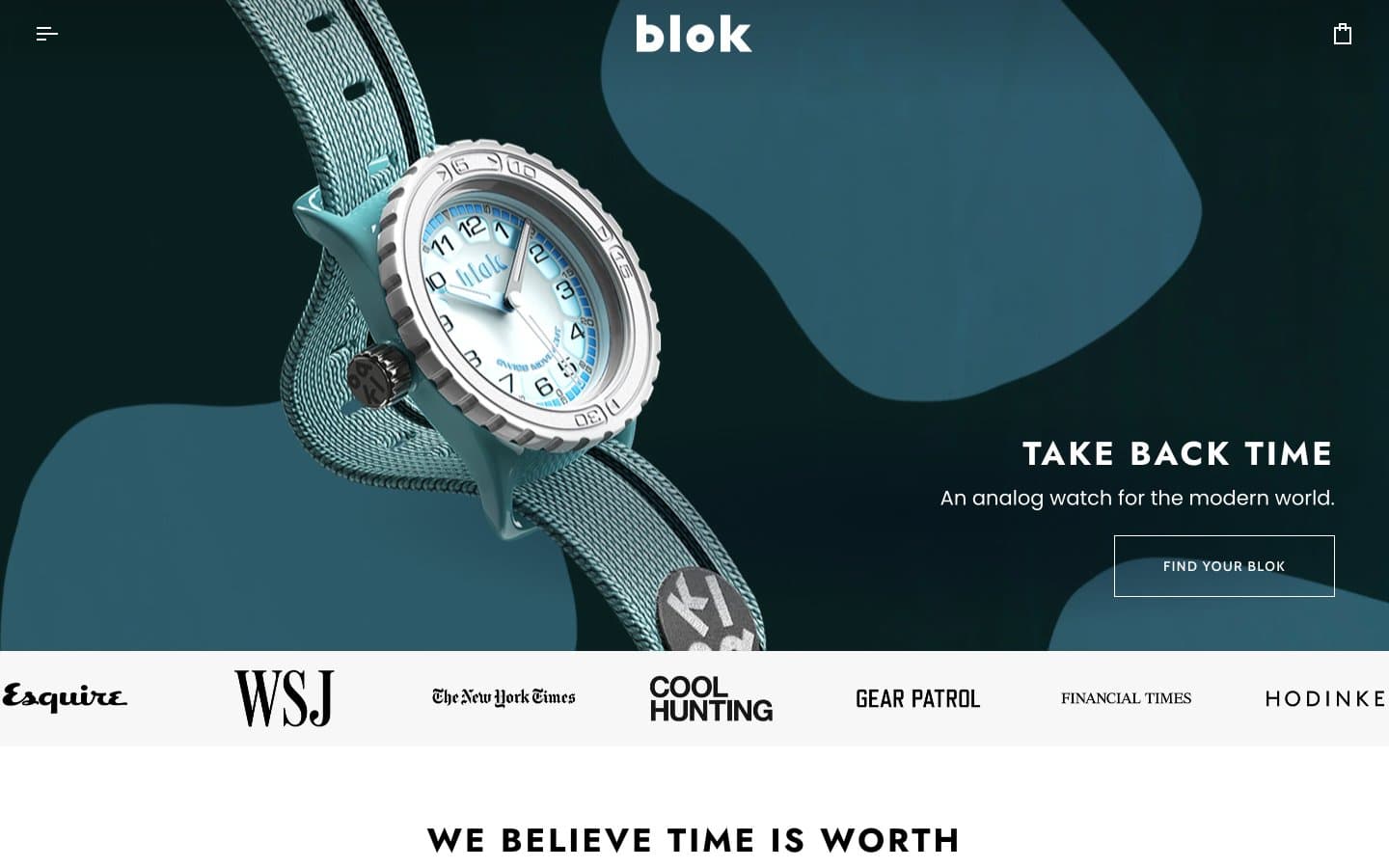
Blok
Commerce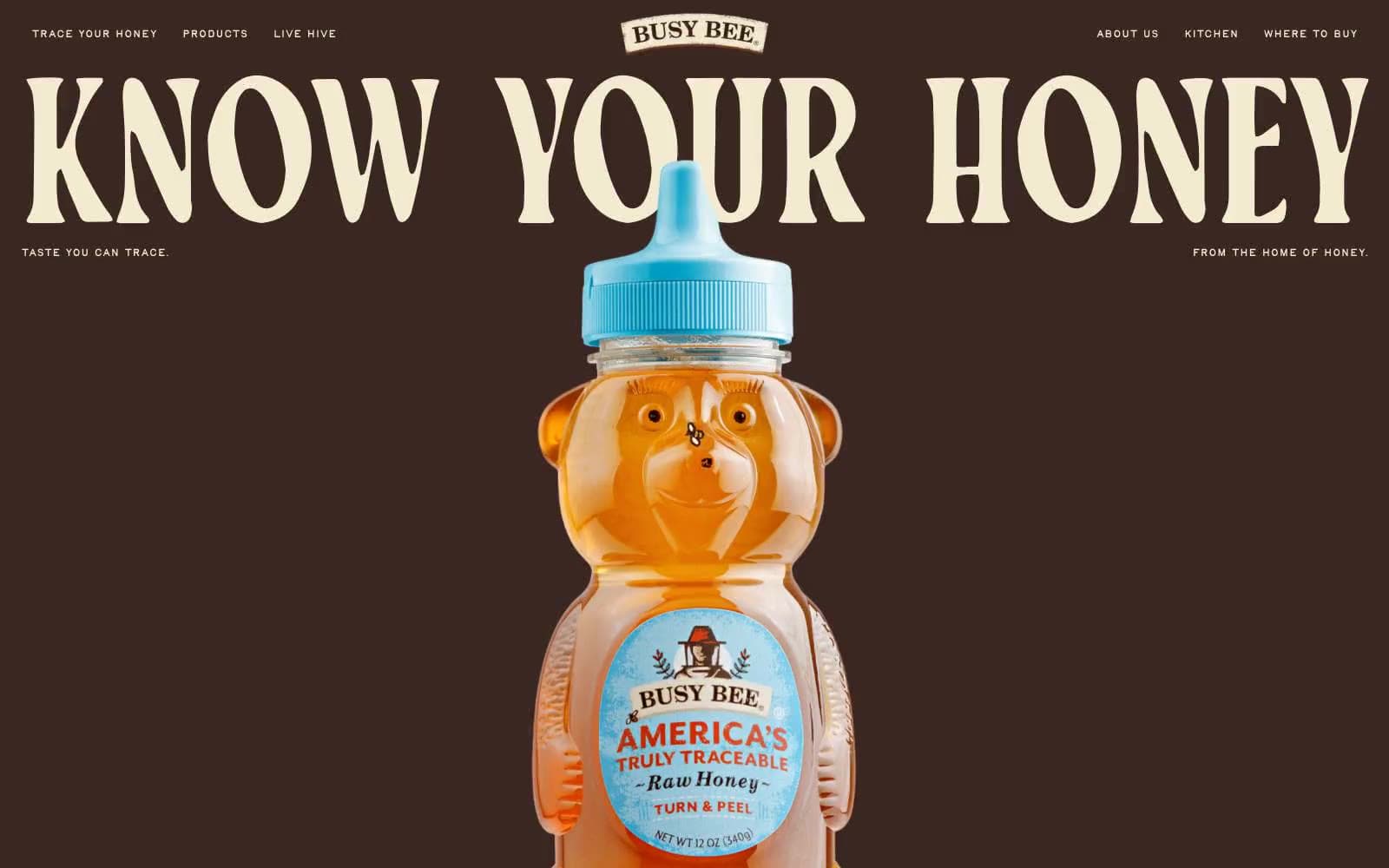
Busy Bee Honey
Commerce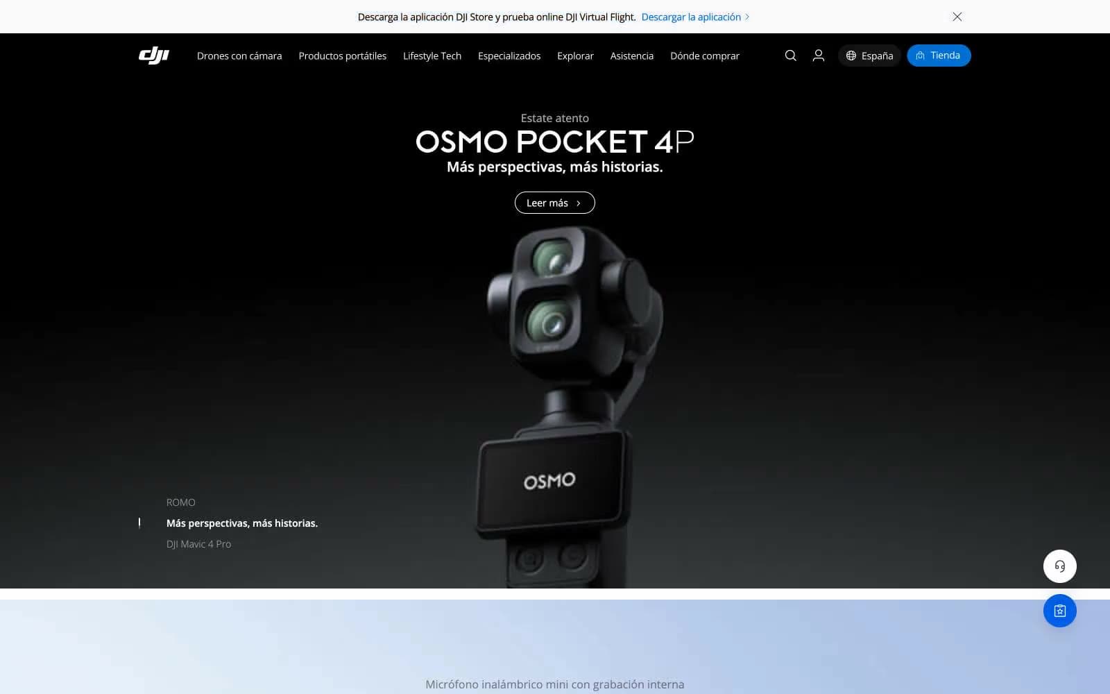
DJI
Commerce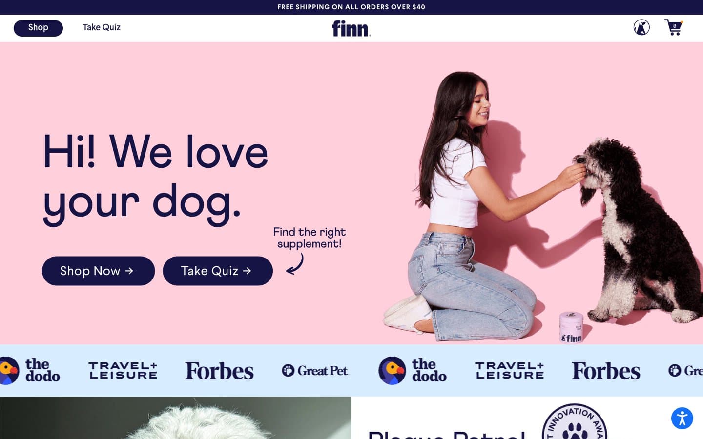
Finn
Commerce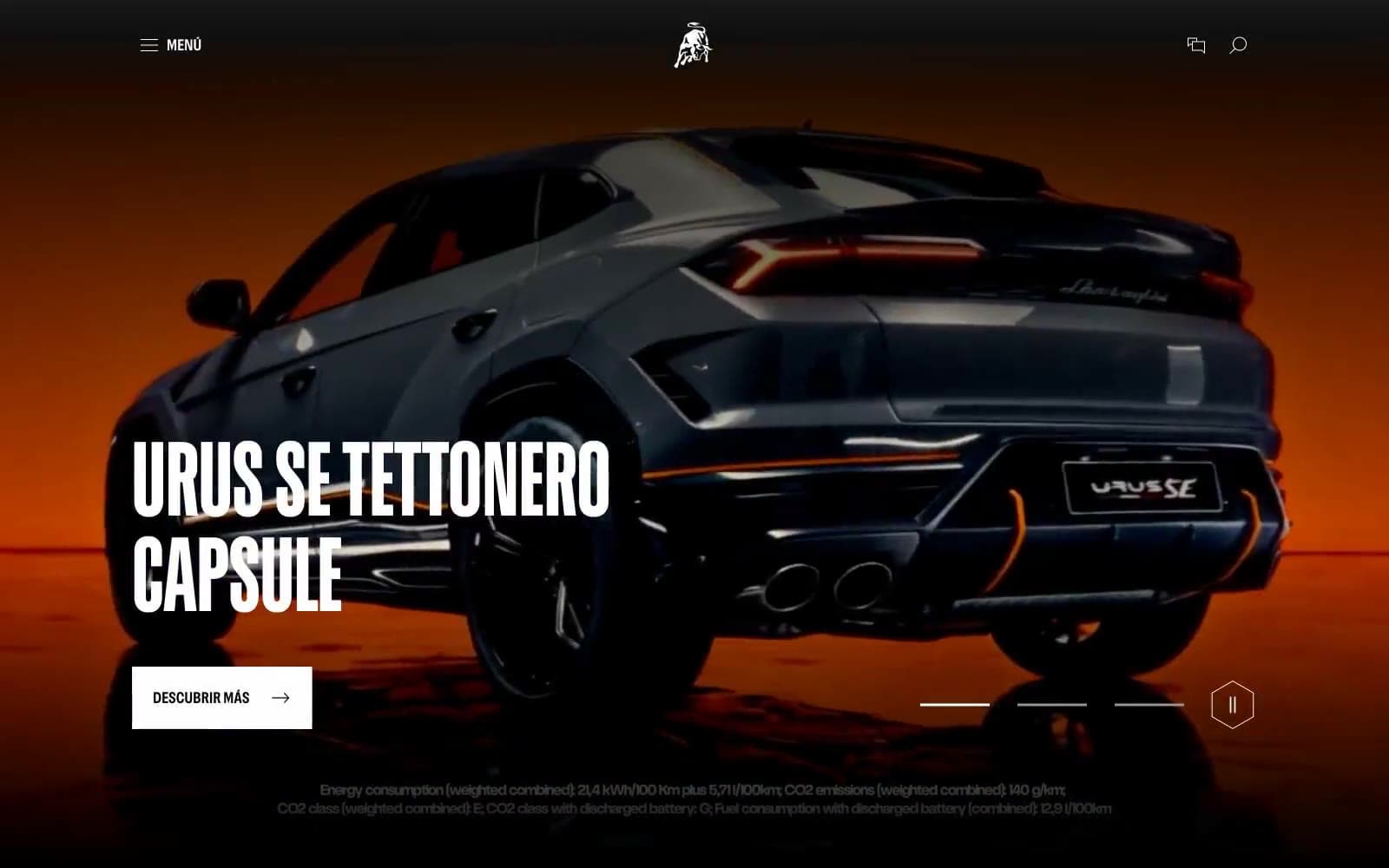
Lamborghini.com
Commerce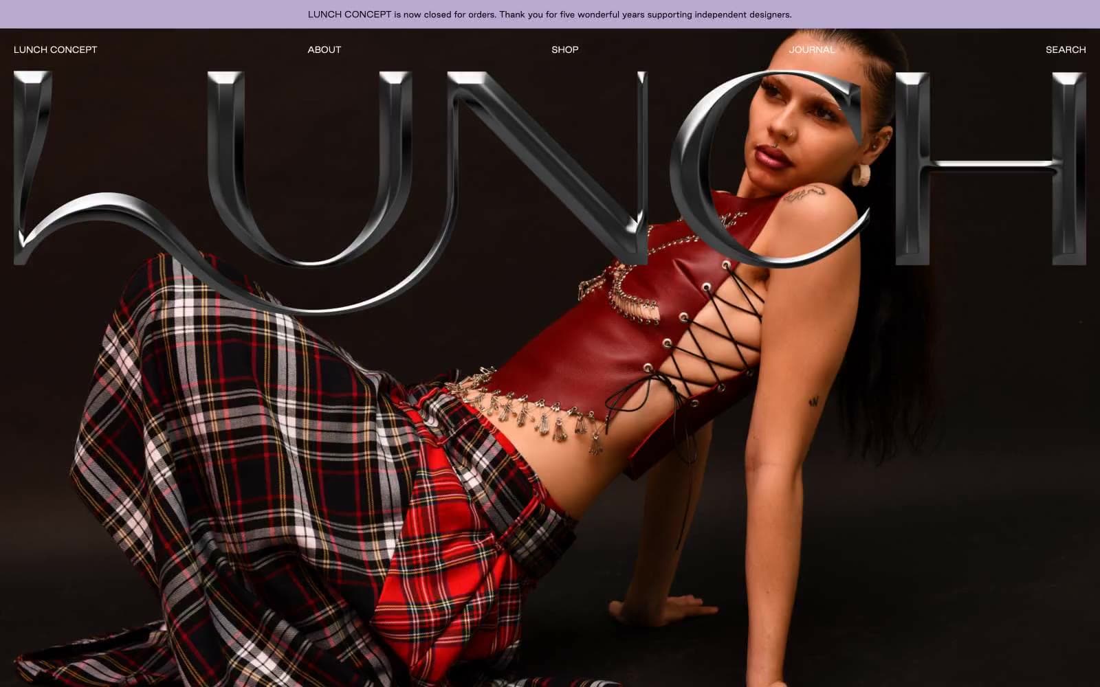
LUNCH
Commerce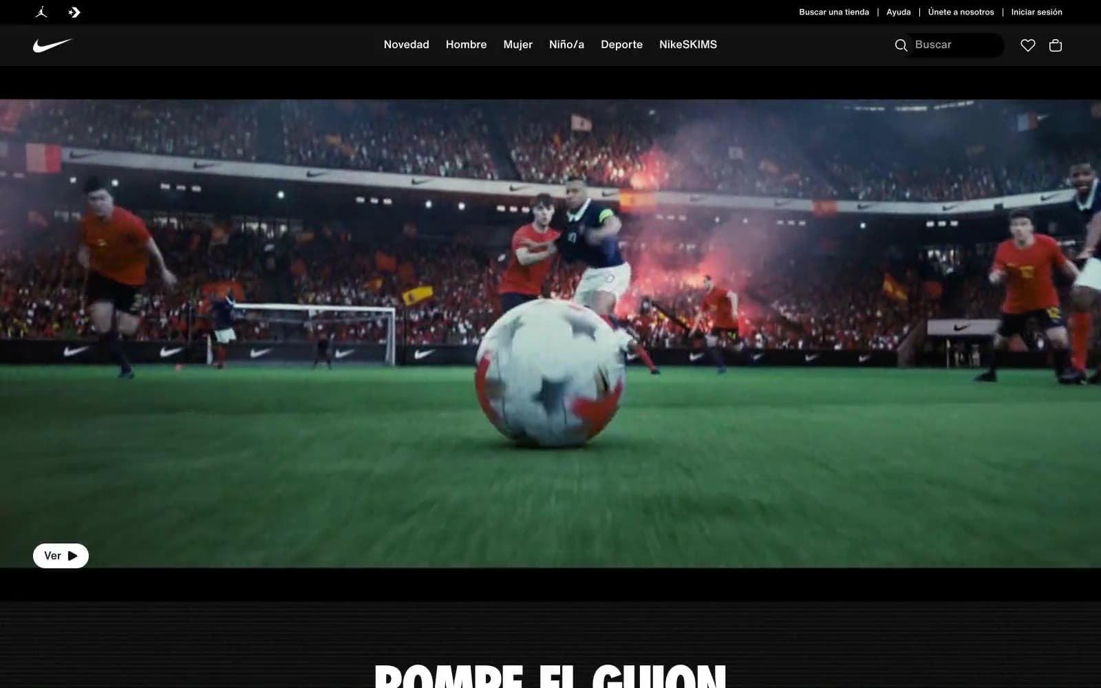
Nike.com
Commerce
Peloton
Commerce
San Rita
Commerce


