Super. Sunlit paper desk with one amber marker.
- SaaS
- Mixed theme
- 12 colors
- 1 typeface
Super runs on a near-monochrome warm-neutral canvas that borrows the tactile grammar of a notebook — cream paper backgrounds, charcoal ink text, hairline dividers — and punctuates it with a single saturated amber that acts as the page's only chromatic accent. The result reads like a well-typeset document that has been wired to one working button: quiet, considered, and immediately legible about where to click. Typography is custom (Beausite) set tight at display sizes and confident at body sizes, giving the page editorial weight without heaviness. Components are lightweight — soft white cards sitting on cream, no decorative gradients, minimal elevation, ghost nav links, and a bold amber filled button as the sole loud element on most screens. The visual system extends Notion's own canvas palette (#f9f9f8, #37352f) and adds a sunlit warm accent to distinguish the brand from its parent tool.
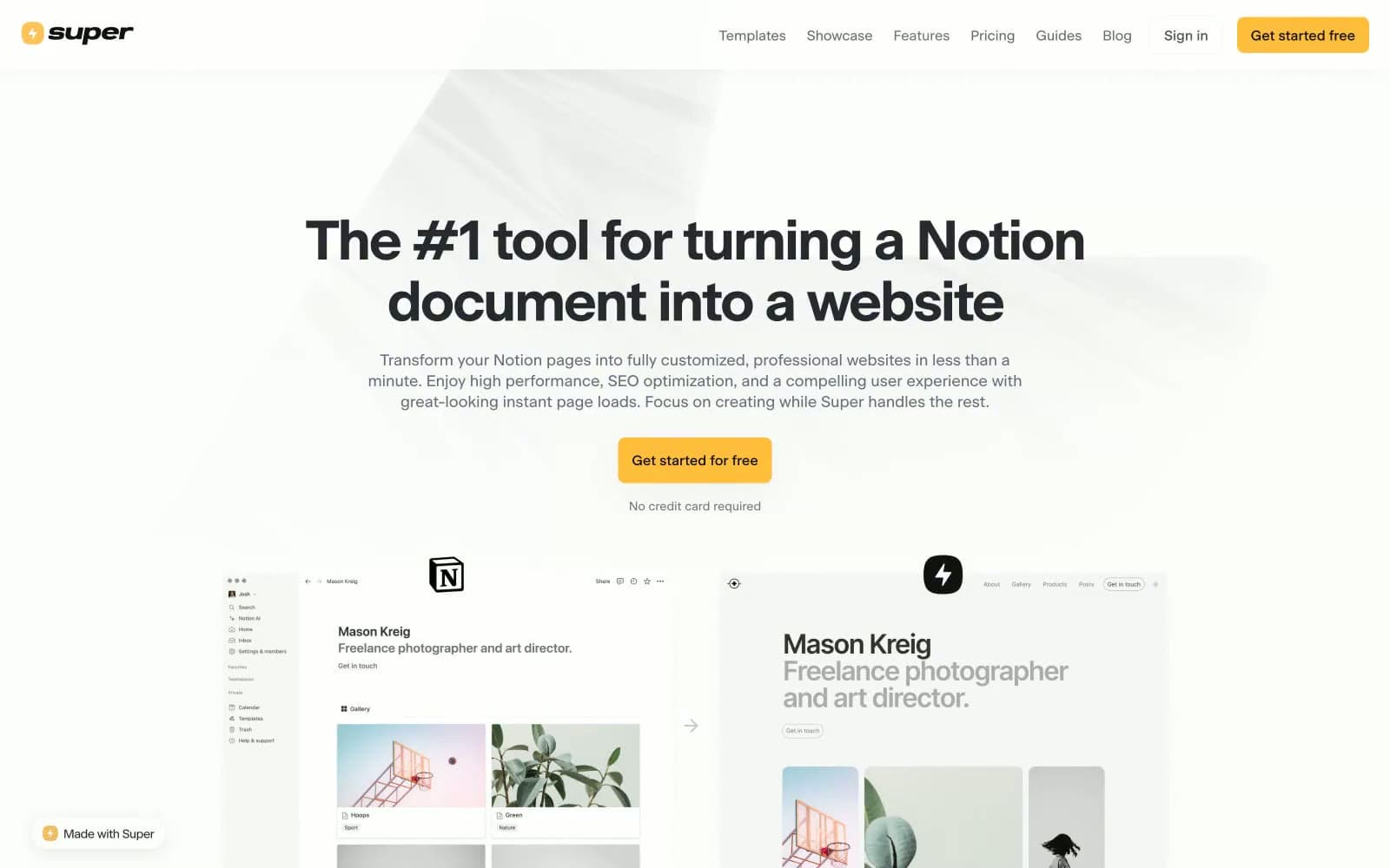
Super design system
Brand1
Yellow supporting accent for decorative details and low-frequency emphasis. Do not promote it to the primary CTA color
Neutrals11
Footer background and deepest dark surface. The maximum darkness level in the surface stack
Heading emphasis, high-contrast dark surface for footer and dark feature sections, near-black for strong typographic moments
Primary text, dominant foreground color, nav elements, and high-emphasis UI. The workhorse neutral of the entire system
Secondary text and borders within card contexts. Slightly warmer than Ink Charcoal, echoes Notion's native text color
Supporting neutral for secondary UI, dividers, and muted labels.
Subtle warm-toned text for tertiary content, gives body copy a slight paper-on-desk warmth without being obviously chromatic
Near-gray with a faint cool tint, used for very low-emphasis body content and subtle borders
Secondary borders and dividers where more visual weight is needed than Hairline
Hairline borders, dividers, and subtle structural lines. The lightest visible neutral that still reads as a defined edge
Page background and outer canvas. Borrowed from Notion's own workspace palette to position Super as its native publishing layer
Card and elevated surface that sits on Cream Paper. Provides subtle separation through brightness contrast rather than shadow
Try a pairing
Pick any two colors from the palette to check whether text stays readable on top.
Aa
Black on Amber Pulse
12.03 : 1 contrast
- Body textPasses AA 4.5
- Large textPasses AA 3
- StrictPasses AAA 7
More DESIGN.md files. Same web, different personalities.

8returns
SaaS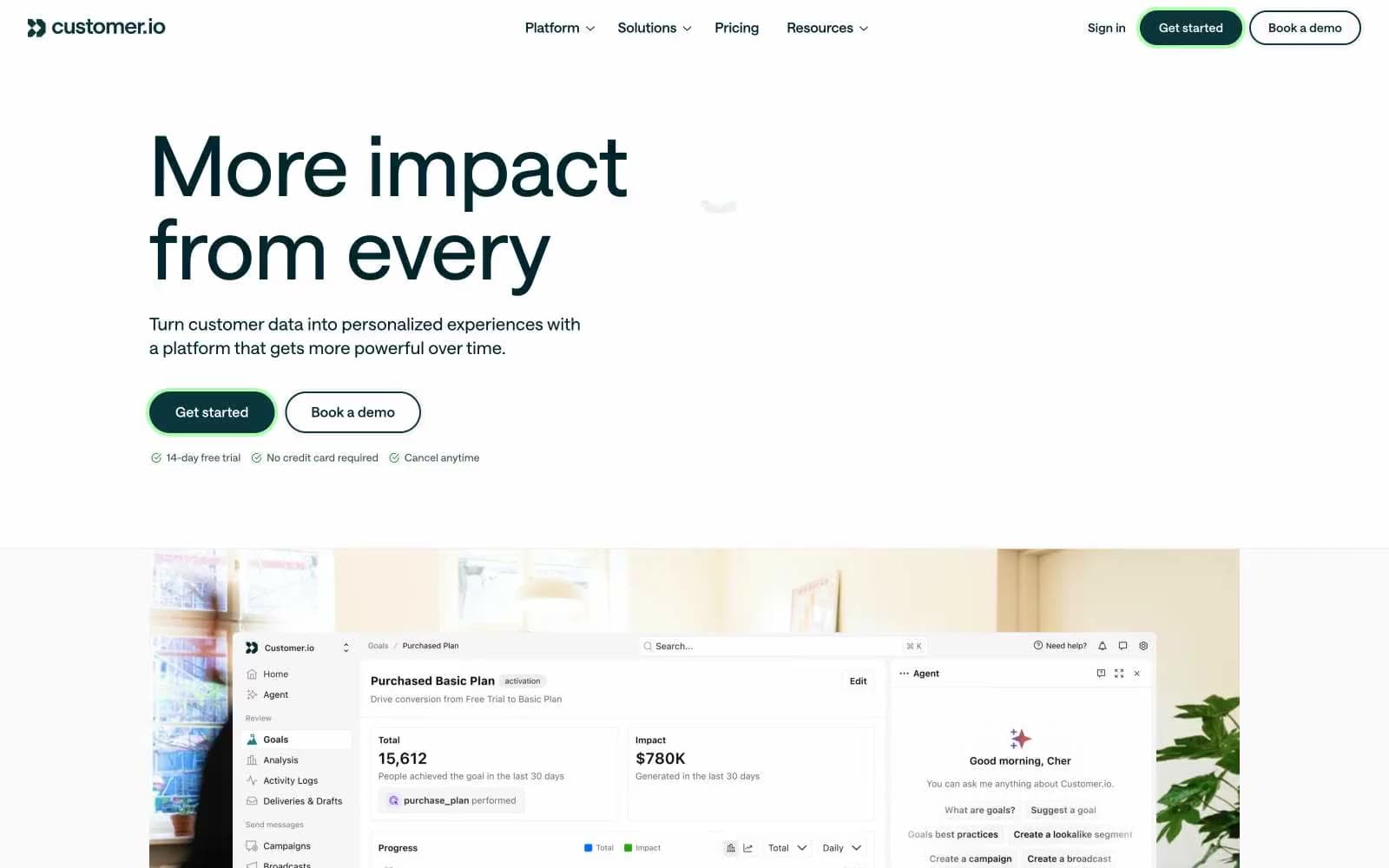
Customer.io
SaaS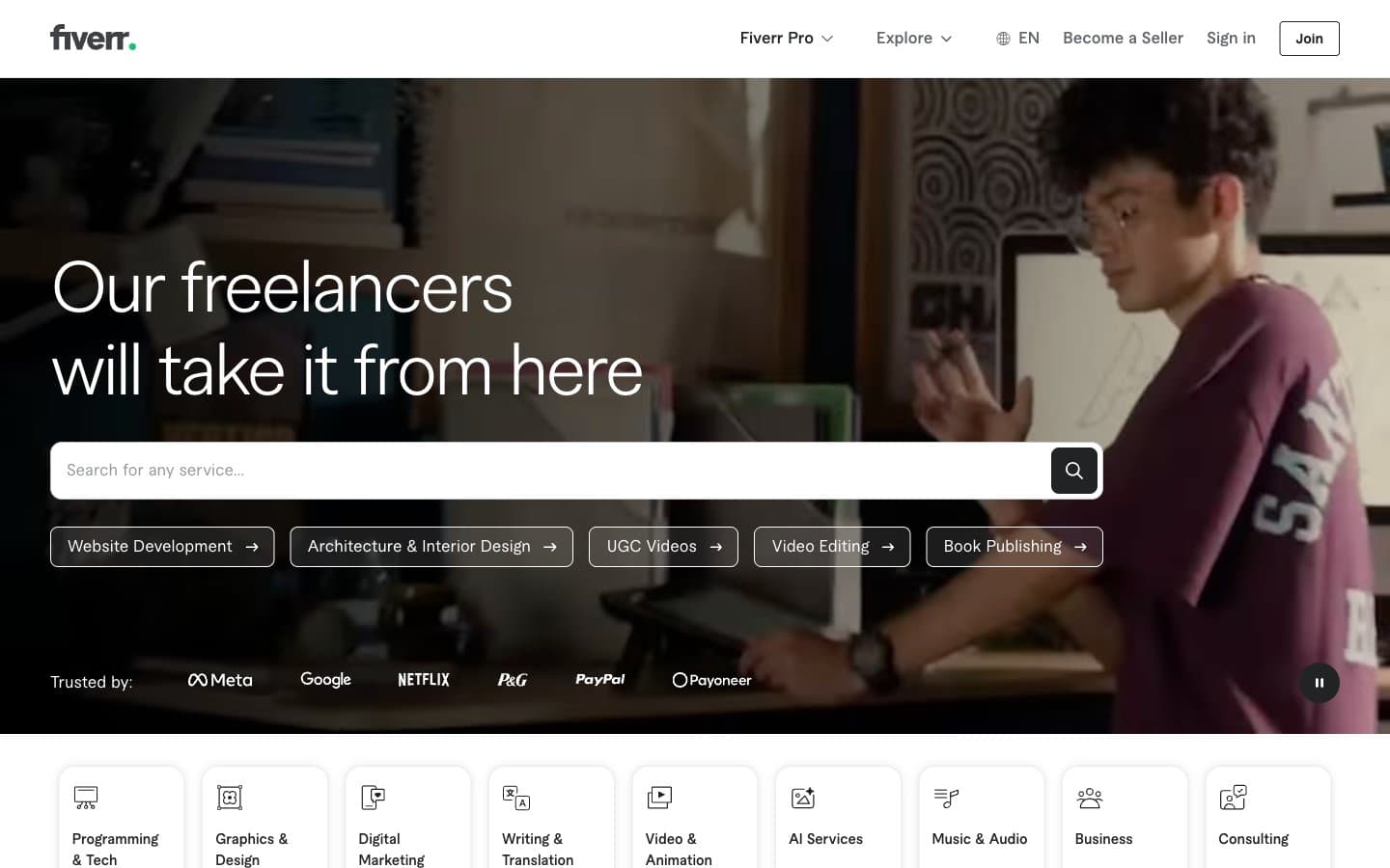
Fiverr.com
SaaS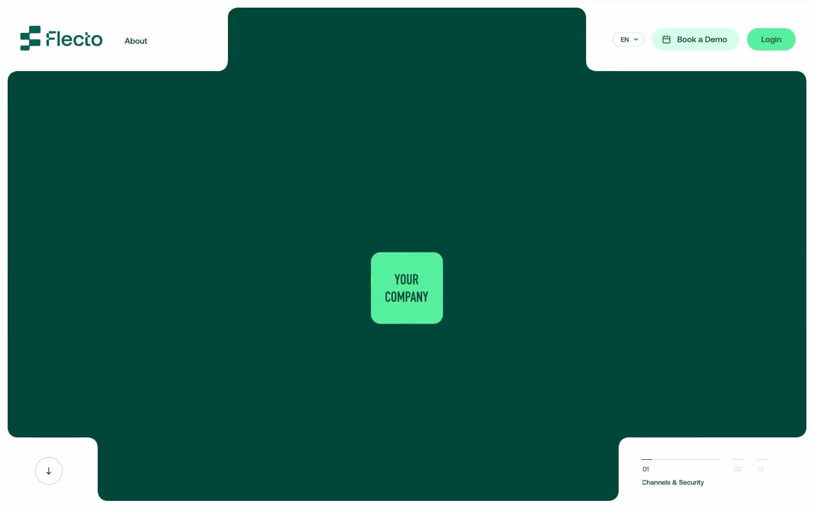
Flecto
SaaS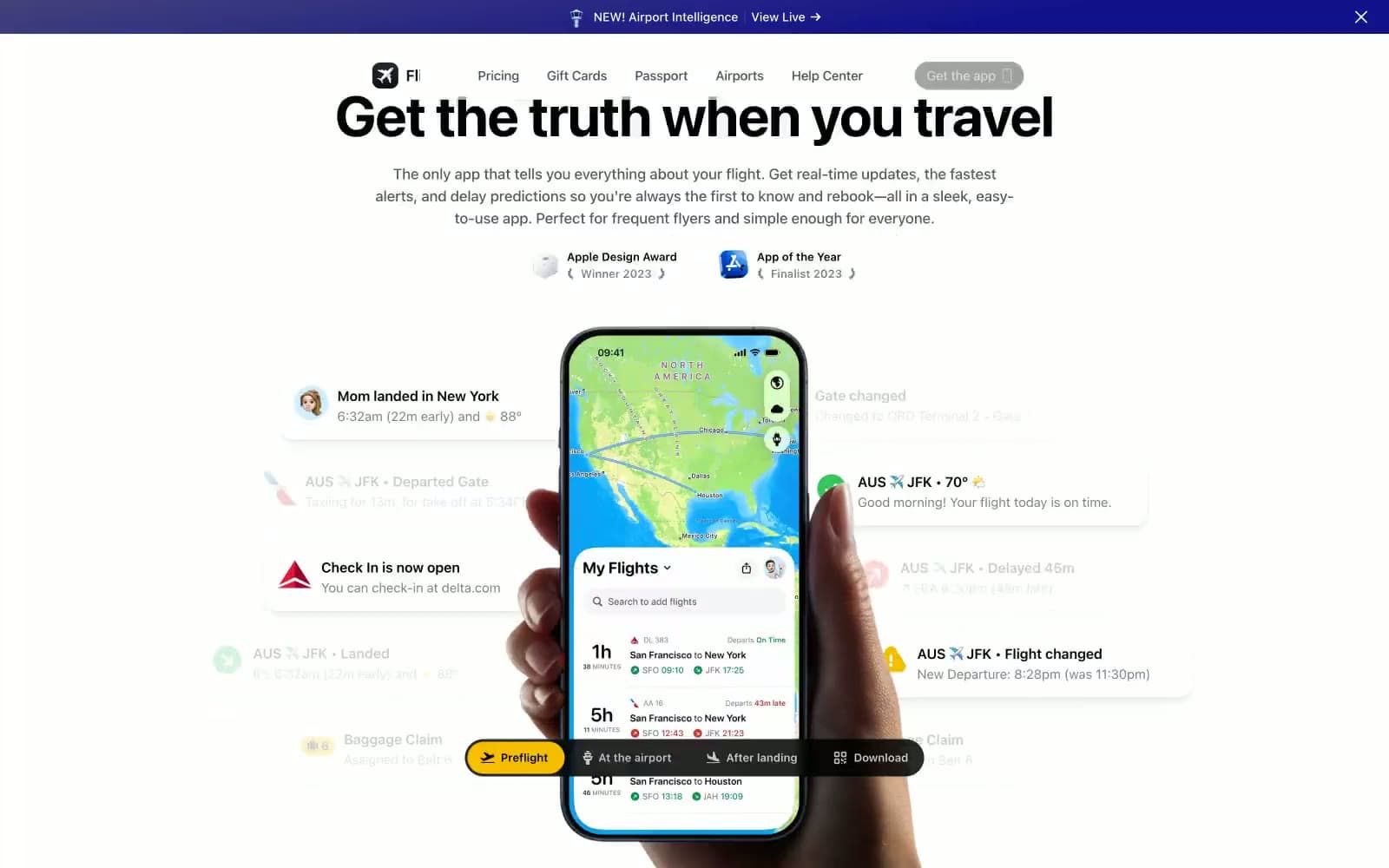
Flighty
SaaS
Ghost
SaaS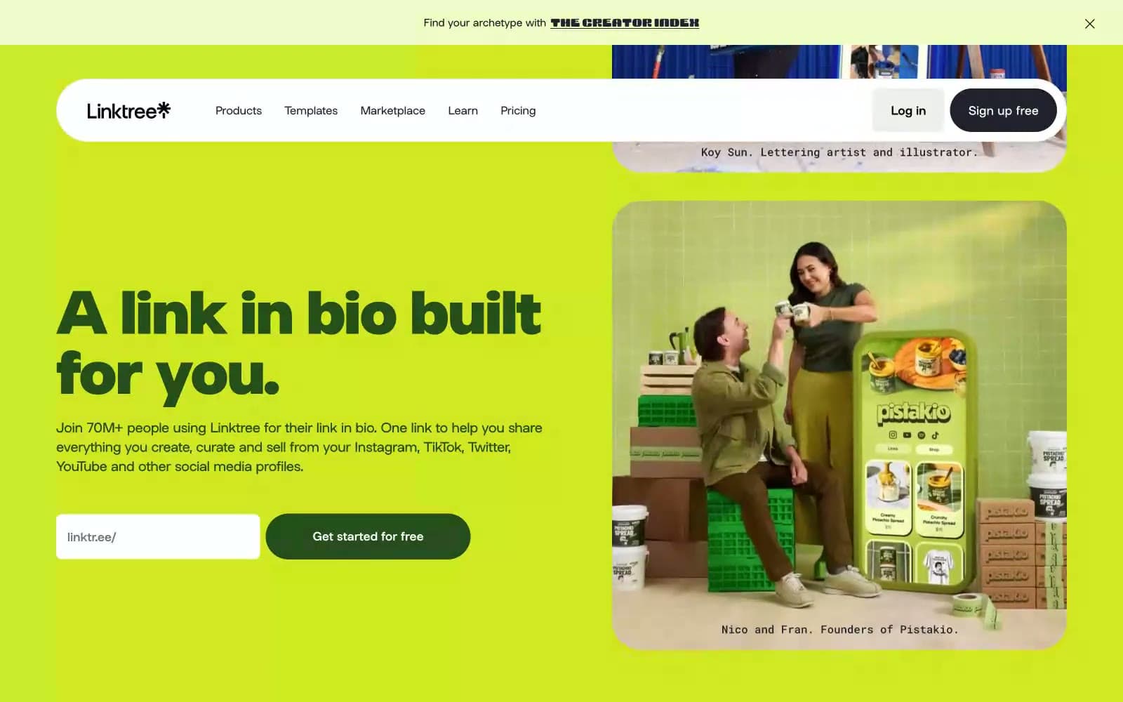
Linktr
SaaS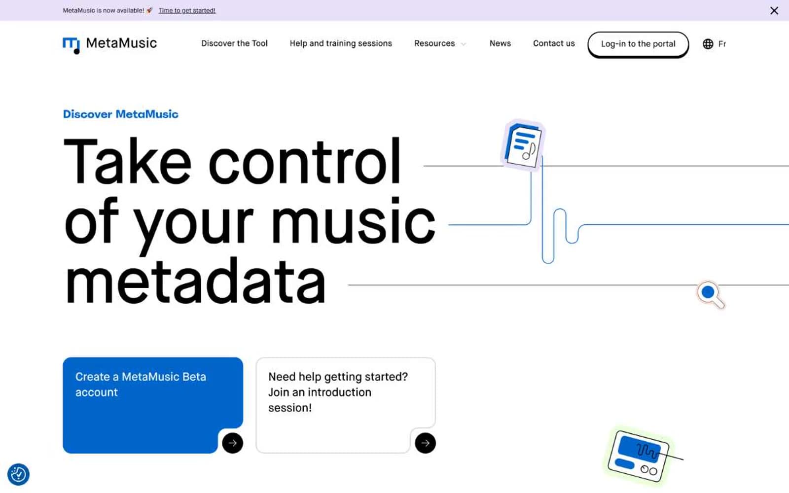
MetaMusic
SaaS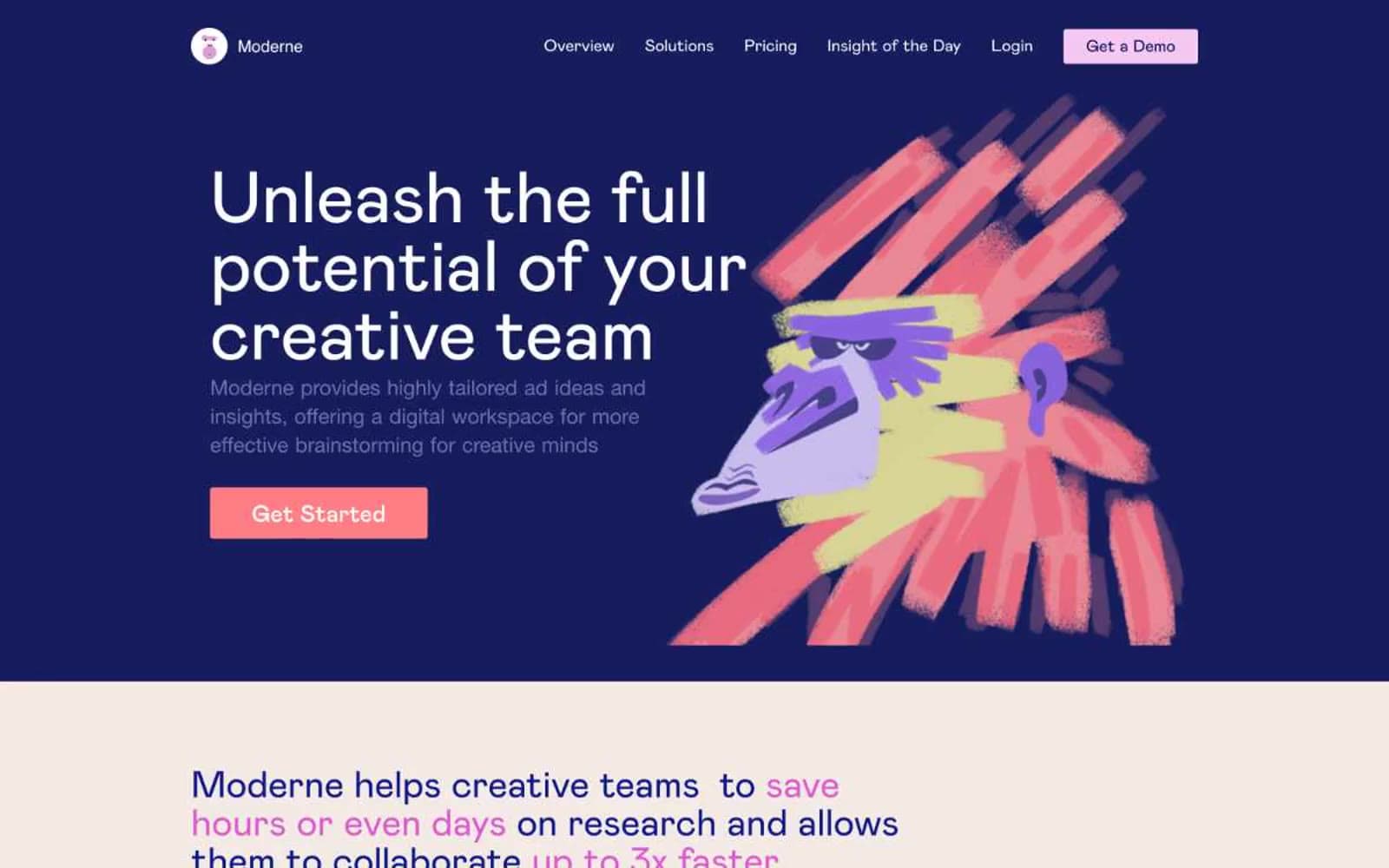
Moderne
SaaS
Passionfroot
SaaS
Planhat
SaaS
Prevalent
SaaS


