
Spotify. Nocturnal jukebox control room.
- Media
- Dark theme
- 14 colors
- 2 typefaces
Spotify's web interface is a dense, dark-mode media command center: a near-black canvas punctuated by vibrant album artwork, one signature green accent, and pill-shaped controls. Typography is compact and utilitarian — a custom geometric sans-serif at small sizes that lets album art and artist photography do the visual heavy lifting. The layout is a fixed two-column shell (sidebar + main feed) with card grids of square covers and circular avatars, creating a rhythmic alternation between geometry types. The interface avoids heavy elevation, relying on subtle surface differentiation (#121212 cards on #000000 canvas) and the one large gradient banner to inject energy. The result feels like a DJ's control room: information-dense, acoustically dark, and ready to play at a glance.
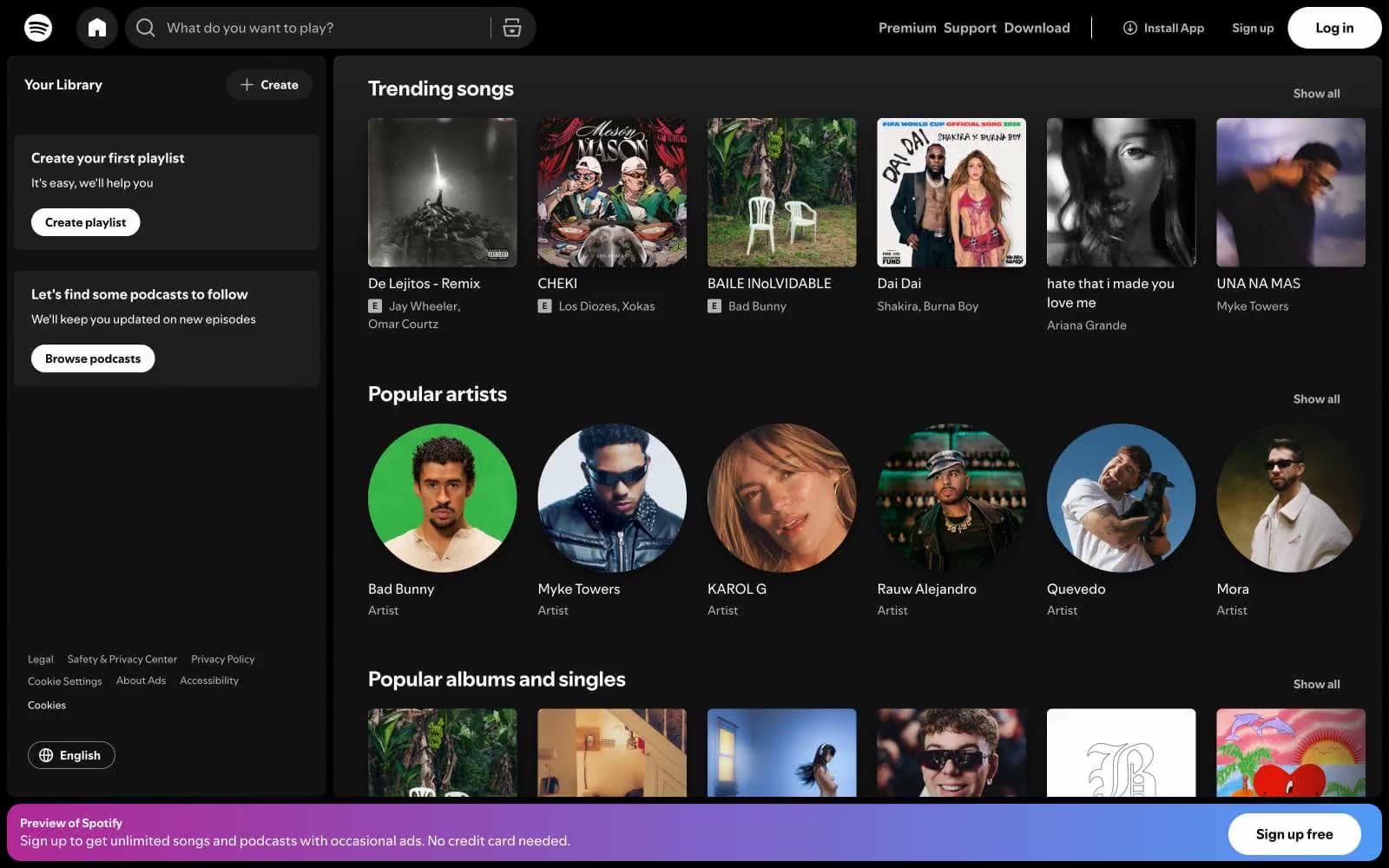
Spotify design system

Brand1
Green supporting accent for decorative details and low-frequency emphasis. Do not promote it to the primary CTA color
Accent3
Red supporting accent for decorative details and low-frequency emphasis. Use as a supporting accent, not as a status color
Sign-up banner gradient endpoint — energetic blue anchor
Promotional banner gradient start — vivid pink-to-blue sweep for marketing CTAs
Neutrals10
Page canvas, top nav background, deepest surface layer
Card surfaces, sidebar panels, secondary surface layer above canvas
Elevated surface — hover states, input fields, selected nav items
Active navigation background, subtle highlight wash
Input borders, subtle dividers between surface layers
Muted UI elements, secondary borders
Muted text, secondary icon fills, inactive nav icons
Secondary text, metadata, artist names, timestamps
Input placeholder text, subtle captions
Light supporting surface for subtle backgrounds and section separation. Do not promote it to the primary CTA color
Try a pairing
Pick any two colors from the palette to check whether text stays readable on top.
Aa
Void Black on Spotify Green
10.94 : 1 contrast
- Body textPasses AA 4.5
- Large textPasses AA 3
- StrictPasses AAA 7
More DESIGN.md files. Same web, different personalities.

Stripe Press
Media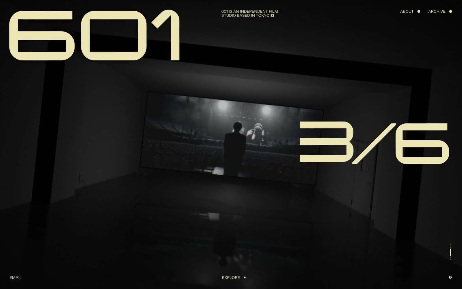
601 Inc.
Media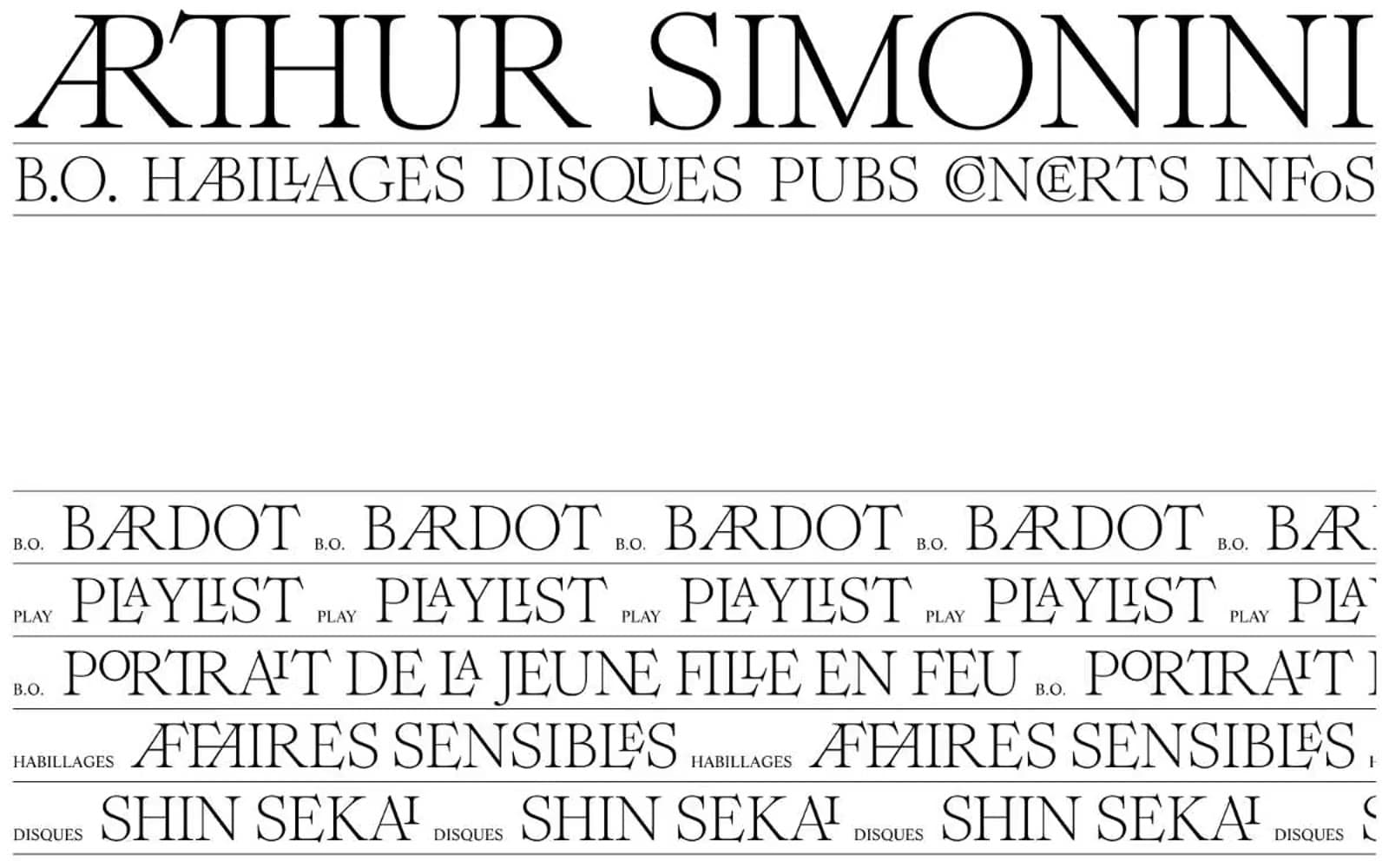
Arthursimonini
Media

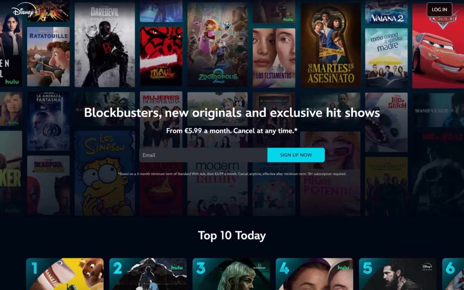
Disney+
Media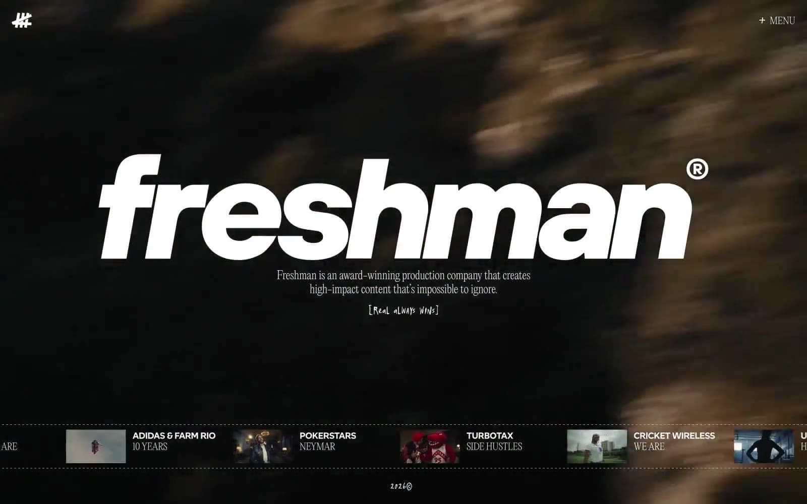
Freshman
Media
HBO Max
Media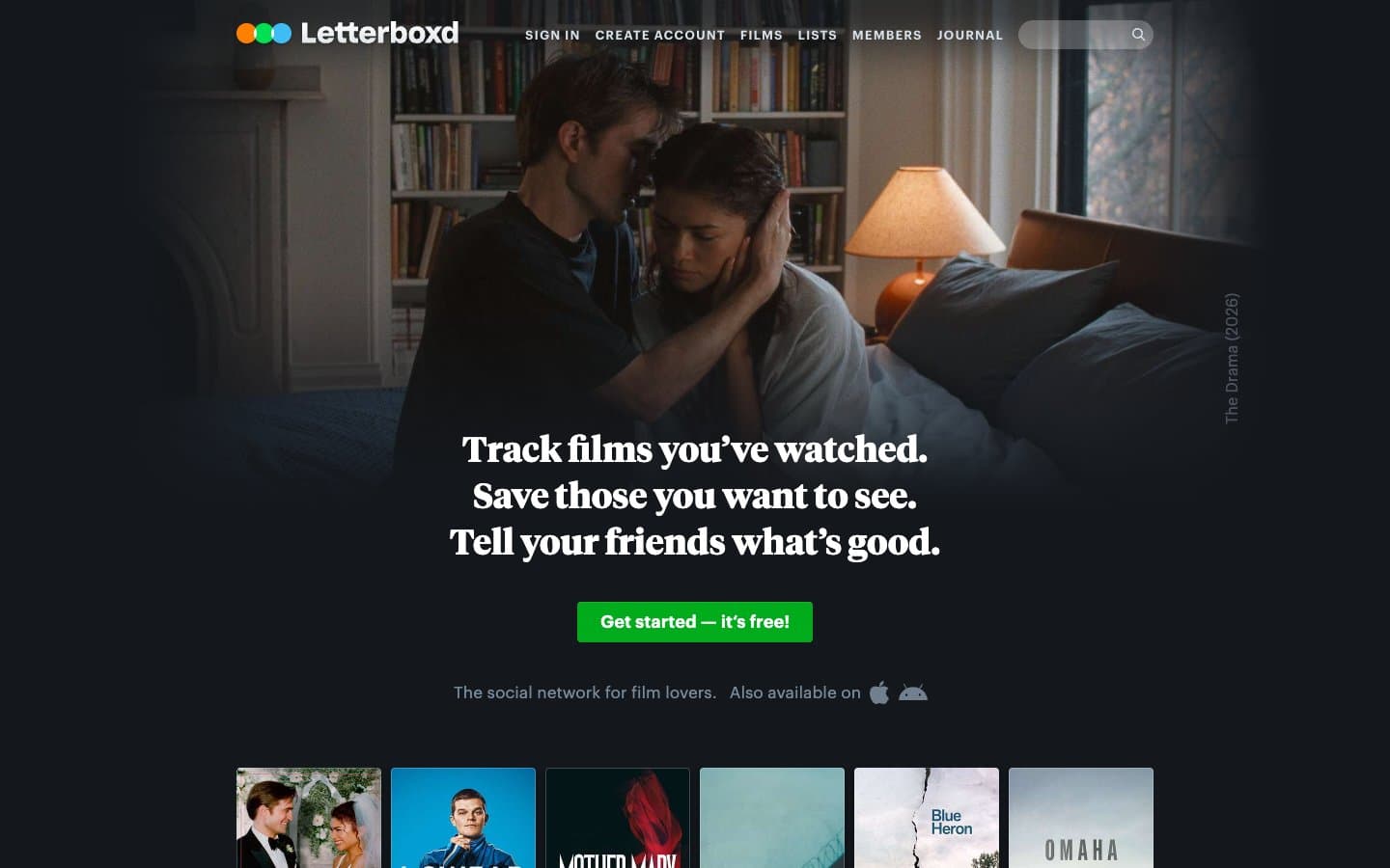
Letterboxd
Media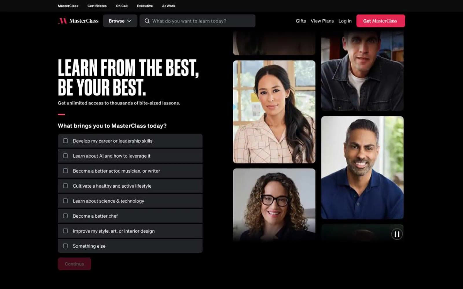
MasterClass
Media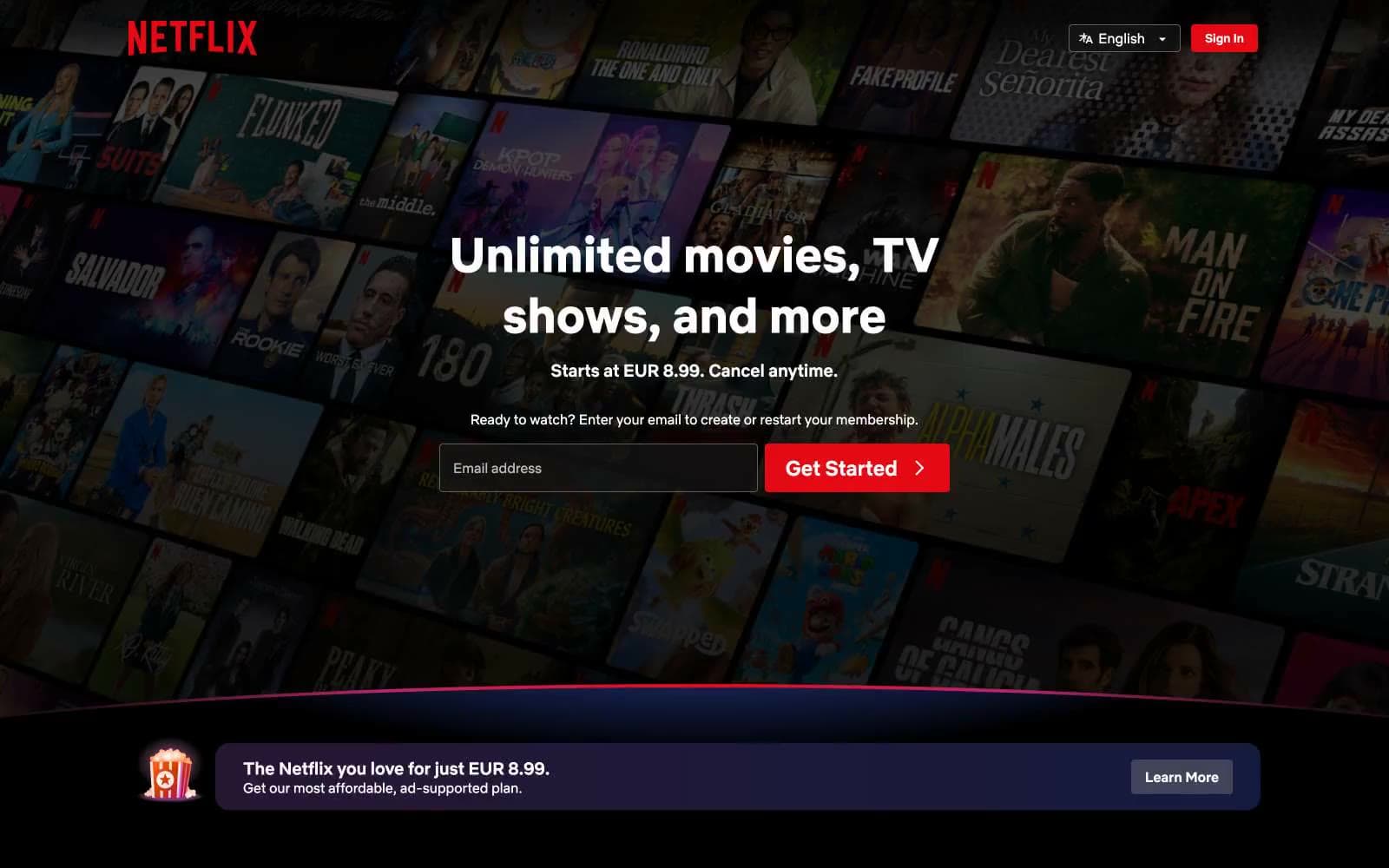
Netflix Spain
Media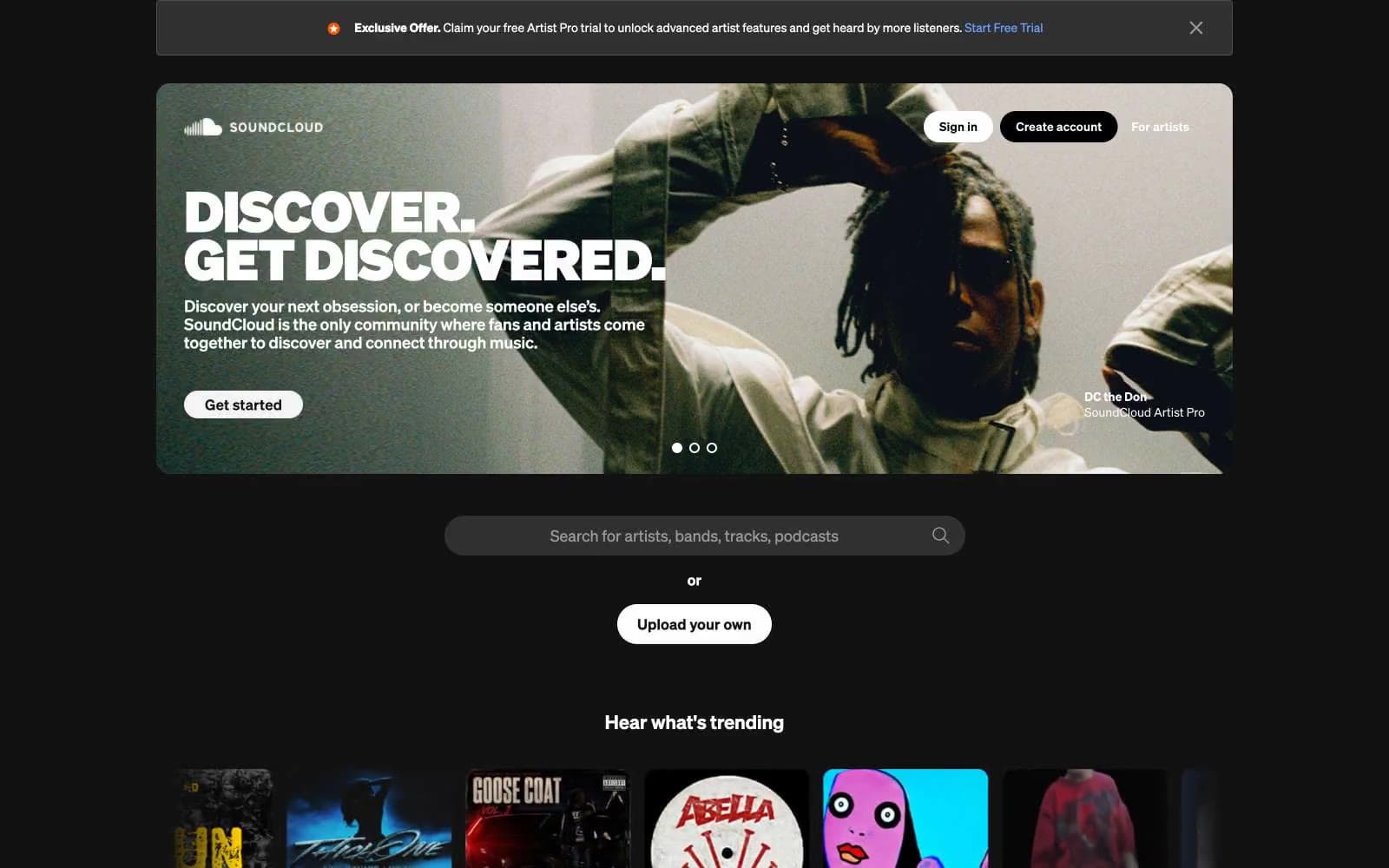
SoundCloud
Media


