
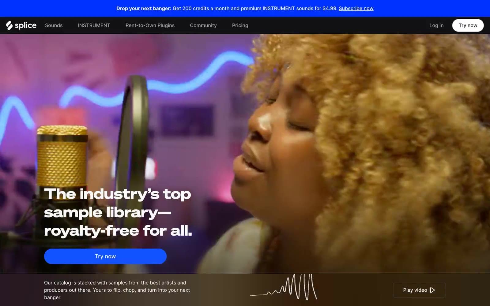
Splice. A dark, weightless space where the only thing that ever gets loud is the music.
- Media
- Dark theme
- 11 colors
- 3 typefaces
Splice operates as a midnight recording studio: deep charcoal canvases, near-borderless surfaces, and a single electric blue accent that cuts through the darkness like a signal light. Typography splits between SoehneBreit at whisper-weight for editorial headlines and Inter Variable as the dense workhorse, creating a deliberate contrast between performance and utility. Components stay flat and weightless — cards sit on near-identical surface tones, shadows are replaced by hairline inset strokes, and elevation comes from the photography itself. Color is rationed: one blue carries links and interactive elements, a saturated yellow-green appears as rare text punctuation, and everything else recedes into grayscale. The product — sound — is the only thing that ever gets loud.
Splice design system

Brand2
Violet supporting accent for decorative details and low-frequency emphasis. Do not promote it to the primary CTA color
Violet supporting accent for decorative details and low-frequency emphasis. Do not promote it to the primary CTA color
Accent1
Rare text accent — highlight punctuation, featured labels, emphasis. Used sparingly, only when a word needs to flash against the dark canvas. Never on backgrounds
Neutrals8
Deepest dark — image containers, nav surface, full-bleed backgrounds. Creates the bottom of the surface stack
Primary page canvas, card surfaces, input fields, footer. The dominant working surface at 425 occurrences across every context
Dominant canvas background, secondary button surface. Sits one step lighter than Carbon, used when a surface needs to feel like a different plane without using shadow
Elevated surfaces, button borders, nav separators. The highest dark in the stack — used for the 1px inset stroke that replaces shadows
Borders, dividers, inactive controls. Darker than Ash for when a divider needs to recede further
Muted text, nav items, secondary labels, inactive links. The first step down from white in the type hierarchy
Button borders, icon strokes, hairline dividers, ghost control outlines. The border that doesn't feel like a border
Primary text, inverted button text, icon fills. The only true white in the system; appears 1506 times across every text context
Try a pairing
Pick any two colors from the palette to check whether text stays readable on top.
Aa
Obsidian on Signal Blue
6.73 : 1 contrast
- Body textPasses AA 4.5
- Large textPasses AA 3
- StrictFails AAA 7
More DESIGN.md files. Same web, different personalities.
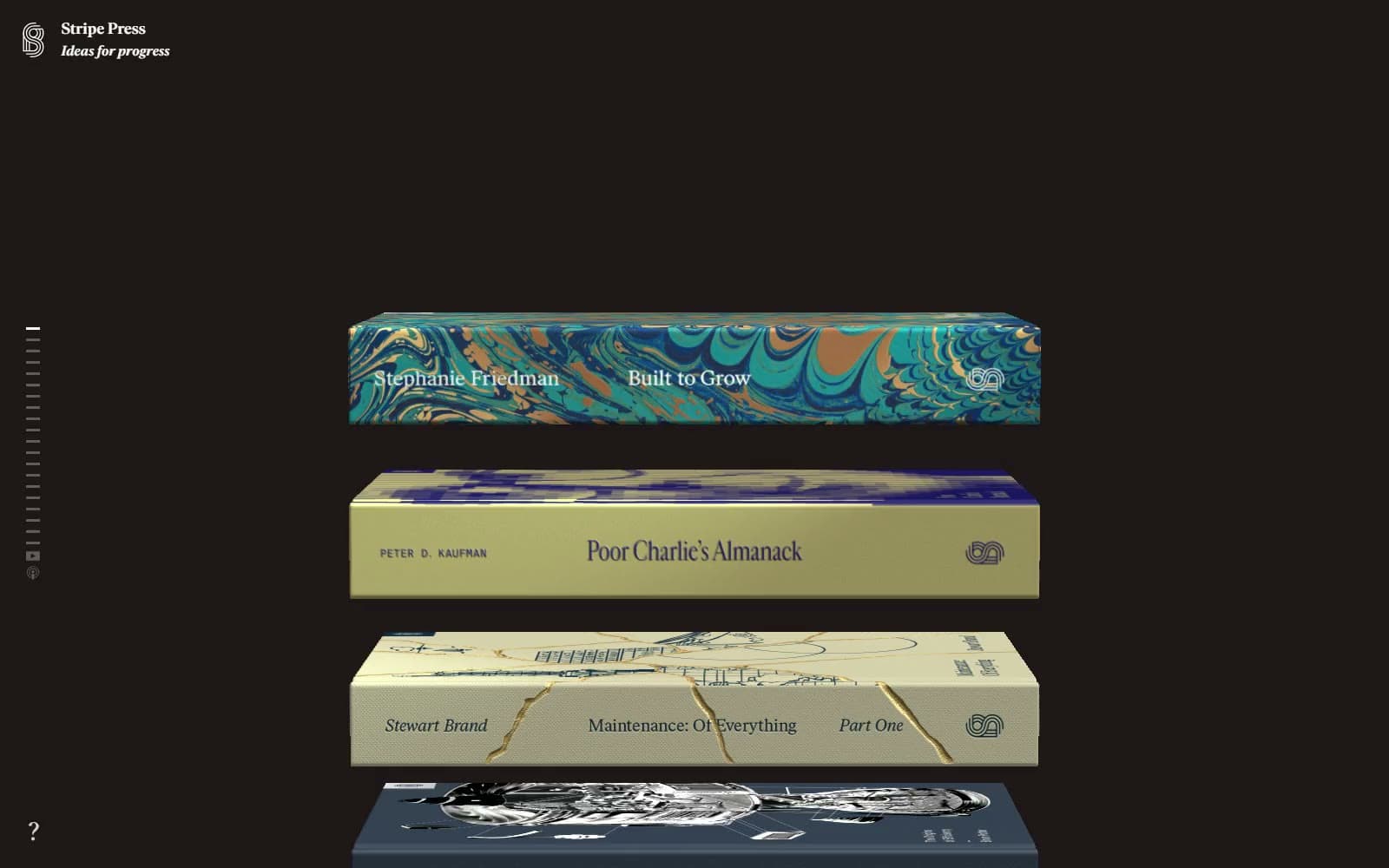
Stripe Press
Media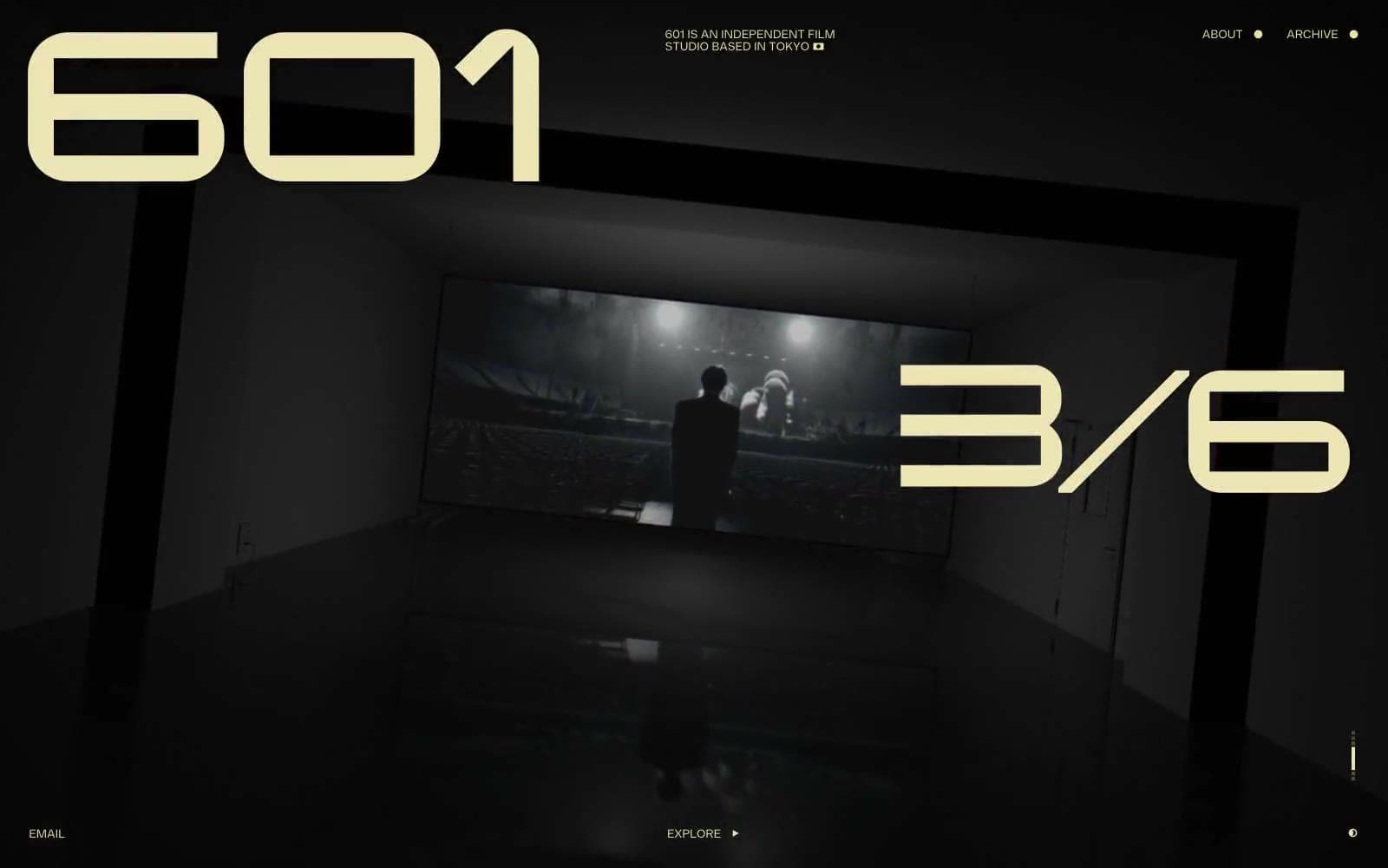
601 Inc.
Media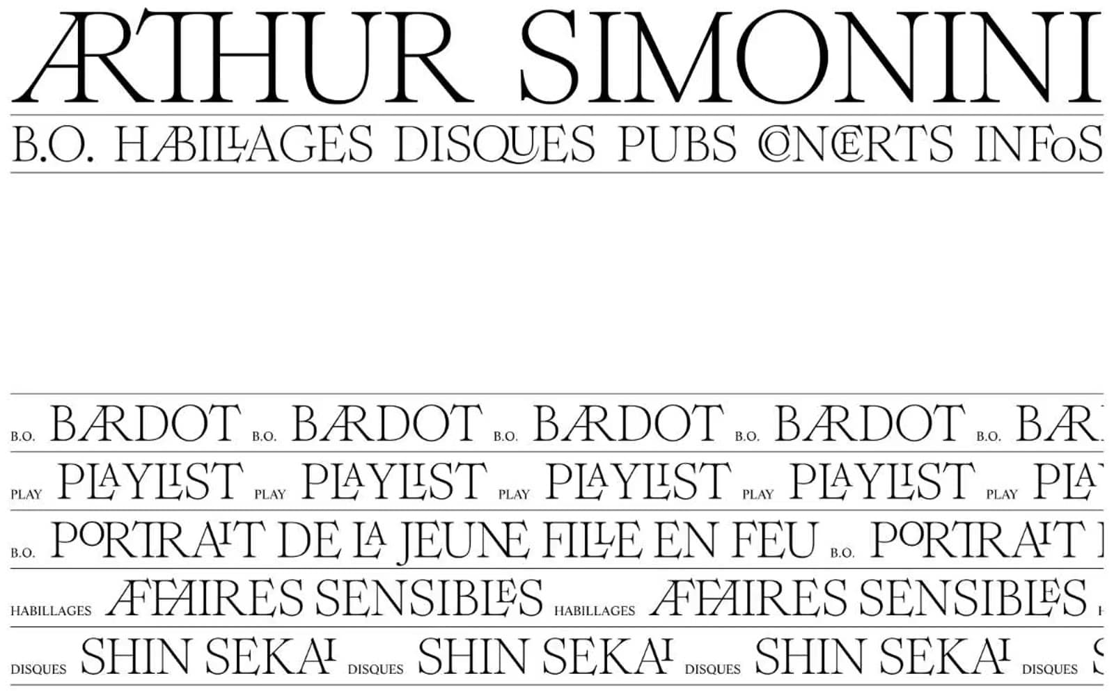
Arthursimonini
Media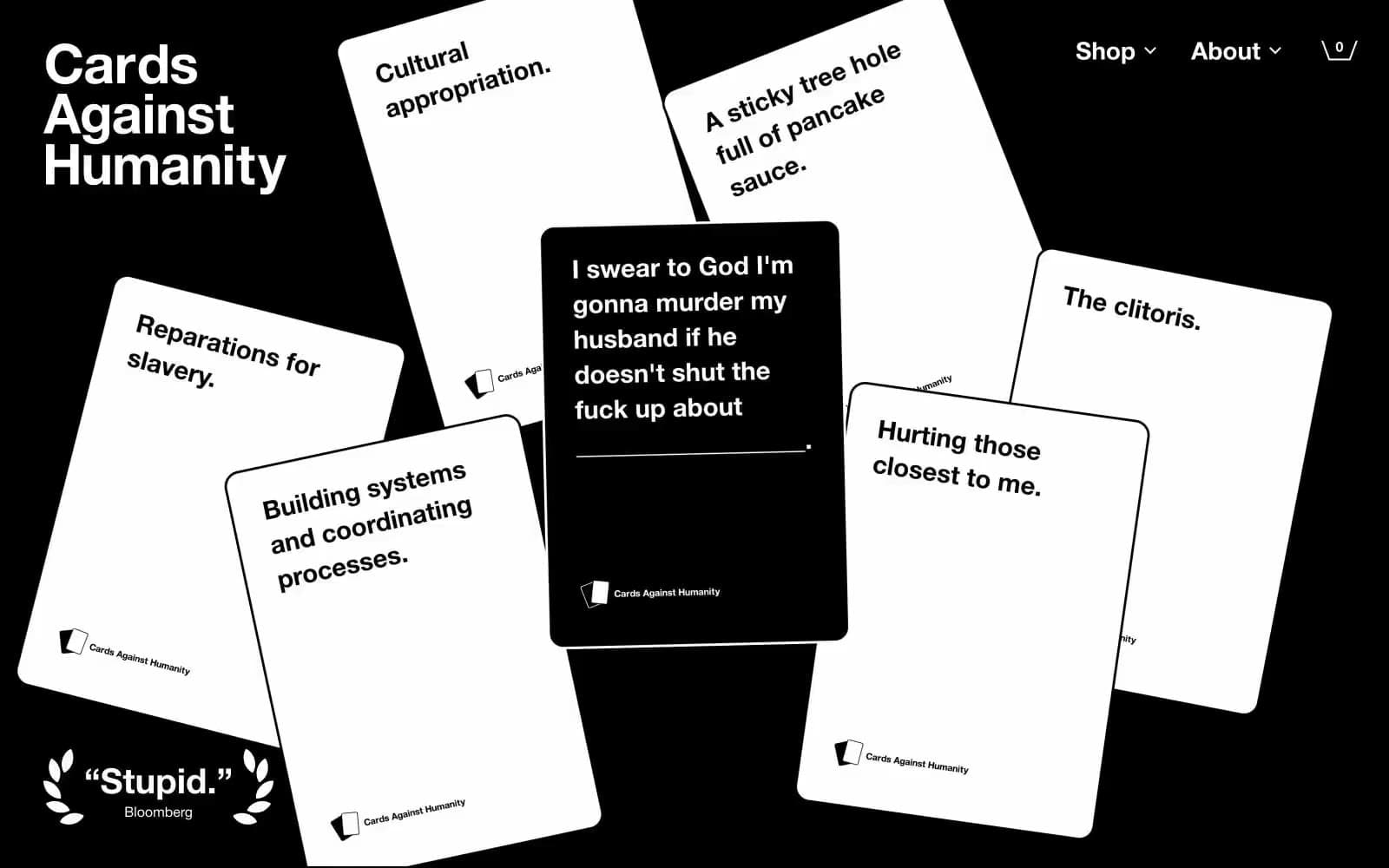
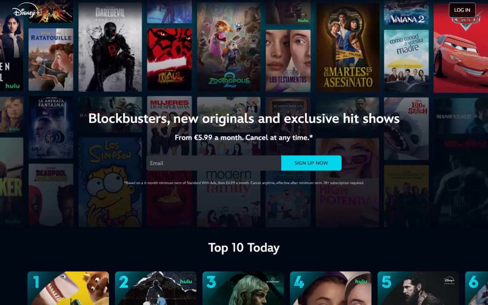
Disney+
Media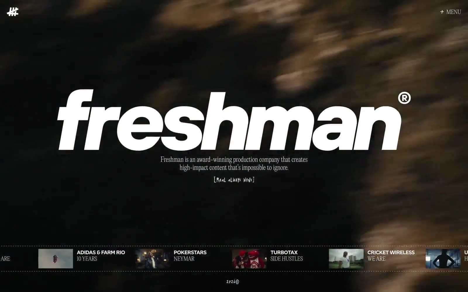
Freshman
Media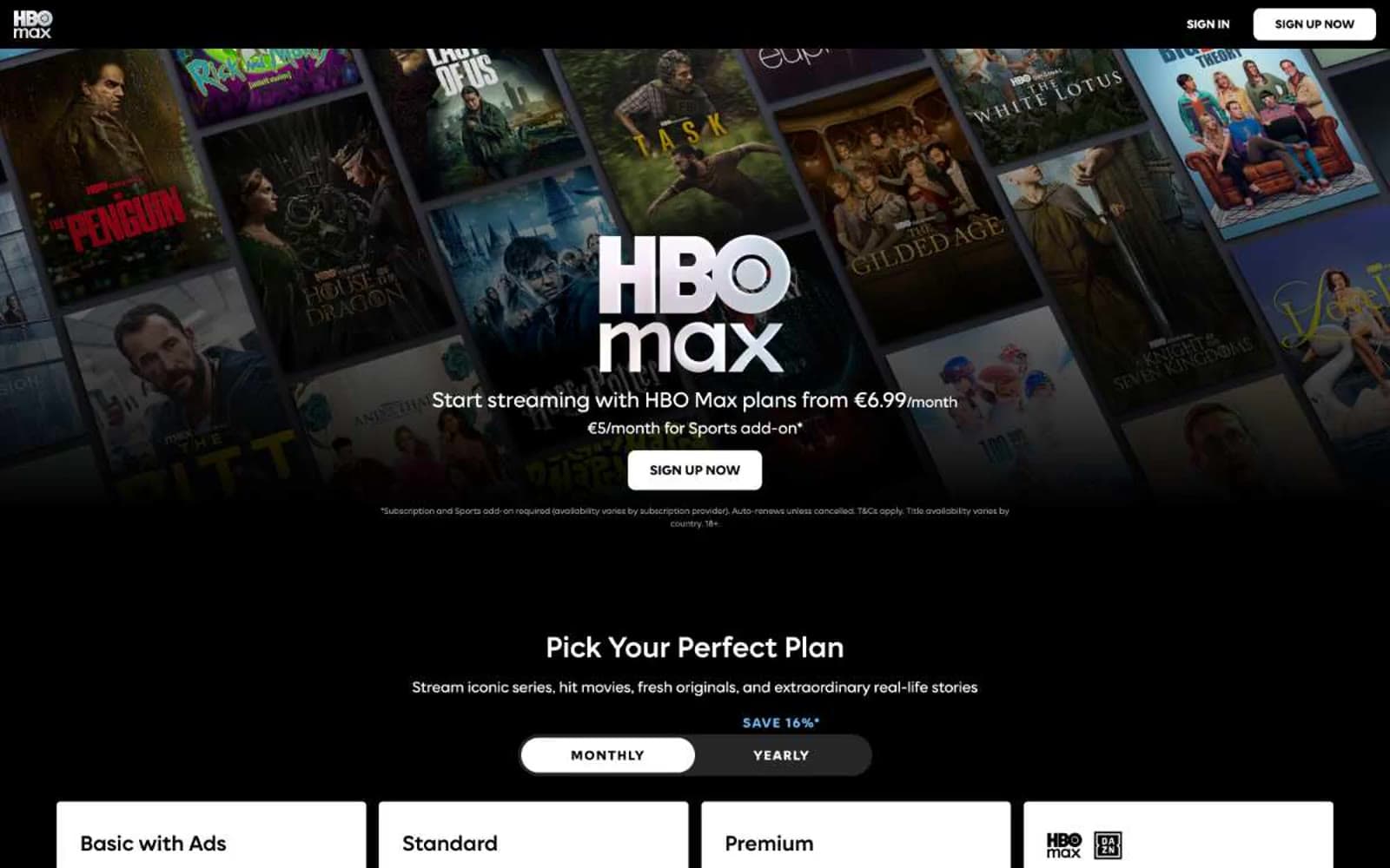
HBO Max
Media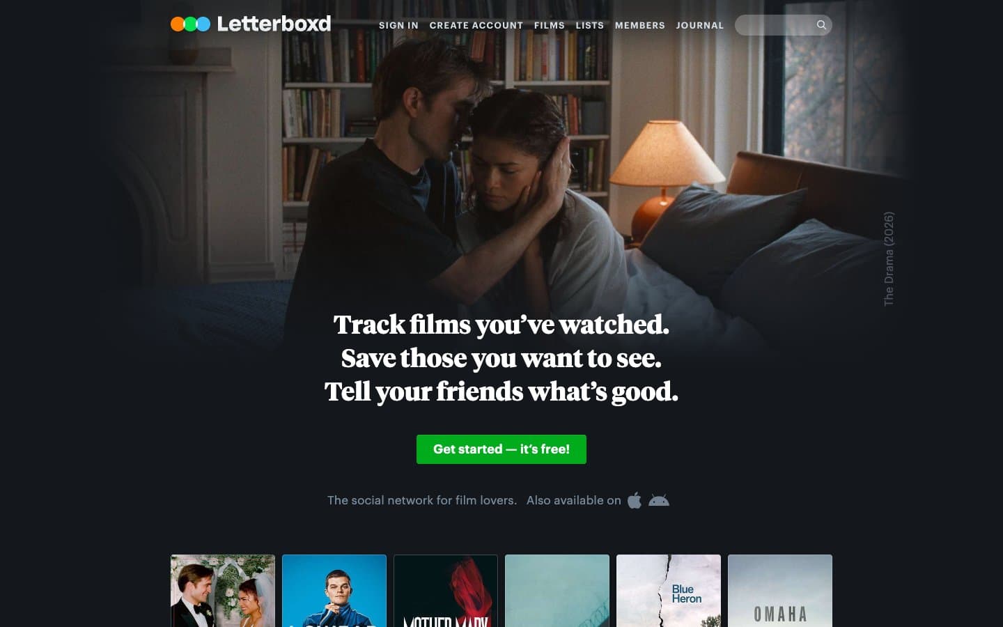
Letterboxd
Media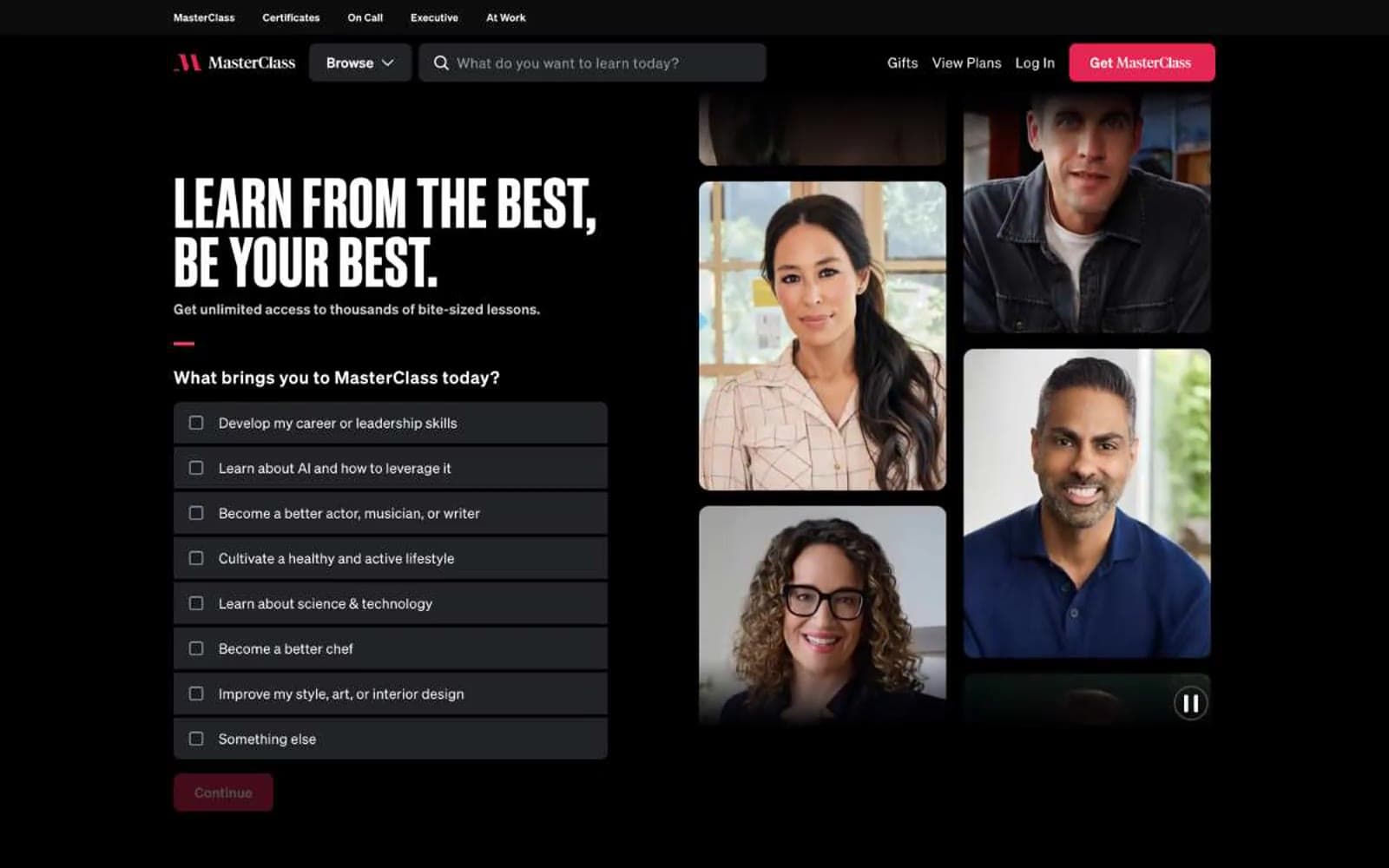
MasterClass
Media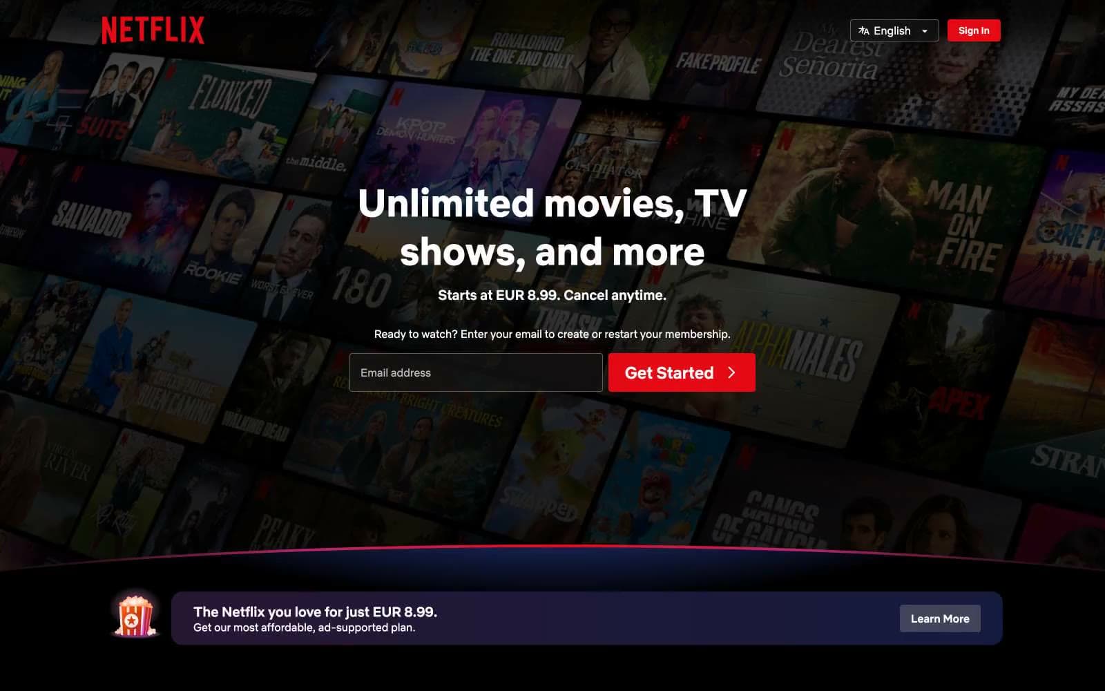
Netflix Spain
Media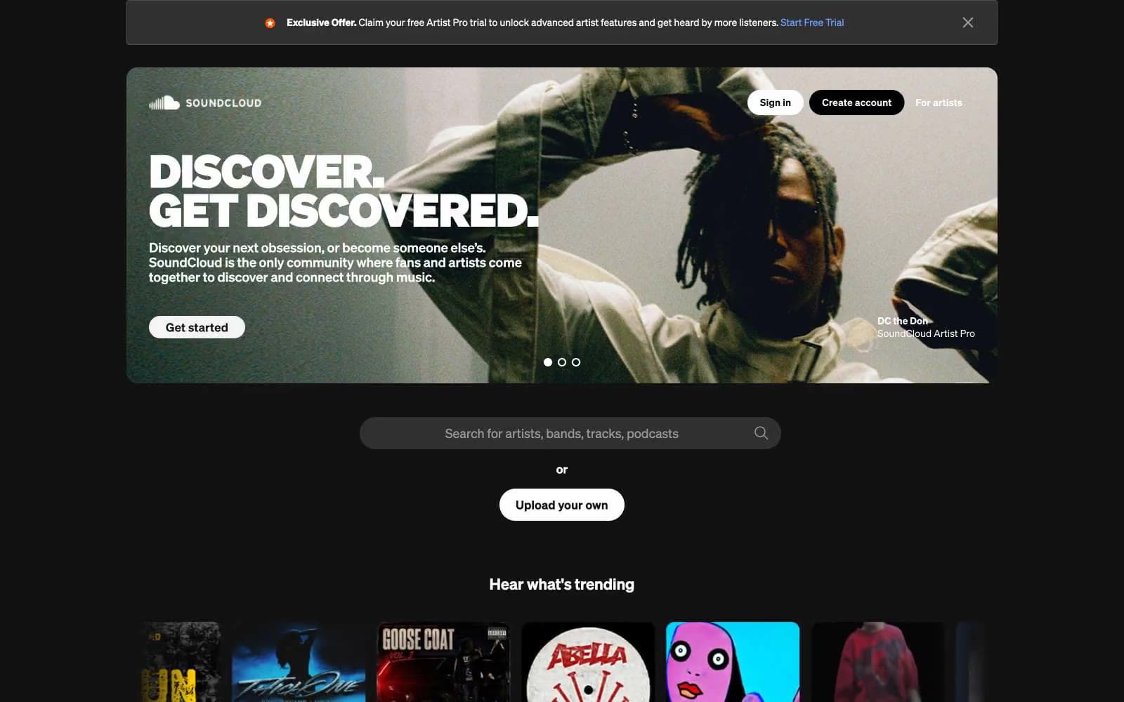
SoundCloud
Media


