
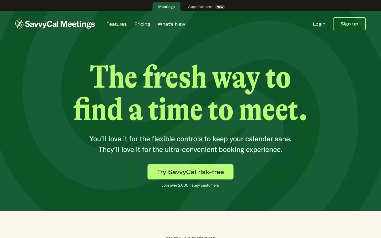
Savvycal. Forest-green stage with cream paper pages, serif headlines and lime-green punctuation.
- SaaS
- Mixed theme
- 13 colors
- 5 typefaces
SavvyCal runs on a two-zone editorial system: a forest-green hero stage and a warm cream-paper body. The personality is magazine-meets-product: a condensed display serif (GT Alpina) headlines with editorial weight, while a grotesk workhorse (GT America) carries body and UI. A single lime-sprout green punctuates every interactive moment, and a coral red lives only as decorative punctuation — wavy underlines, hand-drawn doodles, thin frame borders. The aesthetic borrows from print: warm neutrals, serif voice, generous whitespace, and handcrafted accents that soften the scheduling-tool utility. Screens should alternate between the dark stage (used sparingly for hero, feature spotlights) and the cream canvas (the default for features, pricing, content), never blending the two in one view. Surfaces stay matte and flat — no glassmorphism, no heavy elevation. Color appears as small functional dots, not washes.
Savvycal design system

Brand3
Hero section background, dark feature spotlights — deep green anchors the dramatic first impression
Green supporting accent for decorative details and low-frequency emphasis
Logo green, icon strokes, secondary brand accent — the mid-green companion to the forest stage
Accent2
Decorative stroke accent — wavy underlines, hand-drawn doodles, product frame borders, section dividers
Soft warm surface wash, hero gradient highlight, gentle background tints behind editorial sections
Neutrals8
Headlines, primary body text, dark icons, logo mark on light surfaces
Dark surface (footer dark mode, inverse cards), button text on light fills, heading accent
Strong secondary text, nav links on cream, meta labels
Body paragraph text on cream surfaces, secondary headings, footer description copy
Muted helper text, subtle borders on cream, disabled states, tag outlines
Hairline dividers, form field borders, table separators — the structural neutral
Primary content surface, page background for feature/pricing/footer sections — the default canvas
Card surface lift on cream, button text on dark fills, input field backgrounds
Try a pairing
Pick any two colors from the palette to check whether text stays readable on top.
Aa
Pure White on Forest Stage
9.05 : 1 contrast
- Body textPasses AA 4.5
- Large textPasses AA 3
- StrictPasses AAA 7
More DESIGN.md files. Same web, different personalities.
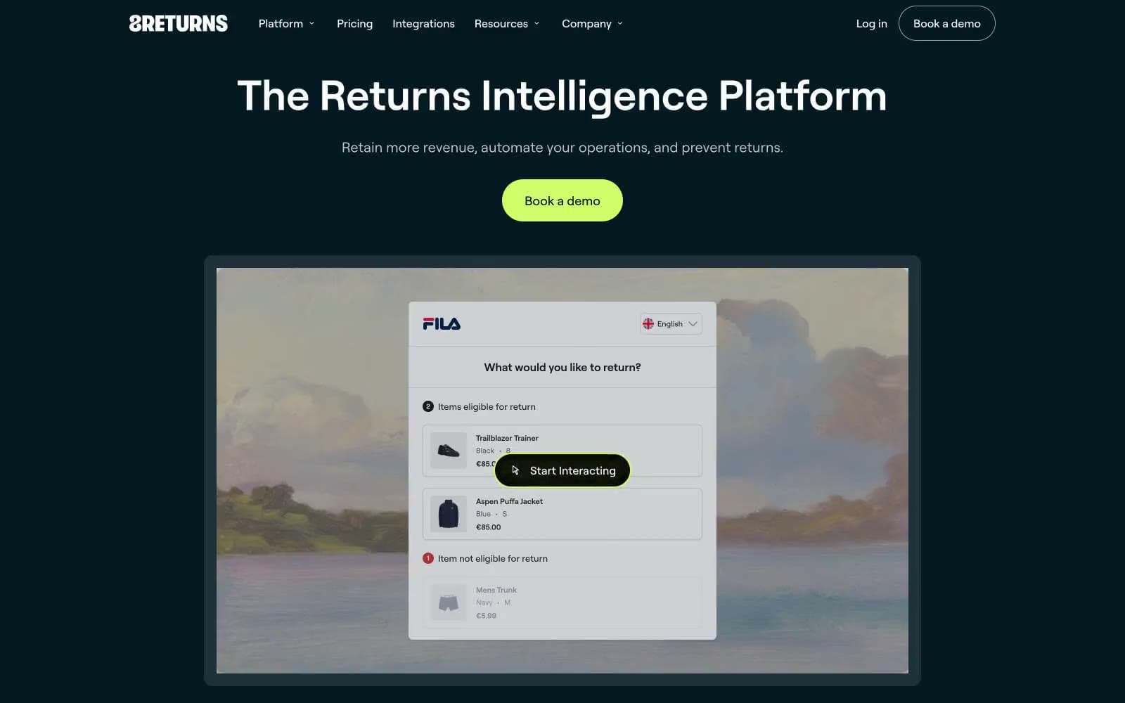
8returns
SaaS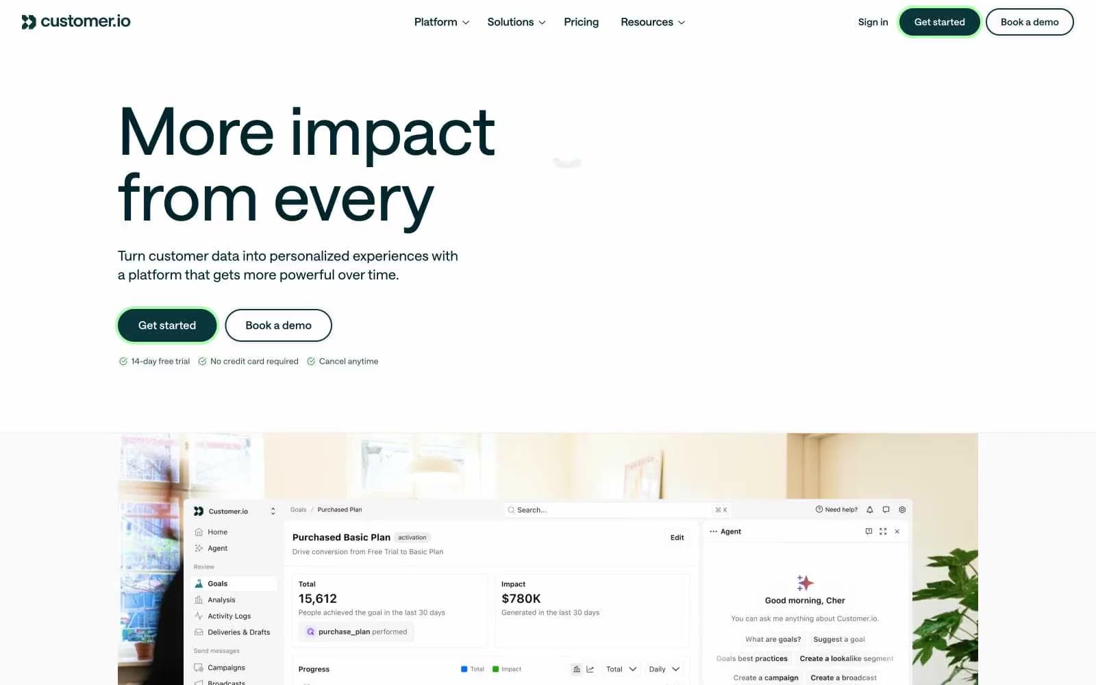
Customer.io
SaaS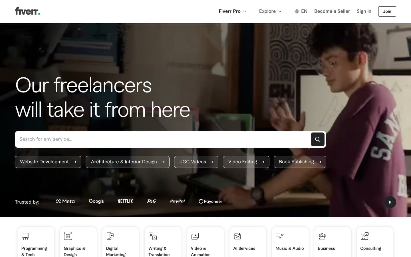
Fiverr.com
SaaS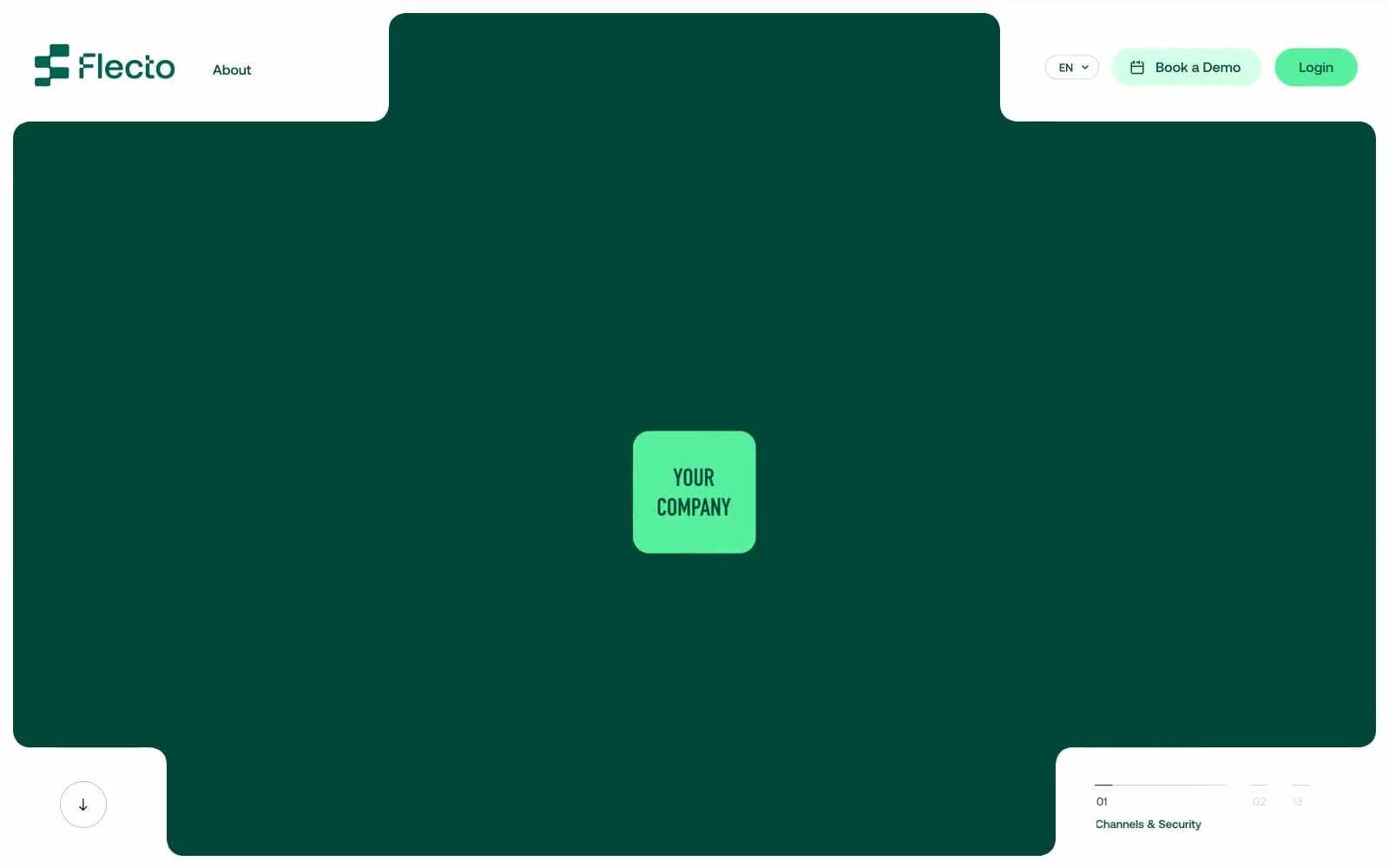
Flecto
SaaS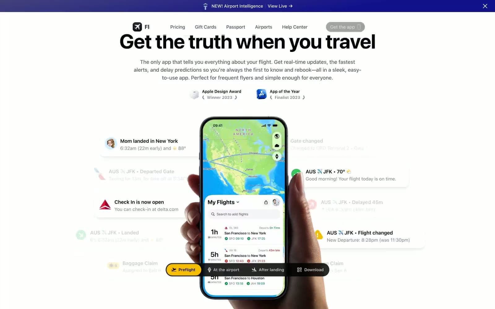
Flighty
SaaS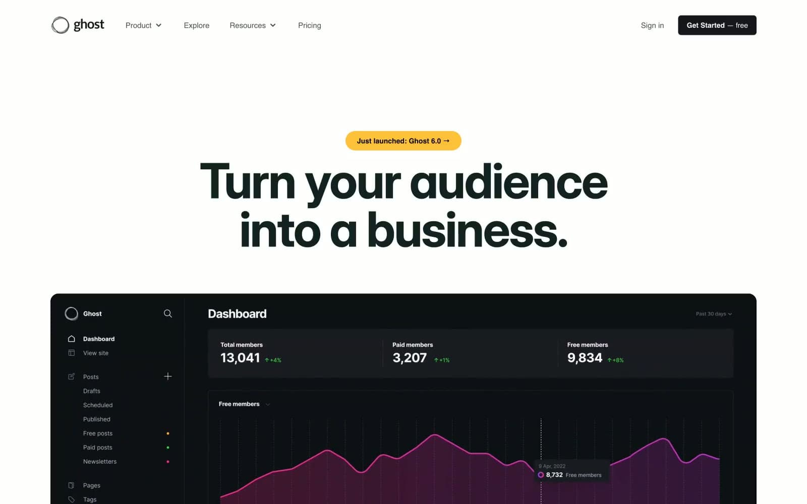
Ghost
SaaS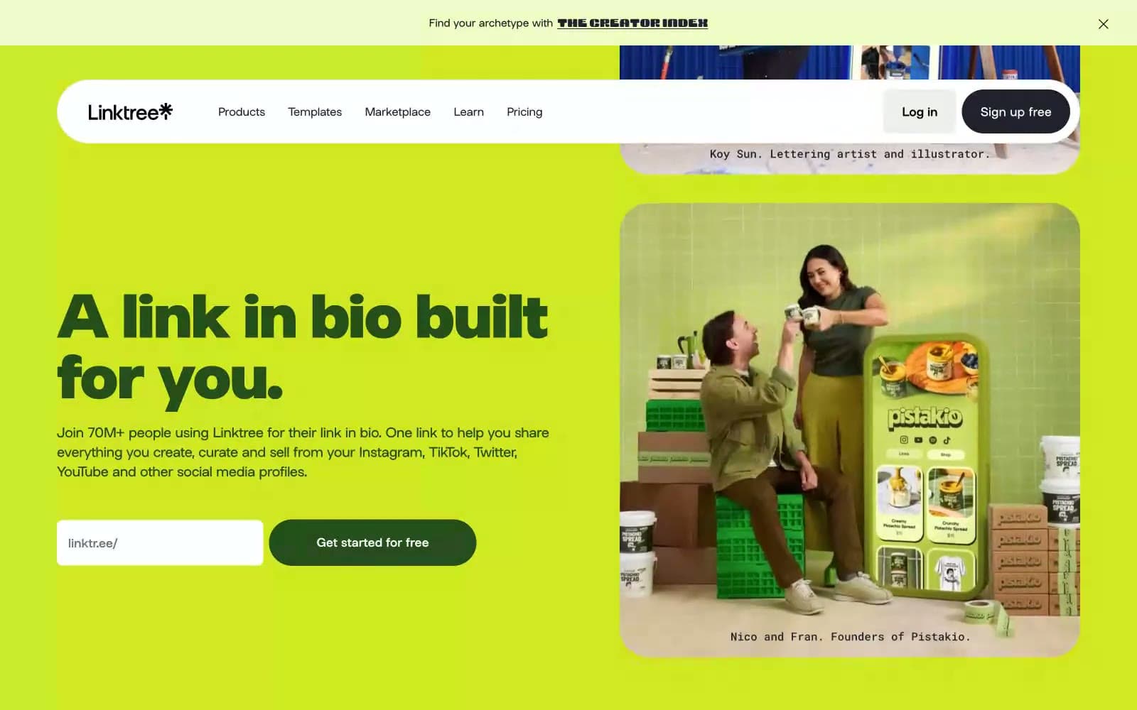
Linktr
SaaS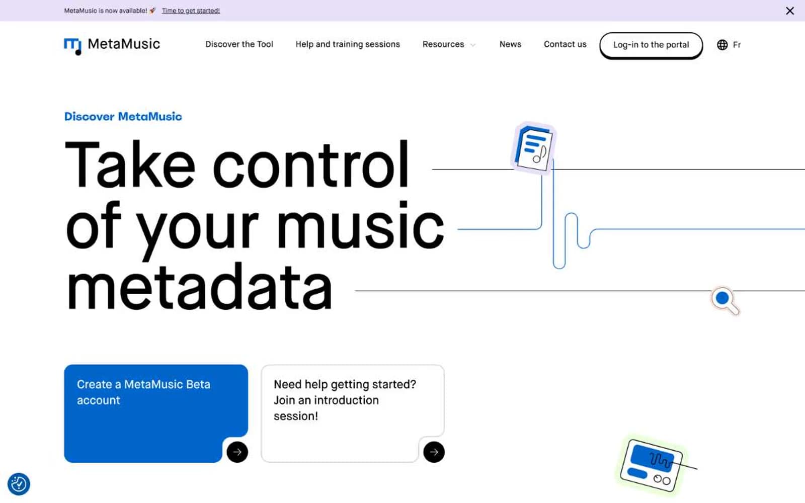
MetaMusic
SaaS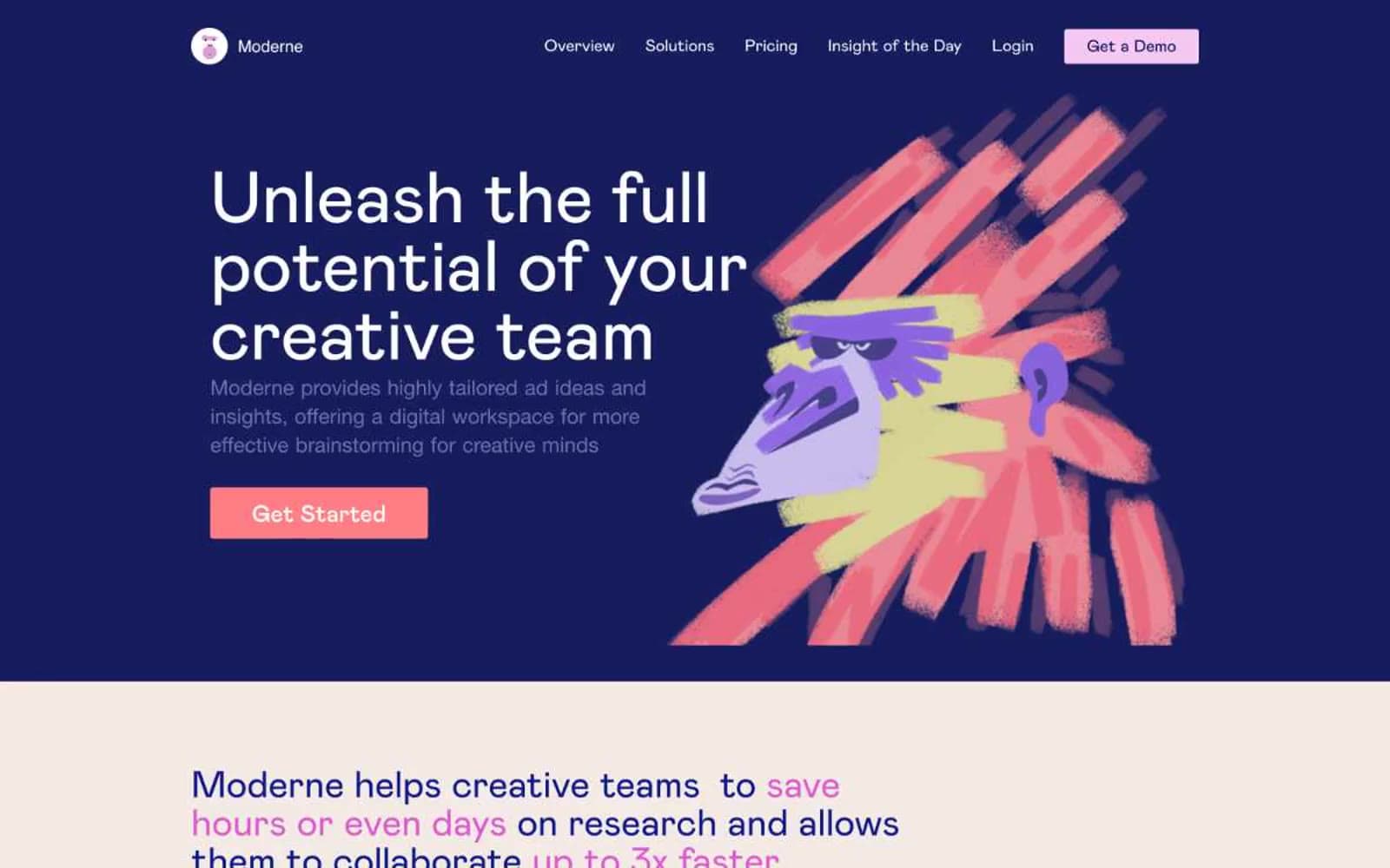
Moderne
SaaS
Passionfroot
SaaS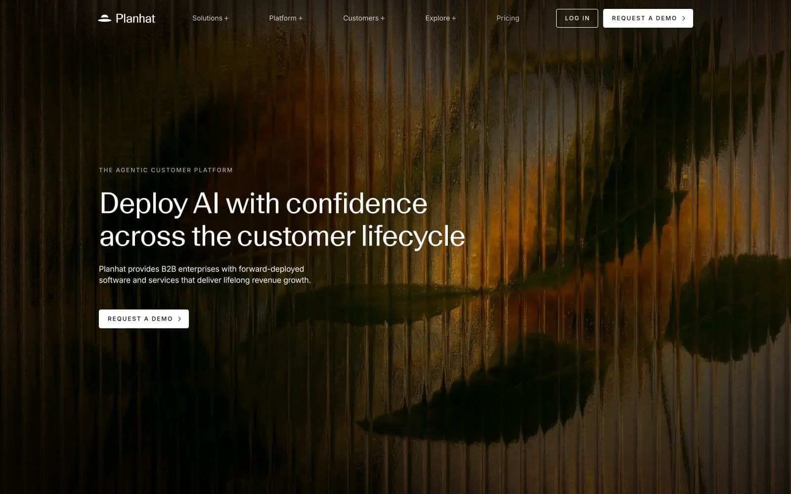
Planhat
SaaS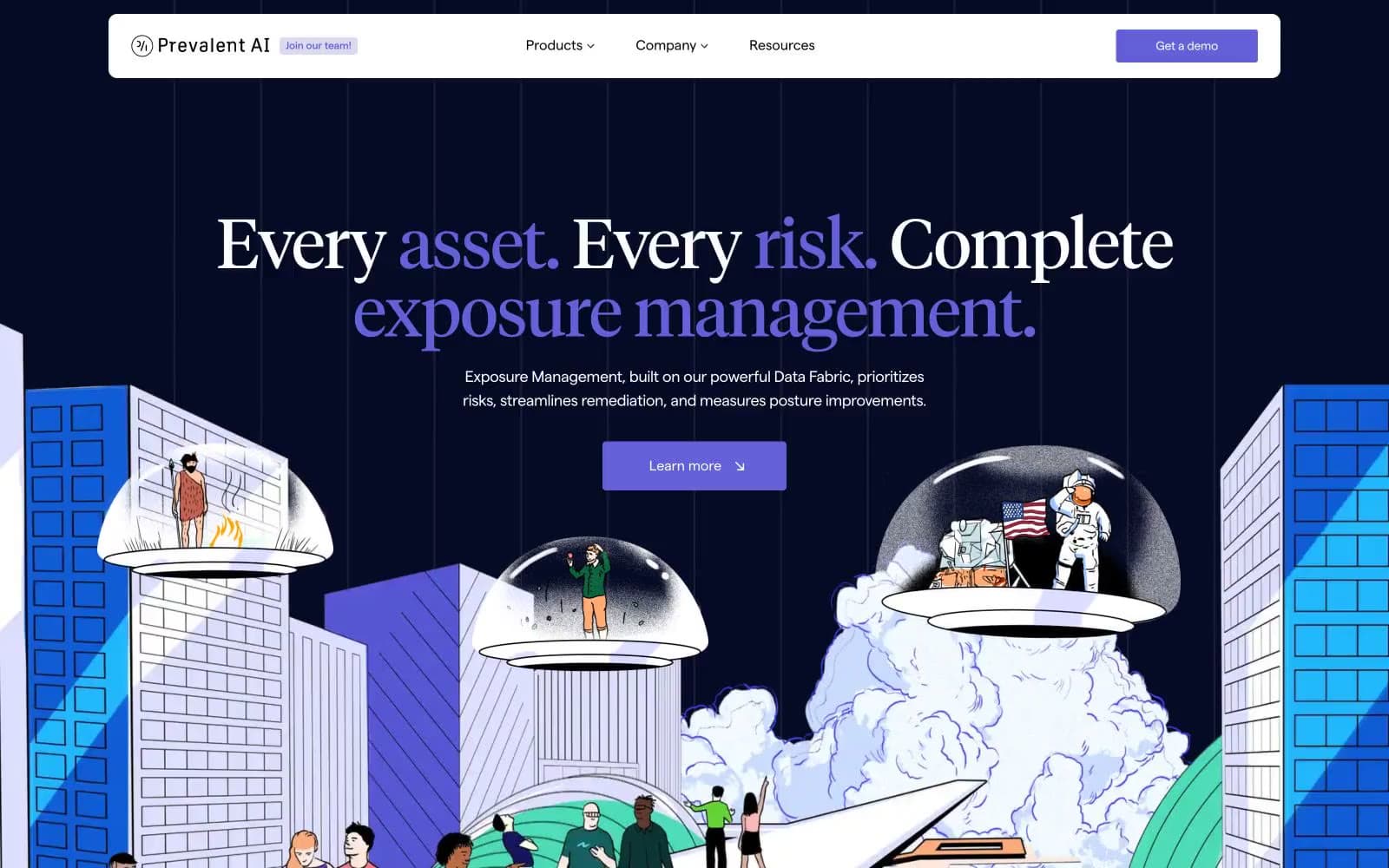
Prevalent
SaaS


