
Xbox.com. Stadium-lit arcade storefront.
- Media
- Light theme
- 11 colors
- 2 typefaces
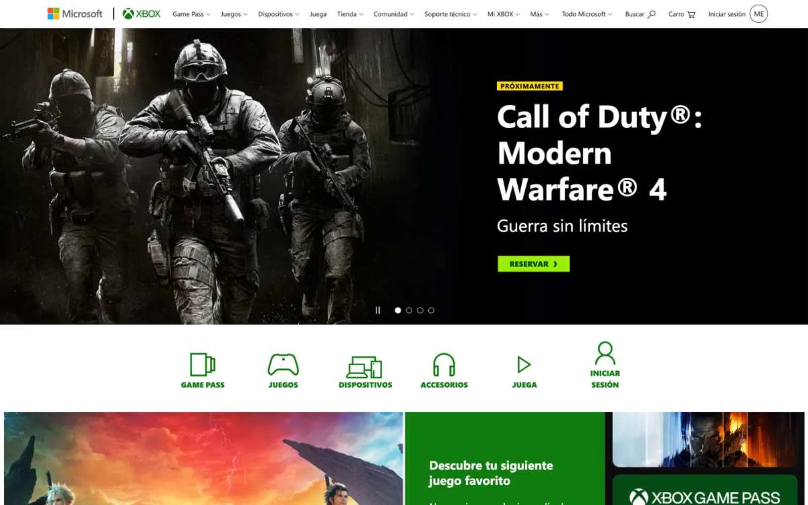
Xbox.com runs a high-contrast storefront language: a stark white canvas interrupted by full-bleed game artwork and product photography, with Xbox's signature deep green (#107c10) acting as a structural accent across category labels, promotional bands, and section headers. The interface is dense and catalog-driven — compact nav, tile grids, and split content blocks — but the visual weight is deliberately held back to let game artwork dominate. Typography stays utilitarian via Segoe UI at conservative weights, with a single bold display size (46px) for hero headlines. The system uses uppercase badge labels with wide tracking (0.075em) as a recurring visual punctuation mark, and lime-green (#9bf00b) promotional buttons punctuate an otherwise monochrome surface.
Xbox.com design system

Brand2
Dominant brand color — Game Pass wordmark, promotional section headers, decorative dividers, link accents. The single chromatic identity anchor in an otherwise achromatic interface
Deep secondary green for dark-surface accents, button hover states on dark backgrounds, Game Pass subheadings on dark imagery
Accent2
Green supporting accent for decorative details and low-frequency emphasis. Do not promote it to the primary CTA color
Yellow supporting accent for decorative details and low-frequency emphasis. Use as a supporting accent, not as a status color
Neutrals7
Primary text color, dark surface fills, footer background, icon strokes. The structural backbone — appears 1086 times across nav, body, button, and icon contexts
Alternative body text and link color for slightly higher contrast on light gray backgrounds
Hero and section heading text, secondary dark surfaces. Slightly softer than pure black for long-form readability
Muted body text, nav dropdown items, icon fills, link colors in body copy. The 215-frequency workhorse for secondary information
Supporting neutral for secondary UI, dividers, and muted labels. Do not promote it to the primary CTA color
Section dividers, alternating band backgrounds, footer top edge. Creates subtle separation without darkening the page
Page canvas, card surfaces, button text on dark fills, hero text on dark imagery. The default background layer
Try a pairing
Pick any two colors from the palette to check whether text stays readable on top.
Aa
Pure White on Xbox Green
5.37 : 1 contrast
- Body textPasses AA 4.5
- Large textPasses AA 3
- StrictFails AAA 7
More DESIGN.md files. Same web, different personalities.

Josh W. Comeau
Media
The Pudding
Media
2020
Media
amra
Media
Bluesky Social
Media
Cup of Couple
Media
Desktop.fm
Media
Dezeen
Media
DICE
Media
Epidemicsound
Media
Exhibition Magazine
Media
Flying Papers
Media


