
Exhibition Magazine. Concrete editorial monolith.
- Media
- Light theme
- 5 colors
- 3 typefaces
Exhibition Magazine operates as a printed editorial artifact translated to screen: white canvas, hairline rules, and oversized condensed typography that commands the viewport. The visual system is almost entirely achromatic — color is virtually absent, replaced by the interplay of pure black text, white surfaces, and the grey 1px line that organizes everything. Two type families do all the work: DIN at 90–100px for display and section titles with extremely tight tracking and near-vertical line-height, and a serif (Cochin) for editorial body and descriptions that warms the otherwise clinical grid. Navigation and micro-labels use a tiny 13px all-caps face with generous 0.062em letter-spacing, creating a typographic hierarchy based on scale contrast alone — gargantuan display type against whisper-quiet UI chrome. Components are stripped to their essentials: image cards with no rounded corners, text buttons that are just underlined words, and a full-bleed black footer that closes the page with the same oversized type on inverted grounds.

Exhibition Magazine design system

Neutrals5
All text, nav links, display headings, footer background, card titles
Muted surface fills, image placeholder backgrounds, secondary tonal blocks
1px borders, dividers, card outlines, link underlines — the structural skeleton of the layout
Subtle warm-tinted card surface — near-white with a hint of warmth, used sparingly
Page backgrounds, nav bar, card surfaces, image backgrounds
Try a pairing
Pick any two colors from the palette to check whether text stays readable on top.
Aa
Paper White on Ink Black
21.00 : 1 contrast
- Body textPasses AA 4.5
- Large textPasses AA 3
- StrictPasses AAA 7
More DESIGN.md files. Same web, different personalities.

Josh W. Comeau
Media
The Pudding
Media
2020
Media
amra
Media
Bluesky Social
Media
Cup of Couple
Media
Desktop.fm
Media
Dezeen
Media
DICE
Media
Epidemicsound
Media
Flying Papers
Media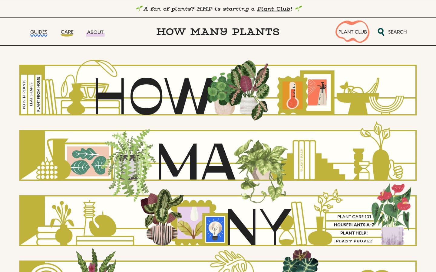
How Many Plants
Media


