
Flying Papers. Saturday morning cartoon confessional.
- Media
- Light theme
- 11 colors
- 4 typefaces
Flying Papers operates like a Saturday-morning cartoon printed on thick riso cardstock: a flat muted-violet stage, a small cast of saturated confetti colors, and type so oversized it eats the viewport. The brand voice is loud, cheeky, and unrepentant — it doesn't ask for attention, it takes it. Every screen should feel like a single bold poster: one dominant display headline, one supporting character illustration, one inline action, and generous breathing room. Borders do the heavy lifting instead of shadows; color is used as paint, not data. Surfaces stay flat, edges stay sharp at 6px, and the only soft thing in the system is the 100px pill on the gate button.

Flying Papers design system

Brand4
Primary canvas and hero background — the stage that every other color performs on
Yellow accent for outlined action borders, linked labels, and lightweight interactive emphasis. Do not promote it to the primary CTA color
Secondary display text and softer borders — a mellower sibling of Hi-Vis for when Hi-Vis would be too much
Card and block backgrounds — a deeper violet for nested surfaces on the violet stage
Accent4
Decorative borders and confetti accent — a warm pink used sparingly for pop
Decorative borders and confetti accent — a dusty sage for the secondary cast of cards
Accent card surface — reserved for standout blocks that need to scream louder than the stage
Red wash for highlight backgrounds, decorative bands, and soft emphasis behind content
Neutrals3
Hard borders, icons, and text on yellow surfaces — pure black where maximum edge contrast is needed
Body text, primary borders, and outlined button strokes — the near-black that does typographic work on cream surfaces
Hairline borders, dividers, input outlines, and card edges on light surfaces. Do not promote it to the primary CTA color
Try a pairing
Pick any two colors from the palette to check whether text stays readable on top.
Aa
Pure Black on Dusk Violet
6.03 : 1 contrast
- Body textPasses AA 4.5
- Large textPasses AA 3
- StrictFails AAA 7
More DESIGN.md files. Same web, different personalities.

Josh W. Comeau
Media
The Pudding
Media
2020
Media
amra
Media
Bluesky Social
Media
Cup of Couple
Media
Desktop.fm
Media
Dezeen
Media
DICE
Media
Epidemicsound
Media
Exhibition Magazine
Media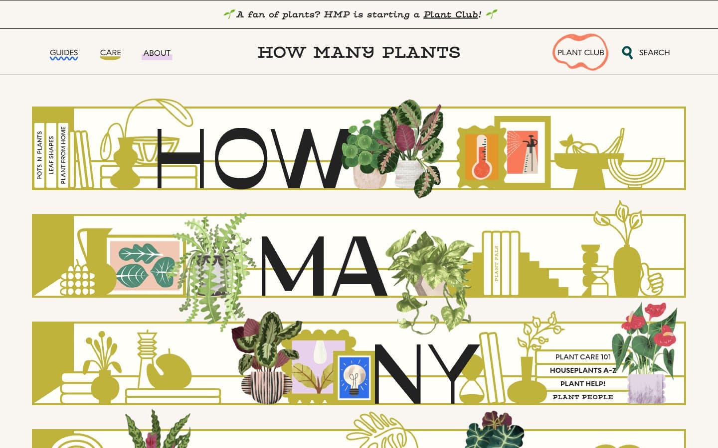
How Many Plants
Media


