
Winamp. Tilted phone cards fanning across bone paper.
- Media
- Light theme
- 9 colors
- 4 typefaces
Winamp's visual system is an exercise in near-total color restraint — a bone-white canvas, ink-black type, and thin neutral hairlines carry every screen. The Poppins geometric sans does the heavy lifting, scaling from a whisper-thin 12px caption up to a 69px display headline that anchors the hero. The only chromatic moment is a small ember-orange lightning bolt reserved for the logo, making the brand mark feel like a switch being thrown against an otherwise monochrome room. Form language is rectilinear and modest: 8px on controls, 16px on cards, no shadows, no gradients. The signature move is the layered, slightly tilted device mockups in the hero — flat rectangles rotated a few degrees to create depth without resorting to elevation, giving the page a playful, almost paper-craft dimensionality.
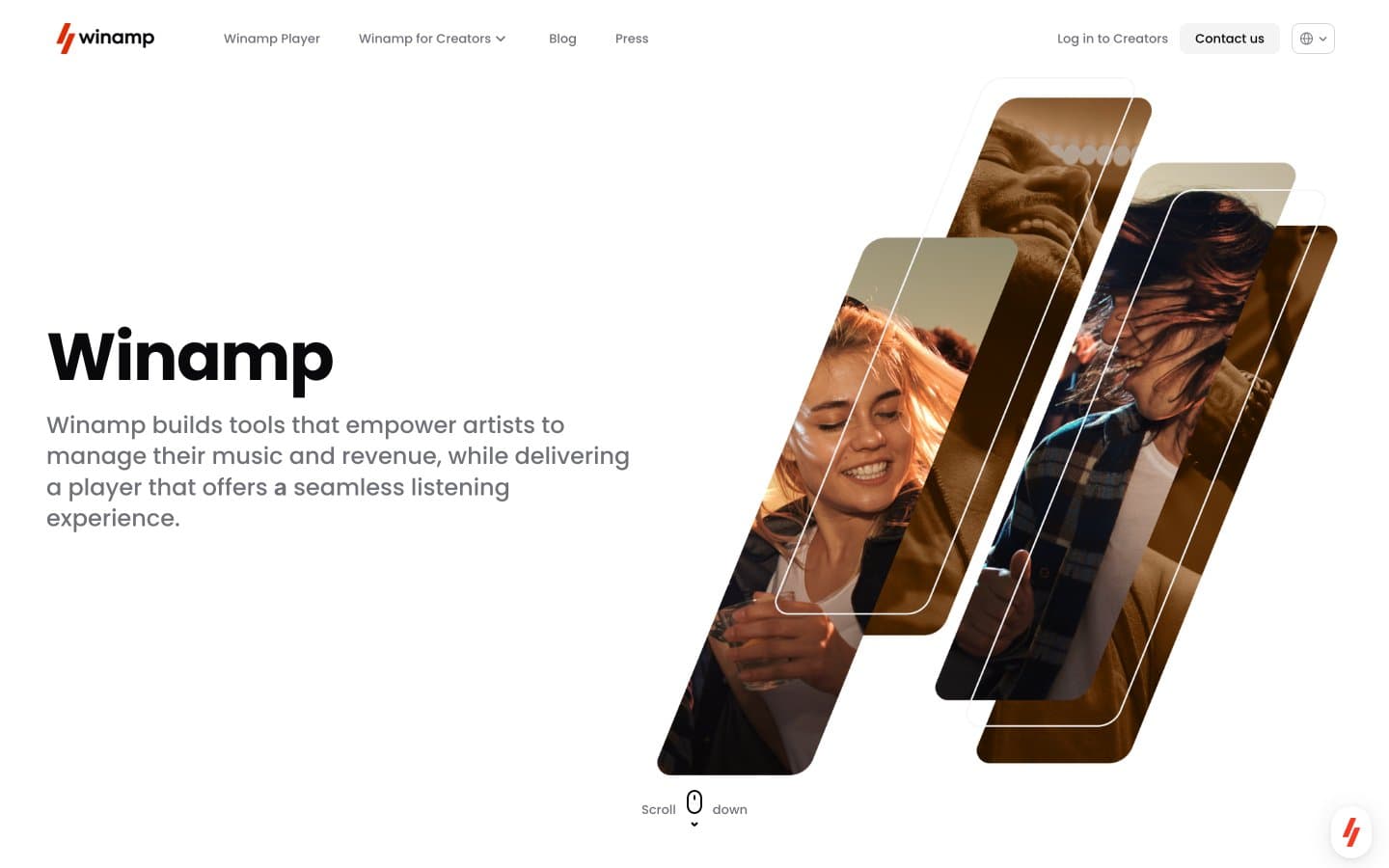
Winamp design system

Brand1
Logo lightning bolt and the single brand accent — appears almost exclusively as the Winamp mark, making it feel like a power indicator rather than a decoration
Neutrals8
SVG icon fills, fine borders, and structural rules — the absolute dark for highest-contrast iconography
Primary text, headlines, and key borders — near-black with a faint cool cast that feels editorial rather than utilitarian
Filled action buttons and dark accent surfaces — one step lighter than Ink Black, reads as solid graphite against the white canvas
Secondary nav text, helper text, and subtle UI marks — mid-gray that stays legible without competing with Ink Black headings
Muted body text, placeholder, and de-emphasized links — the quietest readable gray for tertiary information
Hairline nav borders and the lightest dividers — barely-there structural lines
Page canvas and section backgrounds — warmer than pure white, makes the ink-black type feel printed rather than digital
Card surfaces, raised panels, and inset blocks — the one step brighter than the canvas for subtle layering without shadows
Try a pairing
Pick any two colors from the palette to check whether text stays readable on top.
Aa
Pure Black on Ember Orange
5.75 : 1 contrast
- Body textPasses AA 4.5
- Large textPasses AA 3
- StrictFails AAA 7
More DESIGN.md files. Same web, different personalities.
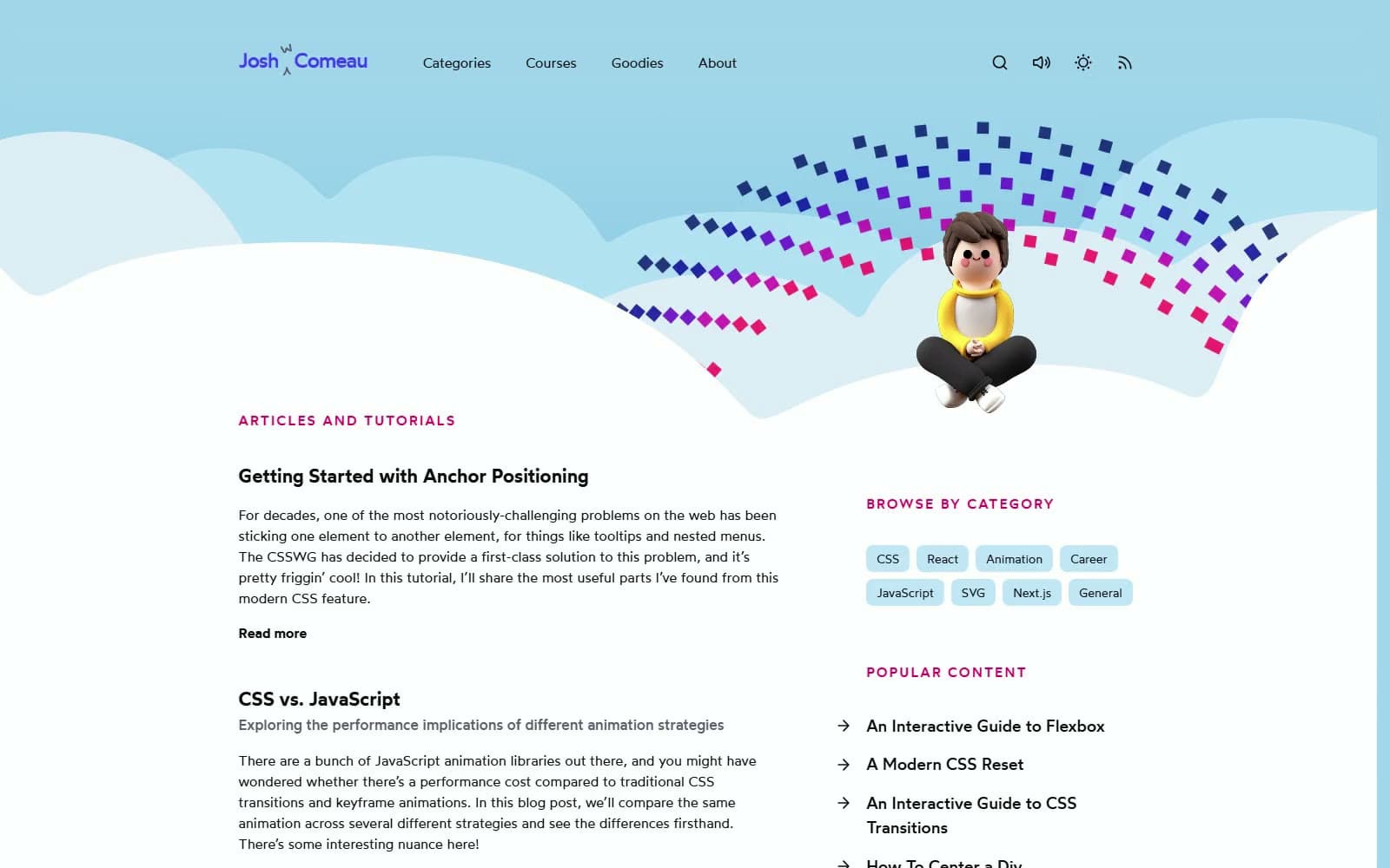
Josh W. Comeau
Media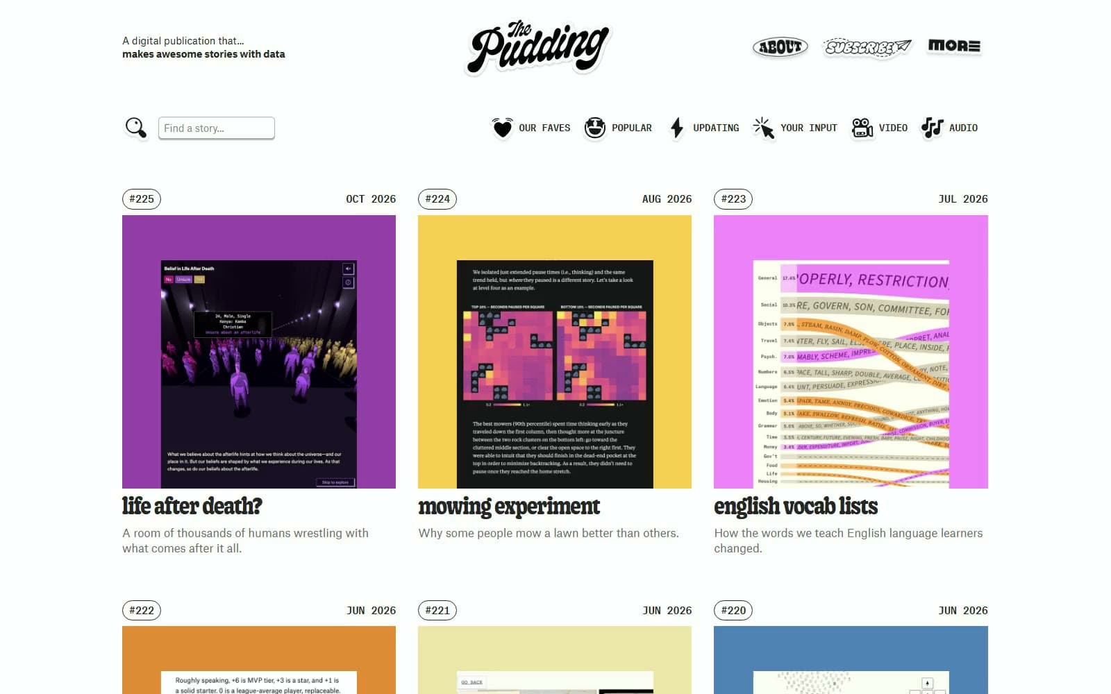
The Pudding
Media
2020
Media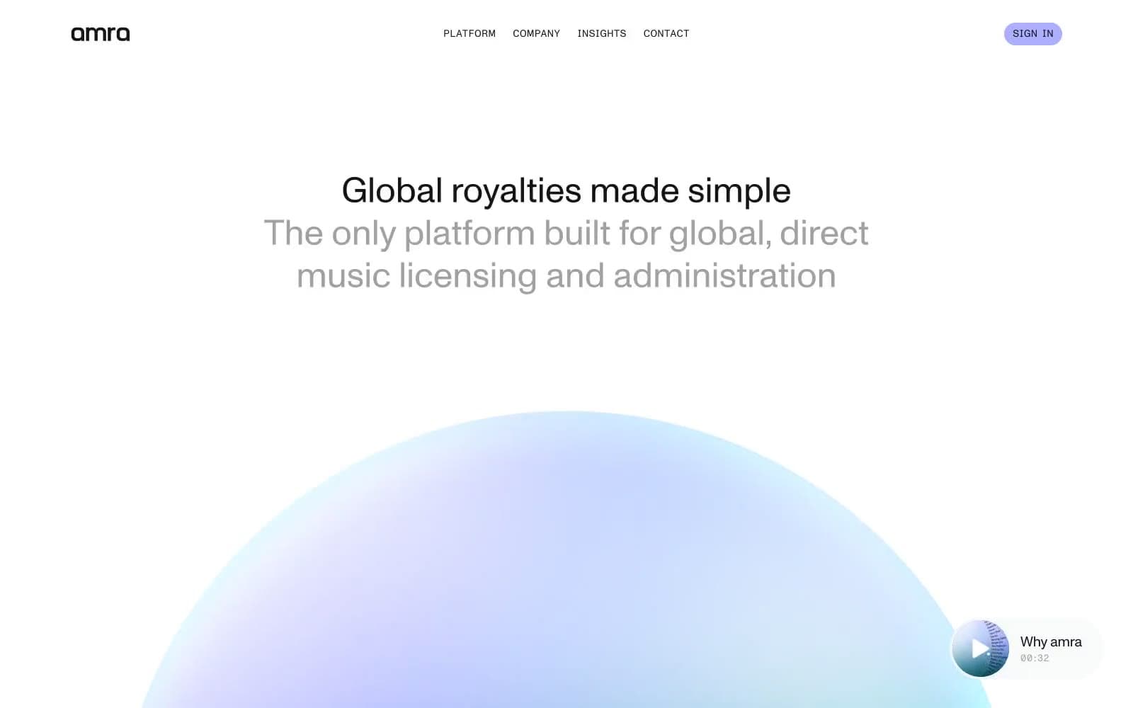
amra
Media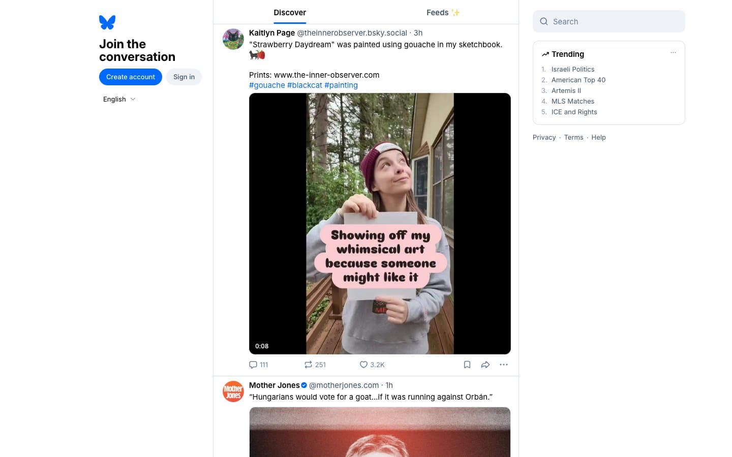
Bluesky Social
Media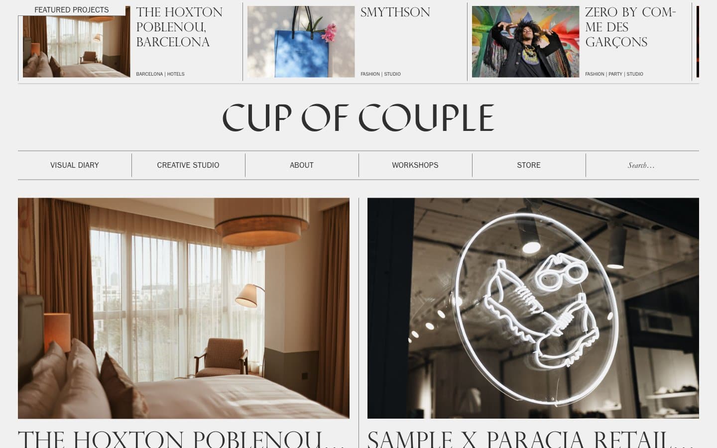
Cup of Couple
Media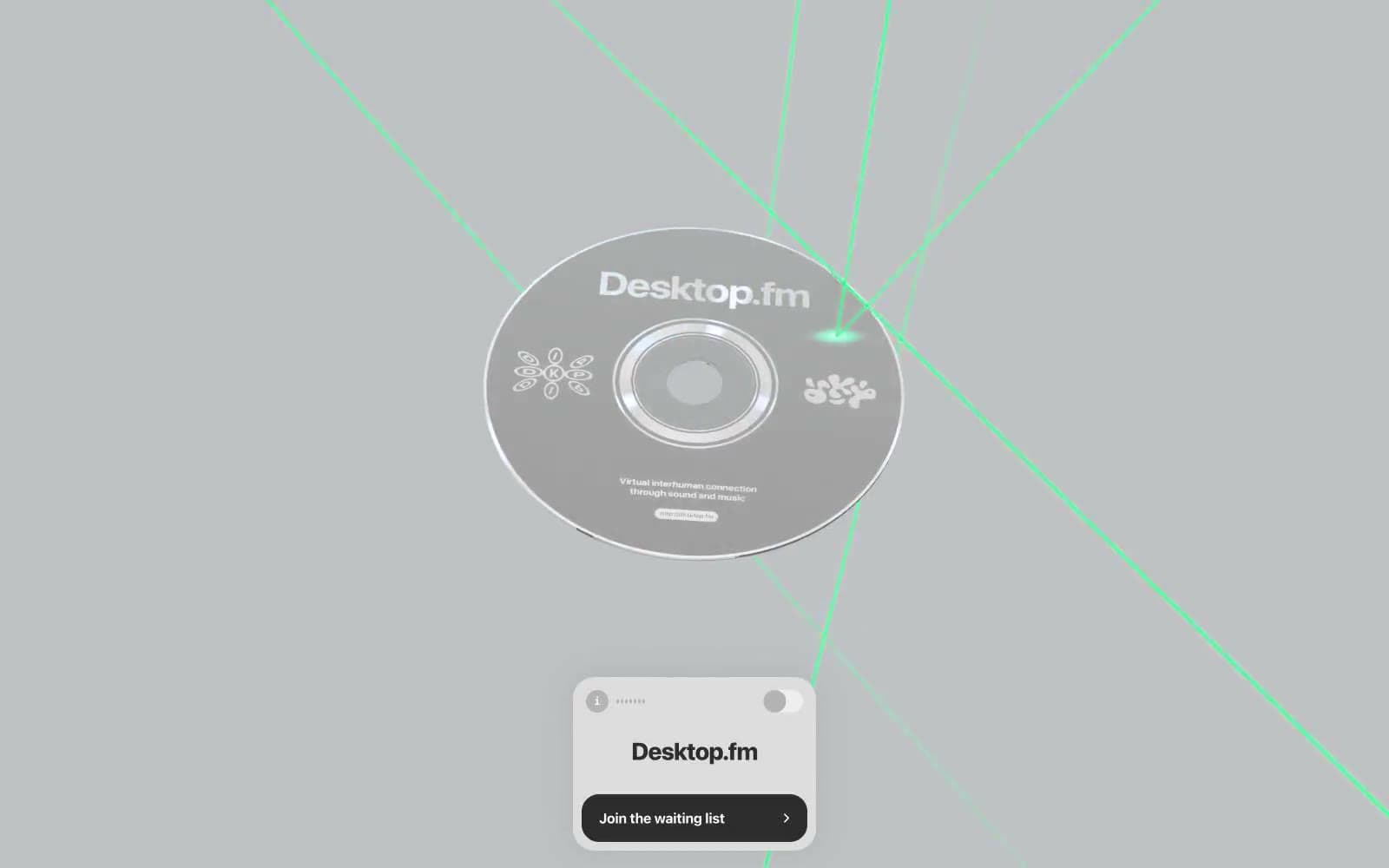
Desktop.fm
Media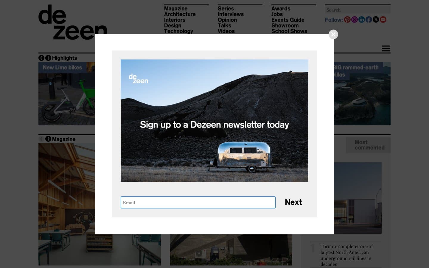
Dezeen
Media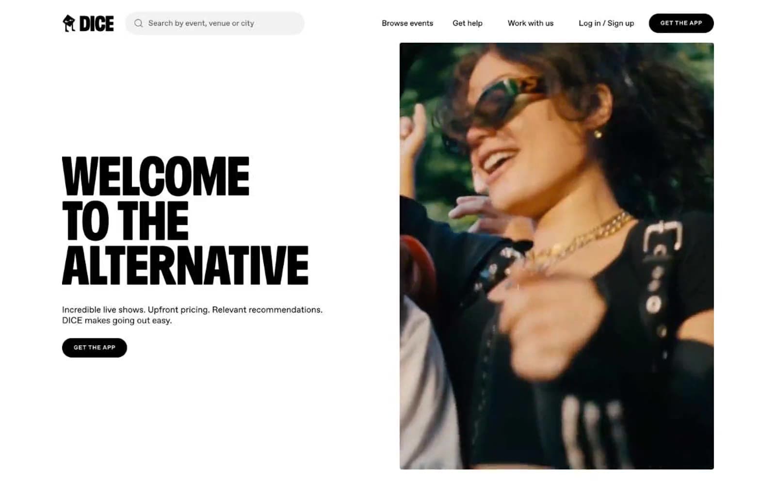
DICE
Media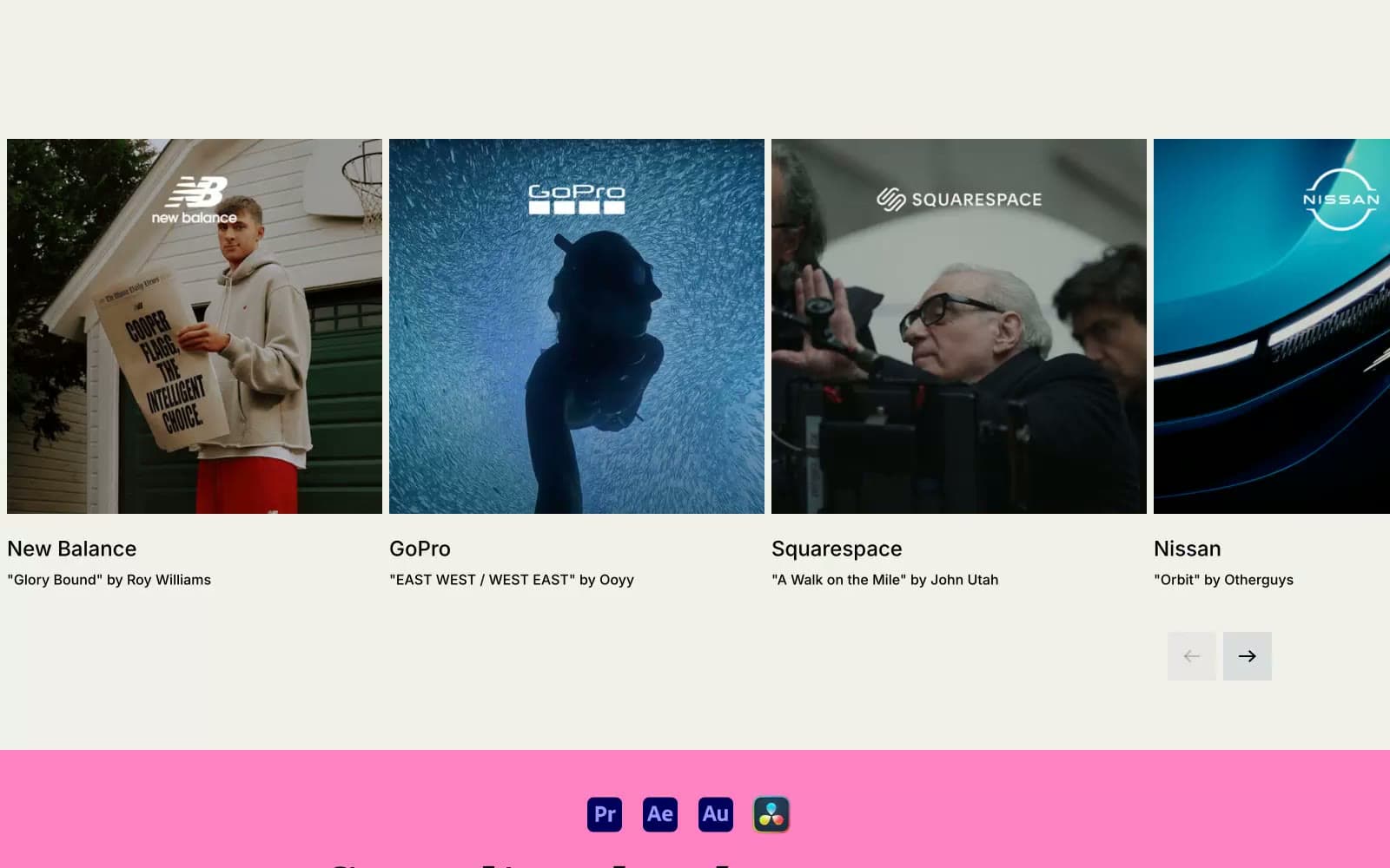
Epidemicsound
Media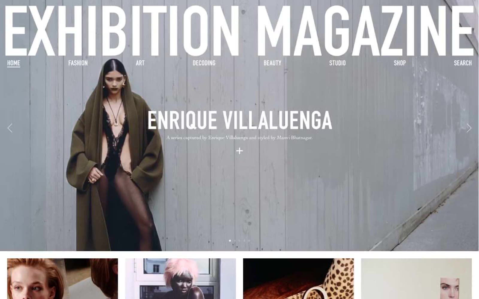
Exhibition Magazine
Media
Flying Papers
Media


