Wealthsimple. Cashmere-lined vault with gallery lighting.
- Finance
- Mixed theme
- 9 colors
- 3 typefaces
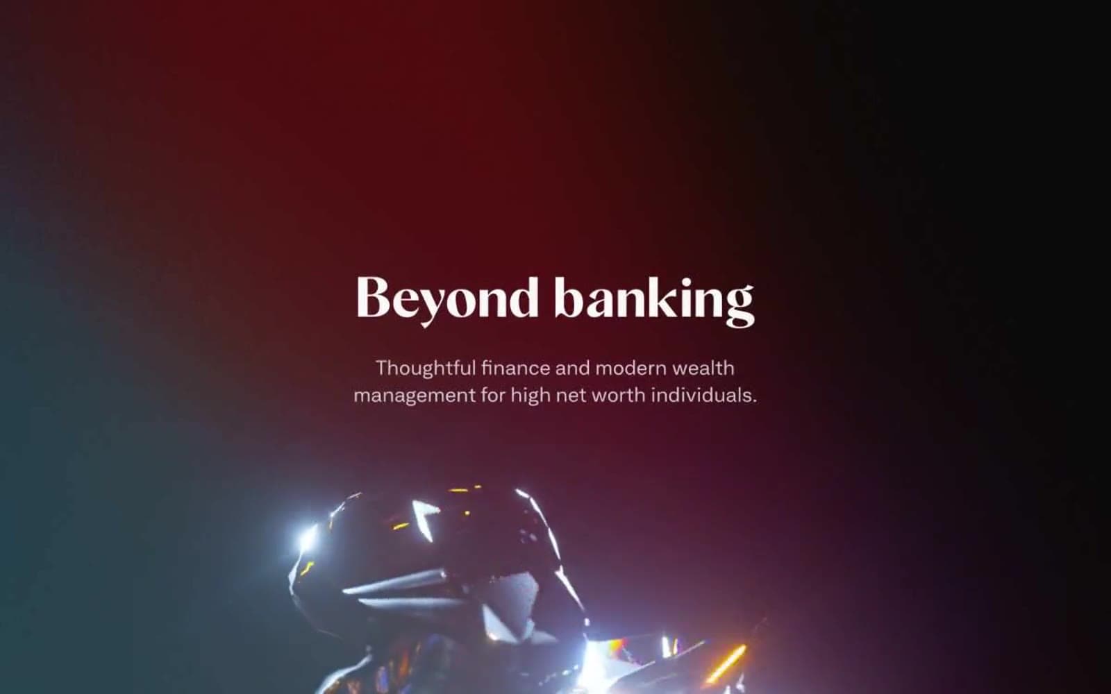
Wealthsimple operates as an editorial boutique masquerading as a fintech: a warm, near-monochrome canvas of paper-cream and graphite, where large Tiempos serif display type shares the page with a quiet geometric sans for body and UI. The signature is the juxtaposition — a fashion-magazine serif headline sitting beside pill-shaped dark buttons, a hero that swaps to a warm bronze-dark field to stage a sculptural 3D form, and illustrations that read as gallery objects rather than product screenshots. Color is almost entirely suppressed in chrome; warmth comes from the off-white stack (#fcfcfc → #faf8f5 → #e4e2e1) rather than from accents. Components stay low and weightless: hairline dividers, 100px-soft-rounded cards, pill buttons, no drop shadows, no gradients. Density is comfortable with long reading lines and generous 48px section gaps — the design trusts typography and whitespace to do the persuading.

Wealthsimple design system

Neutrals9
Reserved for SVG icon fills and a few crisp borders where true black is needed for contrast on warm-cream surfaces
Dark supporting neutral for text, icons, and strong contrast. Do not promote it to the primary CTA color
Supporting neutral for secondary UI, dividers, and muted labels. Do not promote it to the primary CTA color
Hero/feature-block full-bleed background — a warm dark khaki that stages sculptural 3D illustrations without going full-black, maintaining the boutique-warm axis even in dark sections
Secondary/captive text, link body, helper copy — keeps muted text inside the warm-grey family instead of dipping into cool slate
Hairline borders, input outlines, section dividers, nav-rule lines — the workhorse neutral for structural separation
Quiet elevated surfaces, subtle hover washes, soft surface tints for inset regions
Warm alternate section background, hero warm-tones, subtle washes — gives the page its boutique warmth and distinguishes sections from flat white
Default page canvas, card surfaces, button text on dark fills — the brightest neutral, used for main reading surfaces
Try a pairing
Pick any two colors from the palette to check whether text stays readable on top.
Aa
Paper White on Onyx
20.47 : 1 contrast
- Body textPasses AA 4.5
- Large textPasses AA 3
- StrictPasses AAA 7