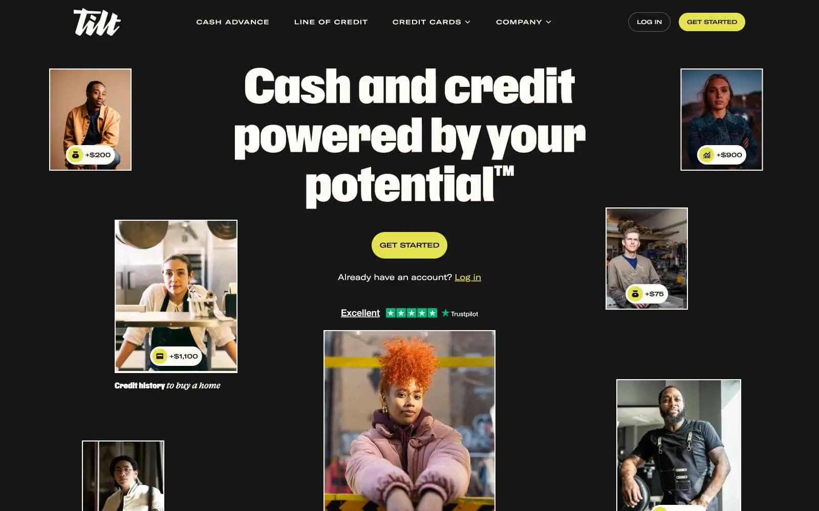
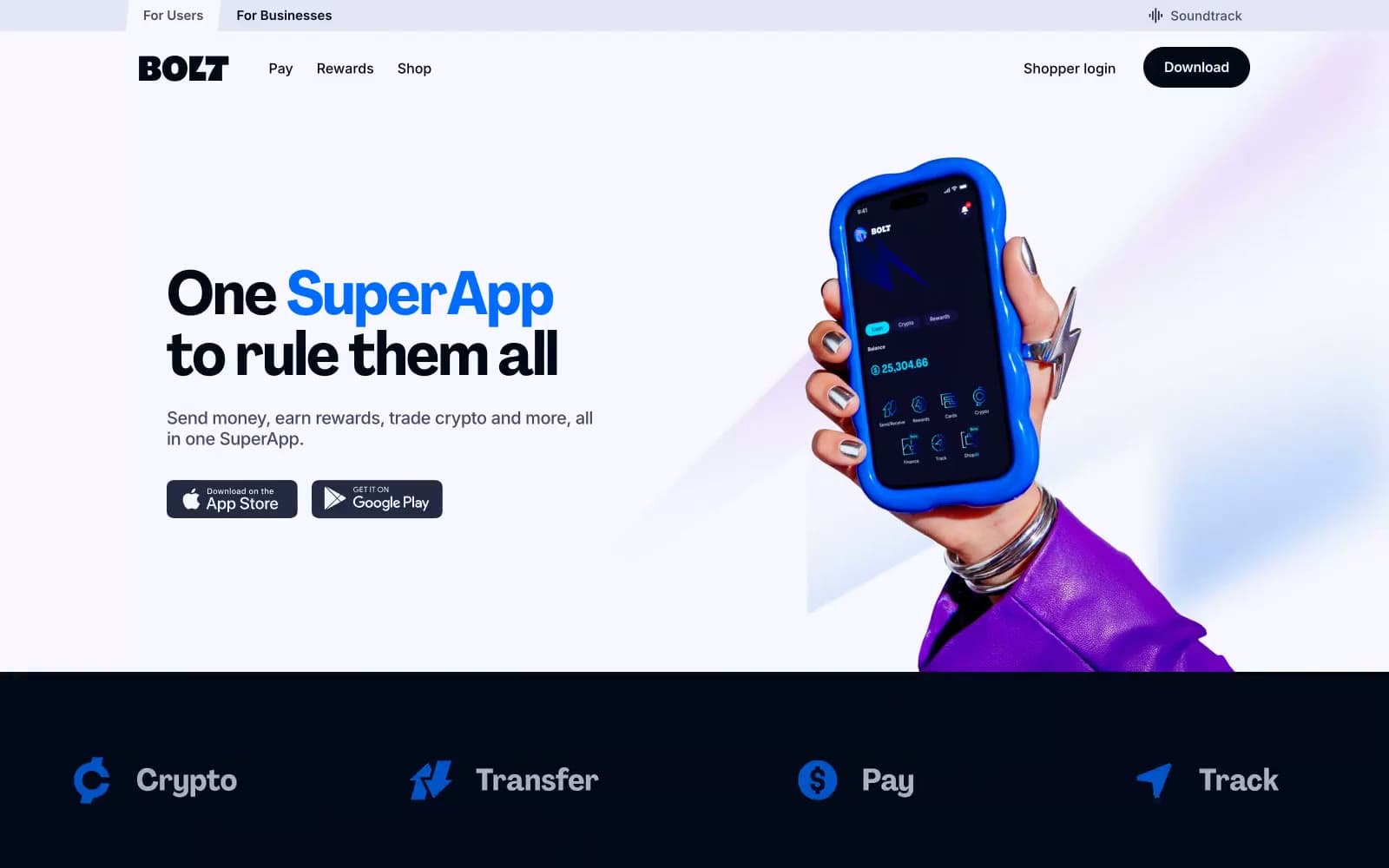
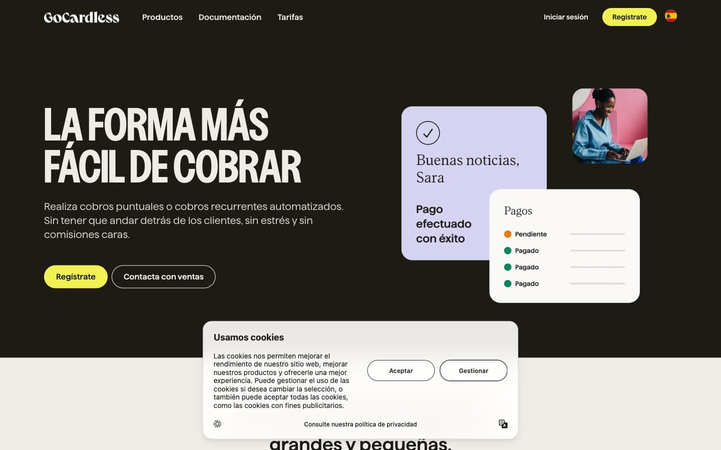
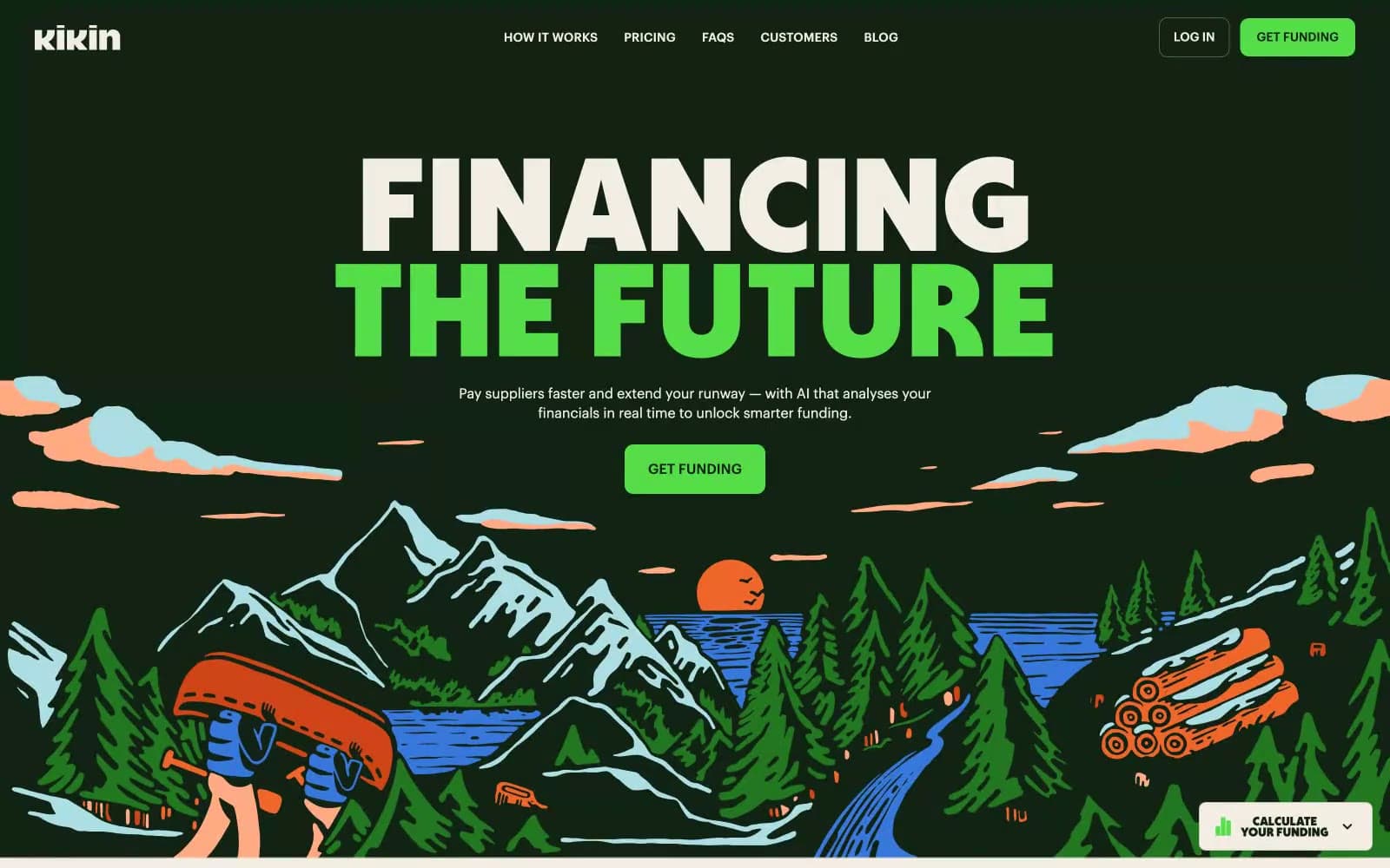
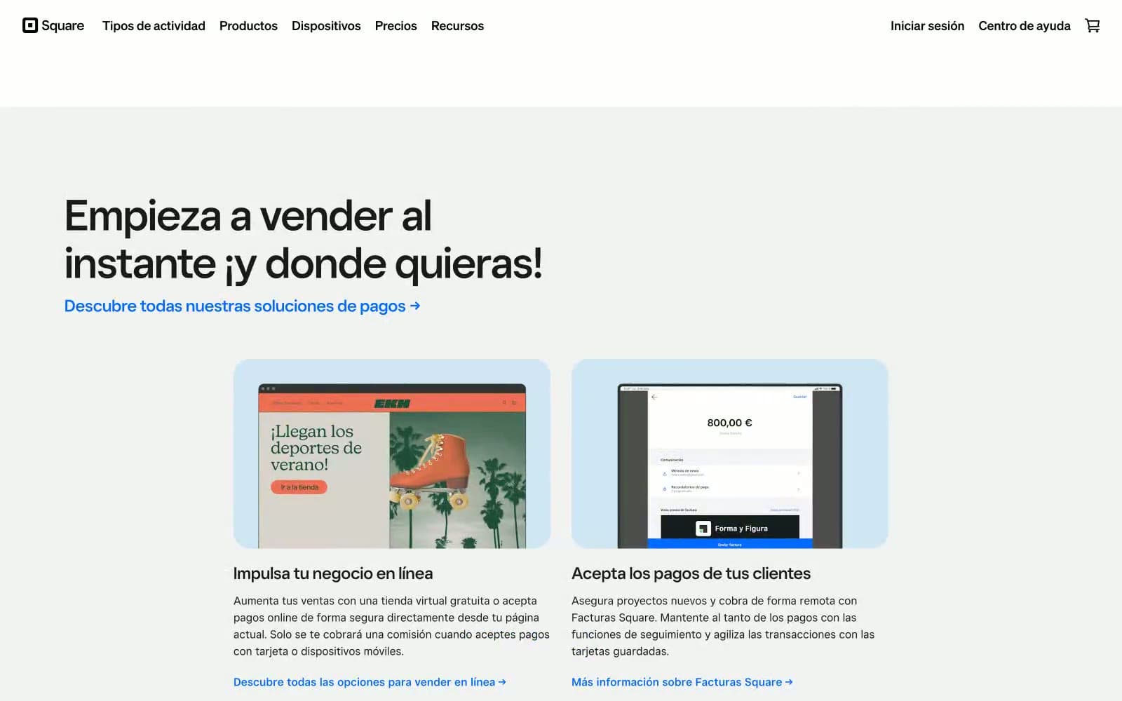
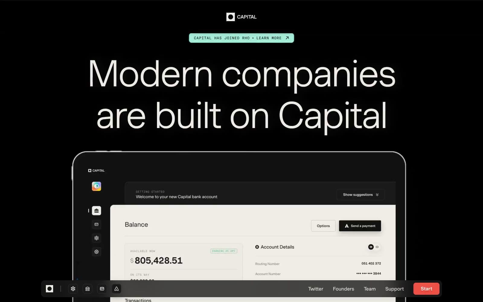
Capital. Midnight editorial gallery with ember accent.
- Finance
- Mixed theme
- 11 colors
- 2 typefaces
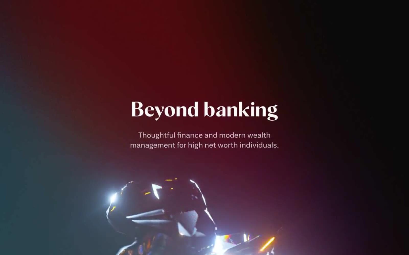
Capital reads as a high-end editorial spread rendered in dark mode: true black canvases alternating with warm cream sections, enormous light-weight Muoto display type, and a single vivid red ember (#ed5145) used sparingly as functional punctuation. Type carries the entire weight of the design — weight 300 at 90–115px with tight negative tracking whispers authority rather than shouts it, and uppercase GT America Mono labels in wide tracking act as section markers above each headline. The layout alternates between dramatic full-bleed dark sections with centered editorial typography and lighter cream sections that feel like magazine pages, with product mockups and portrait photography breaking the rhythm. Surfaces stay flat and matte; the only warmth comes from the cream neutrals and the red accent, never from gradients or decoration.
Capital design system

Brand3
Red action color for filled buttons, selected navigation states, and focused conversion moments.
Outer-glow halo on the ember button — lifts the red off pure black so it feels lit from within rather than pasted on
Inner shadow / pressed state for the ember button — darkens the red when active
Neutrals8
Page canvas for dark sections, hero backgrounds — the true black that swallows surrounding UI
Dark supporting neutral for text, icons, and strong contrast. Do not promote it to the primary CTA color
Intermediate dark surface — product UI panels, modals nested inside the black canvas
Elevated surface above obsidian (card backgrounds, product mockup shells), heading borders on light sections
Button borders, link borders on dark sections — the visible edge of a ghost control against obsidian
Muted body text, secondary metadata, helper labels on both dark and light backgrounds
Muted borders, divider lines on cream sections, low-emphasis form fields
Primary text on dark sections, pill-badge fills, light-section canvas — warm off-white that softens the pure black without going clinical
Try a pairing
Pick any two colors from the palette to check whether text stays readable on top.
Aa
Obsidian on Ember
5.86 : 1 contrast
- Body textPasses AA 4.5
- Large textPasses AA 3
- StrictFails AAA 7