Payments. Zesty citrus on royal violet.
- Finance
- Mixed theme
- 16 colors
- 2 typefaces
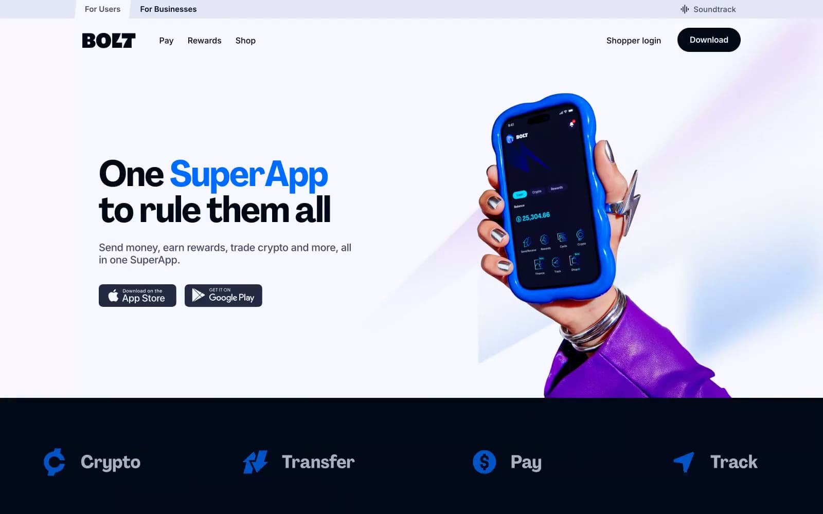
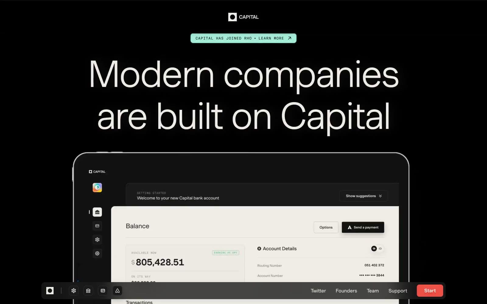
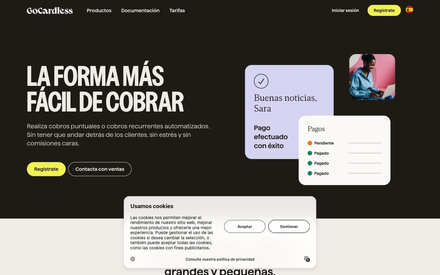
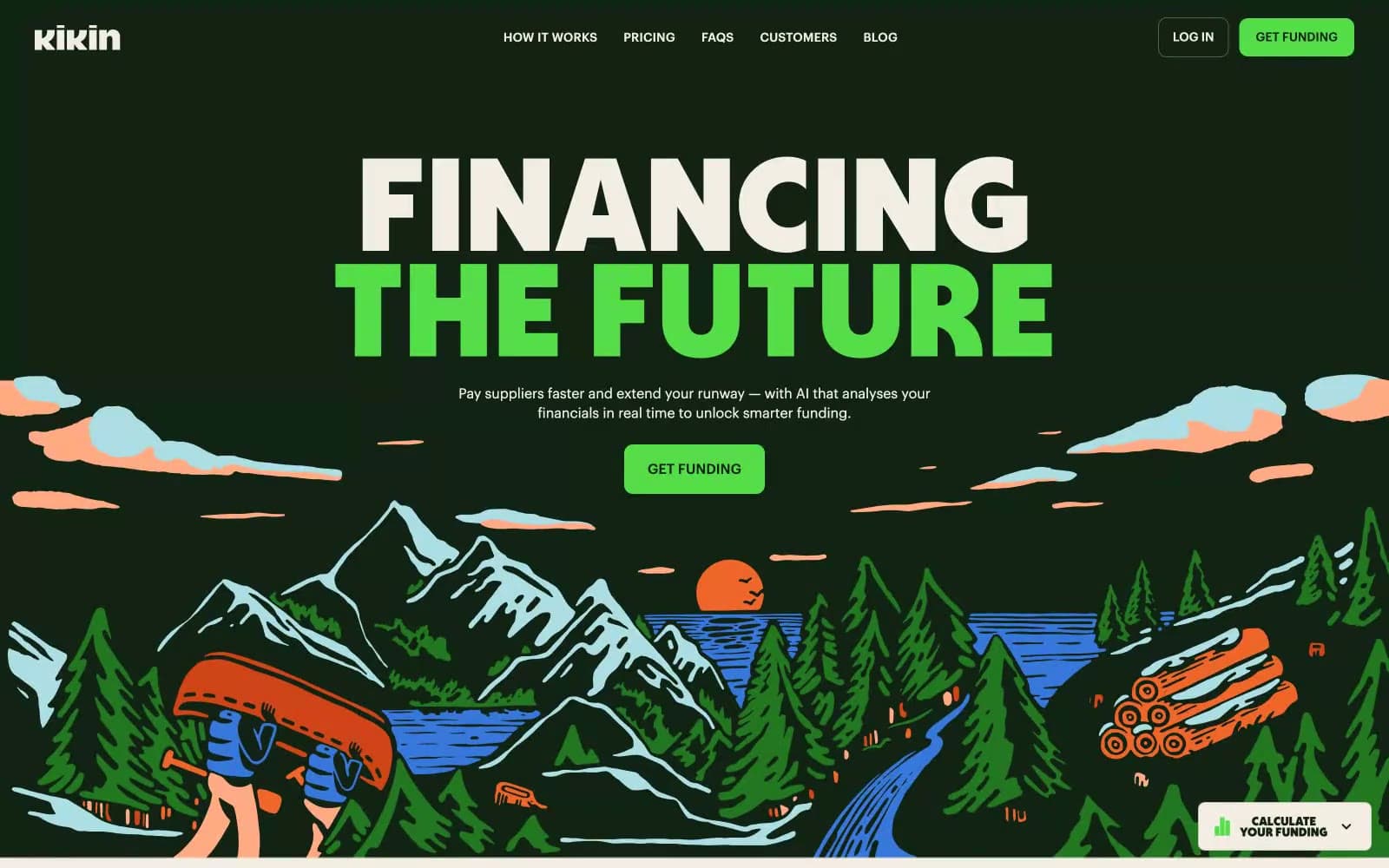
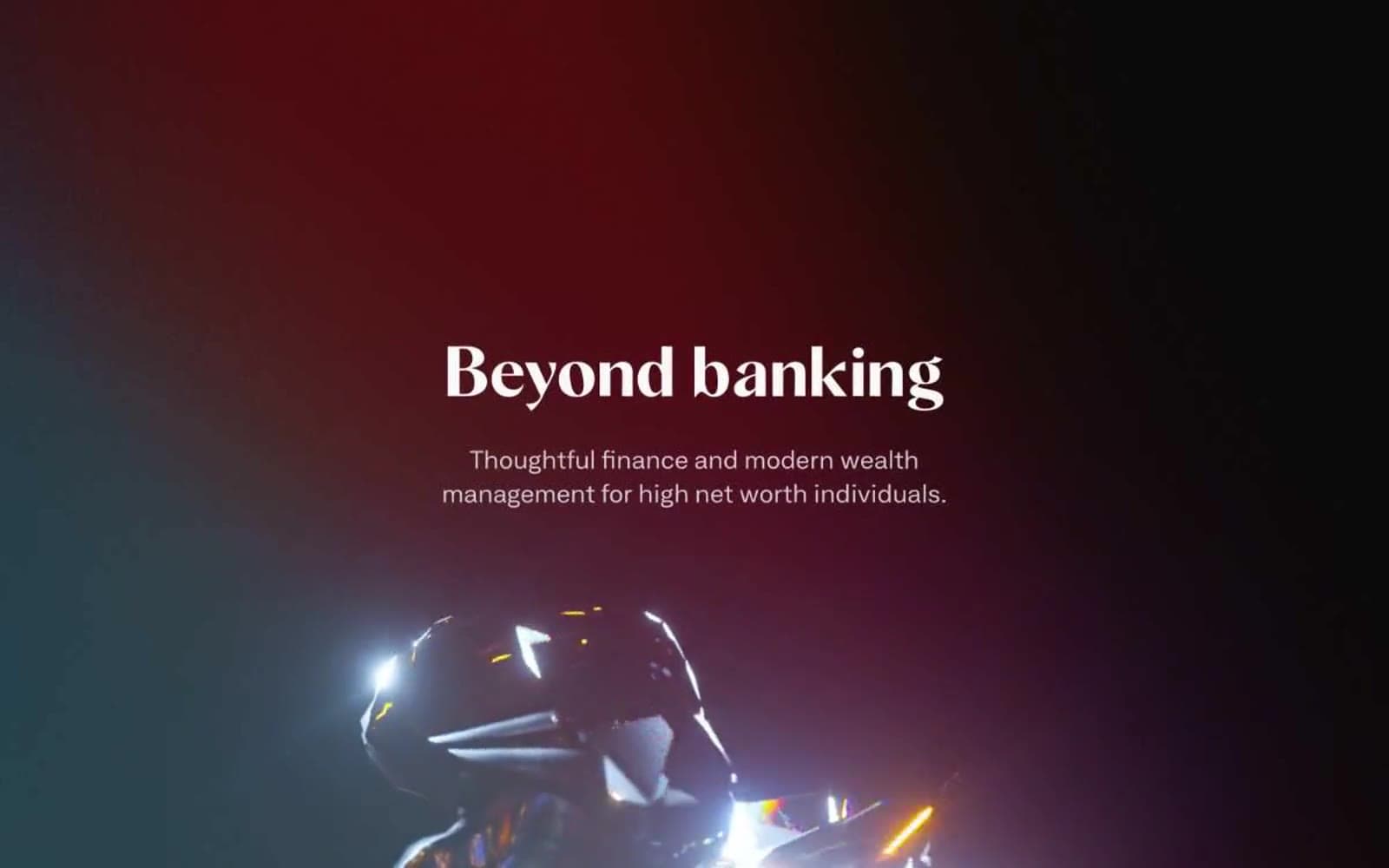
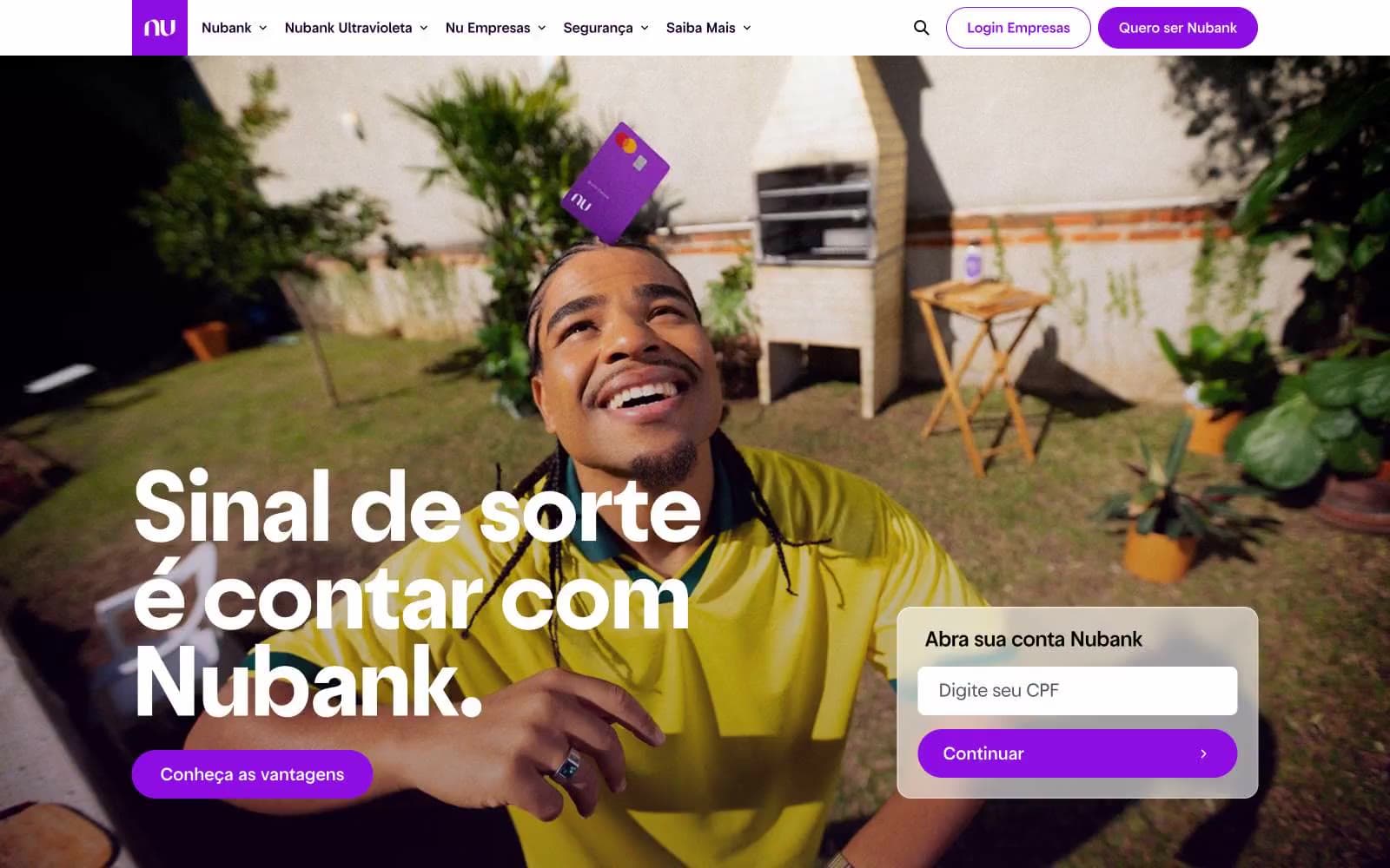
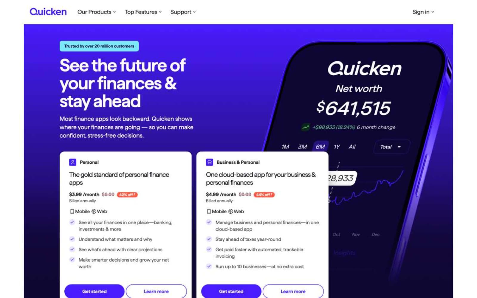
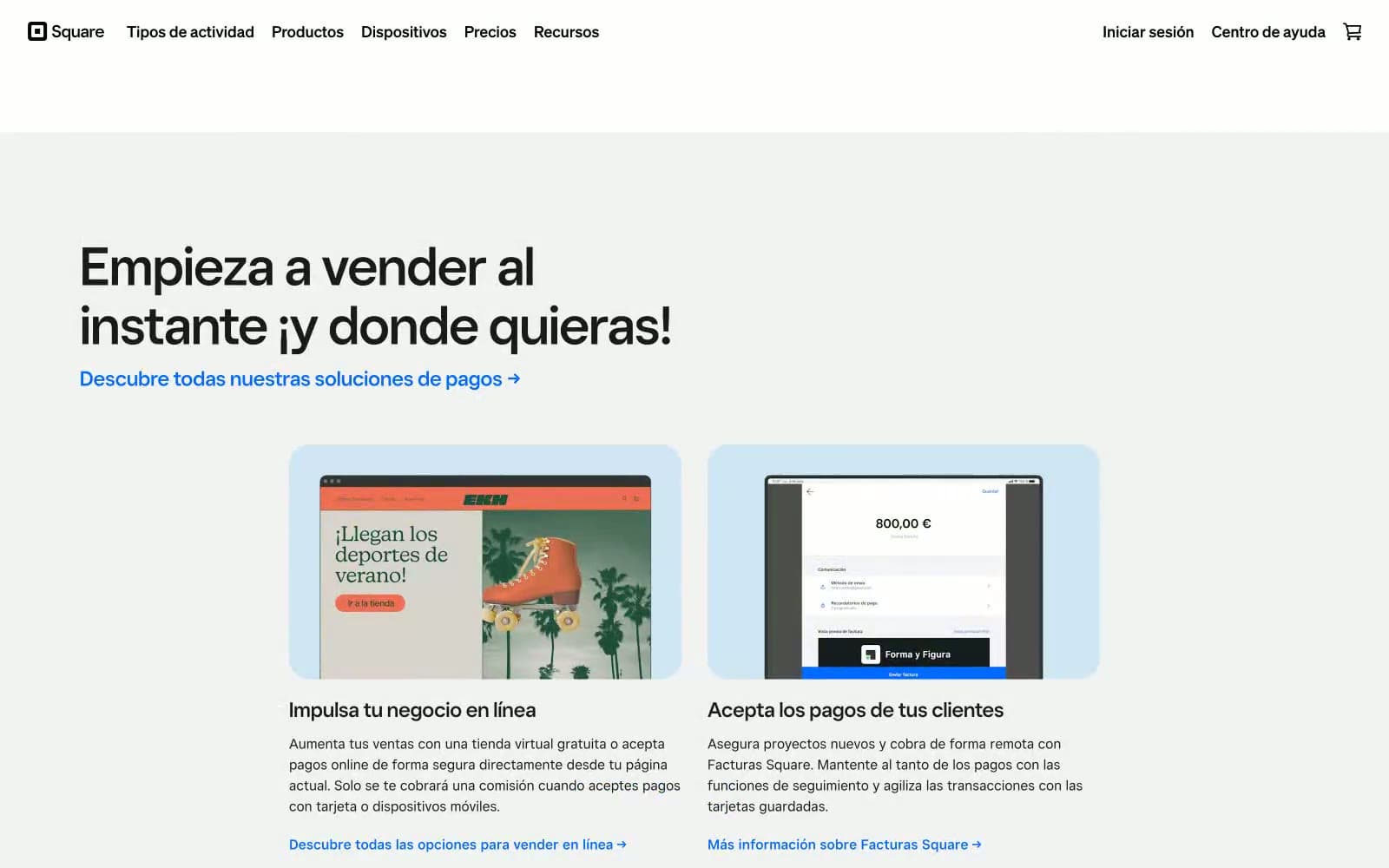
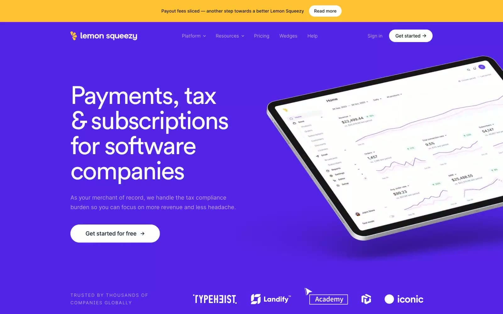
Lemon Squeezy operates on an electric-citrus visual logic: deep royal violet dominates as the hero and CTA canvas, while a sharp lemon-yellow accent acts as functional punctuation for announcement bars and brand moments. The typography pairs a geometric custom display face (Circular Pro Book) with tight negative tracking against Inter for body, producing confident blocky headlines that feel modern without coldness. Cards are unusually rounded at 48px, giving every surface a soft approachable weight, while primary action buttons sit at a tighter 8px radius — a deliberate contrast between playful surfaces and decisive calls-to-action. Full-bleed purple feature bands alternate with white content sections, creating a rhythm of bright calm punctuated by bold brand color. Product mockups float on angled tablets with subtle elevation, reinforcing the all-in-one platform narrative through visual proximity.
Payments design system

Brand2
Violet supporting accent for decorative details and low-frequency emphasis. Do not promote it to the primary CTA color
Icon strokes, secondary accents on violet backgrounds, chart highlights — a slightly lighter companion to Royal Violet
Accent9
Top announcement banners, brand lemon accent, key highlight moments — a sharp citrus spike against the violet/white system
Decorative pastel accent on violet sections, soft highlight washes, pill badge fills
Soft pastel background fills, subtle card highlights, eyebrow tag backgrounds
Pale wash backgrounds, secondary pastel accent
Brand icon accents, chart data lines, secondary illustration color
Green supporting accent for decorative details and low-frequency emphasis
Decorative accent, illustration color, highlight moments
Decorative accent, illustration color, highlight moments
Decorative accent, illustration color, warm highlight moments
Neutrals5
Primary text, dark filled buttons, nav text, headings — the near-black that carries all foreground content
Muted body text, secondary descriptions, nav links, helper copy
Hairline borders, dividers, subtle separation lines
Page canvas, subtle section backgrounds, surface level beneath cards
Light supporting surface for subtle backgrounds and section separation. Do not promote it to the primary CTA color
Try a pairing
Pick any two colors from the palette to check whether text stays readable on top.
Aa
Paper on Royal Violet
7.58 : 1 contrast
- Body textPasses AA 4.5
- Large textPasses AA 3
- StrictPasses AAA 7