Kikin. A financial product wearing a patch jacket.
- Finance
- Mixed theme
- 13 colors
- 3 typefaces
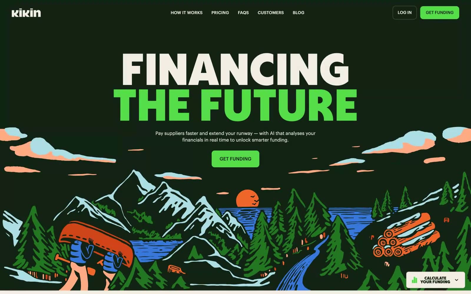
Kikin operates in the visual register of a vintage national-park poster that grew up and learned to do invoice financing. The system alternates between a deep forest-green hero and a warm cream content canvas, with one vivid grass-green (#55dd4a) acting as the single switch-on accent for every primary action. Headlines are set in Deacon, an ultra-condensed display sans pushed to absurd scale (up to 259px) with line-height compressed to 0.8 — type is treated as a landscape feature, not a label. Everything else is grounded: Graphik handles body, illustrations are limited-palette line-and-fill patches of mountains, trees and water, and circular illustrated badges float around content like enamel pins on a hiking jacket. The result is warm, environmental, slightly handmade, but with a serious financial product underneath — the green is a meadow, not a neon.
Kikin design system

Brand3
Hero canvas, primary heading text, nav bar surface, footer — the dominant dark that anchors every green-on-green moment
Primary action fill (GET FUNDING), accent headline words, tag fills — one switch-on green against both dark and cream surfaces
Illustration dark fills, badge backgrounds where Forest Ink would blend with the canvas
Accent3
Outlined/ghost action border, hover-state ring — a softer Meadow for non-filled interactive states
Illustration accent for water and sky in the hero artwork and badge illustrations, small data-viz highlight
Illustration accent for suns and warm callouts in the patch artwork, limited to decorative moments
Neutrals7
Icon strokes, near-black text, very dark UI fills when Forest Ink would be too green
Body text on cream, hairline borders, image overlays — the workhorse neutral that keeps #122315 reserved for display moments
Muted green-gray for secondary borders, dividers on cream, subhead accents — lets Meadow read as the only chromatic action
Dark borders and separators for elevated surfaces and inverted UI. Do not promote it to the primary CTA color
Helper text, metadata, low-emphasis captions on cream
Subtle dividers on cream, secondary card edges — quieter than Sage Border
Main content canvas after the hero, card surface on dark hero, ghost-button fill — warm off-white that replaces typical SaaS white
Try a pairing
Pick any two colors from the palette to check whether text stays readable on top.
Aa
Paper Cream on Forest Ink
14.13 : 1 contrast
- Body textPasses AA 4.5
- Large textPasses AA 3
- StrictPasses AAA 7