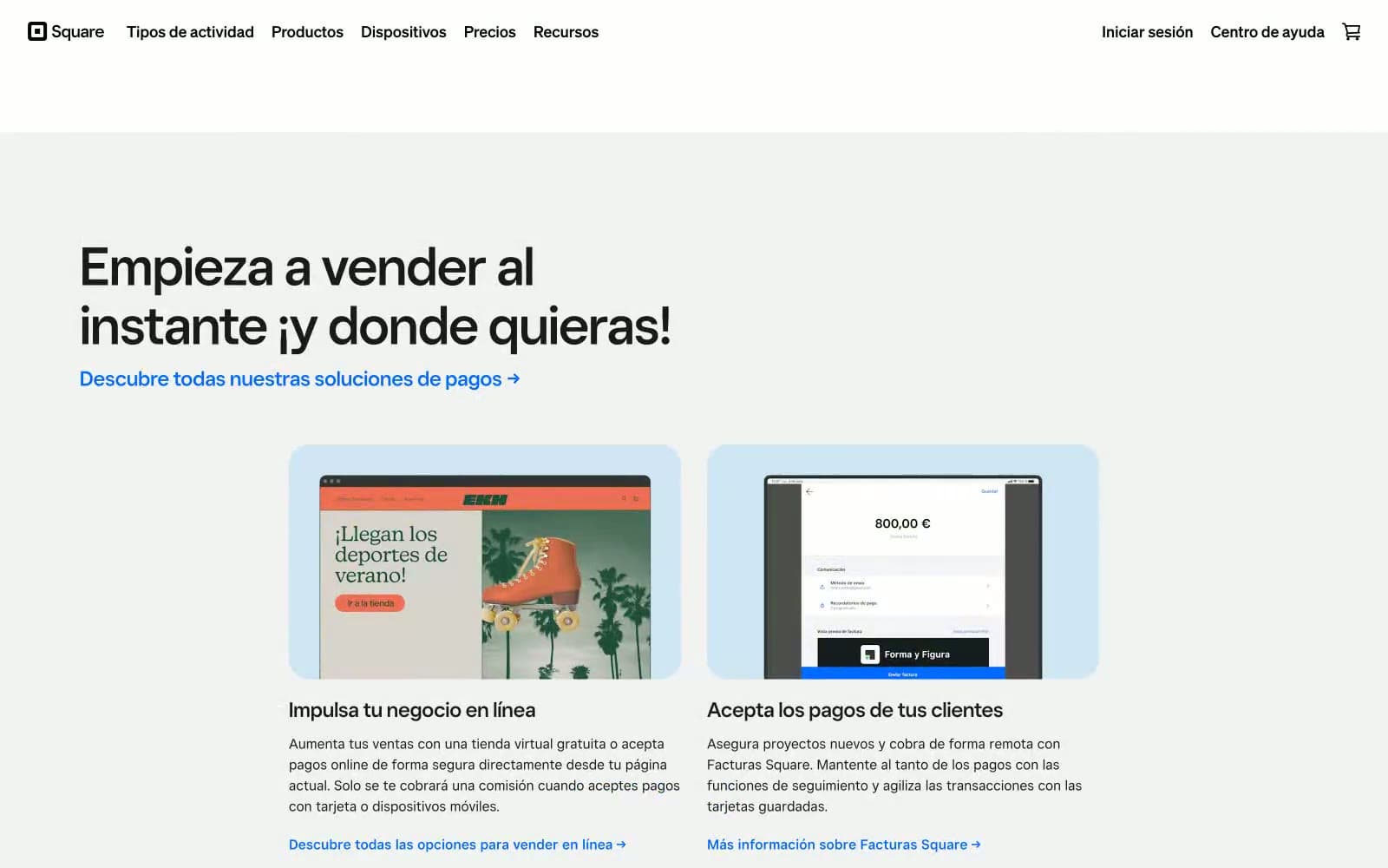
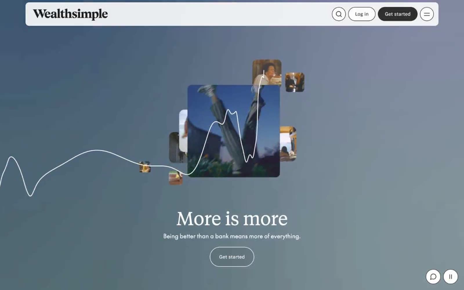
Letter. Private gallery with iridescent vault artifacts.
- Finance
- Mixed theme
- 13 colors
- 2 typefaces
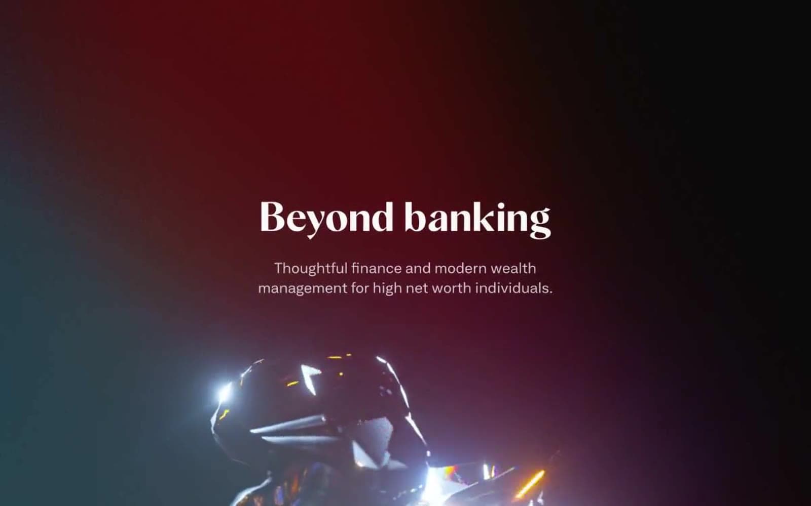
Letter is a private-banking platform that reads like a gallery exhibition for high-net-worth finance. The visual system pivots between a deep ink-black hero stage and a bright editorial body, with 3D metallic and prismatic renders as the recurring sculptural accent. Typography is split into two deliberate registers: a wide grotesque for interface text and navigation, and a high-contrast serif at 80px for headlines that read like magazine cover titles. Color is used as architectural punctuation — three near-gray tinted panels (peach, mint, lavender) act as gallery walls, while teal, violet, and blue claim the action buttons as discrete brand moments. Components are square and confident: 2px corner radii, generous horizontal button padding, and zero decorative shadow — the renders and typography do all the emotional work.
Letter design system

Brand4
Teal action color for filled buttons, selected navigation states, and focused conversion moments.
Violet action color for filled buttons, selected navigation states, and focused conversion moments.
Secondary action buttons, hover state on violet CTAs, accent borders — deeper companion to Electric Violet for depth
Blue action color for filled buttons, selected navigation states, and focused conversion moments.
Accent3
Hairline borders, dividers, input outlines, and card edges on light surfaces.
Tinted card background — cool mint gallery wall, likely the investing/savings panel
Tinted card background — soft lavender gallery wall for the credit or lending panel
Neutrals6
Primary text, headline ink, logo mark — the only true black in the system, reserved for maximum-contrast typography
Hero background, dark surface stage, dark card panel — deep near-black with the faintest blue chill, warmer than pure black but harder than charcoal
Muted helper text, secondary metadata, low-emphasis labels — a true middle gray with no chromatic bias
Borders, dividers, card outlines, button strokes at low contrast — barely-there separators that define structure without drawing the eye
Soft section background, subtle card surface, secondary canvas — sits one step below pure white without grayness
Page canvas, light card surface, inverse text on dark backgrounds, outlined button fills
Try a pairing
Pick any two colors from the palette to check whether text stays readable on top.
Aa
Paper White on Deep Teal
6.01 : 1 contrast
- Body textPasses AA 4.5
- Large textPasses AA 3
- StrictFails AAA 7