Square. Blue signal on white steel.
- Finance
- Mixed theme
- 9 colors
- 3 typefaces
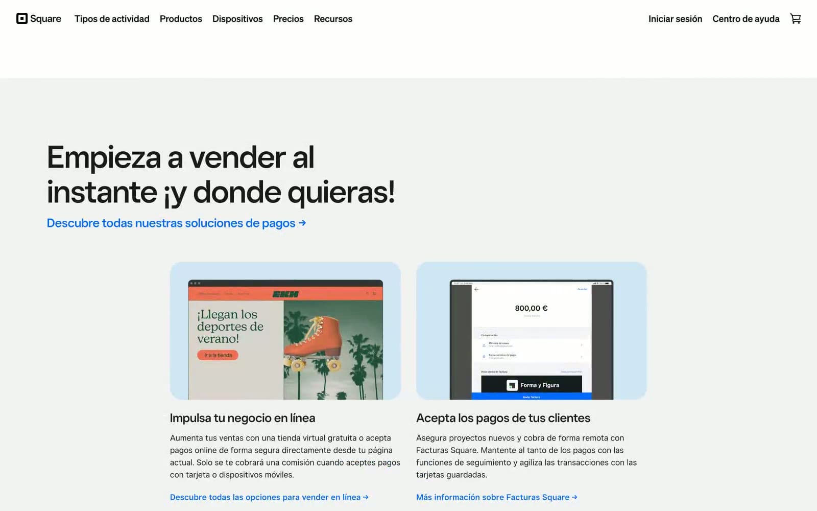
Square's design system is a confident, white-canvas fintech language that lets one vivid blue do all the talking. The interface stays nearly monochrome: white surfaces, a soft gray page background, near-black text, and a single Signal Blue (#006aff) that punctuates CTAs, links, and the subscription form. Headlines lean on a geometric custom display face at near-display sizes (50–86px) with tight line-heights and negative tracking, creating a weight-of-restraint authority rather than shouting. Components are flat and minimal — a 4px-cornered filled button, a ghost variant, light-blue tinted feature cards with 24px image radii, and a single hard-edged dark footer band that flips the palette to black with white type and the same blue for the send button. Elevation is essentially absent: a 1px 16% black shadow on buttons is the only depth the system allows.
Square design system

Brand1
Primary CTAs, link text, active nav, submit buttons, icon accents — the sole chromatic voice in an otherwise achromatic system
Neutrals8
Icon fills, monochrome graphic elements, SVG illustration strokes
Dark footer section background, inverted surfaces — the only break from white
Primary text, heading fills, dark icon strokes, nav labels — near-black that reads softer than pure black on white
Secondary text, helper copy, muted nav, input placeholder tone
Disabled text, tertiary metadata, very subtle structural lines
Hairline borders, input outlines, subtle dividers between sections
Page canvas beneath white cards, soft section background, muted surface
Light supporting surface for subtle backgrounds and section separation. Do not promote it to the primary CTA color
Try a pairing
Pick any two colors from the palette to check whether text stays readable on top.
Aa
Paper on Signal Blue
4.66 : 1 contrast
- Body textPasses AA 4.5
- Large textPasses AA 3
- StrictFails AAA 7