Gocardless. Warm cream broadsheet with acid yellow highlighter.
- Finance
- Mixed theme
- 7 colors
- 4 typefaces
GoCardless uses a warm, editorial fintech language: a cream paper-white canvas punctuated by one electric acid-yellow accent that acts as functional highlighter rather than decoration. The system lives almost entirely in achromatic warm tones — deep charcoal text on cream surfaces — with bold sans-serif typography that carries the weight of the design. Type is oversized and confident (up to 84px display, weight 700) sitting alongside a single whisper-light serif at 48px for contrast. Surfaces are flat with hairline borders instead of shadows, and every interactive element rounds to a generous 32px pill, giving the interface a soft, button-like tactility. The result feels like a well-designed financial newspaper: serious, warm, and surprisingly playful when the yellow punctuates a dark hero.
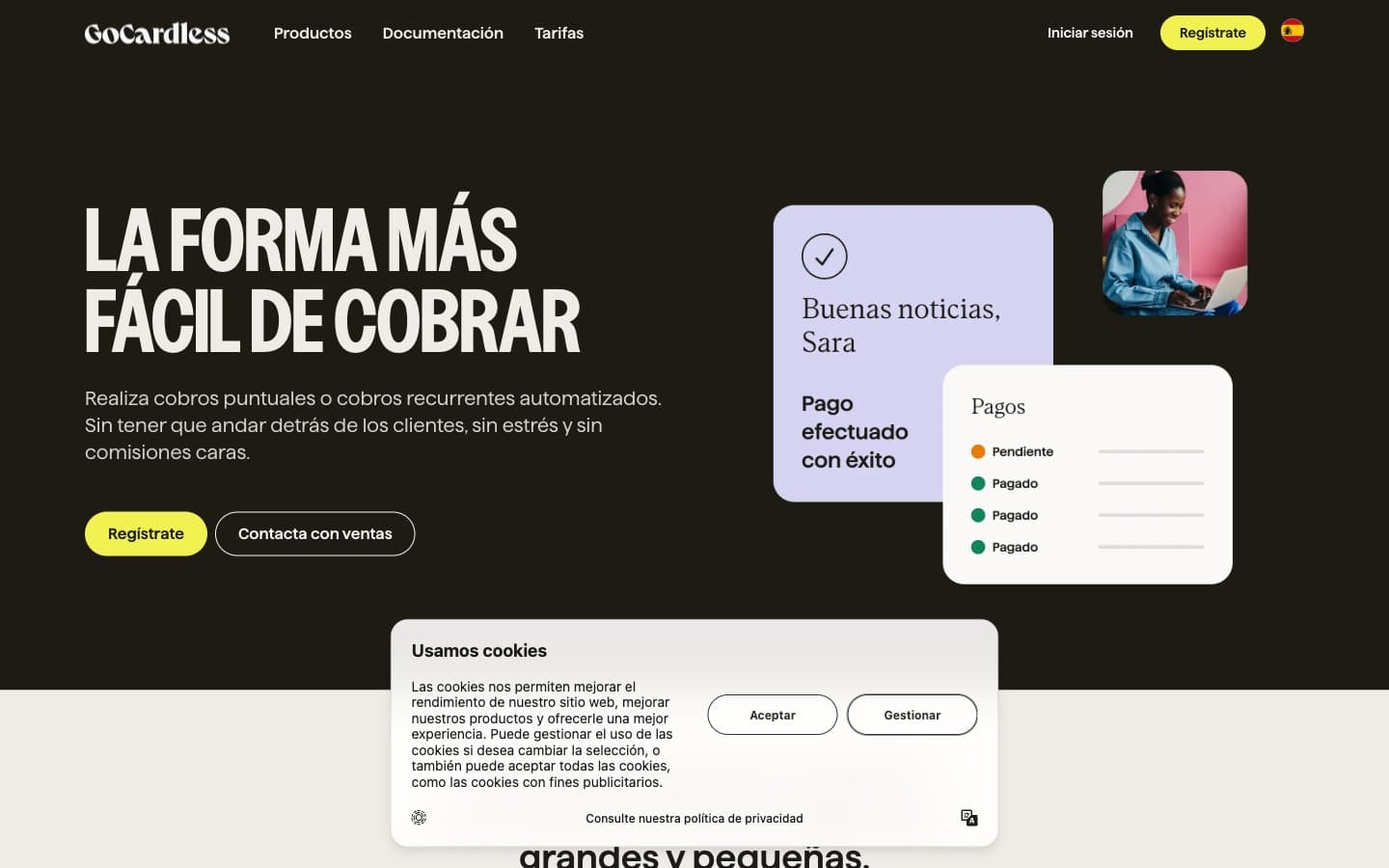
Gocardless design system

Brand1
Primary action buttons, decorative accent shapes, heading highlights, nav emphasis — the single chromatic color in an otherwise achromatic system, used sparingly to draw the eye to CTAs and break visual monotony
Neutrals6
Primary text, dark hero/section backgrounds, icon strokes, nav borders, high-contrast surfaces — the structural black of the system, warmer than pure black
Footer accents, deep warm browns for grounding the bottom of pages — a desaturated warm dark that complements charcoal without competing
Secondary body text, muted labels, image borders, card borders, icon outlines — the mid-tone that bridges ink and paper
Hairline dividers, subtle borders, image outlines, secondary structural lines — the lightest warm gray for quiet separation
Dominant page canvas, card backgrounds on dark sections, nav borders, link borders — the warm off-white that defines the brand's lighter surfaces
Elevated card surfaces, modal backgrounds, light-theme cards, inset border glows — the brightest surface for content containers that sit on cream
Try a pairing
Pick any two colors from the palette to check whether text stays readable on top.
Aa
Charcoal Ink on Acid Highlight
14.40 : 1 contrast
- Body textPasses AA 4.5
- Large textPasses AA 3
- StrictPasses AAA 7