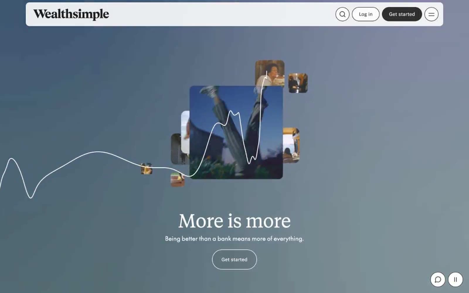
Quicken. Electric violet on white marble.
- Finance
- Mixed theme
- 12 colors
- 1 typeface
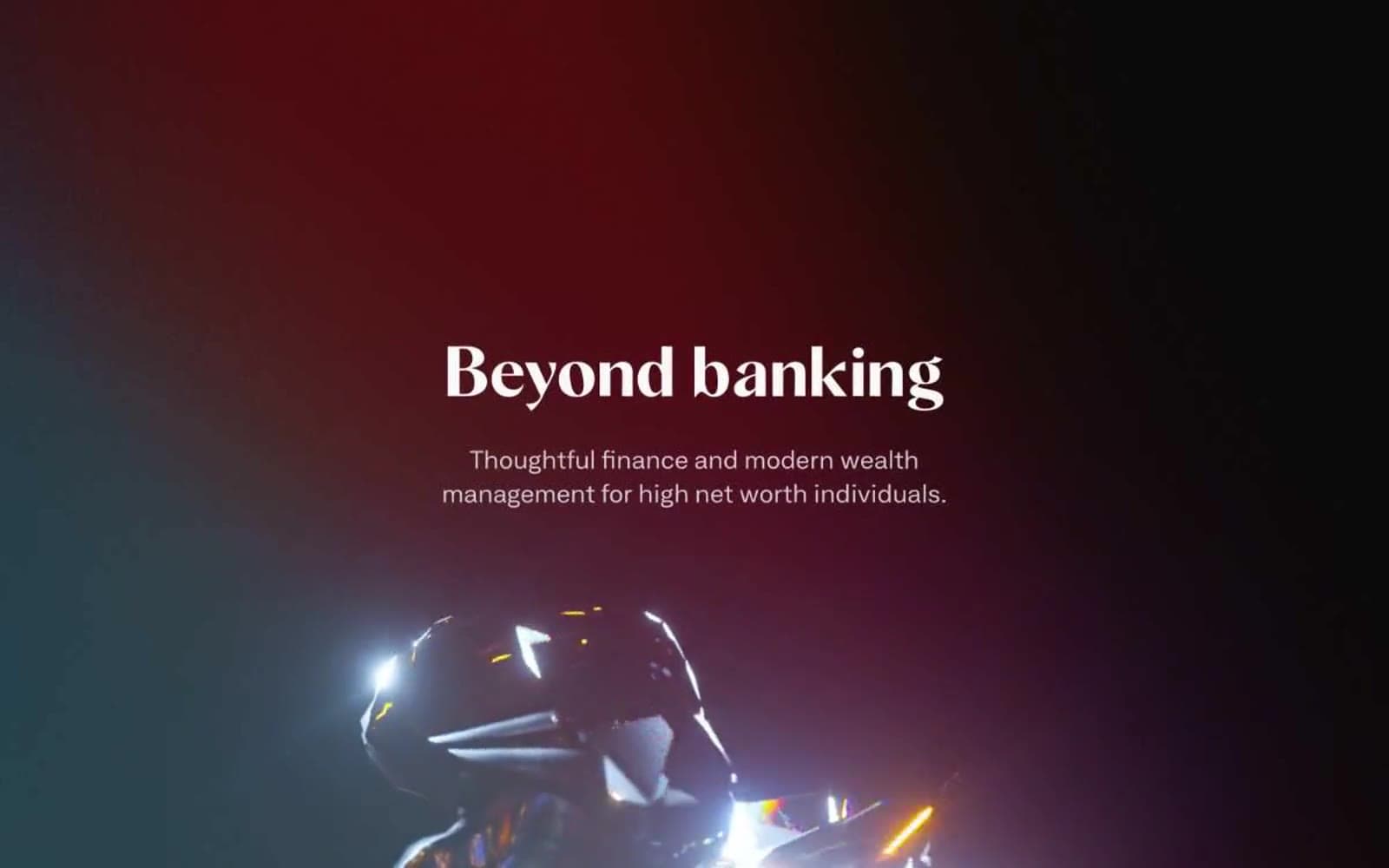
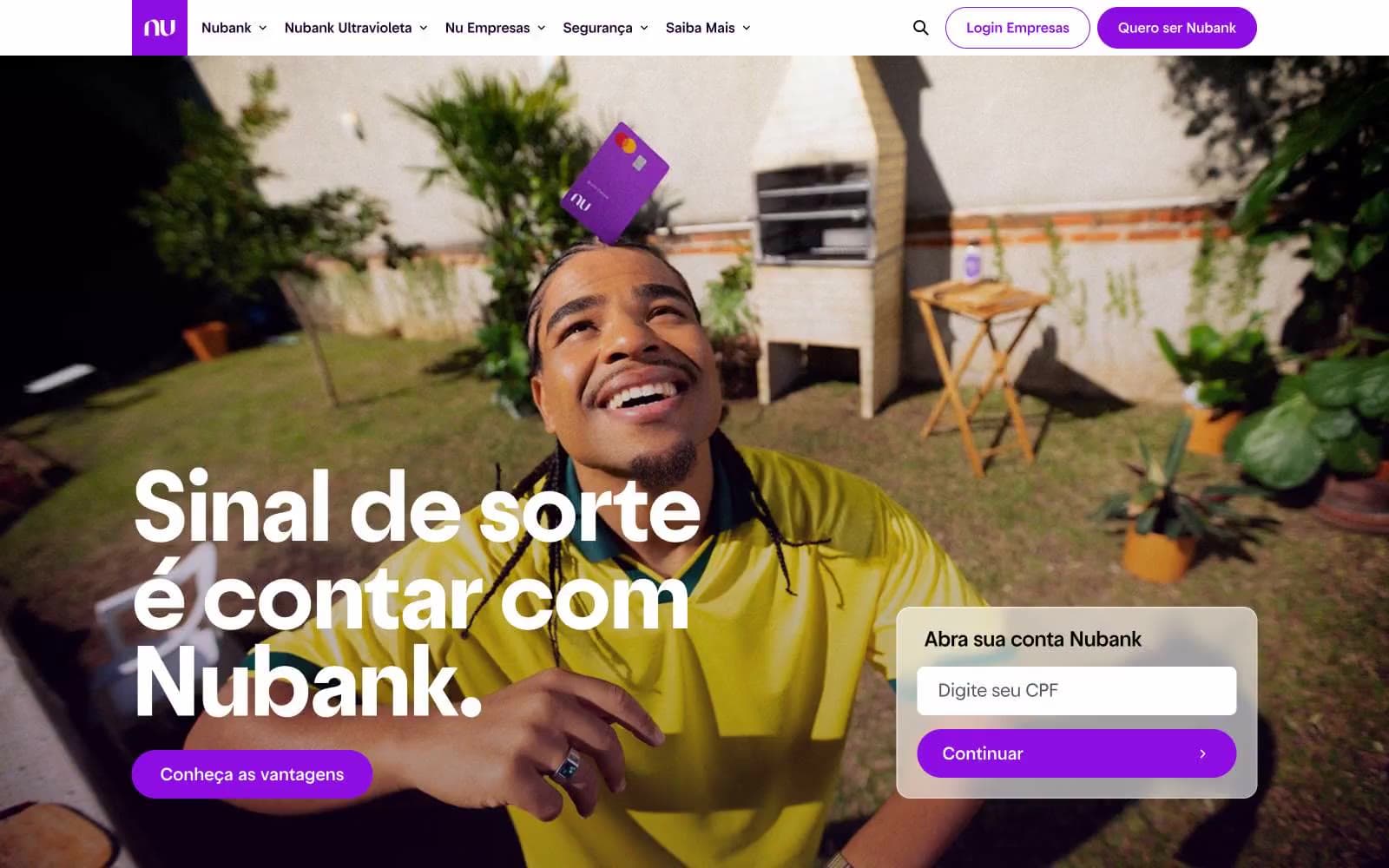
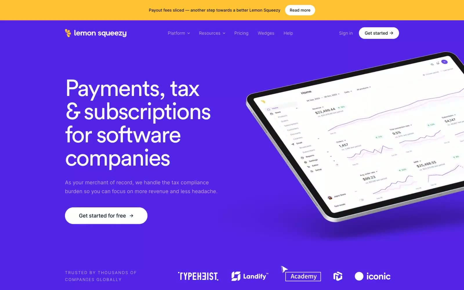
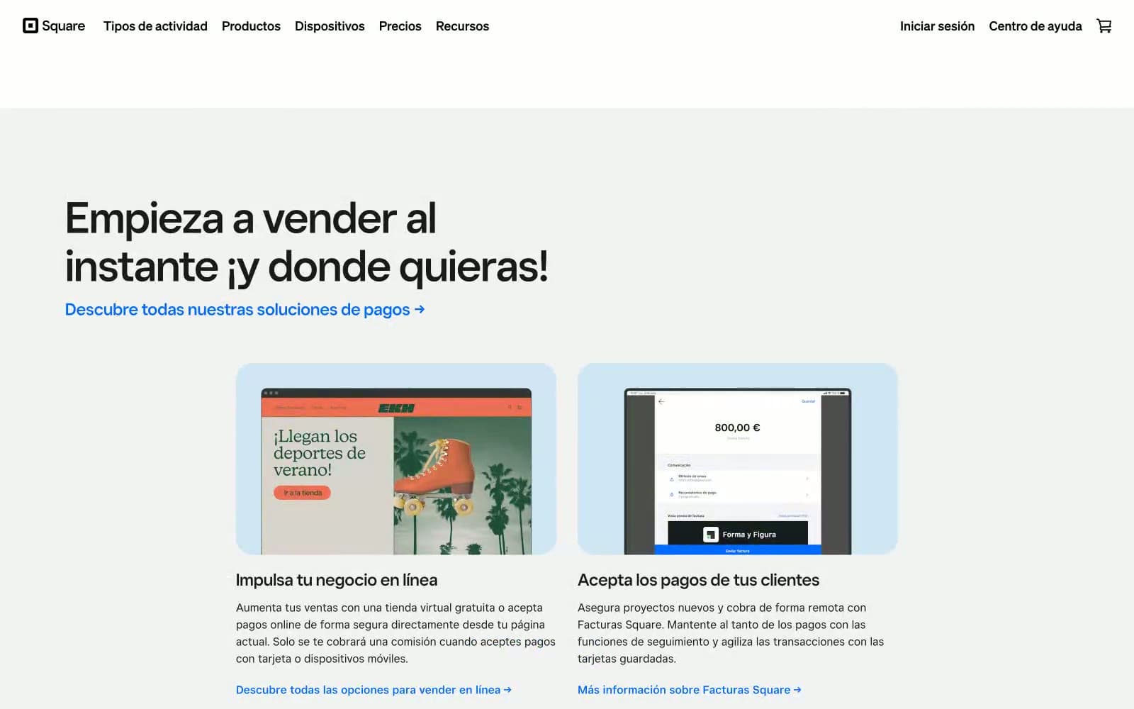
Quicken's design system orbits a single electric violet — vivid #471cff — that acts as the power source for every interactive element against a clean white canvas. The visual personality is confident financial-tech: a custom geometric sans (Haffer) sets the voice with tight negative tracking that tightens further as type grows, creating density and authority without weight. Dark violet sections (#0f0733) alternate with white bands to create rhythm, while soft lavender card borders (#dbd3ff, #bbc5fa) replace the usual gray dividers and reinforce brand identity at every edge. Components lean rounded and pill-shaped: cards use 16px corners, buttons stretch to 400px radius, and shadows are nearly absent — depth comes from color contrast and border treatment, not elevation.
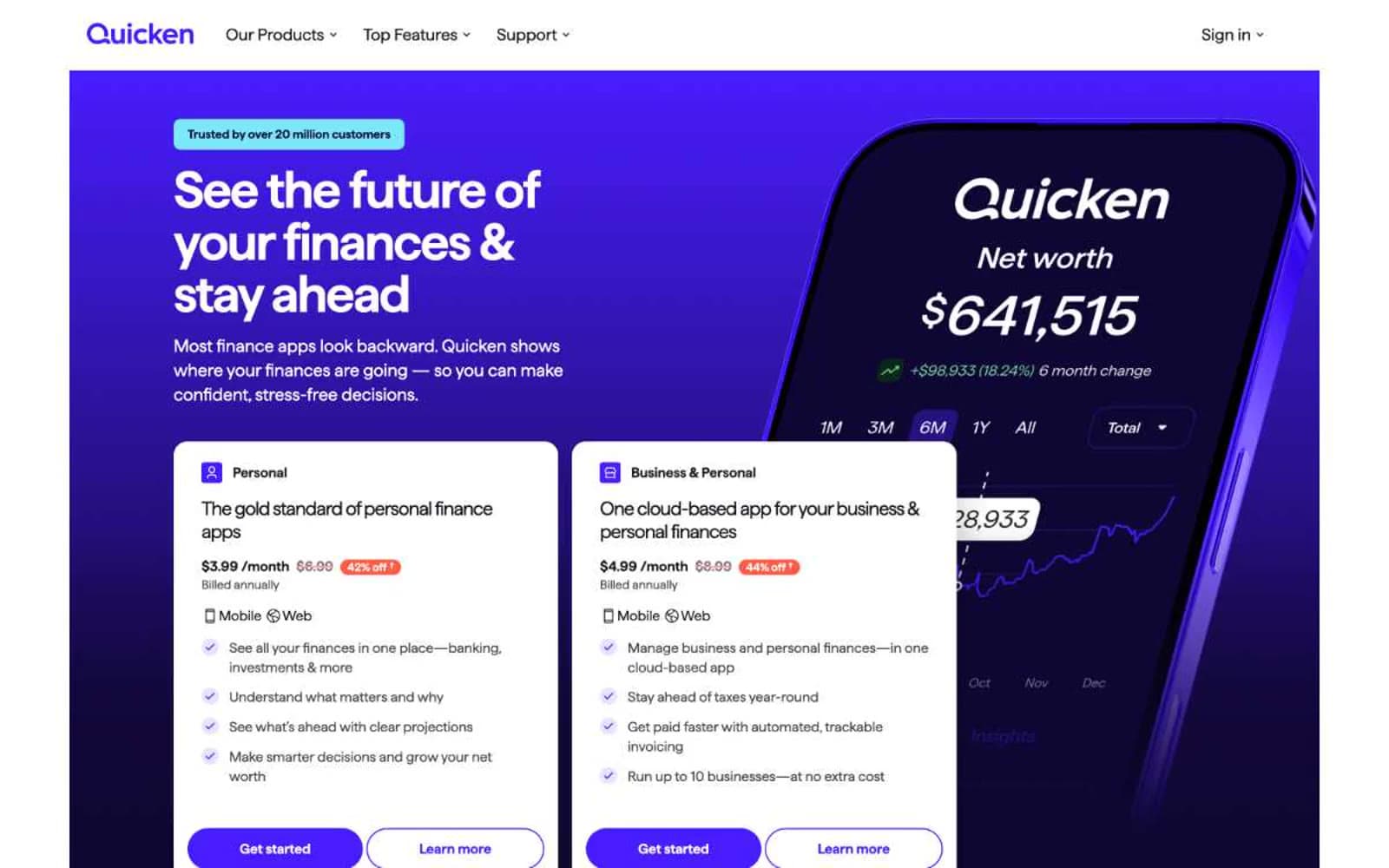
Quicken design system

Brand2
Primary action buttons, active nav items, key links, brand emphasis — the single chromatic pulse of the interface; everything else defers to it
Dark section backgrounds, hero canvas, high-contrast text on light surfaces — the midnight counterpart that anchors alternating dark bands
Accent4
Promotional accents, sale/urgency indicators, highlight strokes — used sparingly to flag attention without competing with the primary violet
Soft card and container borders — a low-contrast violet edge that brands outlines without adding visual weight
Cooler card border tone for grouping and container edges — second step in the violet border scale for layered cards
Decorative badge backgrounds, hero trust-pill fill — cool cyan that brightens dark sections
Neutrals5
Primary body and heading text, dominant border color, icon strokes — the near-black that carries all readable content
Secondary text, muted nav, supporting borders — the mid-gray step between ink and white
Table dividers, hairline borders in data-heavy layouts — a cool neutral that doesn't fight the violet palette
Subtle surface tint for alternating bands, header backgrounds — barely-there cool wash
Page and card backgrounds, text on dark surfaces, button fills for ghost variants
semantic1
Error and warning badge fills, alert pills — warm contrast against the cool violet system
Try a pairing
Pick any two colors from the palette to check whether text stays readable on top.
Aa
Pure White on Voltage Violet
7.30 : 1 contrast
- Body textPasses AA 4.5
- Large textPasses AA 3
- StrictPasses AAA 7