
Waka Waka. Monumental black grotesk type printed on warm off-white paper, everything else recedes.
- Design tools
- Light theme
- 3 colors
- 1 typeface
Waka Waka treats its website like a printed exhibition catalog: a warm bone-colored paper canvas, one near-black ink, and a custom grotesk typeface deployed at both 10px footnote size and 560px monumental scale. The system is essentially monoline and monochromatic — there are no accents, no secondary hues, no gradients, and almost no decorative chrome. Visual hierarchy is created entirely through typographic weight, scale, and whitespace, with the brand's own name acting as the dominant graphic device on every screen. Components are flat, borderless or hairline-bordered, and feel curated rather than interactive — the page reads as a gallery wall of objects and oversized letterforms, not a software interface.
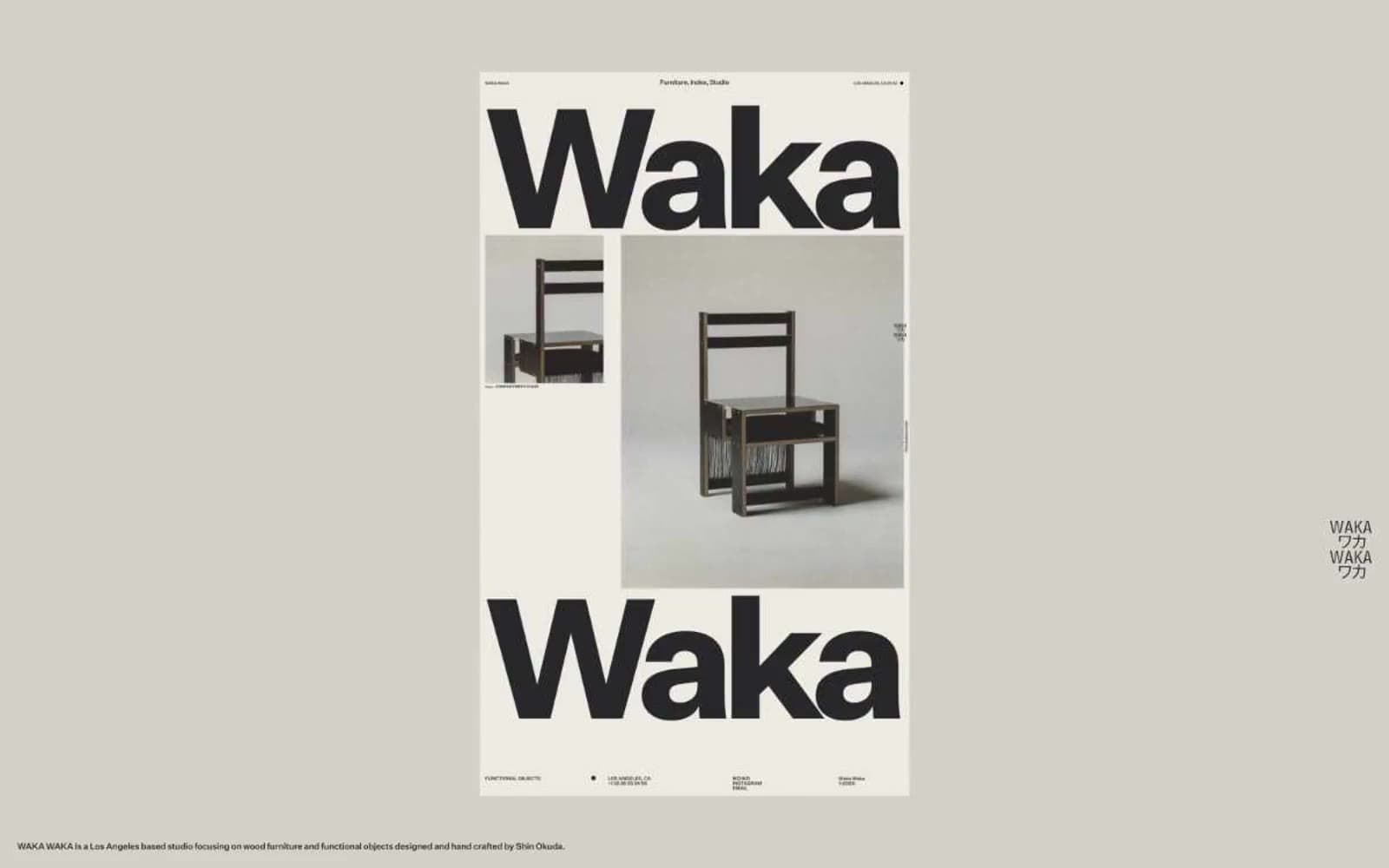
Waka Waka design system

Neutrals3
Primary text, all borders, hairline rules, icon strokes, and the only chromatic anchor in the system — near-black with a hint of warmth so it sits comfortably on the bone background instead of vibrating
Secondary surface and muted contextual neutral — appears in contrast pairings as a slightly deeper layer below the canvas
Page background, all canvas surfaces — warm off-white that reads as unbleached paper rather than digital white
Try a pairing
Pick any two colors from the palette to check whether text stays readable on top.
Aa
Bone Paper on Ink Black
12.26 : 1 contrast
- Body textPasses AA 4.5
- Large textPasses AA 3
- StrictPasses AAA 7
More DESIGN.md files. Same web, different personalities.

099 SUPPLY
Design tools
70Materia
Design tools
Aaply
Design tools
Anacuna
Design tools
Andrei Rybin
Design tools
Artboard
Design tools
Awwwards
Design tools
B—Line
Design tools
Brand
Design tools
Canva
Design tools
Claude Type
Design tools
Control
Design tools


