
Canva. A white canvas floating inside a gradient sky.
- Design tools
- Light theme
- 16 colors
- 3 typefaces
Canva's design system is a candy-colored creative studio: a canvas that breathes, floats, and splashes through saturated gradient skies. The interface alternates between pure white workspace moments and full-bleed chromatic panels that serve as the real product showcase — teal-to-violet, magenta-to-coral, emerald-to-lime — each one a mood rather than a decorative fill. Typography is a custom humanist sans (Canva Sans) that stays warm and friendly at every weight; display sizes stretch to 80px with whisper-tight tracking, while body text sits at 16–18px in a comfortable 1.4–1.5 line height. Surfaces are flat with subtle 8px rounding and barely-there blue-tinted shadows; elevation is implied through color and gradient rather than depth. The wordmark is a hand-cut italic script, the only curved-letterform in the system, acting as a signature stamp on the otherwise geometric UI.

Canva design system

Brand5
Primary brand color, gradient anchor, link text, category icon accents
Secondary violet for lighter gradient stops, subdued link states, decorative icon tints
Violet supporting accent for decorative details and low-frequency emphasis. Do not promote it to the primary CTA color
Hero and feature card gradient — teal to violet sweep at 135deg
Wide spectrum hero gradient — purple to cyan to white wash, the most expansive expression of the brand
Accent5
Warm accent for gradient panels, social/heart icon variants, category tag punctuation
Magenta accent for gradient sweeps, sparkle/sticker icon variants, creative expression
Orange accent for warm gradient panels, fire/print icon variants, callout energy
Warm-to-peach gradient panel for lifestyle/print product cards
Green gradient panel for app-integration and template discovery cards
Neutrals6
Hardest text, logo wordmark rendering, high-contrast icons
Primary text, dark surface fills, button text on light backgrounds, nav text
Print-style black for rich type rendering, secondary deep fill
Muted helper text, secondary nav, icon outlines, inactive state text
Hairline borders, focus ring halos, very-light dividers, subtle shadow tints
Light supporting surface for subtle backgrounds and section separation. Do not promote it to the primary CTA color
Try a pairing
Pick any two colors from the palette to check whether text stays readable on top.
Aa
Paper White on Canva Violet
4.99 : 1 contrast
- Body textPasses AA 4.5
- Large textPasses AA 3
- StrictFails AAA 7
More DESIGN.md files. Same web, different personalities.

099 SUPPLY
Design tools
70Materia
Design tools
Aaply
Design tools
Anacuna
Design tools
Andrei Rybin
Design tools
Artboard
Design tools
Awwwards
Design tools
B—Line
Design tools
Brand
Design tools
Claude Type
Design tools
Control
Design tools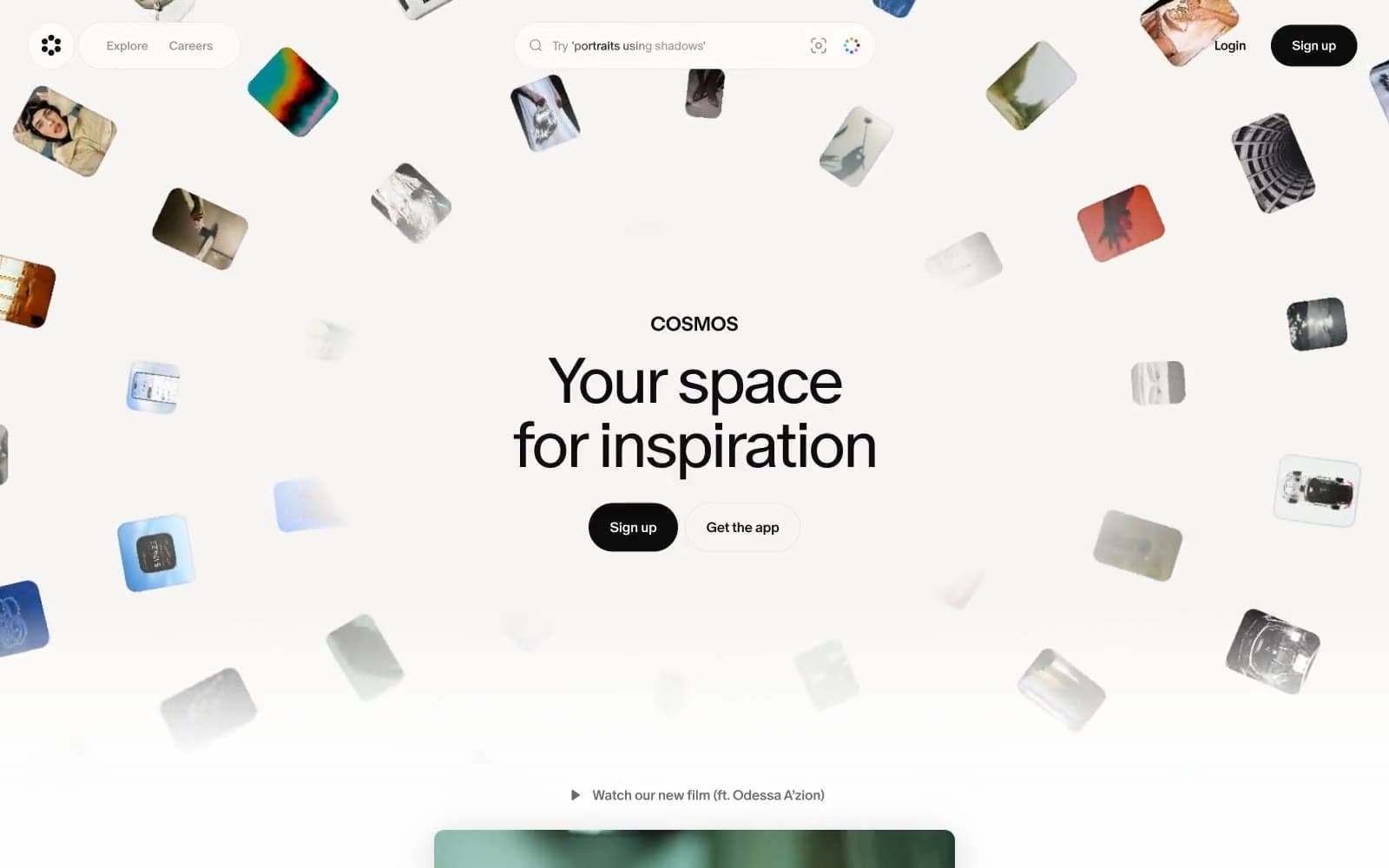
Cosmos
Design tools


