
Awwwards. Oversized type, full-bleed photography, and a single black floating rail to navigate.
- Design tools
- Light theme
- 8 colors
- 1 typeface
Awwwards operates as a curatorial editorial surface: near-monochrome gallery where one massive typographic statement introduces each featured site, anchored by full-bleed hero photography and minimal navigational chrome. The palette is ruthlessly achromatic — ink-black text on a warm pale-gray canvas — letting featured website imagery and a single sparse orange accent carry all visual energy. Components are flat, weighty, and rectangular: 8px radii across most surfaces, a floating dark tab bar, pill buttons that read as labels rather than actions. Type drives hierarchy almost entirely; the 127px display weight at 300 whispers authority rather than shouting, and the same Inter Tight family renders everything from 9px metadata to gallery-scale titles with quiet consistency.

Awwwards design system

Accent1
Sporadic accent — appears as a single-color punctuation mark on rare UI elements and score indicators; the only chromatic color in the system, used sparingly to draw the eye
Neutrals7
Primary text, filled buttons (Be Pro), dark floating nav rail, icons, input borders, table borders
Secondary surfaces, link backgrounds in compact contexts, darker fills for nested elements
Table borders, hairline dividers, muted structural lines
Badge borders, low-emphasis outlines
Secondary borders, icon strokes, list dividers, subtle structural lines
Page background, card borders, section fills — the warm gray that makes the whole surface feel printed rather than digital
Card surfaces, button labels, badge text, image backgrounds, content panels
Try a pairing
Pick any two colors from the palette to check whether text stays readable on top.
Aa
Ink on Ember
5.05 : 1 contrast
- Body textPasses AA 4.5
- Large textPasses AA 3
- StrictFails AAA 7
More DESIGN.md files. Same web, different personalities.

099 SUPPLY
Design tools
70Materia
Design tools
Aaply
Design tools
Anacuna
Design tools
Andrei Rybin
Design tools
Artboard
Design tools
B—Line
Design tools
Brand
Design tools
Canva
Design tools
Claude Type
Design tools
Control
Design tools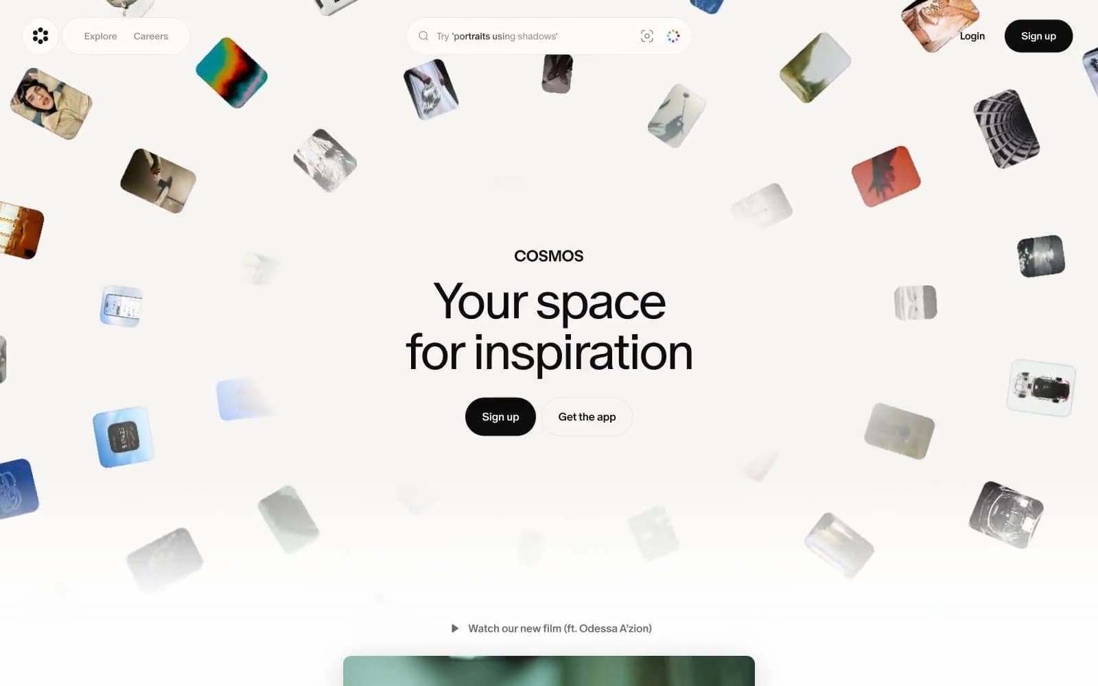
Cosmos
Design tools


