
Brand. A living brand specimen where every color block, headline, and border snaps to an invisible modular grid printed on white.
- Design tools
- Light theme
- 13 colors
- 2 typefaces
Dropbox Brand Guidelines uses a Swiss-editorial visual system: a white graph-paper canvas with thin gray grid lines that organizes the entire page into discrete cells, each capable of holding either type or a flat color block. Headlines are tight-tracked, heavy sans-serif set in Dropbox Blue (#0061fe) that bleeds into the grid as confident editorial type, while a curated palette of eight vivid swatches — tangerine, sky cyan, sun yellow, lime, coral, lavender, magenta, slate — populates large rectangular panels that act as both color documentation and page furniture. The system feels like a living style guide: the grid IS the layout, color blocks ARE the content, and every element snaps to the modular lattice. The only radius is 8px, the shadows are absent, and the typographic discipline is total.

Brand design system

Brand10
Primary text, link borders, icon strokes, heading type, outlined action borders — the single most defining chromatic element, used wherever the brand needs to speak
Soft surface washes, decorative icon accents, and secondary blue fields — a desaturated companion to Dropbox Blue for large background panels
Brand palette swatch, large color block panels, decorative fills
Brand palette swatch, full-bleed color block panels, accent fills
Brand palette swatch, full-bleed color block panels, illustration accent
Brand palette swatch, large color block panels, accent fills
Brand palette swatch, warm color block panels, accent surfaces
Brand palette swatch, soft color block panels, illustration accent
Brand palette swatch, deep accent panels, editorial accent
Brand palette swatch, dark accent panels, editorial contrast
Neutrals3
Primary body text, hairline borders, structural dividers, nav type — the near-black workhorse of the grid system
Muted secondary text, subtle helper labels, low-emphasis borders
Page canvas, card surfaces, reverse text on color blocks, background beneath the visible grid
Try a pairing
Pick any two colors from the palette to check whether text stays readable on top.
Aa
Paper on Dropbox Blue
5.07 : 1 contrast
- Body textPasses AA 4.5
- Large textPasses AA 3
- StrictFails AAA 7
More DESIGN.md files. Same web, different personalities.

099 SUPPLY
Design tools
70Materia
Design tools
Aaply
Design tools
Anacuna
Design tools
Andrei Rybin
Design tools
Artboard
Design tools
Awwwards
Design tools
B—Line
Design tools
Canva
Design tools
Claude Type
Design tools
Control
Design tools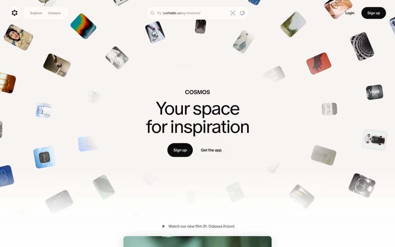
Cosmos
Design tools


