
B—Line. Achromatic typographic grid where the wordmark out-sizes every product.
- Design tools
- Light theme
- 3 colors
- 3 typefaces
B—Line operates as an editorial product index rather than a marketing site — the brand name itself is the hero, rendered at architectural scale before any product imagery appears. The palette is intentionally colorless: pure black, white, and a single mid-gray carry every text, border, and surface decision. Monospace typography (HELVMONO) dominates body, navigation, and metadata, giving every label the feel of a museum catalog entry. Product photography is treated as object documentation: uniform gray studio backdrops, tight crops, and zero lifestyle staging. Surfaces stay flat — no elevation, no decorative gradients, no rounded corners beyond a few subtle link treatments. The result is a Swiss-inflected minimalism where the absence of color and decoration is the statement.

B—Line design system

Neutrals3
Primary text, all borders, nav link color, product card frame, massive hero wordmark — the structural color of the entire system
Muted secondary text, tertiary borders, inactive UI elements
Page canvas, card backgrounds, image backgrounds, inverted text on dark controls
Try a pairing
Pick any two colors from the palette to check whether text stays readable on top.
Aa
Paper on Ink
21.00 : 1 contrast
- Body textPasses AA 4.5
- Large textPasses AA 3
- StrictPasses AAA 7
More DESIGN.md files. Same web, different personalities.

099 SUPPLY
Design tools
70Materia
Design tools
Aaply
Design tools
Anacuna
Design tools
Andrei Rybin
Design tools
Artboard
Design tools
Awwwards
Design tools
Brand
Design tools
Canva
Design tools
Claude Type
Design tools
Control
Design tools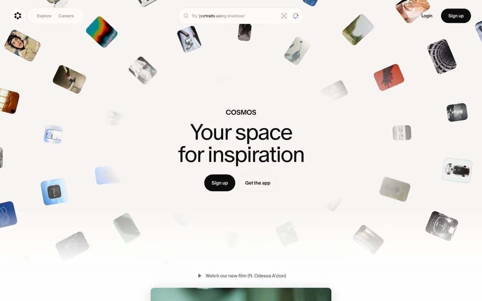
Cosmos
Design tools


