
Anacuna. A page where type IS the design and the single pink pill is the only color the eye can find.
- Design tools
- Light theme
- 3 colors
- 1 typeface
Anacuna runs on a typographic monosystem: a single grotesque weight at three sizes does every job on the page, from 94px project headlines down to 15px nav labels. The canvas is pure white and almost every stroke is pure black — the only chromatic note is a single blush-pink (#ffc8c8) used as a soft brand seal, never as decoration. Layout is an editorial index: full-bleed rows separated by hairlines, oversized titles bleeding past the viewport, client names tucked into small outlined pills at the row's right edge. Everything interactive collapses into one shape — a 27px pill — which makes the page feel like a printed broadsheet that happens to be clickable.

Anacuna design system

Brand1
Brand mark fill (the ANA CUNA pill in the header) and the sole chromatic accent — a whisper of warmth that marks identity without ever shouting
Neutrals2
Primary text, all borders, every hairline divider, filled language toggle — the entire structural skeleton of the page
Page background, card surfaces, pill interiors, button text on dark fills
Try a pairing
Pick any two colors from the palette to check whether text stays readable on top.
Aa
Ink Black on Blush Bloom
14.35 : 1 contrast
- Body textPasses AA 4.5
- Large textPasses AA 3
- StrictPasses AAA 7
More DESIGN.md files. Same web, different personalities.

099 SUPPLY
Design tools
70Materia
Design tools
Aaply
Design tools
Andrei Rybin
Design tools
Artboard
Design tools
Awwwards
Design tools
B—Line
Design tools
Brand
Design tools
Canva
Design tools
Claude Type
Design tools
Control
Design tools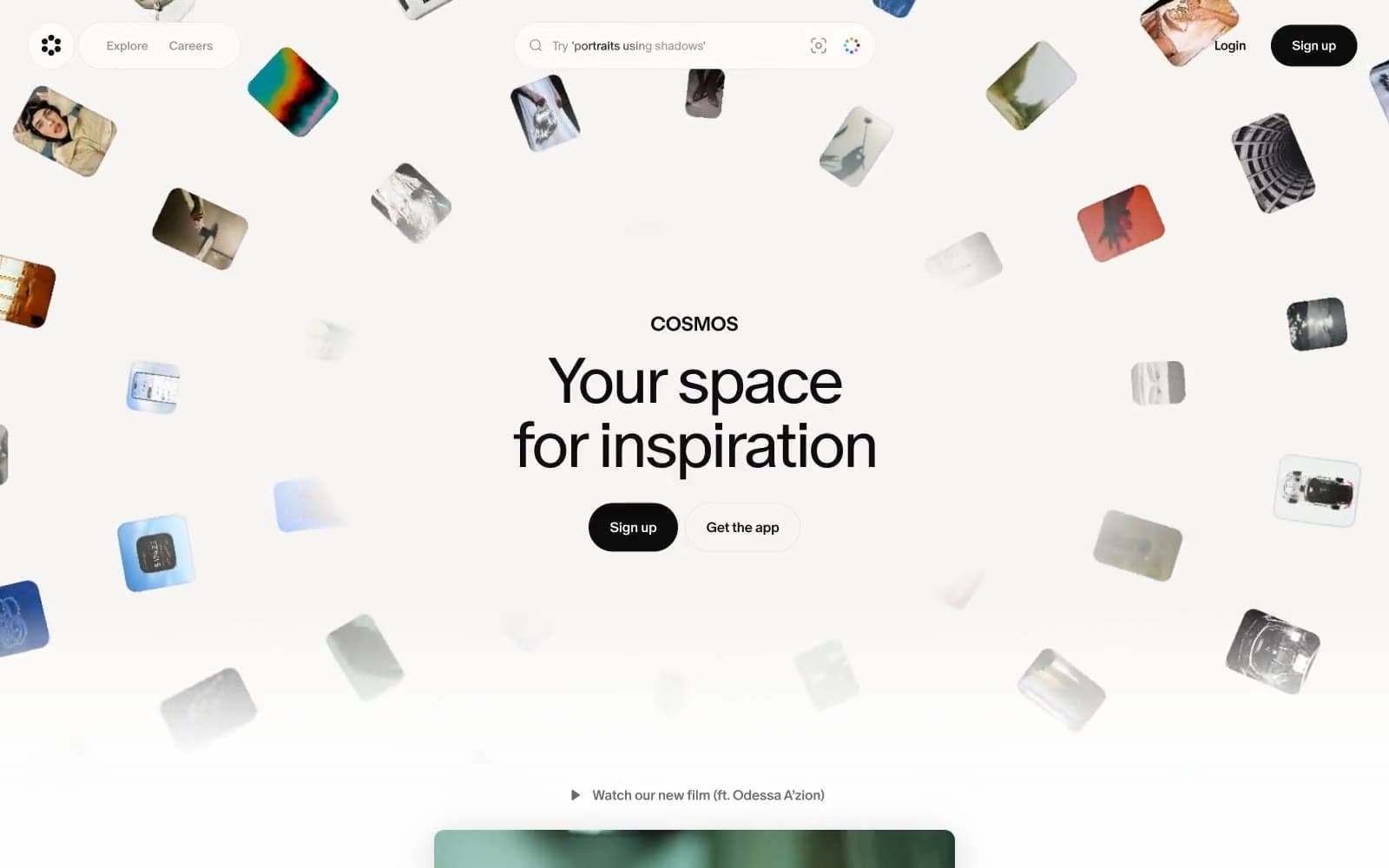
Cosmos
Design tools


