
70Materia. The UI is the mount, never the artwork.
- Design tools
- Light theme
- 4 colors
- 2 typefaces
70Materia is a neutral frame built to disappear around its content — a curated material library where the UI chrome is deliberately invisible so stone, terrazzo, and pigment samples can dominate. Every typographic element sits at weight 400 in a single sans family (Matter), with a monospace companion (Matter Mono) used for labels, navigation, and small UI controls. Letter-spacing on the mono (0.02em–0.04em) plus tabular numerals gives the interface a spec-sheet, architectural-drawing quality — as if the page itself is a technical sample board. The palette is strictly achromatic: black text, white surfaces, and a warm mid-gray canvas (#bababa) that recedes behind the photography. Buttons are thin, square, and outlined; the only filled surface is a near-black (#1e1e1e) for select actions and the footer. No accent color exists in the system — all chromatic energy is outsourced to the product photography.

70Materia design system

Neutrals4
Primary text, hairline borders, navigation outlines — the structural ink
Filled button background, footer surface, dark UI blocks — warm near-black replacing pure black for non-text surfaces
Dominant page canvas, muted dividers, secondary surface tone
Page highlights, card surfaces, text on dark surfaces, button outlines
Try a pairing
Pick any two colors from the palette to check whether text stays readable on top.
Aa
Bone on Obsidian
21.00 : 1 contrast
- Body textPasses AA 4.5
- Large textPasses AA 3
- StrictPasses AAA 7
More DESIGN.md files. Same web, different personalities.

099 SUPPLY
Design tools
Aaply
Design tools
Anacuna
Design tools
Andrei Rybin
Design tools
Artboard
Design tools
Awwwards
Design tools
B—Line
Design tools
Brand
Design tools
Canva
Design tools
Claude Type
Design tools
Control
Design tools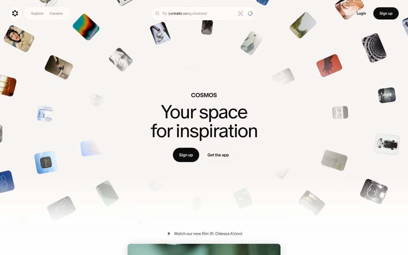
Cosmos
Design tools


