
Aaply. Digital sketchpad with electric highlighter.
- Design tools
- Light theme
- 10 colors
- 3 typefaces
Aaply reads as a digital sketchpad on a light gray canvas: everything is flat, everything is rounded, and electric yellow carries the energy while black anchors the structure. The headline itself behaves like a whiteboard — bold black type interrupted by colorful emoji and icon stickers, signaling that this is a tool for creative work. Surfaces float as soft white cards on a cool gray field with a faint dot-grid texture, never relying on shadows for depth. Brand color appears as generous fills (buttons, accent shapes, logo marks) rather than thin strokes or tinted backgrounds. The overall feeling is energetic but unpretentious — a working surface, not a gallery.

Aaply design system

Brand2
Primary brand accent — logo mark, filled pill buttons, accent shapes inside product mockups, highlight washes on feature cards
Brighter yellow variant for highlighted feature containers — the outer glow on flow-diagram cards
Accent3
Red supporting accent for decorative details and low-frequency emphasis
Product mockup logos, icon accents, connector arrows inside the flow diagram — the cool counterweight to warm yellow
Soft tinted background blocks behind product mockup clusters — warm secondary surface that softens the gray canvas
Neutrals5
Primary text, dark filled buttons, icon strokes — the structural ink of the entire system
Single soft drop shadow color (used at 20% opacity as rgba), muted text on dark surfaces
Subtle borders, secondary surface fills, dividers between content sections
Page canvas background — the cool gray field that makes white cards appear to float
Card surfaces, navigation bar background, product mockup canvas — every elevated surface
Try a pairing
Pick any two colors from the palette to check whether text stays readable on top.
Aa
Carbon on Highlighter Yellow
15.59 : 1 contrast
- Body textPasses AA 4.5
- Large textPasses AA 3
- StrictPasses AAA 7
More DESIGN.md files. Same web, different personalities.

099 SUPPLY
Design tools
70Materia
Design tools
Anacuna
Design tools
Andrei Rybin
Design tools
Artboard
Design tools
Awwwards
Design tools
B—Line
Design tools
Brand
Design tools
Canva
Design tools
Claude Type
Design tools
Control
Design tools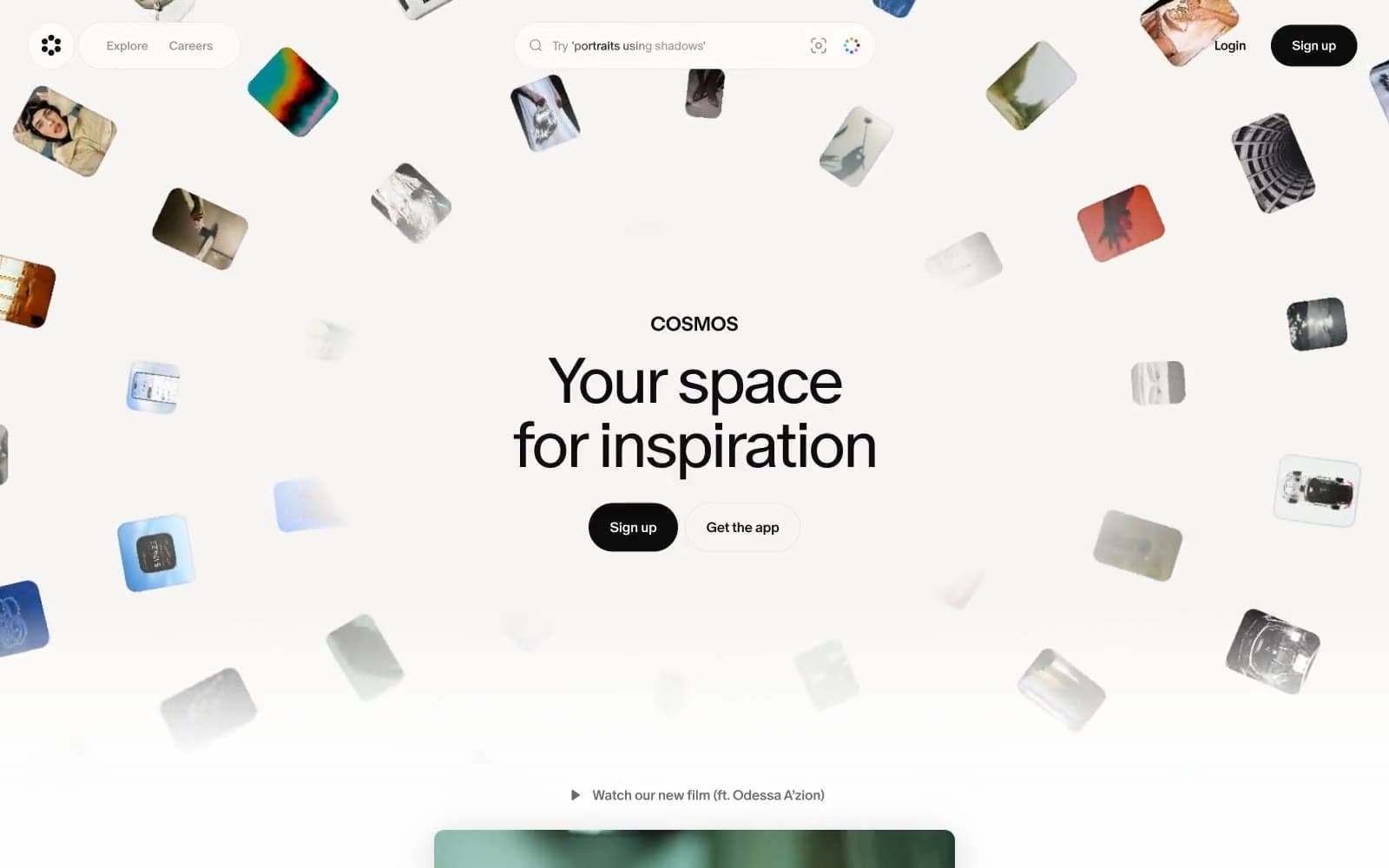
Cosmos
Design tools


