
Control. Editorial Swiss grid meets creative tool.
- Design tools
- Light theme
- 14 colors
- 3 typefaces
Control operates as an editorial design tool: white canvas, hard black borders, and a near-monochrome palette punctured by vivid green, orange, and yellow accents that feel like editorial highlighter marks. The signature is a brutalist typographic contrast — massive Melange display type (71–146px) at near-zero tracking set against tiny uppercase Favorit Mono labels (9–10px) with tight negative letter-spacing. Every surface is flat; depth comes from black border outlines (1–2px), not shadows. The aesthetic reads like a Swiss editorial spread rebuilt for software: grid-anchored, unapologetically geometric, and confident in its asymmetry.

Control design system

Brand1
Primary action buttons, active states, and live UI feedback — saturated green on black-and-white canvas reads as switched-on electricity
Accent2
Orange action color for filled buttons, selected navigation states, and focused conversion moments
Decorative borders, selection marks, and editorial accent strokes — never used as fill
Neutrals11
Primary text, structural borders, and outline contours that define all surface edges
Secondary text and muted UI elements
Deemphasized body text and metadata
Disabled button surfaces
Tertiary captions and disabled states
Faint outlines and placeholder chrome
Hairline borders and tertiary dividers
Mid-tier borders and inactive form strokes
Subtle dividers and light borders on secondary surfaces
Card surfaces and elevated panel backgrounds — one shade off white
Page canvas, inverted text on dark surfaces, and button labels on green fills
Try a pairing
Pick any two colors from the palette to check whether text stays readable on top.
Aa
Obsidian on Voltage Green
12.84 : 1 contrast
- Body textPasses AA 4.5
- Large textPasses AA 3
- StrictPasses AAA 7
More DESIGN.md files. Same web, different personalities.

099 SUPPLY
Design tools
70Materia
Design tools
Aaply
Design tools
Anacuna
Design tools
Andrei Rybin
Design tools
Artboard
Design tools
Awwwards
Design tools
B—Line
Design tools
Brand
Design tools
Canva
Design tools
Claude Type
Design tools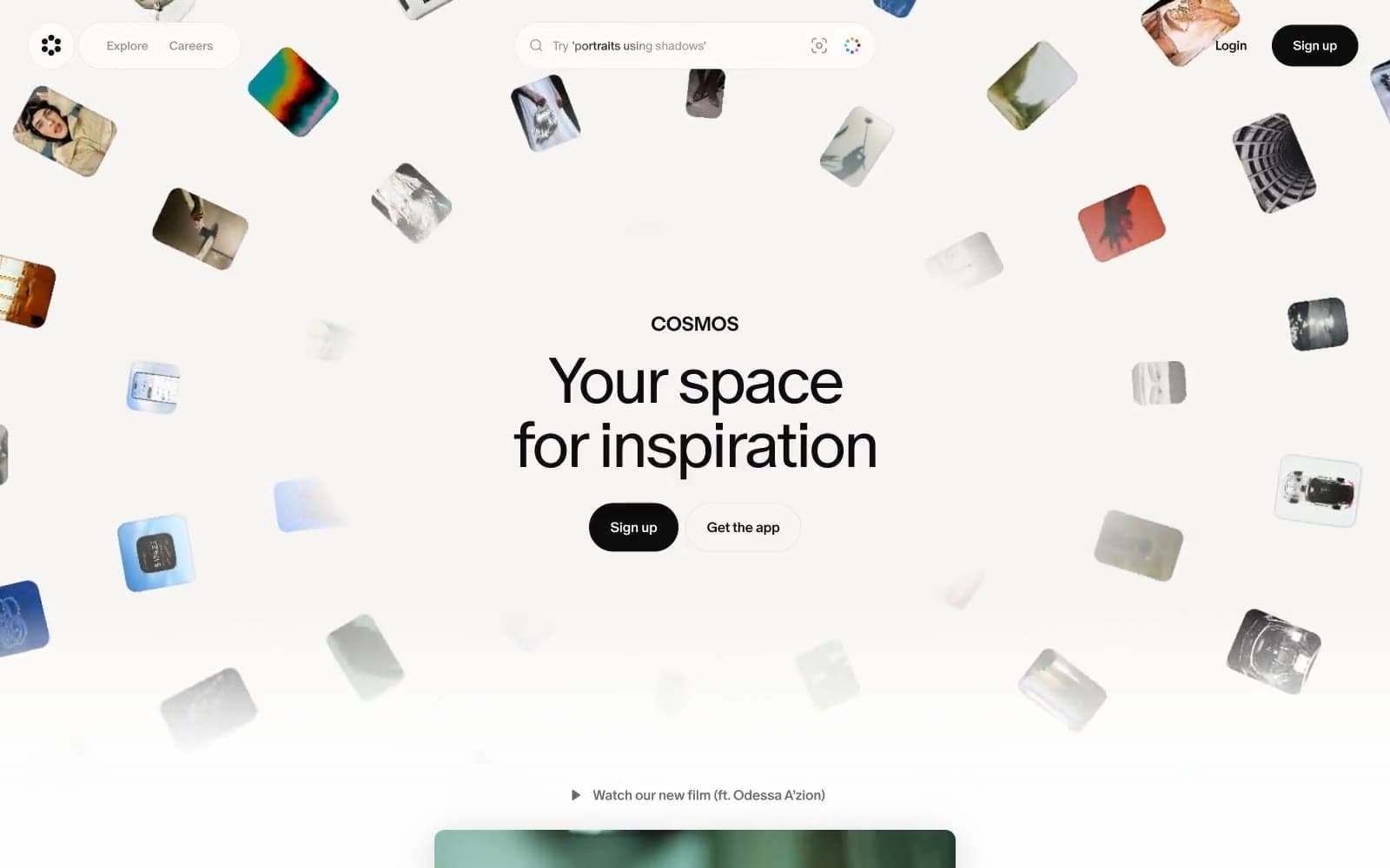
Cosmos
Design tools


